Pin That Sh*t


Like most kids I collected various things throughout my childhood, including buttons and pins. Most of my pins were from family travels, my parent’s political involvement in education, or participation in school events (see the full array here). Ramblin’ Rod would not have been impressed, but it was my collection and I was proud of it.

A few buttons and pins were collected of my own volition, and one of my prize pins was found in a deserted lot near my home around 8 years of age – a unicorn with gold metal accents and a multi-colored mane. Between childhood activities of building forts out of firewood stacks and popping tar bubbles on recently repaired roads, finding a monogram unicorn pin was a highlightable moment – even if it had a G on it instead of an M. Many days I wore this pin and thought “if only my name started with a G”. Alas. Here are a few favorites from my childhood collection.

pin collection from my childhood including a unicorn with multicolor mane

So, it seemed destined that one day I would participate in a group art show called Pin That Sh*t during Design Week Portland 2017. Over 60 artists from around the world donated pins, all of which will be for sale with funds donated to support arts education. Once I learned I would be a part of the show, I revisited my 1980’s collection and started on designing something new for the show.

My brainstorming ran the gamut from textures to animals to random icons. A theme of birds became apparent which guided a more specific exploration of several bird pins, of which the top three were considered for the final piece. After feedback from studio mates, the simplest bird was adjusted to have bold black outlines, taking inspiration from my childhood unicorn pin but modernizing it in style. And really, what better way to converge ‘put a bird on it’ with the new hip trend of pinning everything in sight?

preliminary bird pin brainstorms

love bird with heart speech bubble and rainbow wings for WeMake Pin That Sh*t Show

Love Bird is a tiny yet highly visible fashion partner to any wardrobe or backpack choice. With a nickel metal detail and flat polished surface, its minimal design seeks to spread love and acceptance. It’s a bird with a meaning, but it’s also just darn cute!

Two larger collections are also a part of the show from Kate Bingaman-Burt and from Brian Stowell, and many artists donated more than one pin so that there will be over 600 pins on display. For a more comprehensive list of artists and their bios, visit WeMake’s event page.

The show opens April 27th at Tillamook Station (665 N Tillamook Street in PDX, OR), from 4-9pm. In addition to the pin display there will be activities and beer. Most pins will go for about $10, also known as very affordable art. Time to find a bigger jean jacket…

participant pins of Pin That Sh*t art show

The pin was produced through GS-JJ who make custom pins, patches AND belt buckles. To transport/display the love bird pin, I ordered custom cards from Moo. A square, rounded corner card with spot gloss on the title and white clouds was the perfect fit for the bird with both shiny and matte surfaces.

love bird pin with cloudy spot glass Moo Cards background backer

Testing: New Hearts


Here are some tests I have been working on for a group art show at Land Gallery happening February 10th titled 69 Love Songs. The show pays tribute to the Magnetic Fields album 69 Love songs with artists each interpreting a song. My song is “I Think I Need a New Heart”, and I’ve been working on tiny heart packaging (think cigarette package size) using painted wooden blocks and 2 colors of liquid paint Markal markers. It’s definitely a medium with limitations, which has been fun to work with.

new-heart-tests-1

new-heart-tests-2

Ducks VS Beavers “Civil War” Beer Design Series


Each year, Oregon descends into sports madness when the Ducks (University of Oregon) and Beavers (Oregon State) face off at the “Civil War” football game, the biggest sporting event in the state. The tradition dates back to 1894 with over 115 games on record. Every November sport pennants fly proudly from cars, allegiances are sworn and catcalls are common. For the most part, I stay completely out of the mêlée. Until this year.

Which brings me to the Ducks VS Beavers Civil War “Beer Design by Decade” project! For every decade that the Ducks and Beavers have been competing against each other I created a beer label for both teams. Design wise I focused on the simplest execution possible to represent the styles, tropes, themes and feeling from that decade.

13 decades of beer designs for the Oregon State Beavers and University of Oregon Ducks.

While having participated in sports in high school with great fervor but mediocre talent, most of my 20’s and 30’s have been spent in front of a computer or a book. My sister, on the other hand, can most often be found cheering on her favorite sports team and alma mater: the Ducks. She probably inherited this from my dad who used to have a sport for every season which he watched dutifully and on the edge of his seat, can of peanuts and Pabst in hand. Realizing that my sister’s fandom would probably never subside, I decided to join in the only ways I knew how – eating guacamole during games and designing beer labels for the respective teams. Here are the labels zoomed in and side by side for each decade.

ducks-vs-beavers-civil-war-beer-design-final

Oh yeah, this years Civil War is on Saturday November 26th at Reser Stadium.

Thanks to:

Hayden Walker, a new Portland design transplant who helped with research and design as I balanced client work and a project effort that I underestimated greatly. See his work or Dribbble. Also to Tess Wojahn for helping with research (I’m sure a process post with inspiration images will follow at some point). See her work.

My playground friends from Madras, Oregon circa 1988 for spurring my alternative sports involvement when we wrote a rap about how great the Trail Blazers were (those were the days!).

My dad, who watched sports and drank beer and seemed to know infinitely more than both coaches and players based on the color commentary provided. He probably did know quite a bit as an ex-college and army ball player in both baseball & basketball. Those tense moments of accidentally running in front of the TV during an important play or daring to speak during a key game decision and being reprimanded with the Rankin glare will never be forgotten.

There you have it!

Ducks VS Beavers civil war beer design by decade

Copenhagen Mind Map for Archie’s Press


Here is a recent collaboration with Archie’s Press that I’m super excited to share: a conceptual “mind map” of Copenhagen, Denmark. So many aspects of the project spoke to me: the history, the design challenge, the process, and the city itself.

Archie Archambault and I met almost a decade ago when we were both members of Em Space, a letterpress & book making collective. He was a bright eyed and idealistic printer/maker and I was an agency designer who liked to relax with a good stack of paper and a letterpress. He made his first map of Portland, which was pretty different from everything else out there at the time. I quit the agency life and started the Bureau of Betterment as a freelance designer. Over the years we crossed paths here and there. He moved to Amsterdam; I visited. I moved to Copenhagen (and back to Portland again); he kept in touch. And he made maps – lots of them – first of places he lived or visited, then collaborating with local designers on new maps.

archie-map-trio

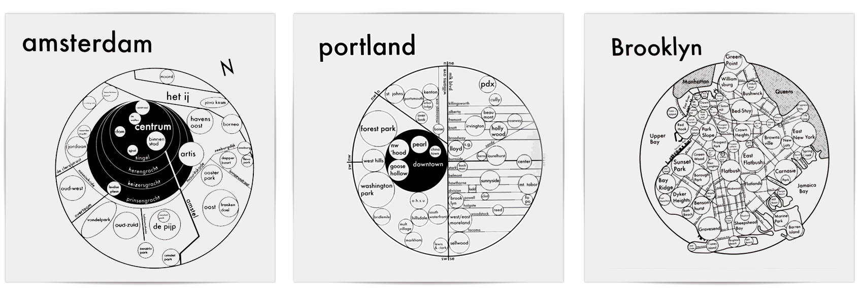
As you can see, Archie’s maps are built with circles. As he explains on his site, research indicates that GPS’s are hindering our ability to create mental maps of our surroundings. His aim is to install a “Map from the Mind”, simplifying structures and neighborhoods in the most efficient and beautiful way possible. The circle, our Universe’s softest shape, is the clearest graphic to convey size and connection.

A few months ago, Archie got in touch and asked if I would collaborate with him on a map of Copenhagen, based on my knowledge of the city and his system of designing maps. I said YES. Having lived in Copenhagen for several years, it was a project close to my heart. I spent time looking at historic maps, reading about the city like I hadn’t done before, and interviewing both Danes and expats living in Copenhagen (thanks Niklas, Christa, Lise, Emil, Michelle & Carli).

old-copenhagen-map

Creating a “mind map” is different than a regular A-to-B map, and boy does that make me happy. How do people use the city and how do they get around? How do they explain the city to others? How does the city feel? How are the parts connected in the mind? What are the bare essentials for wayfinding while also understanding how the city is organized? And as a design piece, how do we make it visually engaging? I started with the basics, not even entering design mode until we had figured out the underpinnings of what was important.

copenhagen-map-core-elements

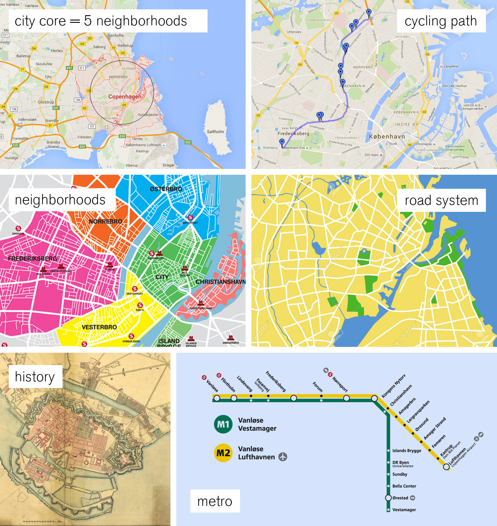
Roads might seem obvious as a heavy hitter, but Copenhagen is different. Its’ roads don’t follow a grid pattern, and sometimes the same road changes name four times within a kilometer. When my interviewees were given the choices of 1) neighborhood, 2) landmarks, 3) water, 4) major roads, 5) a specific address and 6) public transit as wayfinding tools, the clear winners were neighborhoods and landmarks with water and public transit coming in second. Roads were last, even scoring low among those who used cars as their main method of transportation. That is why we only included the critical inner ring road that connects the neighborhoods and the “5-finger” spoke roads that were part of Copenhagen’s city plan from way back when. Simplifying the public transportation system was a tough choice. Archie and I decided that the Metro was the public transit mode to feature – there were too many bus lines and the train system wasn’t exclusive to the city, but the Metro is on the move and connects to the airport.

preliminary-copenhagen-map-sketches-copy

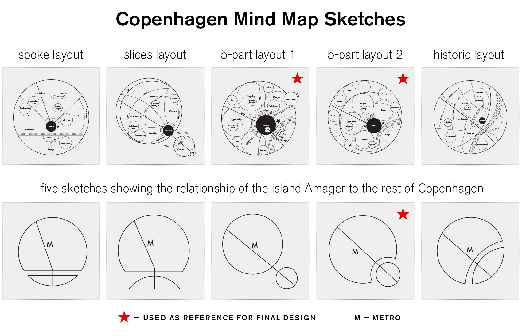
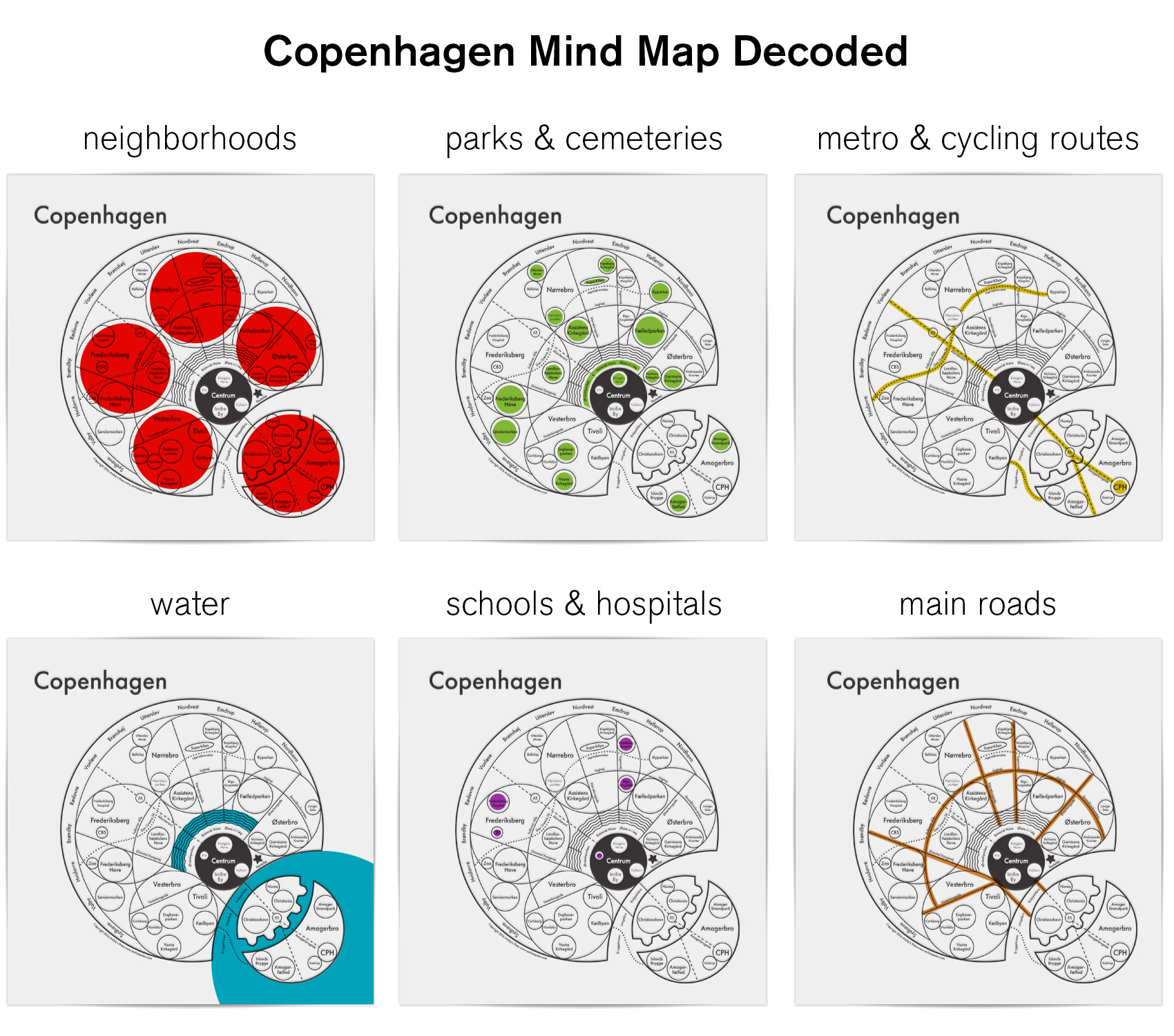
After much exploration I settled on a structure that featured the defining neighborhoods (or “broer”, which means bridge in Danish) – Østerbro, Nørrebro, Vesterbro, Amagerbro and Frederiksberg. These neighborhoods are top of mind when describing how to traverse the city and have very distinct vibes that define them: quiet and well-to-do Østerbro, multi-cultural and diamond-in-the-rough Nørrebro, established and monied Frederiksberg, the cool hipster feel of Vesterbro, and the up-and-coming Amager which has both unique merits and suffers from the stepsister syndrome. The map prominently features the main bike thoroughfare that thousands use daily on their commute and provides a serene way to bike with minimal interaction with regular roads. Unlike most of Archie’s circle maps, the Copenhagen map puts emphasis on public parks as well as schools and hospitals that allude to the Danish social system.

copenhagen-mind-map

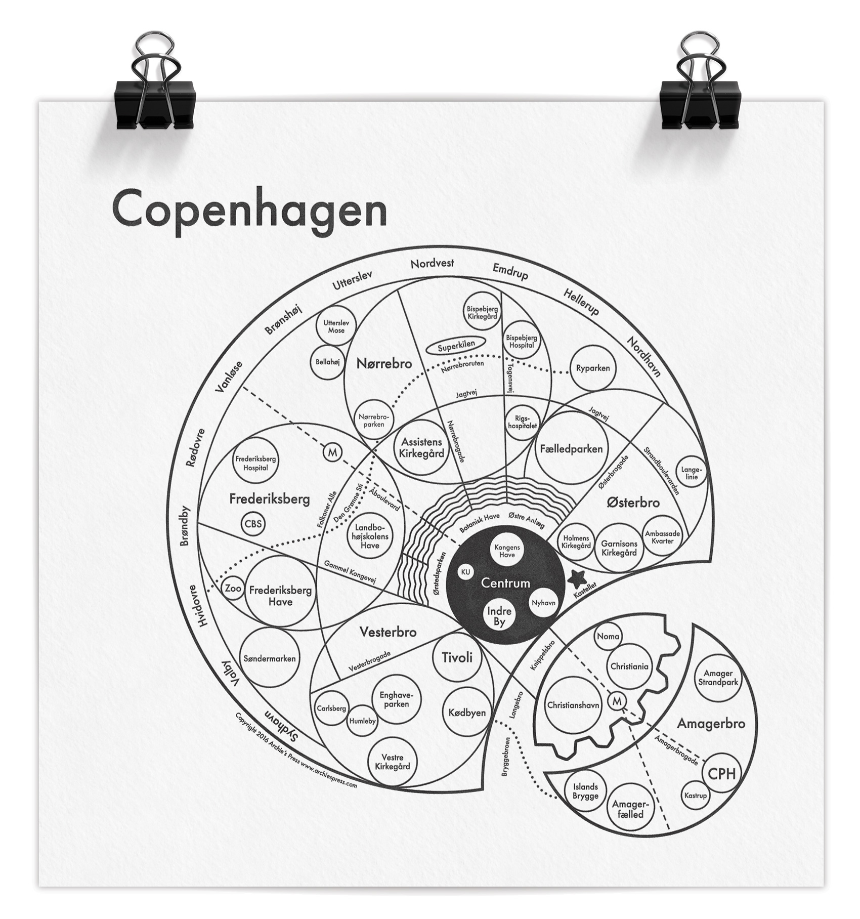
Many challenges lay in the details: getting the placement and proportions right so that major roads connected accurately to parks and water, dividing the lakes correctly with the bridges that crossed them, and having the metro pass through the right areas while still hitting their end destinations that are used as the line names when boarding (Vanløse, Lufthavn, Vestamager). All while using circles, circles, and more circles!

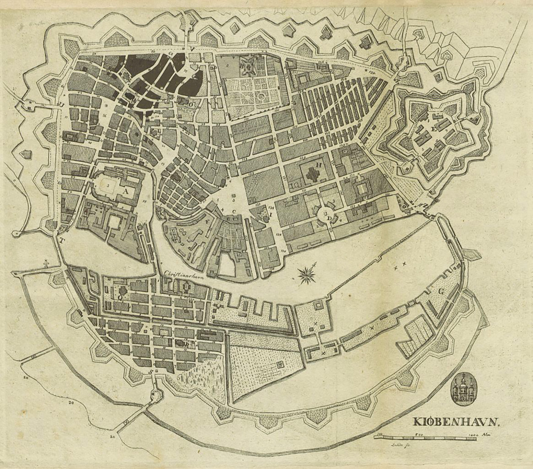
A favorite part of the map for me is the integration of the lakes circling the city, which visually connects to the remainders of the old defensive moat system from the Middle Ages (the triangular points on the south side of the harbor on Amager). The northern contained lakes are a central gathering point for tourists, runners, and locals enjoying the banks of the lake for a quick take-out meal. I also love the juxtaposition of the free city-state Christiana right next to the world-class restaurant Noma – two experiments on different ends of the spectrum. And even though we didn’t follow a structure based on the quaint maps of centuries gone by, where everything spreads out from the oldest and most central part of the city, I’m happy that a little bit of the historic “radiating city” feel was retained in this modern interpretation.

The Copenhagen map has been reviewed by a Danish magazine, Magasinet KBH, which focuses on city life and the changing architectural spaces of Copenhagen. You can use google translate, but the general opinion was that the map was simple and clear to understand – which from the Danes is a pretty good review!

While the map has been deemed simple and clear by the natives (and hopefully to visitors as well), here is a decoder key so you can quickly get an idea of all the parts and how they interact. The ring of names around the outside/northwest are suburbs, and following Archie’s system the city center (Centrum) is black. All smaller localized areas, tourist spots and notable locations are in individual circles (the zoo, Tivoli Gardens, Noma, Islands Brygge, the airport, etc), as well as parks, hospitals, schools and the overarching neighborhoods.

copenhagen-map-explanations

The Copenhagen mind map is available at Archie’s Press in letterpress (8×8″) or screen print (17.5×17.5″) editions.* Some of my favorite pieces of Archie’s are from the Outer Space series, including The Moon, The Sun, and The Milky Way – even the product descriptions make me smile. Thanks for reading – now you know way more than you probably need about designing a mind map of Copenhagen.

*Tim May, I have you covered.

New Site!


THE SHORT VERSION
Check out my new website! New content, new design!

THE LONG VERSION
The last iteration of this website was launched in 2010 when I started my freelance career (or as I like to call it, being an independent designer). It showcased the work I had done over the course of 5 years while working at Sockeye Creative and Morrow McKenzie Design in Portland, Oregon. My years spent there gave me a great start in doing the work I love and let me learn so much. The site was also built for small screens, when retina displays were a thing of the future and responsive design wasn’t super mainstream. When I realized the time spent designing independently was greater than my time spent at agencies, I knew it was time to update the Bureau online.

The new site focuses on both technical updates (big images, responsive design, portfolio sorting) as well as the work I’ve done independently (although it still has a few of my favorite projects from my agency days). Since 2010, I’ve gained a lot of experience in managing projects, working directly with clients, illustrating in different styles, and working abroad for almost 3 years in Copenhagen, Denmark. Looking back, quite a lot has happened…

I published 550 blog posts in that time (almost all of it original content), and opened 178 job tickets. The blog effort includes over 75 pioneer rabbit illustrations and a whole slew of outfits as well as creating a pop-up adult lemonade stand and outfitting a vending machine to look like a monster. I also illustrated not one but two entire books, developed my lettering skills (proof A and proof B), and completed perhaps one of my favorite projects to date – branding a new ice cream product. In the middle of that I had a baby (once) and moved transcontinentally (twice). Sometimes I wish there was more time for napping.

All of that to say, I’m very proud to share my work with you in its most recent incarnation – I hope you enjoy it!

(Thanks to Monumental for the technical side of the website making process!)

Monster Drawing Rally


Recently I participated in a Monster Drawing Rally at the Portland Art Museum as a fundraiser for kids arts programs. Seventy-five artists donated their time and art in three 1-hour drawing bouts. After each drawing was completed it went up for auction for a flat $35. I was on shift #3 and it was a test of speed and dexterity to draw in the dusk while passerby and other ambitious artists made the table jiggle from bumping it or vigorously erasing.

My friend Nathan making india ink figures - his work is online at www.nathanpaulrice.com
My friend Nathan making india ink figures – his work is online at www.nathanpaulrice.com
Illustrators hard at work while the audience bellies up.

I surprised myself and cranked out two typographic pattern pieces. The first one was from my daughter’s favorite word du jour (uh oh) took 35 minutes plus the set up time of getting my materials out (Office Depot printer paper on a clipboard and a.01 micron pen). The second (oh my) was completed in 20, the last 5 being used to quickly decide on how to most efficiently fill up the type sections (big dots and sub par stippling).

Drawing number 1.
Drawing number 1 – uh oh.
Drawing number 2.
Drawing number 2 – oh my.

Kids had fun giving suggestions on the patterns to fill the sections with (hearts, zig zags, leopard print, stars). Usually these typographic terrain pieces are two to three times bigger and take at least a few hours to complete, or more, if I plan them out in advance. It was fun to see that I could do this type of drawing without planning it at all, although the results also showed the haste and split second decision making that took place. While not super pro, it was super fun, and I hope more of these kinds of events happen.

Event Documentation
Photo set by Cody Maxwell | Video by Paul Searle

Piano! Push Play!


Each year I usually tackle one side project that takes me off the beaten path of my typical work-for-hire jobs. This is how the Goodie Monster was born, I manned a lemonade stand in Copenhagen, and made a fuzzy printed poster about moose falling in love. This year, I painted a piano. It is now out in the world for anybody to play thanks to the group Piano! Push Play!

Process from dingy wood, enamel coating, to fully illustrated.
Process from dingy wood, adding an enamel paint coat, to fully illustrated.

Piano! Push Play! partnered with the Portland Art Museum and Portland Parks & Rec to create an installation of 10 designer pianos, which were featured in a concert on June 26th at the Museum. From there, the pianos move to various sidewalk and park locations to be played by passers-by for a few weeks before they are donated to schools, community centers and other organizations unable to purchase pianos on their own.

For my piano design, a glossy white enamel paint coat topped with black illustration was a simple way to stay true to the piano’s form and accentuate the features of the instrument as an individual. Patterning and texture were used to mimic the variety and nuance that pianos are capable of and to show the feeling of how it is when you play.

Continue reading “Piano! Push Play!”

Piano. Push. Play. Preview…


Here is a quick sneak peek of what I’m working on right now, along with an invite to come see it in action. The Portland Art Museum is partnering with Piano! Push Play! to create an installation of 10 designer pianos, which will be featured in a concert on June 26th at the Museum. From there, the pianos move to various sidewalk and park locations to be played by passers-by for a few weeks before they are donated to schools, community centers and other organizations unable to purchase pianos on their own.

That’s right, I’m painting an entire piano for anybody to play.

piano-push-play-preview

Piano! Push Play! Concert
Friday, June 26th at 7:00pm
Portland Art Museum
1219 SW Park Ave, Portland, Oregon 97205
FREE to the public!

Check out the event on Facebook for more details.

A Gender Rebrand


I’ve never really understood the gender symbols. As a kid, they were so far from being representative, I always wondered how people knew which was which. If they had been used to label restrooms, I probably would have chosen the wrong door half the time in confusion due to the arbitrary placement of a circle and some lines.

As an adult, my sarcastic interpretation might be that obviously the ladies had very large brains and the gents had very small…anyways, perhaps subconsciously I felt that there was a need for improvement in this graphic system, because I have now redesigned the gender icons. Without even really meaning to, here is how it happened…

Before

men women gender rebrand-before

While doodling during a phone conversation one day, some scribbles appeared that I liked. Often I will fill an entire sheet of paper with the same shape or squiggle as I talk on the phone or listen to muzak while on hold with the various Danish Governmental Offices that have very specific opening hours and very long telephone waits. Most of the time, the doodles are just time fillers – but these popped out as prettier than usual and I immediately wanted to use them for THIS SPECIFIC PURPOSE. Muzak = instant faux miniature branding projects? The creative process can, indeed, be confounding.

After

men women gender rebrand-01

men women gender rebrand-02

men women gender rebrand-03

men women gender rebrand-04

men women gender rebrand-05

men women gender rebrand-06

men women gender rebrand-07