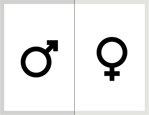
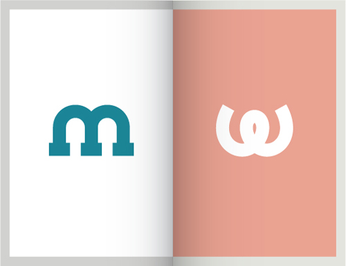
I’ve never really understood the gender symbols. As a kid, they were so far from being representative, I always wondered how people knew which was which. If they had been used to label restrooms, I probably would have chosen the wrong door half the time in confusion due to the arbitrary placement of a circle and some lines.
As an adult, my sarcastic interpretation might be that obviously the ladies had very large brains and the gents had very small…anyways, perhaps subconsciously I felt that there was a need for improvement in this graphic system, because I have now redesigned the gender icons. Without even really meaning to, here is how it happened…
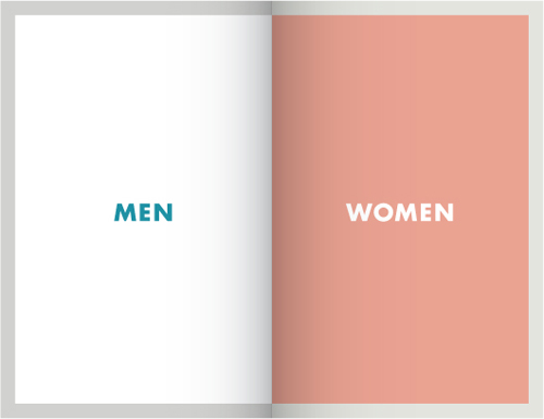
Before
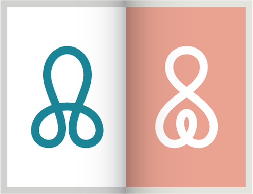
While doodling during a phone conversation one day, some scribbles appeared that I liked. Often I will fill an entire sheet of paper with the same shape or squiggle as I talk on the phone or listen to muzak while on hold with the various Danish Governmental Offices that have very specific opening hours and very long telephone waits. Most of the time, the doodles are just time fillers – but these popped out as prettier than usual and I immediately wanted to use them for THIS SPECIFIC PURPOSE. Muzak = instant faux miniature branding projects? The creative process can, indeed, be confounding.
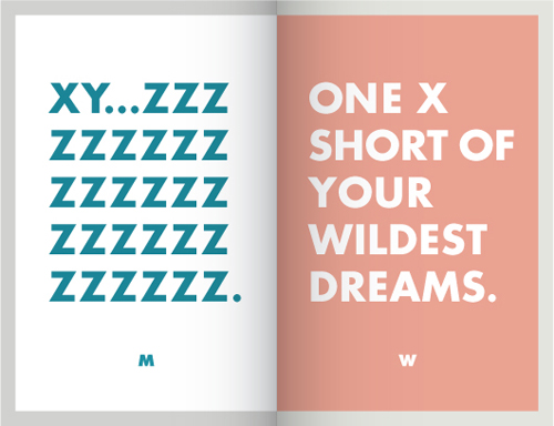
After
Ælsker det!!!!!! fantastisk!!!!!!