Tofurky Moocho Logotype and Lettering for Packaging Design


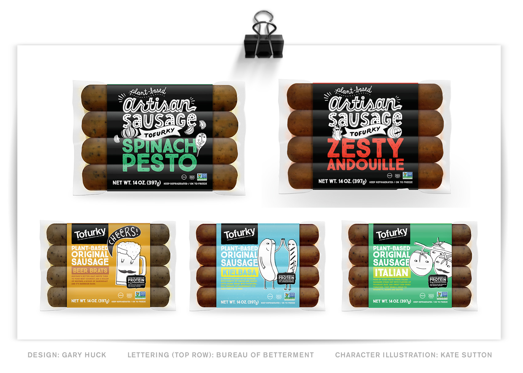
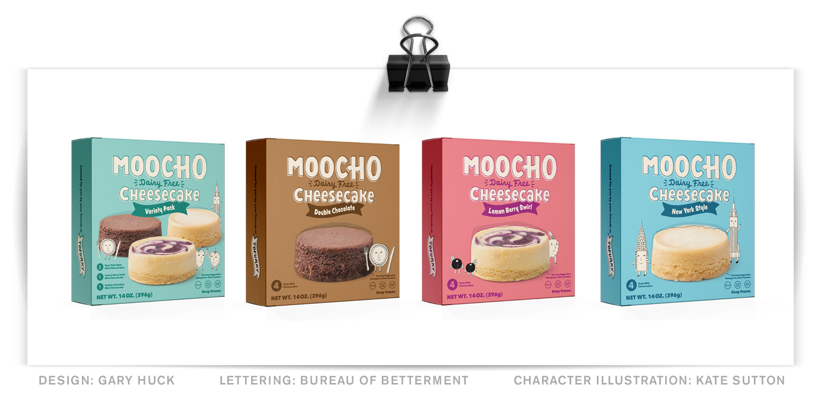
A long time client-collaborator – Tofurky – has recently launched both a new product and their new website that feature lettering work by the Bureau. The new product line is called Moocho, which I worked on with Art Director Gary Huck to create a handlettered logo for Tofurky’s new division of dairy-free vegan options. The first series of product are 3 cheesecake flavors. We hit a balance between being bold on package, having a similar personality to other lettered & illustrated elements, being fairly non-gendered and feeling like the word.

Hand lettered / hand drawn word mark for Tofurky brand MOOCHO vegan / dairy free cheesecake.

A technical portion of many packaging projects is fulfilling the legal requirements of packaging. This means that the brand name (Moocho), product name (cheesecake), any specific claims or identifiers (Dairy Free), and flavor (goes in the banner) all have to work together in a specific way in certain size proportions and order. To achieve a balanced look, the product name was lettered in mixed case with a very high x-height, and the claim was also created with a high x-height so it didn’t have to be very large compared to the brand name.

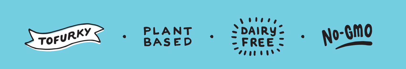
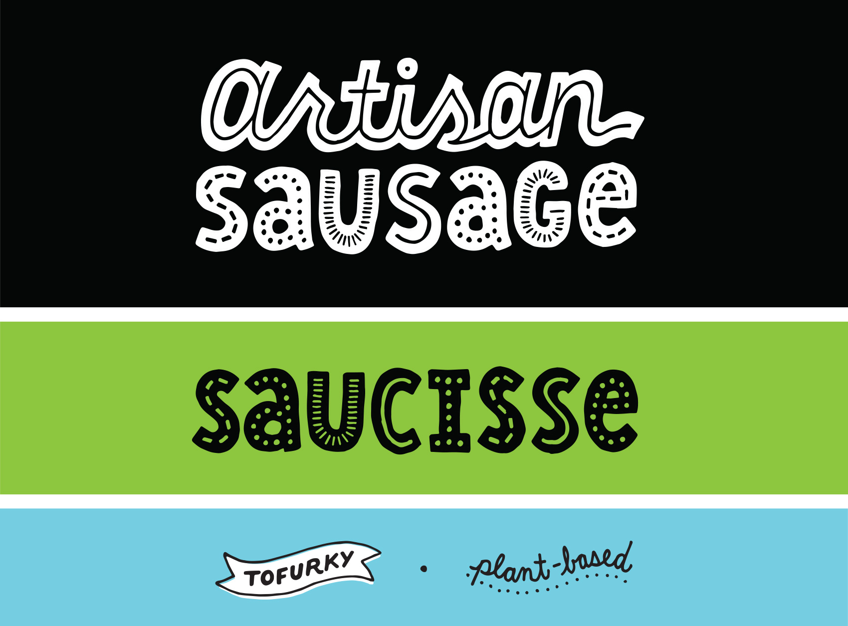
A part of the project was determining the right hierarchy between the parent brand (Tofurky) and the new sub-brand (Moocho). For that reason, Tofurky is represented by a lettered banner instead of the classic black box + logo combination on their other product lines, of which I’ve also created lettering for to differentiate their artisan sausage from the regular old sausages.

The design in general is clean and features the product next to their character illustrations, with color blocking and the brand name being the main on-shelf visual. This is a great way to create a big shelf presence and a recent trend in packaging as new products compete for scannability.

Series of four Moocho Cheesecake packaging boxes (design: Gary Huck) with a hand lettered MOOCHO word mark and product title and flavor.

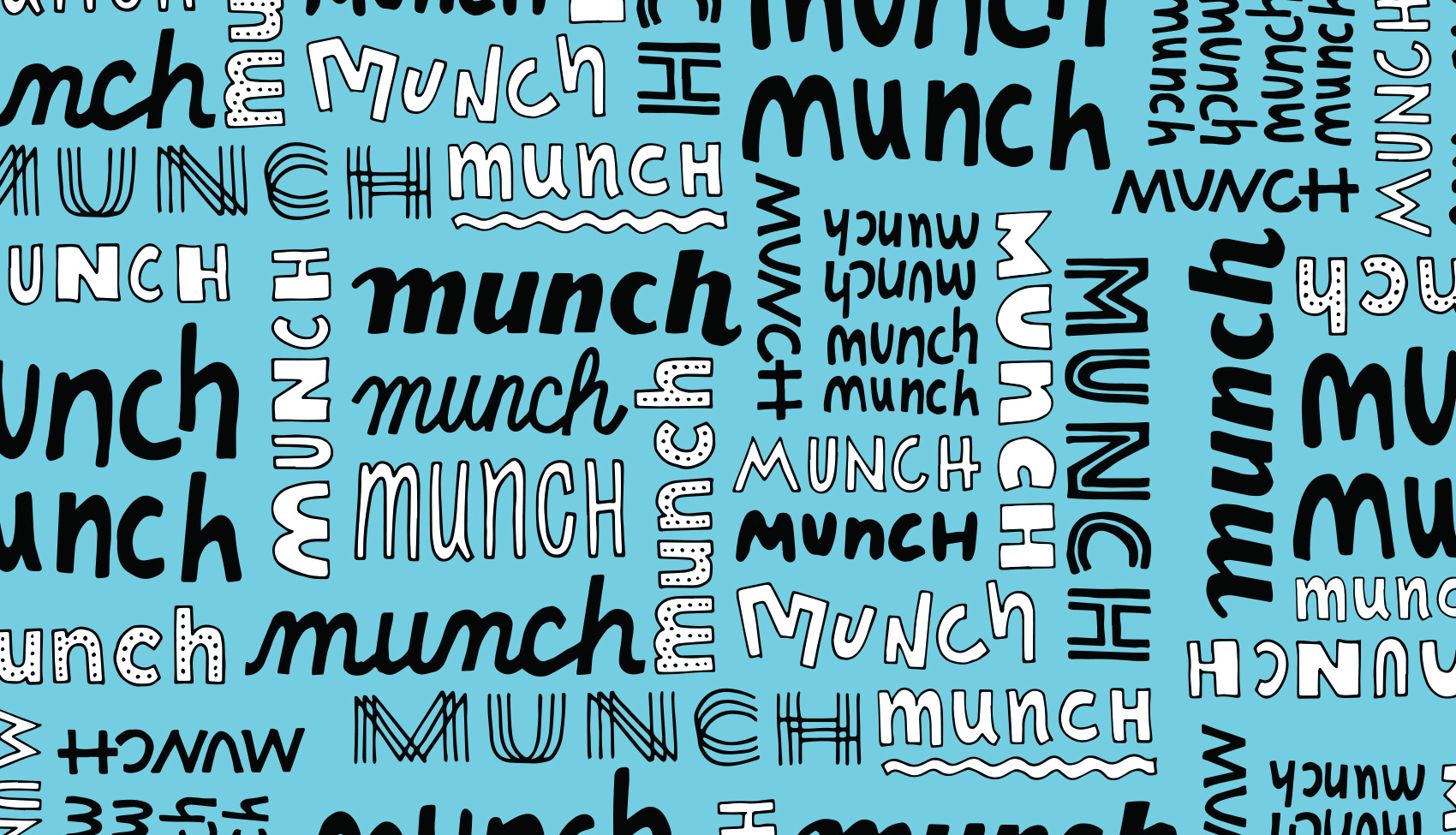
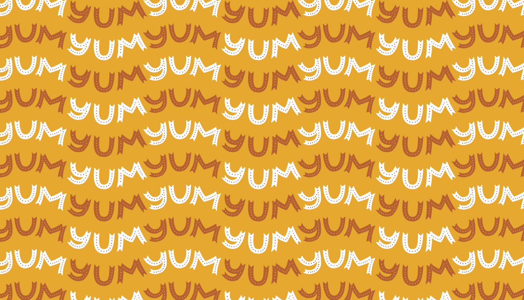
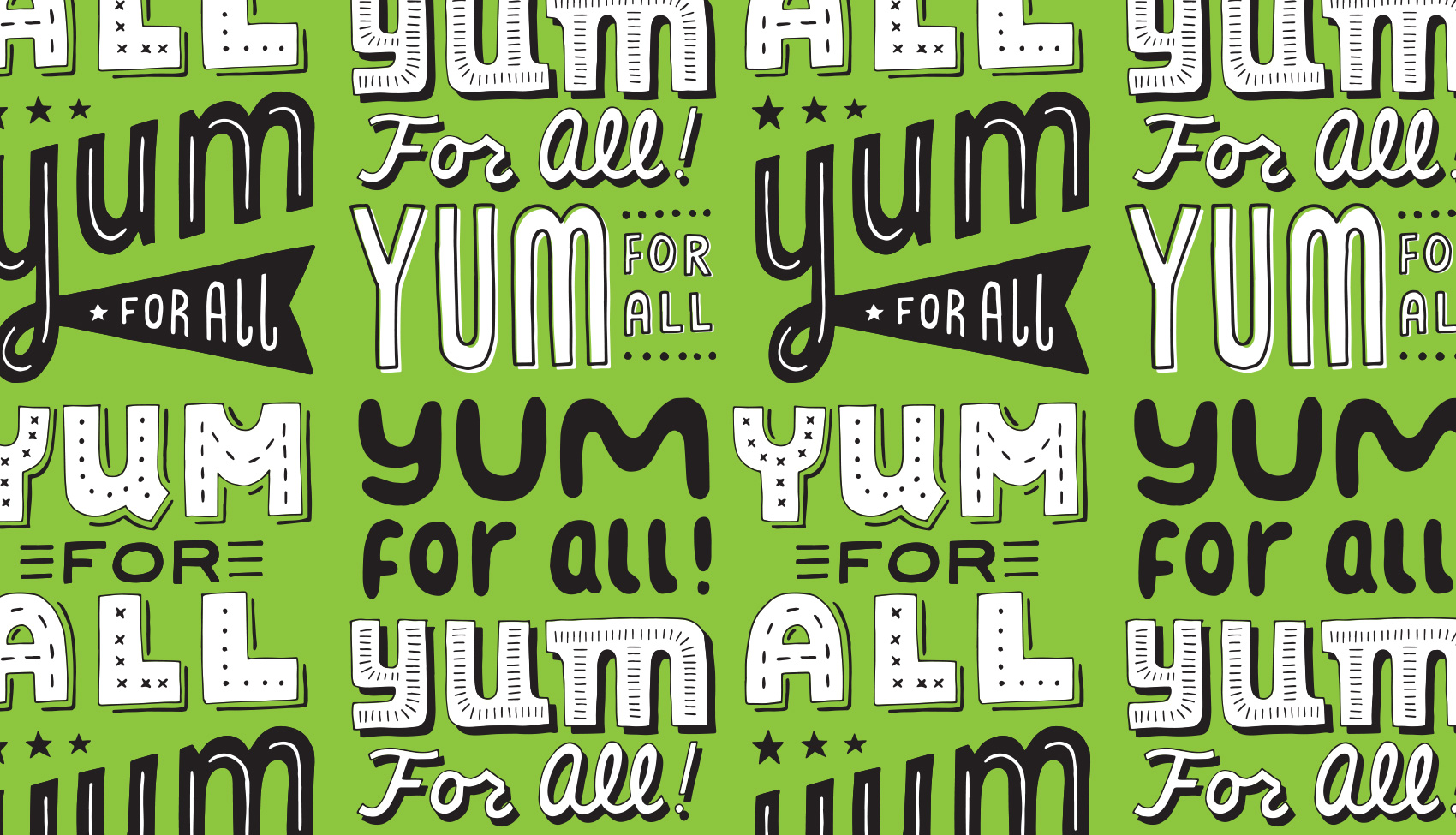
In addition to the new Moocho brand, Tofurky has also launched their new website that uses various brand lettering I’ve designed as their loading images and visual support throughout their recipe and several about pages. So each time you switch pages, a variety of randomized sayings will pop up…Taste Bud High Five!!!

Ali Shapiro Branding


Working with small businesses and entrepreneurs is a solid portion of my design projects, and a recent collaboration was with Ali Shapiro. Ali works with clients to help unravel their eating patterns and to have a whole body / whole mind approach to food and nutrition. Ali wanted a modern, approachable, personal and research-based feel to her rebrand.

Ali Shapiro logos - an AS monogram with a modern A and a windy feather arrow S.

Working with Ali, we created the basic brand building blocks needed for her to grow her business: a logo, website, and support graphics to populate the site with. The chosen direction from the design exploration phase focused on a simple, bold and hand drawn series of editorial images to support her content. The logo itself was a traditional monogram with a friendly twist, focusing on the theme of upward momentum, making your own path, and optimism. The color palette is limited to bright/dark blue, red and black – all strong colors used sparingly.

Insatiable Podcast blurb with illustration of a woman eating and thinking about eating.
Program icons of: plate of hearts, eye dropper conversations, arrow through chaos, conversation bubble support, winding fork path.

With five main programs available to clients, a series of icons representing each of these topics: Truce With Food®, Truth Serum, Why Am I Eating This Now?, The Insatiable Community, and Freedom From Cravings.

I worked with developer and project manager Katie Koteen to create the site. The site is fairly content heavy, so a series of icons was made to help break up content and give some visual markers when reading.

Snapshot of Ali Shapiro website with sidebar, portrait, signup area and illustration of Russian nesting dolls.
Icon set for Ali Shapiro using iPad pro Adobe Sketch program pastel brushes, all in the light blue, dark blue and bright red color palette with black ink line work.

This is one of the first projects where most of the artwork was done exclusively on the iPad Pro. It was an interesting way to use drawing technology to take out some labor intensive steps of scanning and editing, and being able to create more content for a start-up client.


Flight School Books


Earlier this year I worked on this fun book series project for Mattt Zmuda, author of a series of guides for various coding and development topics. As founder of Flight School, he explores “essential topics in iOS and macOS development through concise, focused guides created for advanced Swift developers“. Mattt previously founded NSHipster and worked for Apple as a technical writer.

A technical writer I am not, but I do love to create visual systems for interesting topics and people, and this project was no exception. Mattt came to me with the brief of 1) wanting to stand apart from the standard look of development books, and 2) having the book series be flight/aviation themed (as many examples in the books use aviation to explain things). After some exploration we landed on a bright, eye catching, somewhat retro-inspired poster-like style for the covers.

Although there are three books currently available, the entire series will total eight books once they are all released. It was fantastic that Mattt already had a plan for all 8 titles as it allowed me to have freedom to build a cohesive system, which at the end is meant to be a set.

Each title has a number of planes on it (1-8), corresponding to the sequence in which it is released. The cover image in some way supports the general idea of the book topic, and between titles there are shared elements that bridge the landscapes together (for example, the volcanos on the back of book #1 become the foreground mountains on the front of book #2).

As the series progresses, each cover gets more complex with the number of planes, organization of their flight paths, and color overlays. I can’t wait to show the entire series, but for now, here are the first three volumes: Guide to Swift Codable, Guide to Numbers, and Guide to Strings.

Book covers are a type of project I always enjoy – they combine learning about new topics, condensing large amounts of information into a visual time capsule (the cover), and finding interesting and unusual interpretations of content. As a bonus, sometimes they also allow you to explore new styles of design or illustration that don’t pop up in other work such as branding projects.

+++++++

Founded in 2018, Flight School is an independently-published book series whose “mission is to write the kinds of programming books we wish we had when we were first starting out — material that connects the computer science theory with practical insights from experience working in the software industry.”

Get the guides at flight.school. Follow at: @flightdotschool / @NSHipster / @mattt.

Jefferson County Cultural Coalition


I grew up in Madras, surrounded the dusty high desert of Central Oregon. It was a small town when I lived there, and it’s still a small town, although the last two decades has seen the town acquire a few stoplights, a prison, and even a swimming pool and performing arts center.

However, Madras has never been a place that is about the typical amenities. It’s about the various cultures that live there and the natural environment that they share. Originally called “The Basin” from the valley it sits in, with craggy plateaus on all sides, this geographical feature was the visual center of designing a logo for the Jefferson County Cultural Coalition.

A modern style was used to render a logo and a seal. The main hero is the topography of the area that typifies Madras, which forms the “J” monogram for the county seat of Jefferson County and ties back to the previous logo’s monogram. A palette of dusty tans, golds and burnt brown keep things neutral so that any other internally created imagery won’t compete with the branding.

Logo redesign for Jefferson County Cultural Coalition.
Willow Creek trestle in Madras, Oregon.

This project was pro-bono, for my mother and other board members who work to support the arts and heritage of the area with project grants.

Friday and Company Branding


Every once in a while a project comes along where your intuition lines up just right with the vision of the client, so the creative negotiation that is usually a part of the creative process is….gone. This project was like that, and I think I entered something of a “design flow state” while working on it.

Having roots in Scandinavia means I often veer naturally to the side of simplicity and minimalism (side note: Real Danes might look at this branding and exclaim “oh my! how quaint and busy!”). This turned out to be the perfect match for Friday and Company – a real estate and interior design duo of native Swede Calle Holmgren and American Nicole Wear who has a hard streak of Scandinavian style in her interior design work.

Friday and Company logo with text styled buttons, font selections, and a series of small icons including a dala horse "real simple real estate" badge.

A chunky, friendly logo conveys both the fun Calle and Nicole have at their jobs, but also their approach to working together and directly with their clients. This look also stands out quite a bit in the real estate sector – especially in the real estate signs (below) which are visible from a mile away (possibly even space). To sum up their brand, a series of spreads was created to show the brand from straight-laced to fun-filled in the span of just a few pages.

Online we created a site that was to-the-point and lifestyle oriented, with user flows for selling, buying and design. All roads lead to working with Calle and Nicole, so extra attention was paid to about page and a Q&A section getting to know them (apparently they are very taco motivated). In addition to the site, Friday and Company also has a well-trafficked Instagram feed.

Friday and Company website design for homepage and seller flow page. Staging houses for a sale makes a huge difference in time on the market and buyer impression.
Friday and Company website - House + Hemma. Taking a holistic approach, design and staging is integrated into their realty business.
Working directly with clients is one of their main differentiators and why they keep their business small and personal.

Working with Ryan Galloway on writing and Jessica Berardi on web development was also a real pleasure. Creating a voice, both written and visual, and then having it executed just as imagined is such gift. The print collateral was produced at both Brown Printing and Anders Printing in Portland.

Business cards for the duo reflect their Swedish ties.
Standing out in the market with a bold sign allows for visual recognition even for a small company.

Promotional brochures for each house take on an editorial feel, catering the content of each sales piece to the house it is representing. For this modern house listing I even got to work in this Winston Churchill quote: “We shape our buildings, thereafter they shape us”.

Marketing materials and takeaway items that are on-brand reinforce Friday and Company's high professionalism and personal touch.

A series of simplistic blocky icons were created to supplement the other brand elements – namely pink, and two nearly mono-line fonts (Campton and School Script (yes, School Script!)). Between these few simple ingredients, a variety of mixing them up allows the brand to be straightforward and serious or offbeat and fun, depending on the needs of the message and medium.

A series of simple and bold icons were created to add flair to an otherwise minimal brand look.

Check out Calle and Nicole online at www.fridayandcompany.com or on Instagram.

Icebreaker Book Diagrams


ICEBREAKERS - icons for the four types of activities

A few years ago I worked on the Icebreakers book – an activity book that combines movement and song to get large choral groups warmed up in a fun way. Developed by a Danish high school classmate and his modern a cappella group Postyr, the book is for sale at Break the Ice.dk.

This spring they published a second edition of the book, so I worked on a new series of diagrams to support the directions for each activity. The style of the illustrations was intentionally loose to allow for easily shaping the characters to various poses and configurations, which focused more on the action of the activity rather than the details of the characters.

Hire an Esquire Iconography


Earlier this year I worked on brand explorations for Hire an Esquire, an online service for finding the right legal consultant for a project. The illustrations and icons – set on making the legal profession and process of hiring a lawyer seem approachable, easy and fun – helped the internal team decide the overall direction their rebrand should take.

Hire an Esquire - choosing the right lawyer is easy. A lawyer for hire jumping out of a tablet, ready to work on freelance projects.

A blocky bold style was used with the companies selected teal and orange palette. With such strong colors, the rest of the elements were kept very simple and used knockouts of white.

Series of icons for law firm including quill pen signing, light bulb, search function, smart glasses, signature bubble, conversation and thought bubble.

Stand-alone icon style was also explored to show how small visual accents could strengthen the brand presence when used consistently throughout their new site. While the final brand look ended up being a little more serious and traditional, the exploration process was key in helping decide how far to push the needle in their field.

Icon set for Hire an Esquire - network, briefcase, selecting a lawyer, top notch, searching resumes, paying/payment, requirement fulfillment, checklist/clipboard, lawyer profile, checklist, signing a document, connecting the dots.

Code/Art Shirt and Event Materials


For the 4th annual Code/Art Miami event, non-profit client Code/Art wanted a new design for their participant and volunteer shirts. Previously I had made a series of pins and stickers using small icons, but for this project we created a larger Code/Art constellation design in 3-colors that could easily be printed on two different t-shirt colors (purple for participants, teal for volunteers).

Code/Art t-shirt design with a girl throwing code snippets into the sky to form a Code/Art constellation.

The t-shirt features a girl throwing code snippets into the sky to form a Code/Art constellation. Printed at Custom Ink, the design was arranged so that each color on the purple shirt translated directly to a color on the teal shirt to keep costs low on printing materials and time.

Code/Art participant shirt in lilac.

Over the last two years I had designed a series of enamel pins and decals/stickers that were given out to participants. These assets were leveraged internally to create a cohesive look for their events – a strong example of how using a few elements consistently can go a long way in creating a recognizable brand look.

Code/Art event participants and teachers.

Because I still love me a good enamel pin collection, here is a repost of the series of enamel pins and stickers created over the course of a few mini-projects. These were designed for Code/Art participants – girls in their tweens and teens who explore code through art & creativity in guided Code/Art workshops. Read more about Code/Art on their website.

Enamel pin trio: 01100111010111 code sunglasses (cool shades), a </> heart, and code girl banner.” class=”wp-image-8341″/></figure>


<figure class=
Code/Art donor pin inspired by participant art - featuring a constellation portrait of a young girl.
Girls in STEAM - Code/Art participants and teachers work on projects and take pictures in front of their photo booth.