Ali Shapiro Branding


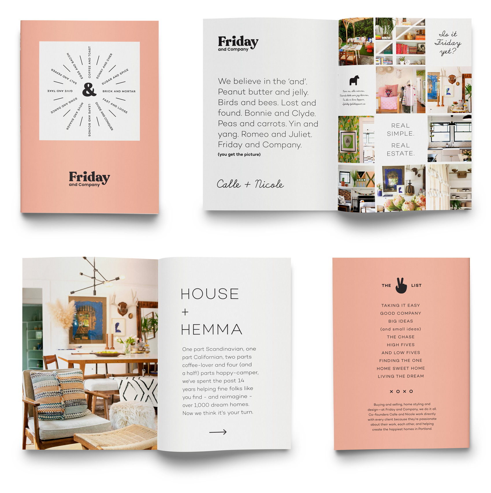
Working with small businesses and entrepreneurs is a solid portion of my design projects, and a recent collaboration was with Ali Shapiro. Ali works with clients to help unravel their eating patterns and to have a whole body / whole mind approach to food and nutrition. Ali wanted a modern, approachable, personal and research-based feel to her rebrand.

Ali Shapiro logos - an AS monogram with a modern A and a windy feather arrow S.

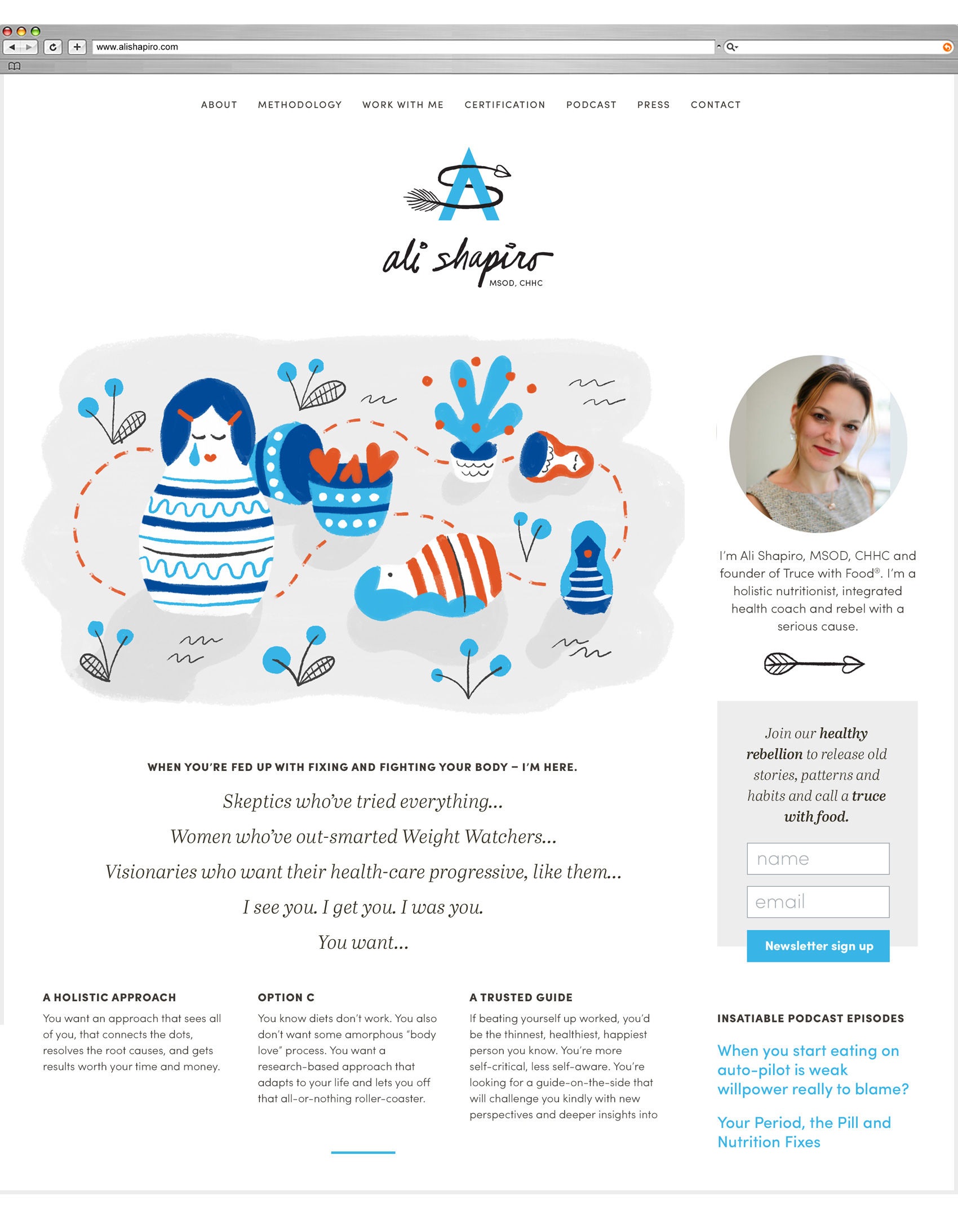
Working with Ali, we created the basic brand building blocks needed for her to grow her business: a logo, website, and support graphics to populate the site with. The chosen direction from the design exploration phase focused on a simple, bold and hand drawn series of editorial images to support her content. The logo itself was a traditional monogram with a friendly twist, focusing on the theme of upward momentum, making your own path, and optimism. The color palette is limited to bright/dark blue, red and black – all strong colors used sparingly.

Insatiable Podcast blurb with illustration of a woman eating and thinking about eating.
Program icons of: plate of hearts, eye dropper conversations, arrow through chaos, conversation bubble support, winding fork path.

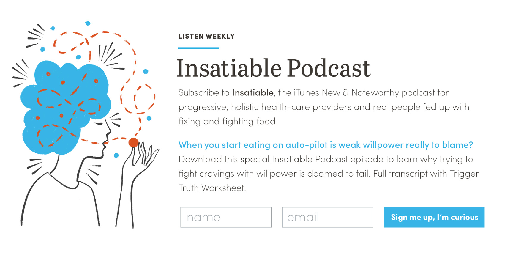
With five main programs available to clients, a series of icons representing each of these topics: Truce With Food®, Truth Serum, Why Am I Eating This Now?, The Insatiable Community, and Freedom From Cravings.

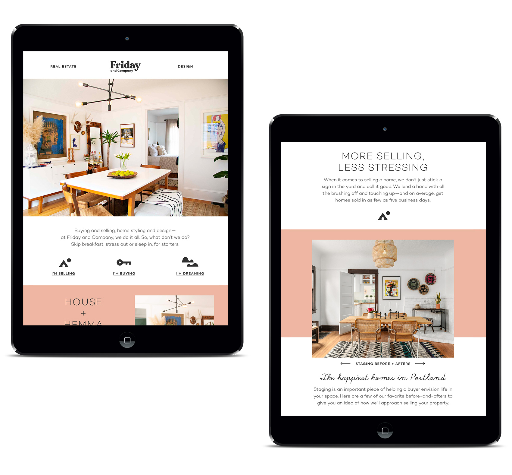
I worked with developer and project manager Katie Koteen to create the site. The site is fairly content heavy, so a series of icons was made to help break up content and give some visual markers when reading.

Snapshot of Ali Shapiro website with sidebar, portrait, signup area and illustration of Russian nesting dolls.
Icon set for Ali Shapiro using iPad pro Adobe Sketch program pastel brushes, all in the light blue, dark blue and bright red color palette with black ink line work.

This is one of the first projects where most of the artwork was done exclusively on the iPad Pro. It was an interesting way to use drawing technology to take out some labor intensive steps of scanning and editing, and being able to create more content for a start-up client.


Flight School Books


Earlier this year I worked on this fun book series project for Mattt Zmuda, author of a series of guides for various coding and development topics. As founder of Flight School, he explores “essential topics in iOS and macOS development through concise, focused guides created for advanced Swift developers“. Mattt previously founded NSHipster and worked for Apple as a technical writer.

A technical writer I am not, but I do love to create visual systems for interesting topics and people, and this project was no exception. Mattt came to me with the brief of 1) wanting to stand apart from the standard look of development books, and 2) having the book series be flight/aviation themed (as many examples in the books use aviation to explain things). After some exploration we landed on a bright, eye catching, somewhat retro-inspired poster-like style for the covers.

Although there are three books currently available, the entire series will total eight books once they are all released. It was fantastic that Mattt already had a plan for all 8 titles as it allowed me to have freedom to build a cohesive system, which at the end is meant to be a set.

Each title has a number of planes on it (1-8), corresponding to the sequence in which it is released. The cover image in some way supports the general idea of the book topic, and between titles there are shared elements that bridge the landscapes together (for example, the volcanos on the back of book #1 become the foreground mountains on the front of book #2).

As the series progresses, each cover gets more complex with the number of planes, organization of their flight paths, and color overlays. I can’t wait to show the entire series, but for now, here are the first three volumes: Guide to Swift Codable, Guide to Numbers, and Guide to Strings.

Book covers are a type of project I always enjoy – they combine learning about new topics, condensing large amounts of information into a visual time capsule (the cover), and finding interesting and unusual interpretations of content. As a bonus, sometimes they also allow you to explore new styles of design or illustration that don’t pop up in other work such as branding projects.

+++++++

Founded in 2018, Flight School is an independently-published book series whose “mission is to write the kinds of programming books we wish we had when we were first starting out — material that connects the computer science theory with practical insights from experience working in the software industry.”

Get the guides at flight.school. Follow at: @flightdotschool / @NSHipster / @mattt.

Jefferson County Cultural Coalition


I grew up in Madras, surrounded the dusty high desert of Central Oregon. It was a small town when I lived there, and it’s still a small town, although the last two decades has seen the town acquire a few stoplights, a prison, and even a swimming pool and performing arts center.

However, Madras has never been a place that is about the typical amenities. It’s about the various cultures that live there and the natural environment that they share. Originally called “The Basin” from the valley it sits in, with craggy plateaus on all sides, this geographical feature was the visual center of designing a logo for the Jefferson County Cultural Coalition.

A modern style was used to render a logo and a seal. The main hero is the topography of the area that typifies Madras, which forms the “J” monogram for the county seat of Jefferson County and ties back to the previous logo’s monogram. A palette of dusty tans, golds and burnt brown keep things neutral so that any other internally created imagery won’t compete with the branding.

Logo redesign for Jefferson County Cultural Coalition.
Willow Creek trestle in Madras, Oregon.

This project was pro-bono, for my mother and other board members who work to support the arts and heritage of the area with project grants.

Friday and Company Branding


Every once in a while a project comes along where your intuition lines up just right with the vision of the client, so the creative negotiation that is usually a part of the creative process is….gone. This project was like that, and I think I entered something of a “design flow state” while working on it.

Having roots in Scandinavia means I often veer naturally to the side of simplicity and minimalism (side note: Real Danes might look at this branding and exclaim “oh my! how quaint and busy!”). This turned out to be the perfect match for Friday and Company – a real estate and interior design duo of native Swede Calle Holmgren and American Nicole Wear who has a hard streak of Scandinavian style in her interior design work.

Friday and Company logo with text styled buttons, font selections, and a series of small icons including a dala horse "real simple real estate" badge.

A chunky, friendly logo conveys both the fun Calle and Nicole have at their jobs, but also their approach to working together and directly with their clients. This look also stands out quite a bit in the real estate sector – especially in the real estate signs (below) which are visible from a mile away (possibly even space). To sum up their brand, a series of spreads was created to show the brand from straight-laced to fun-filled in the span of just a few pages.

Online we created a site that was to-the-point and lifestyle oriented, with user flows for selling, buying and design. All roads lead to working with Calle and Nicole, so extra attention was paid to about page and a Q&A section getting to know them (apparently they are very taco motivated). In addition to the site, Friday and Company also has a well-trafficked Instagram feed.

Friday and Company website design for homepage and seller flow page. Staging houses for a sale makes a huge difference in time on the market and buyer impression.
Friday and Company website - House + Hemma. Taking a holistic approach, design and staging is integrated into their realty business.
Working directly with clients is one of their main differentiators and why they keep their business small and personal.

Working with Ryan Galloway on writing and Jessica Berardi on web development was also a real pleasure. Creating a voice, both written and visual, and then having it executed just as imagined is such gift. The print collateral was produced at both Brown Printing and Anders Printing in Portland.

Business cards for the duo reflect their Swedish ties.
Standing out in the market with a bold sign allows for visual recognition even for a small company.

Promotional brochures for each house take on an editorial feel, catering the content of each sales piece to the house it is representing. For this modern house listing I even got to work in this Winston Churchill quote: “We shape our buildings, thereafter they shape us”.

Marketing materials and takeaway items that are on-brand reinforce Friday and Company's high professionalism and personal touch.

A series of simplistic blocky icons were created to supplement the other brand elements – namely pink, and two nearly mono-line fonts (Campton and School Script (yes, School Script!)). Between these few simple ingredients, a variety of mixing them up allows the brand to be straightforward and serious or offbeat and fun, depending on the needs of the message and medium.

A series of simple and bold icons were created to add flair to an otherwise minimal brand look.

Check out Calle and Nicole online at www.fridayandcompany.com or on Instagram.

Hire an Esquire Iconography


Earlier this year I worked on brand explorations for Hire an Esquire, an online service for finding the right legal consultant for a project. The illustrations and icons – set on making the legal profession and process of hiring a lawyer seem approachable, easy and fun – helped the internal team decide the overall direction their rebrand should take.

Hire an Esquire - choosing the right lawyer is easy. A lawyer for hire jumping out of a tablet, ready to work on freelance projects.

A blocky bold style was used with the companies selected teal and orange palette. With such strong colors, the rest of the elements were kept very simple and used knockouts of white.

Series of icons for law firm including quill pen signing, light bulb, search function, smart glasses, signature bubble, conversation and thought bubble.

Stand-alone icon style was also explored to show how small visual accents could strengthen the brand presence when used consistently throughout their new site. While the final brand look ended up being a little more serious and traditional, the exploration process was key in helping decide how far to push the needle in their field.

Icon set for Hire an Esquire - network, briefcase, selecting a lawyer, top notch, searching resumes, paying/payment, requirement fulfillment, checklist/clipboard, lawyer profile, checklist, signing a document, connecting the dots.

Code/Art Shirt and Event Materials


For the 4th annual Code/Art Miami event, non-profit client Code/Art wanted a new design for their participant and volunteer shirts. Previously I had made a series of pins and stickers using small icons, but for this project we created a larger Code/Art constellation design in 3-colors that could easily be printed on two different t-shirt colors (purple for participants, teal for volunteers).

Code/Art t-shirt design with a girl throwing code snippets into the sky to form a Code/Art constellation.

The t-shirt features a girl throwing code snippets into the sky to form a Code/Art constellation. Printed at Custom Ink, the design was arranged so that each color on the purple shirt translated directly to a color on the teal shirt to keep costs low on printing materials and time.

Code/Art participant shirt in lilac.

Over the last two years I had designed a series of enamel pins and decals/stickers that were given out to participants. These assets were leveraged internally to create a cohesive look for their events – a strong example of how using a few elements consistently can go a long way in creating a recognizable brand look.

Code/Art event participants and teachers.

Because I still love me a good enamel pin collection, here is a repost of the series of enamel pins and stickers created over the course of a few mini-projects. These were designed for Code/Art participants – girls in their tweens and teens who explore code through art & creativity in guided Code/Art workshops. Read more about Code/Art on their website.

Enamel pin trio: 01100111010111 code sunglasses (cool shades), a </> heart, and code girl banner.” class=”wp-image-8341″/></figure>


<figure class=
Code/Art donor pin inspired by participant art - featuring a constellation portrait of a young girl.
Girls in STEAM - Code/Art participants and teachers work on projects and take pictures in front of their photo booth.

Naia Gelato Cup Packaging


Long term client and collaborator, Gelateria Naia, has extended their gelato and sorbetto into a new format – the 14oz small tub. On this project, their signature orange was used as a background for the color-coding used on each flavor. Presented mostly in a top down freezer in grab-and-go areas, having a strong color presence on the lid was integral.

A major update / minor evolution to this brand was shifting their name on the packaging from Bar Gelato by Naia (also their namesake and inaugural product) to just Naia. Originally Bar Gelato made sense because it was their only product. However with the addition of sorbetto to the line-up, food regulations and approval got trickier with how the brand name only accurately described part of their product line. With this most recent packaging, Naia takes the lead as the brand name, and sorbetto and gelato can be used as the product identifier. Hierarchy on packages is critical for both the consumer, stocker, and fulfilling legal requirements. Pistachio is shown here because it’s my favorite flavor.

From a production standpoint, the cup was designed to be a standard issue brand orange with universal information, with a white scalloped template area into which a circular sticker could be placed to differentiate flavor. This type of design works well for product lines where it is hard to predict exact quantities of specific flavors, where flexibility in quantity/distribution of flavors is key, and when very small runs of speciality flavors are common. Naia often produces seasonal or specialty flavors, always experimenting with local producers to find nuanced and specific flavors. The rim of the cup was also a universally produced element, while the top of the lid was custom to each flavor.

A series of icons associated with each flavor has been used across many of Naia’s products, so they were employed again to provide a subtle indicator of the simple and pure ingredients. The custom lettered blocky font previously used in the logotype is now the headliner, providing some visual crossover recognition, as consumers were used to seeing BAR GELATO large and in charge on the previous packaging. And now, for a National Geographic-esque photo of a herd of gelato/sorbetto migrating across the icy plains of your nearest Whole Foods freezer case.

Born to Bake Book Cover


Over the years I have done many projects and non-projects with my intrepid foodie friend, Jen Stevenson. From her first guidebook and blog, to watching her become an award winning author for The Picnic and The Campout, we have eaten our way through a decade of friendship.

On the side, Jen churns out young adult literature and publishes them as e-books – the latest being Born to Bake, a story about a teen who enters a baking competition to earn money to go to culinary school in France. To add another book collaboration under our belts, I created the cover for it. Bake it ’til you make it!

Holiday Gift Wrap AKA Pattern Palooza!


It’s that time of year again! The time when Danes, half-Danes, quarter-Danes and honorary-Danes go deep into Danish Christmas traditions, as previously documented here, here, here and here.

This year is extra special because I had the opportunity to design some scandinavian-inspired promotional gift wrap paper in collaboration with Laura Luethje from West Coast Paper Solutions and Randy Murray from Brown Printing. So without further ado…

Four rolls of West Coast Paper and Brown Printing collaboration on holiday promotional gift wrap.

Red ribbon and silver snowflake flurry gift wrap paper patterns.

To create a series that was Christmasy without being too over the top, I opted for some patterns that kept it classy – abstract red ribbons and a snowflake flurry. On the back a tiered landscape of wintertime activity is revealed in tonal grays with pops of red, making it easy to mix and match between the three designs.

Tonal gray gnome village pattern with scenes from winter.

Red ribbon and silver snowflake flurry gift wrap paper patterns, along with gnome winter landscape in tonal grays.

Gift wrap patterns on presents: red ribbons, silver snowflakes and tonal gray gnome villages.

The WCP holiday wrap promo happens every year, and this year I was lucky enough to have Laura ask if I would create the designs. While West Coast Paper donated paper and I donated design, Brown Printing donated printing for a final product of two 2-sided promotional sheets produced on 70# Titan Dull Text.

As a bonus, I slipped a non-holiday side onto one of the sheets. Hand drawn with black ink and digitally colored, the feather pattern is an excerpt of a twelve feather series from a few years ago. Hopefully it gives the gift wrap a life past December.

Illustrated feather hand drawn gift wrap pattern or wallpaper.

Illustrated feather pattern gift wrap with watercolor specs.