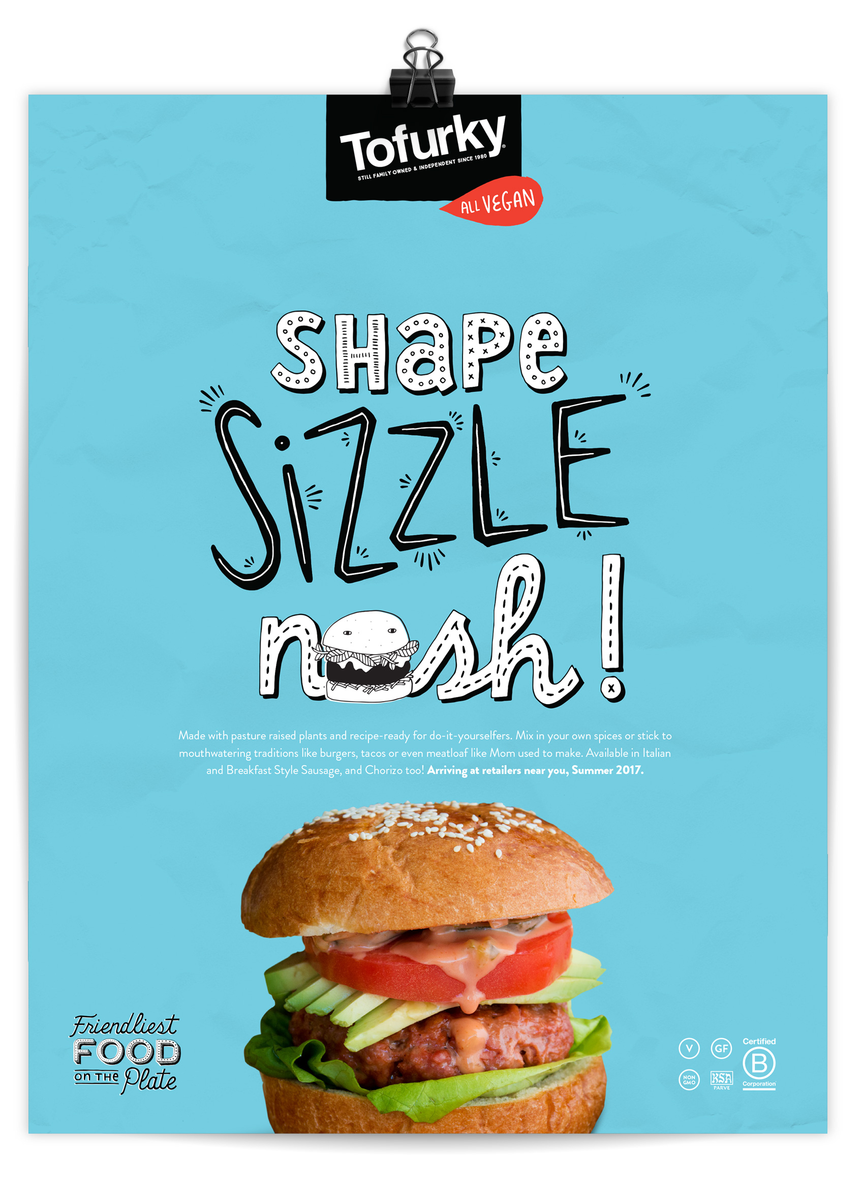
Lettering for Tofurky DIY Ad
Tofurky has a new product out – DIY crumbles – for making your own all-vegan burgers, breakfast sausage, chorizo, meatloaf, tacos and more. In the initial advertising effort for it I lettered the headline below for Creative Director Gary Huck to use in this ad.
Well Vegan Brand Refresh
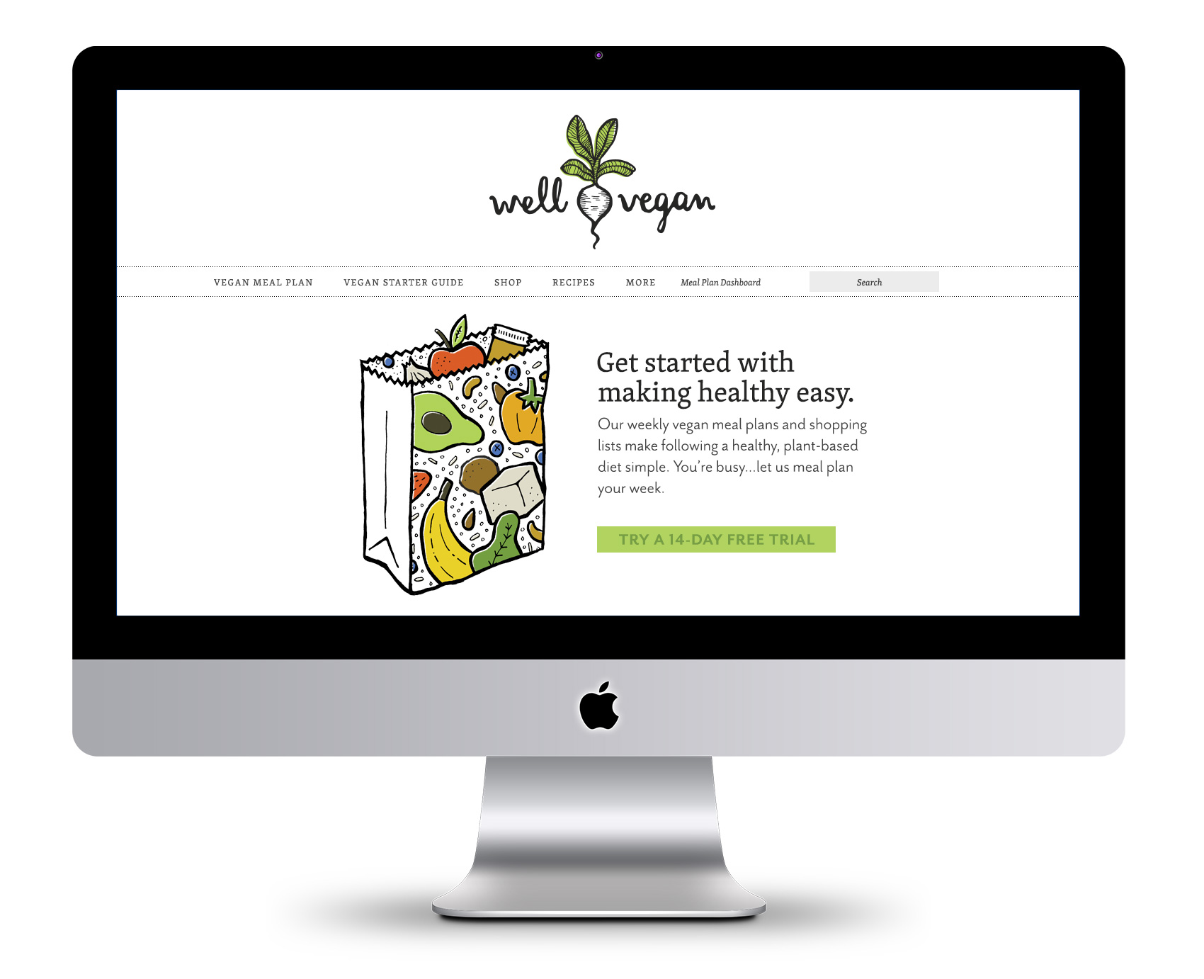
Six years ago marked Well Vegan’s launch when Bureau developed the brand from scratch for food-entrepreneur Katie Koteen to market her vegan meal plan subscription service. This spring, with a ton of new site features and her first cookbook under her belt, Katie wanted a refresh for the logo and website.
The first thing on the docket was a logo update. The friendly hand drawn script was a keeper, but legibility was increased by redrawing it on a level baseline and separating the two words with a visual – one of Katie’s favorite illustrations from the initial branding, a white radish. A pop of green was retained in the radish leaves, but the overall impression was more toned down.
![]()
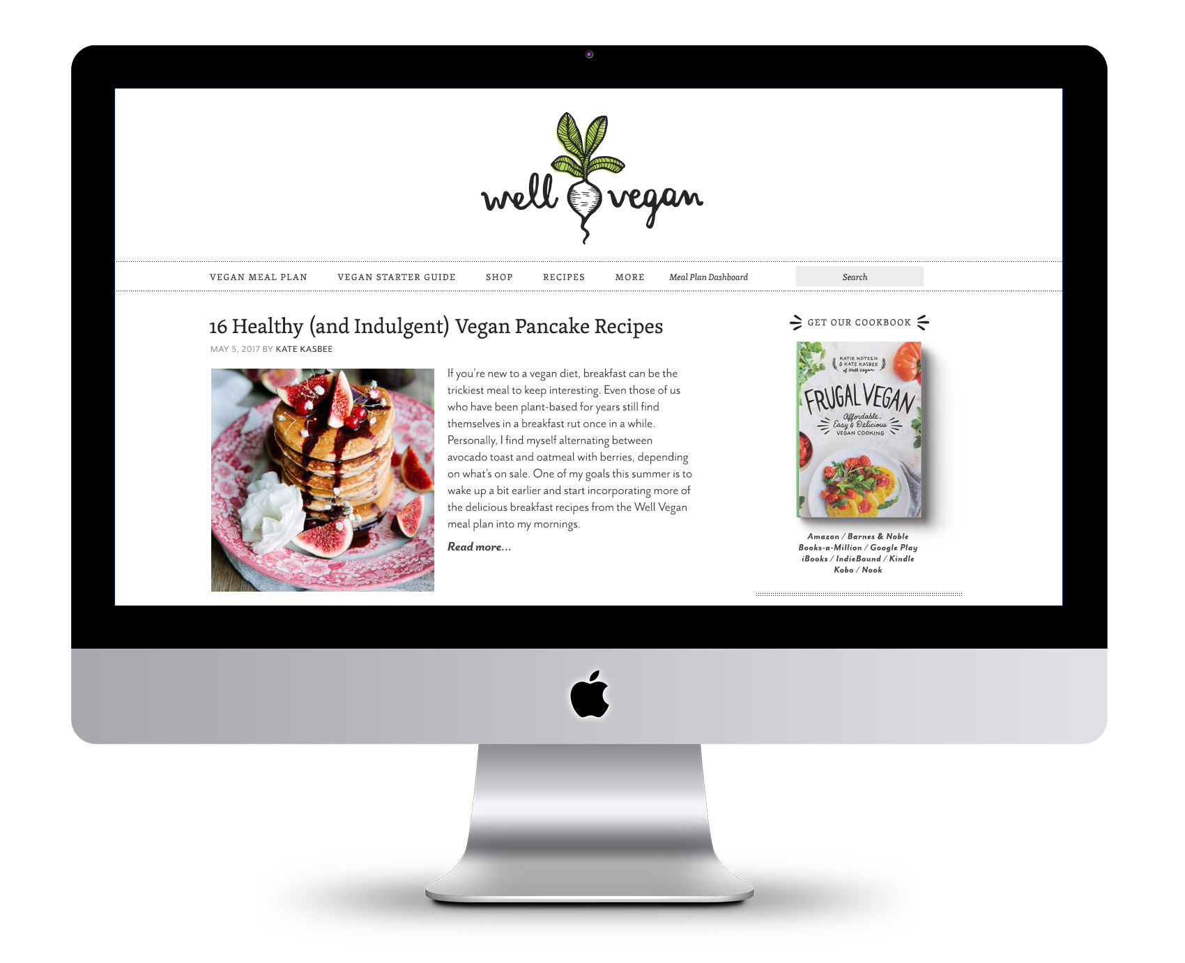
The inaugural 2011 branding for Well Vegan included lots of hand drawn elements, borders, spot illustrations and illustration as main images (see it here). In 2017 Katie wanted to update the site based on the increase in photography and recipe posts, as well as make the site feel a bit simpler and cleaner rather than the homespun start-up it used to be.
![]()
A major area of focus was paring down the use of illustration and color to allow the food photography to shine. Instead of being the main focus, illustrations were used as accents and often in black & white instead of full color. The fonts also were refreshed – headline and accents were kept in the friendly legacy font (Skolar) while body and informational text was updated to the lighter, brighter Mr. Eaves.
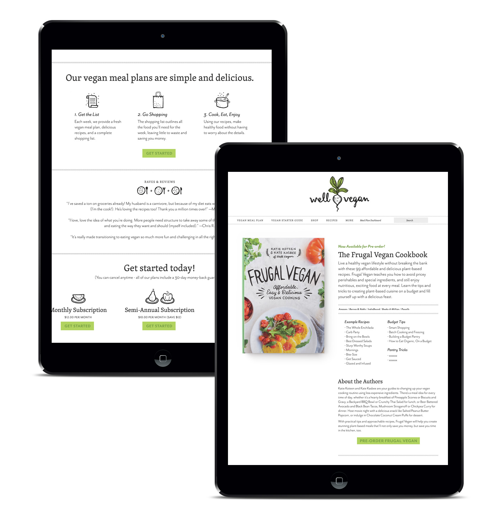
In the instances where illustration is used for main effect, we stuck with the black line-work style with color accents. This also left room for future promotional illustrations which had been a heavy favorite over the years with subscribers and the Pinterest crowd.
The new streamlined feel was leveraged lightly throughout the site and in the cookbook design, featured on the cover and as page accents. The book is currently available.
Ceek Logo and Website
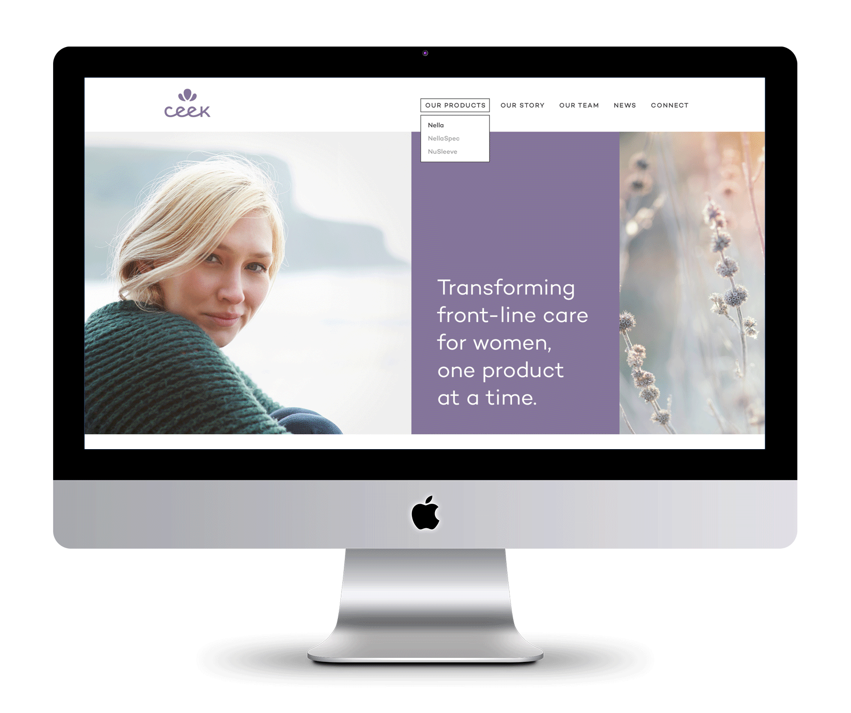
An interesting client I have been working with recently is Ceek, a product design and development start-up that provides innovative solutions for frontline women’s healthcare. Bucking the historical trend of men making products for women to varying degrees of success, this company focuses on products created for women, by women. Definitely an approach I could get behind!
![]()
Their logo was an exercise in custom typography and compactness as it needed to reproduce well on a variety of materials in small format (for example, as a deboss on a rubber handle grip). To aid in keeping the logo as big as possible at even the tiniest scales, a monoline x-height was implemented so the logo wouldn’t have to scale to accommodate the tallest character (since there are none!). A simple petal icon went through many iterations to become soft yet bold, feminine and somewhat regal, and have the right proportions to scale as well. A metallic lavender was chosen as the main brand color, differentiating it in the medical field which tends to employ blues (HEALTH!) and pinks (FOR WOMEN!) across the board. A broad palette of supporting colors were added to increase vibrancy and flexibility for future product lines and create a more nuanced palette than competitors, making the brand more approachable than clinical.
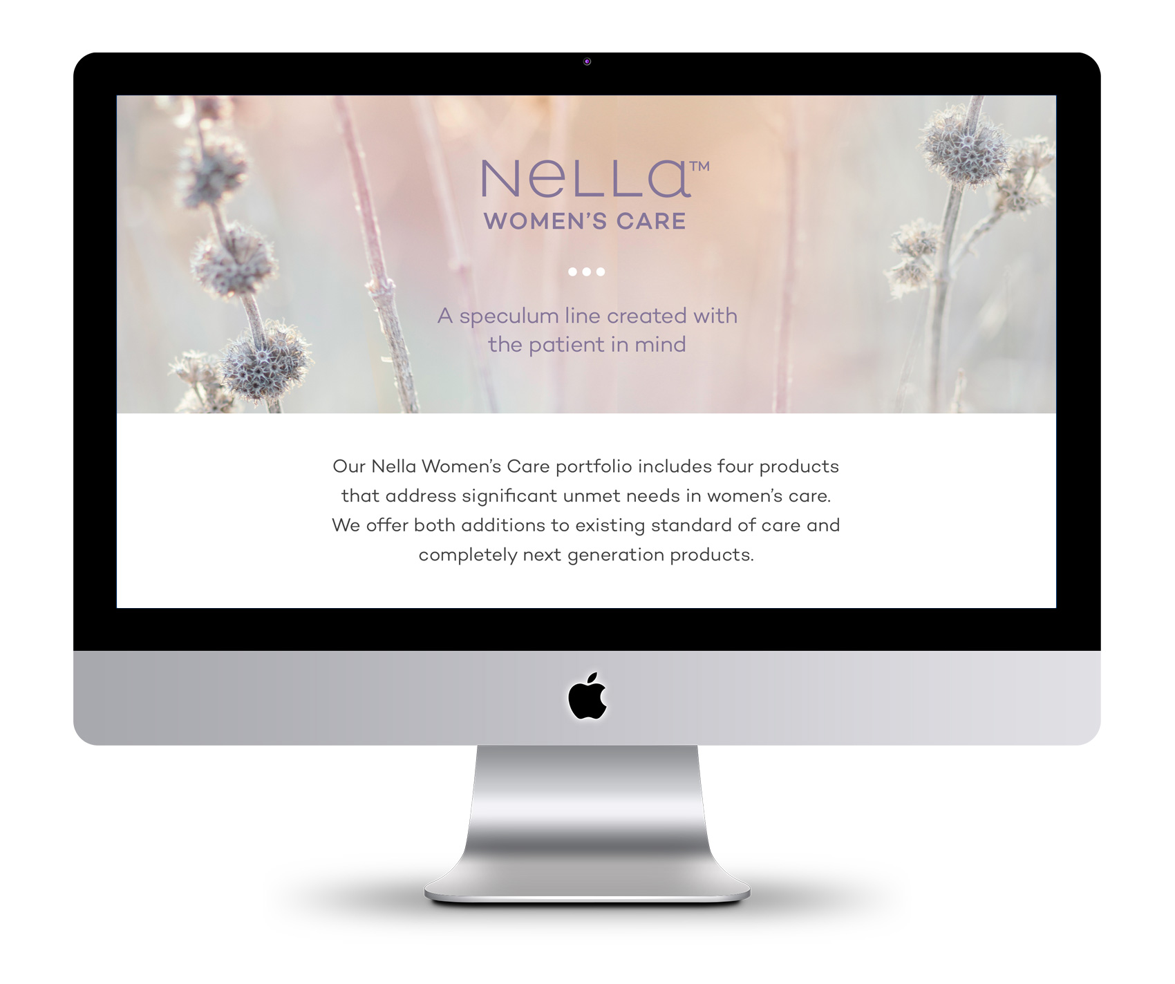
Ceek’s first foray is tackling the age old device of every women’s annual visit – the speculum – with a range of patient and doctor friendly updates in their product design. Shockingly, the device hasn’t had major updating since its invention in the 1800s. From a graphic design perspective, it was also not the most inspirational visual matter to present front and center. To communicate Ceek’s intentions and story, we focused on their leading goals and featuring a wide variety of portrait stories and subtle growth focused imagery. A complementary logotype for Nella, the first product line, was also created. In addition to design, Leighann Franson aided in brand copywriting and Katie Koteen implemented the website.
Love Script
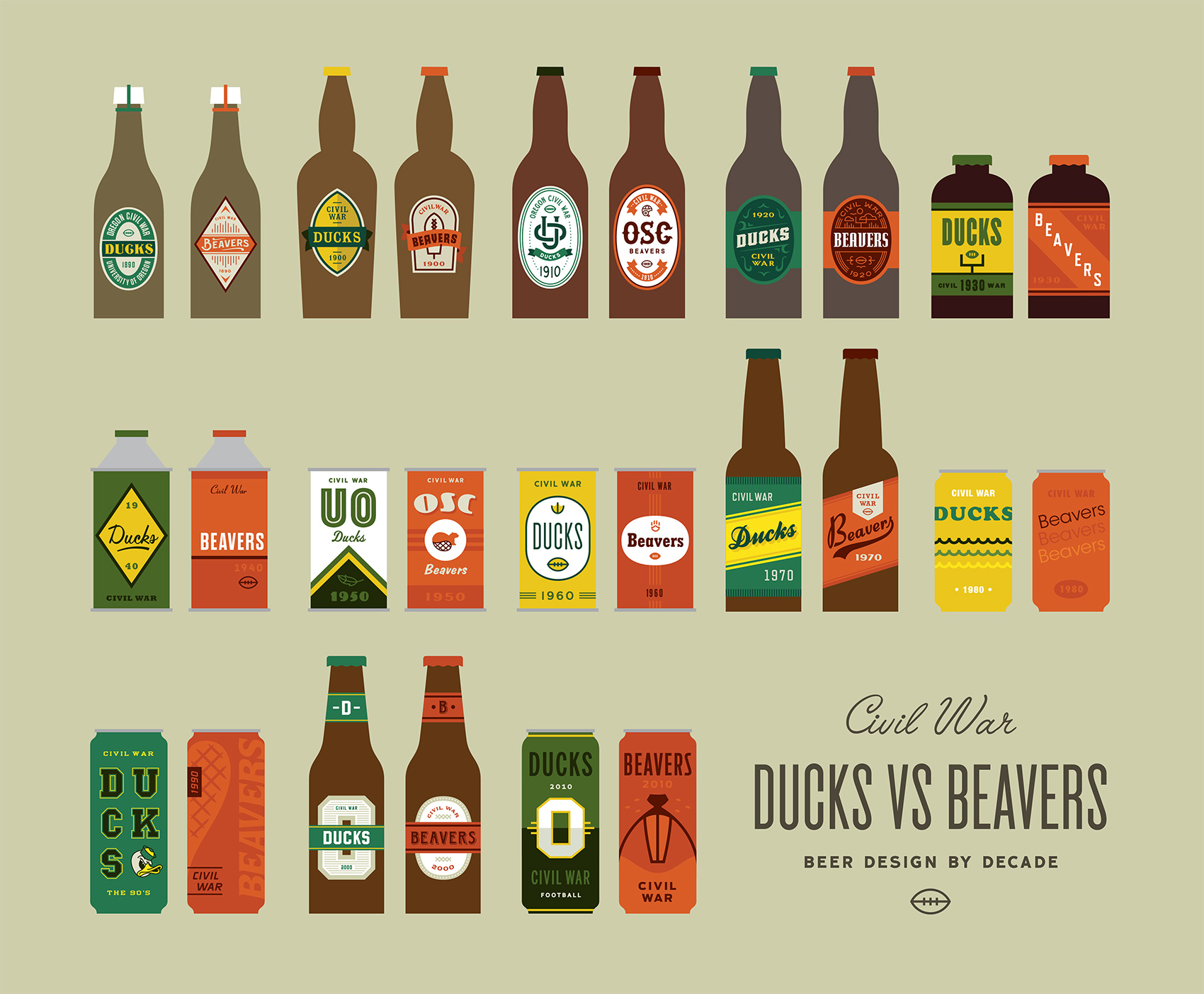
Ducks VS Beavers “Civil War” Beer Design Series
Each year, Oregon descends into sports madness when the Ducks (University of Oregon) and Beavers (Oregon State) face off at the “Civil War” football game, the biggest sporting event in the state. The tradition dates back to 1894 with over 115 games on record. Every November sport pennants fly proudly from cars, allegiances are sworn and catcalls are common. For the most part, I stay completely out of the mêlée. Until this year.
Which brings me to the Ducks VS Beavers Civil War “Beer Design by Decade” project! For every decade that the Ducks and Beavers have been competing against each other I created a beer label for both teams. Design wise I focused on the simplest execution possible to represent the styles, tropes, themes and feeling from that decade.
While having participated in sports in high school with great fervor but mediocre talent, most of my 20’s and 30’s have been spent in front of a computer or a book. My sister, on the other hand, can most often be found cheering on her favorite sports team and alma mater: the Ducks. She probably inherited this from my dad who used to have a sport for every season which he watched dutifully and on the edge of his seat, can of peanuts and Pabst in hand. Realizing that my sister’s fandom would probably never subside, I decided to join in the only ways I knew how – eating guacamole during games and designing beer labels for the respective teams. Here are the labels zoomed in and side by side for each decade.
Oh yeah, this years Civil War is on Saturday November 26th at Reser Stadium.
Thanks to:
Hayden Walker, a new Portland design transplant who helped with research and design as I balanced client work and a project effort that I underestimated greatly. See his work or Dribbble. Also to Tess Wojahn for helping with research (I’m sure a process post with inspiration images will follow at some point). See her work.
My playground friends from Madras, Oregon circa 1988 for spurring my alternative sports involvement when we wrote a rap about how great the Trail Blazers were (those were the days!).
My dad, who watched sports and drank beer and seemed to know infinitely more than both coaches and players based on the color commentary provided. He probably did know quite a bit as an ex-college and army ball player in both baseball & basketball. Those tense moments of accidentally running in front of the TV during an important play or daring to speak during a key game decision and being reprimanded with the Rankin glare will never be forgotten.
There you have it!
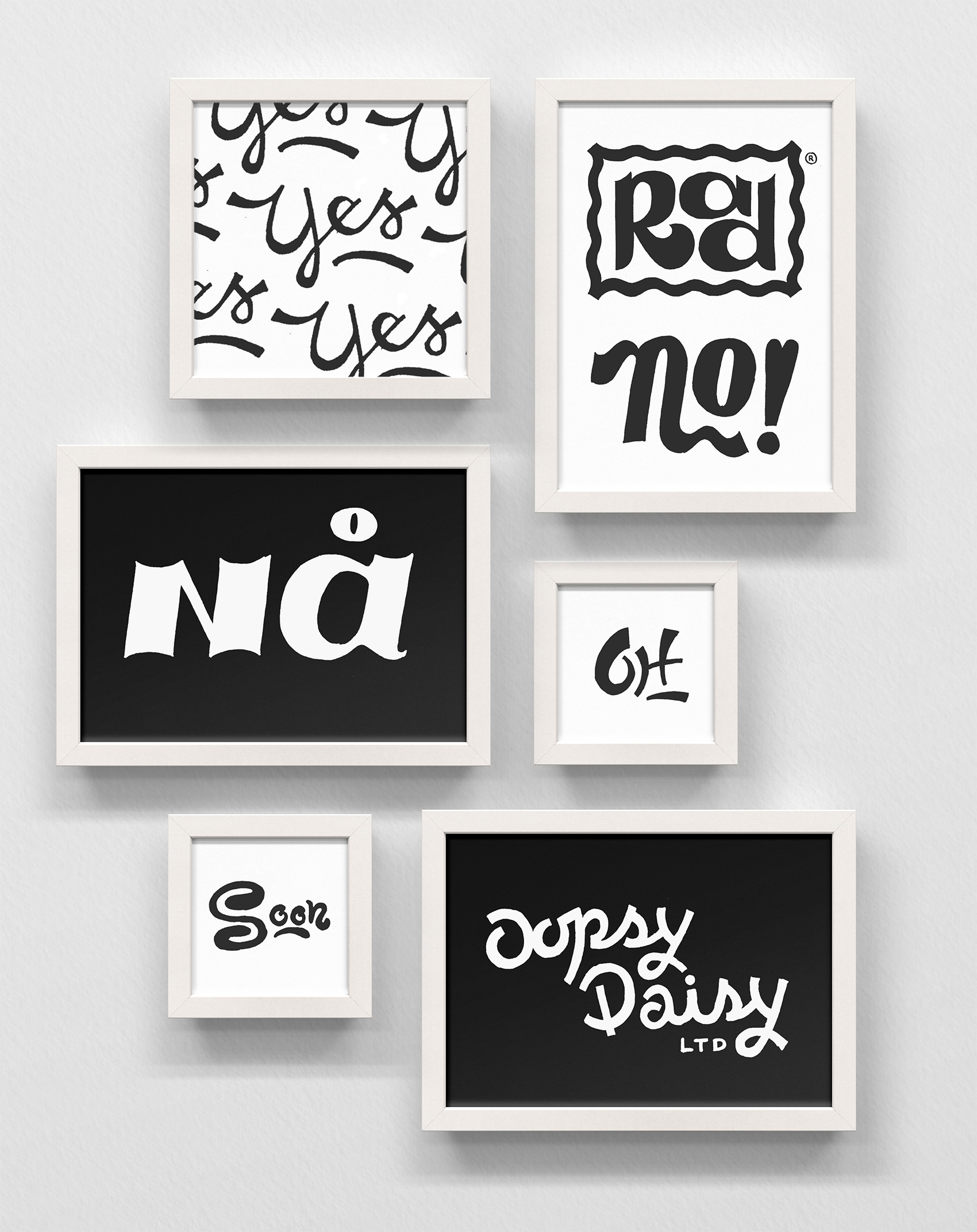
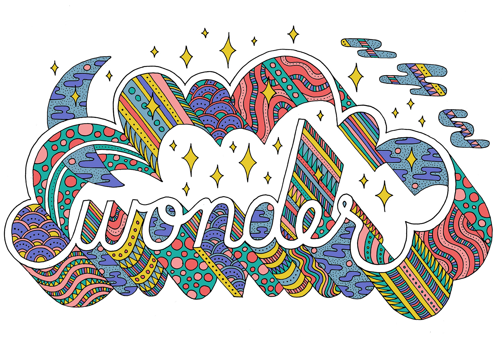
Wonder Typography
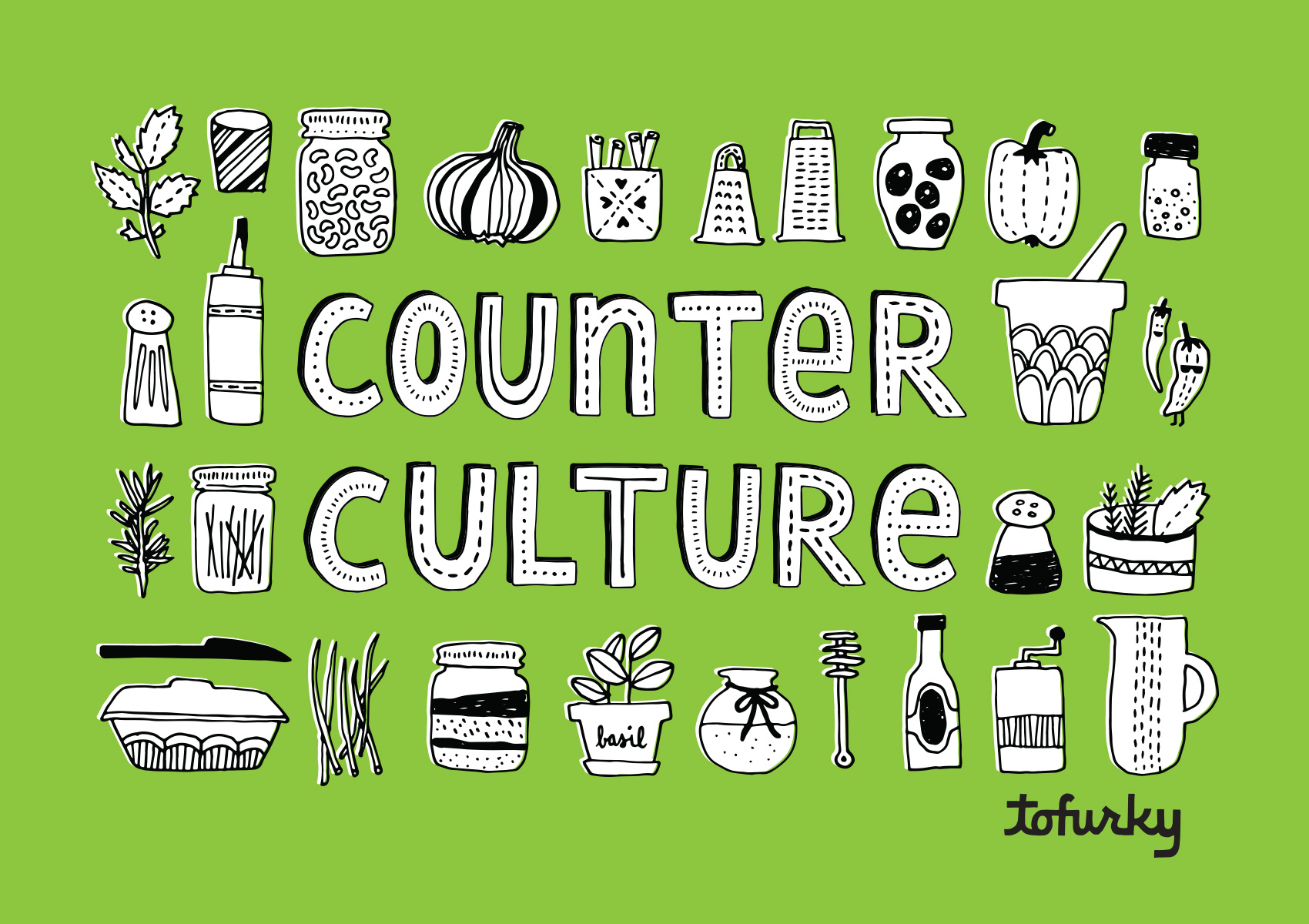
More Tofurky Lettering
Here is another snippet from a longer-term lettering project I’ve been working on for Tofurky. Below is the second set of two series exploring their company name in a casual, hand drawn style (see the first set here).
As part of their online content the company posts recipes and tips under the name Counter Culture, which I gave some bling in this lettering piece. I also got to draw a bunch of small ingredients to go along with the type (matching their current brand illustration look), and implement one of the type treatments from above.
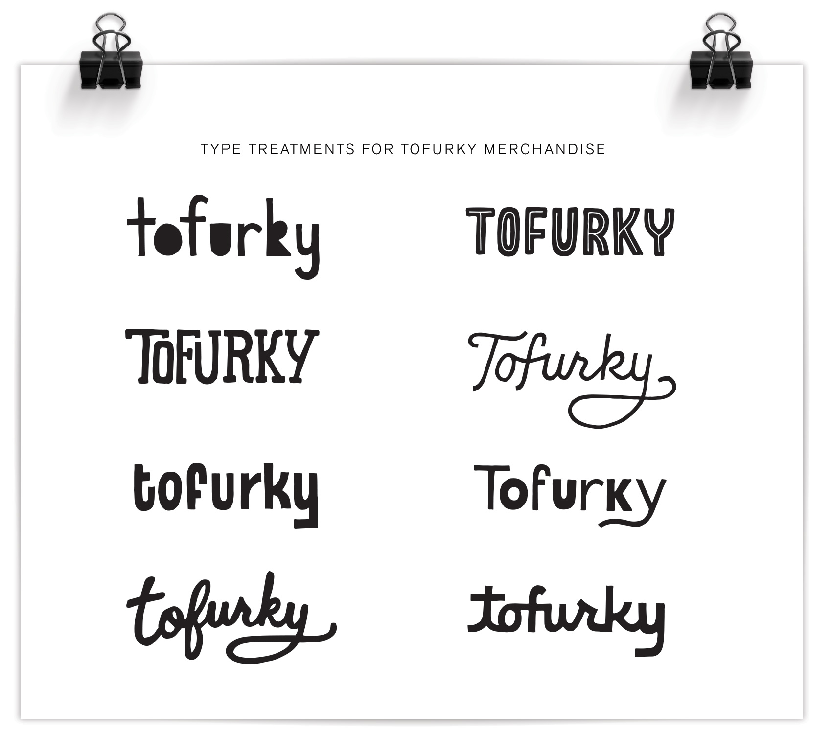
Tofurky Lettering
This summer I’ve been working with Tofurky on various projects, all rated very high on the level of fun had. Tofurky is a local company from Hood River, Oregon that makes meat-alternative products, including their inaugural product of a non-Turkey that also gave the company its name (a spoonerism of FAUX and TURKEY). While not a vegetarian myself, the brand resonates with me because of its positive and intentional mission as well as the playful way they communicate it. Food should be fun after all!
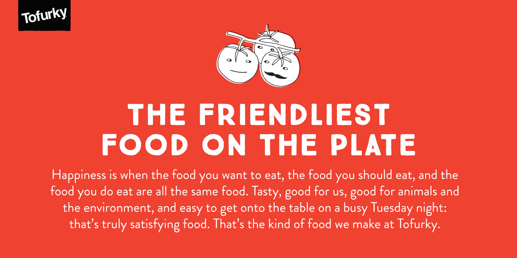
The first part of the project was to make some logo spin-offs so there was a casual and unique way to insert the Tofurky brand into secondary branding without feeling too serious. Two sets of Tofurky “nametags” were created, the first of which is shown below. For this series the defining feature was mimicking the angle and basic form of the Tofurky logo, but altering the letterforms so they are more playful. It also involved working with Tofurky’s current brand assets, which included an awesome set of illustrations done by Kate Sutton of animals, trees and little beans and lentils just doing their thing. Integrating these brand assets into the new work was both fun and a good way to illustrate in a specific style. Success? Well I’ve never seen a pair of beans high-five that hard, so yeah.
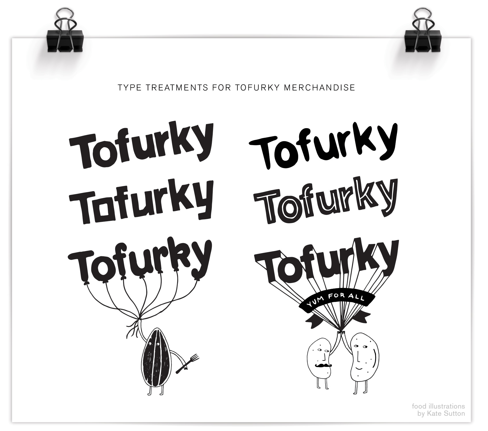
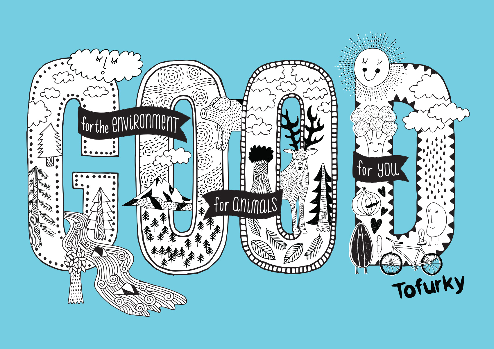
The next step of the project was to build a library of hand drawn lettering assets to use in their merchandise and promotion. Working with independent creative director Gary Huck, we made a slew of brand sayings and lettering/illustration combos, the first of which is being used on a tote bag and is a great representation of the Tofurky mindset: good for people, good for animals, and good for the environment. Hard to argue with that. We focused on the repeated word so it was a quick read and compact compositionally, with details of the saying appearing in banners around the main message: GOOD. A combination of Kate’s and my illustration fill the GOOD type so it’s a complete mash-up of type & illustration. My favorite kind!
That’s it for now – stay tuned for more work from the Tofurky lettering project…
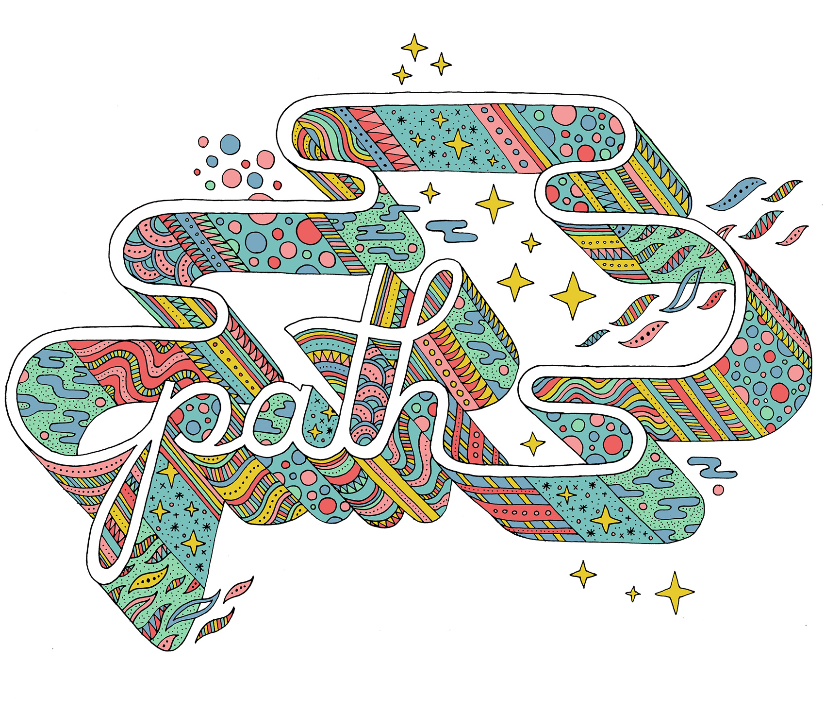
Path Typography