Every once in a while a project comes along where your intuition lines up just right with the vision of the client, so the creative negotiation that is usually a part of the creative process is….gone. This project was like that, and I think I entered something of a “design flow state” while working on it.
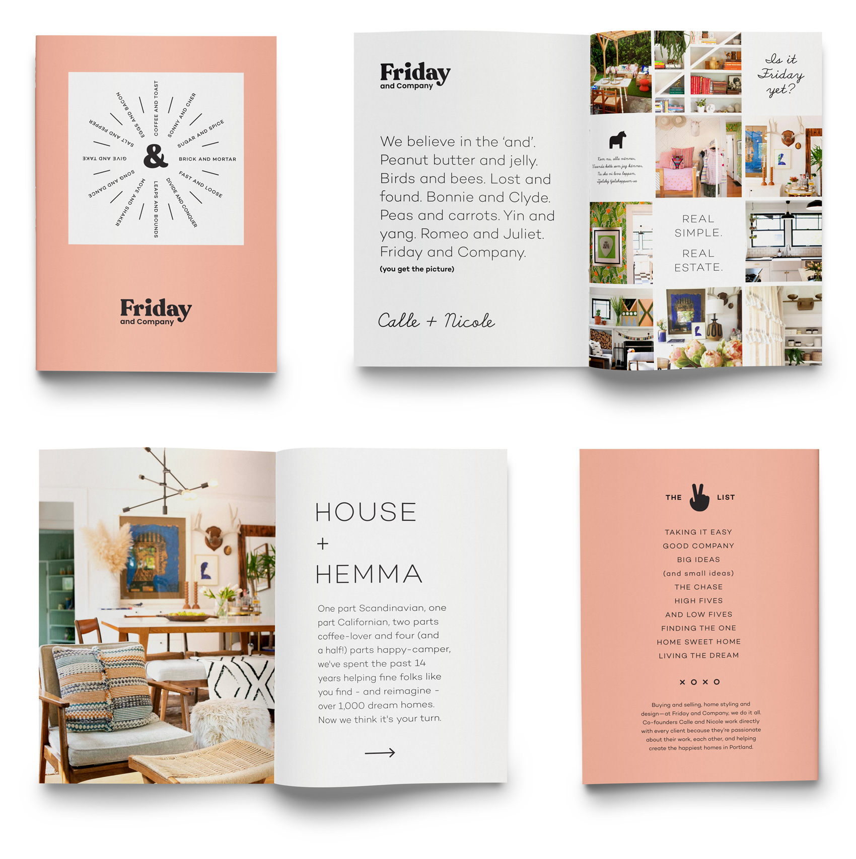
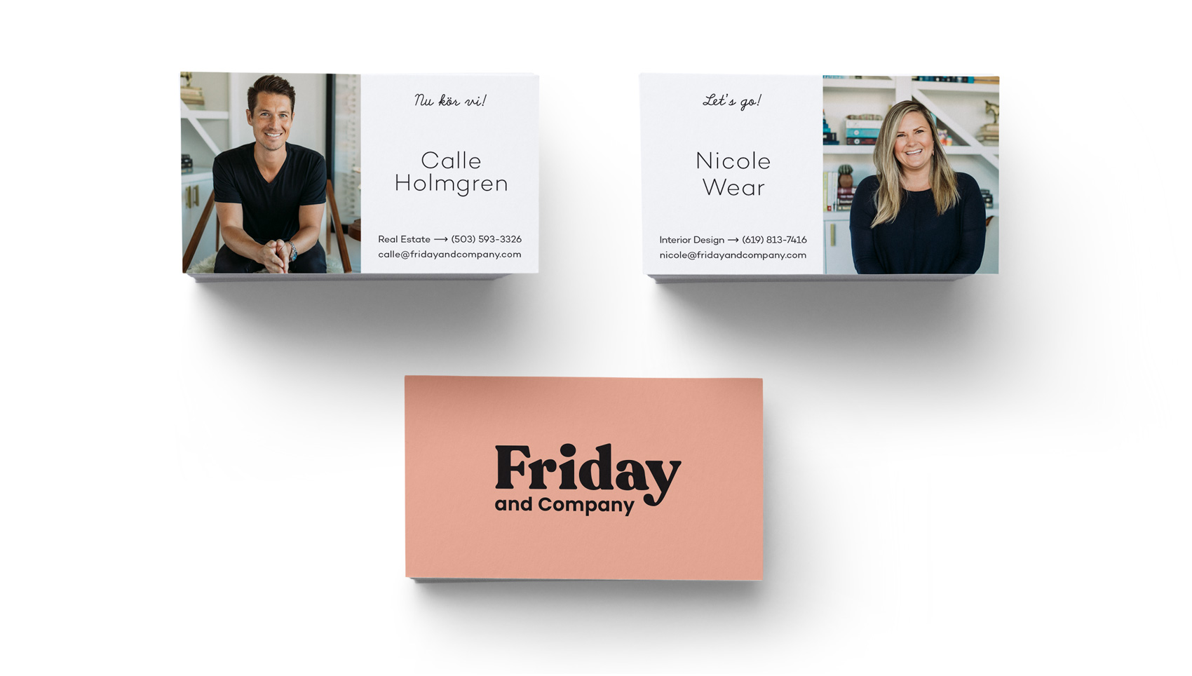
Having roots in Scandinavia means I often veer naturally to the side of simplicity and minimalism (side note: Real Danes might look at this branding and exclaim “oh my! how quaint and busy!”). This turned out to be the perfect match for Friday and Company – a real estate and interior design duo of native Swede Calle Holmgren and American Nicole Wear who has a hard streak of Scandinavian style in her interior design work.
A chunky, friendly logo conveys both the fun Calle and Nicole have at their jobs, but also their approach to working together and directly with their clients. This look also stands out quite a bit in the real estate sector – especially in the real estate signs (below) which are visible from a mile away (possibly even space). To sum up their brand, a series of spreads was created to show the brand from straight-laced to fun-filled in the span of just a few pages.
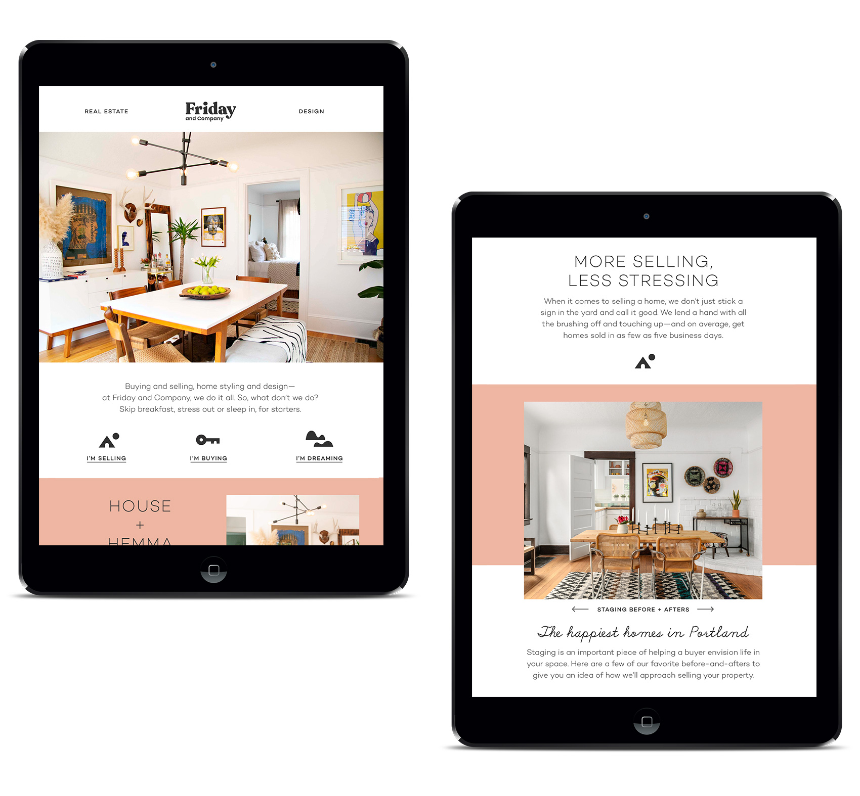
Online we created a site that was to-the-point and lifestyle oriented, with user flows for selling, buying and design. All roads lead to working with Calle and Nicole, so extra attention was paid to about page and a Q&A section getting to know them (apparently they are very taco motivated). In addition to the site, Friday and Company also has a well-trafficked Instagram feed.


Working with Ryan Galloway on writing and Jessica Berardi on web development was also a real pleasure. Creating a voice, both written and visual, and then having it executed just as imagined is such gift. The print collateral was produced at both Brown Printing and Anders Printing in Portland.

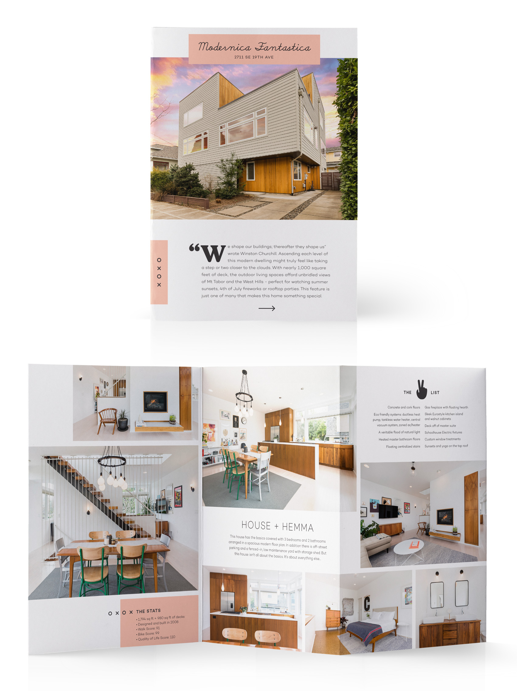
Promotional brochures for each house take on an editorial feel, catering the content of each sales piece to the house it is representing. For this modern house listing I even got to work in this Winston Churchill quote: “We shape our buildings, thereafter they shape us”.
A series of simplistic blocky icons were created to supplement the other brand elements – namely pink, and two nearly mono-line fonts (Campton and School Script (yes, School Script!)). Between these few simple ingredients, a variety of mixing them up allows the brand to be straightforward and serious or offbeat and fun, depending on the needs of the message and medium.
Check out Calle and Nicole online at www.fridayandcompany.com or on Instagram.