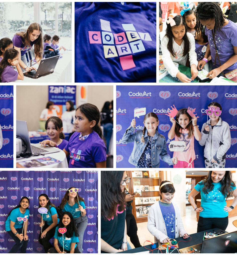
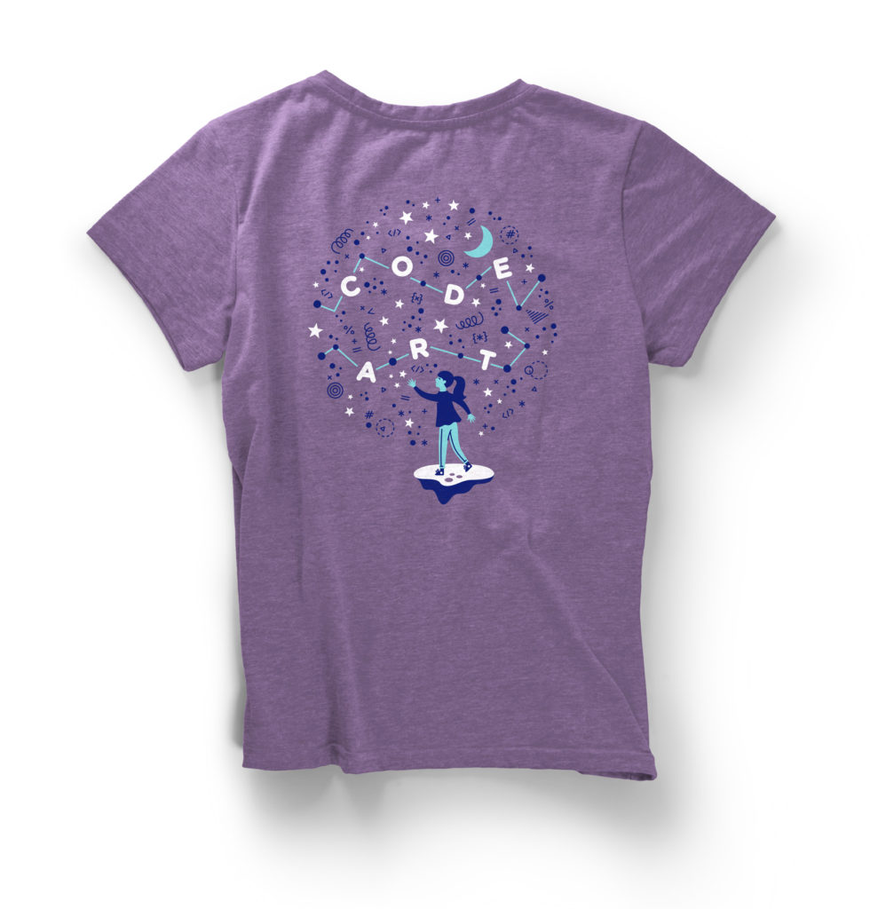
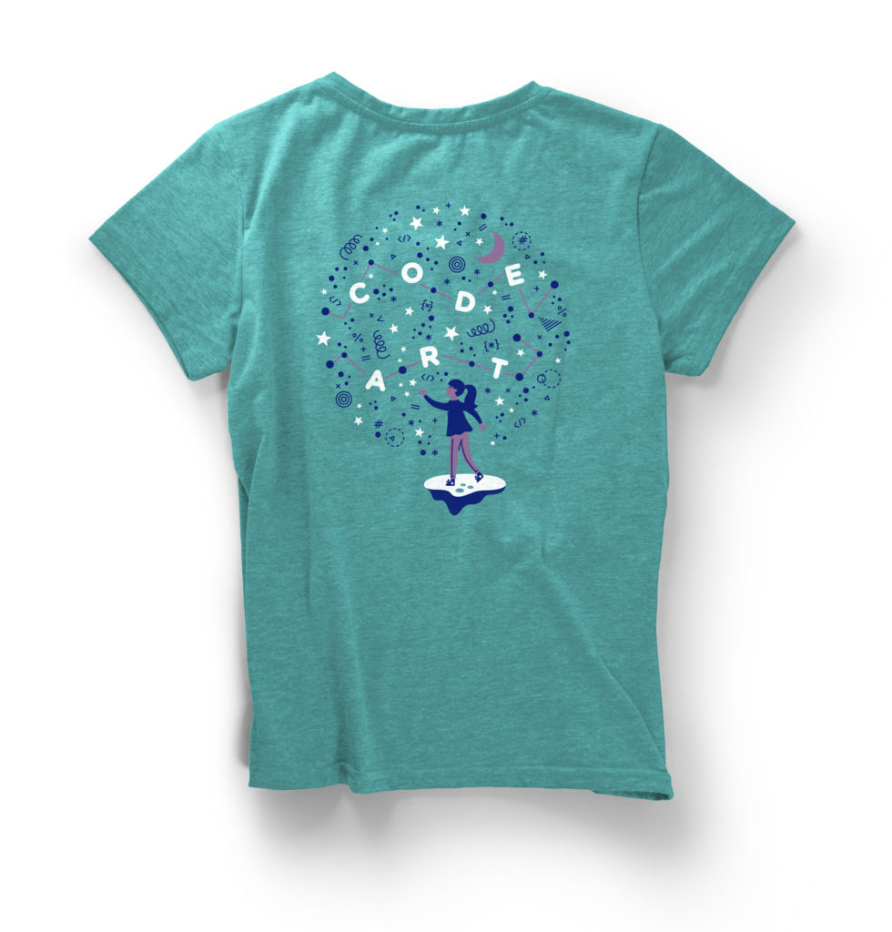
For the 4th annual Code/Art Miami event, non-profit client Code/Art wanted a new design for their participant and volunteer shirts. Previously I had made a series of pins and stickers using small icons, but for this project we created a larger Code/Art constellation design in 3-colors that could easily be printed on two different t-shirt colors (purple for participants, teal for volunteers).
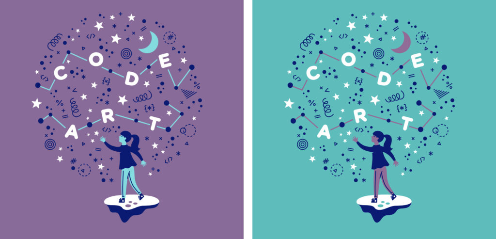
The t-shirt features a girl throwing code snippets into the sky to form a Code/Art constellation. Printed at Custom Ink, the design was arranged so that each color on the purple shirt translated directly to a color on the teal shirt to keep costs low on printing materials and time.
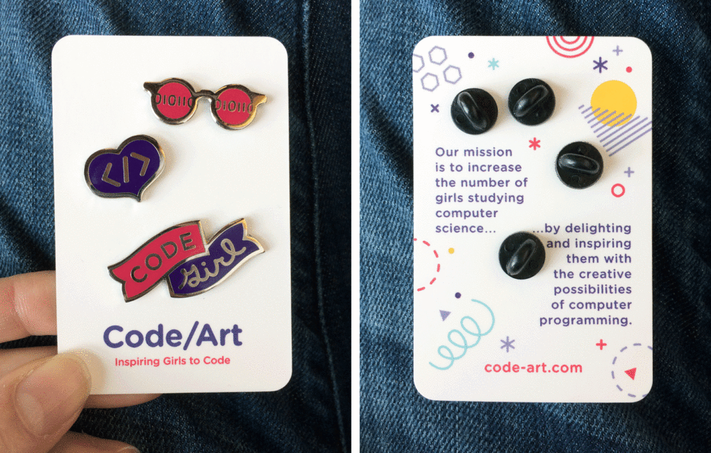
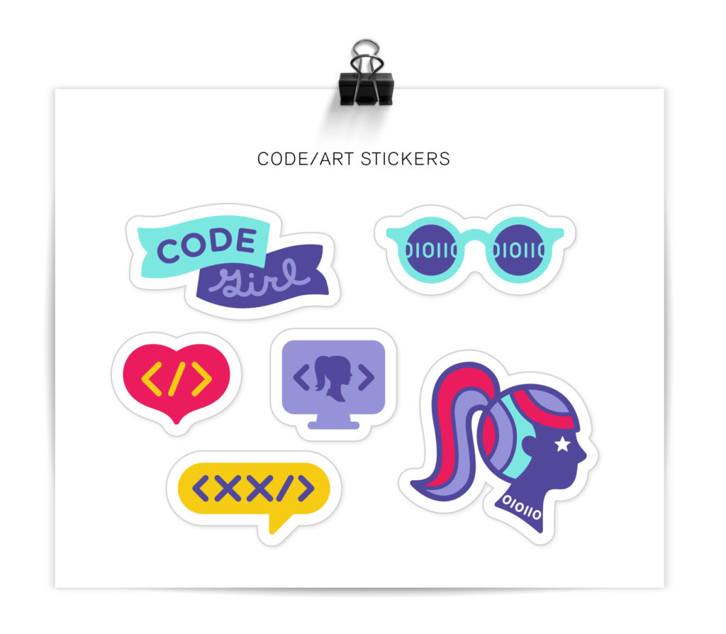
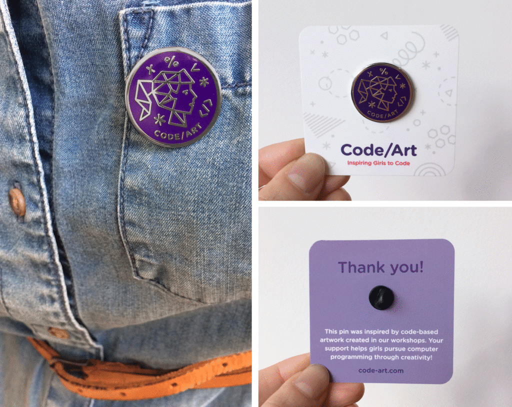
Over the last two years I had designed a series of enamel pins and decals/stickers that were given out to participants. These assets were leveraged internally to create a cohesive look for their events – a strong example of how using a few elements consistently can go a long way in creating a recognizable brand look.
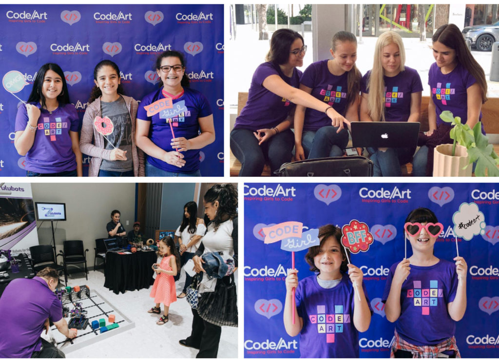
Because I still love me a good enamel pin collection, here is a repost of the series of enamel pins and stickers created over the course of a few mini-projects. These were designed for Code/Art participants – girls in their tweens and teens who explore code through art & creativity in guided Code/Art workshops. Read more about Code/Art on their website.