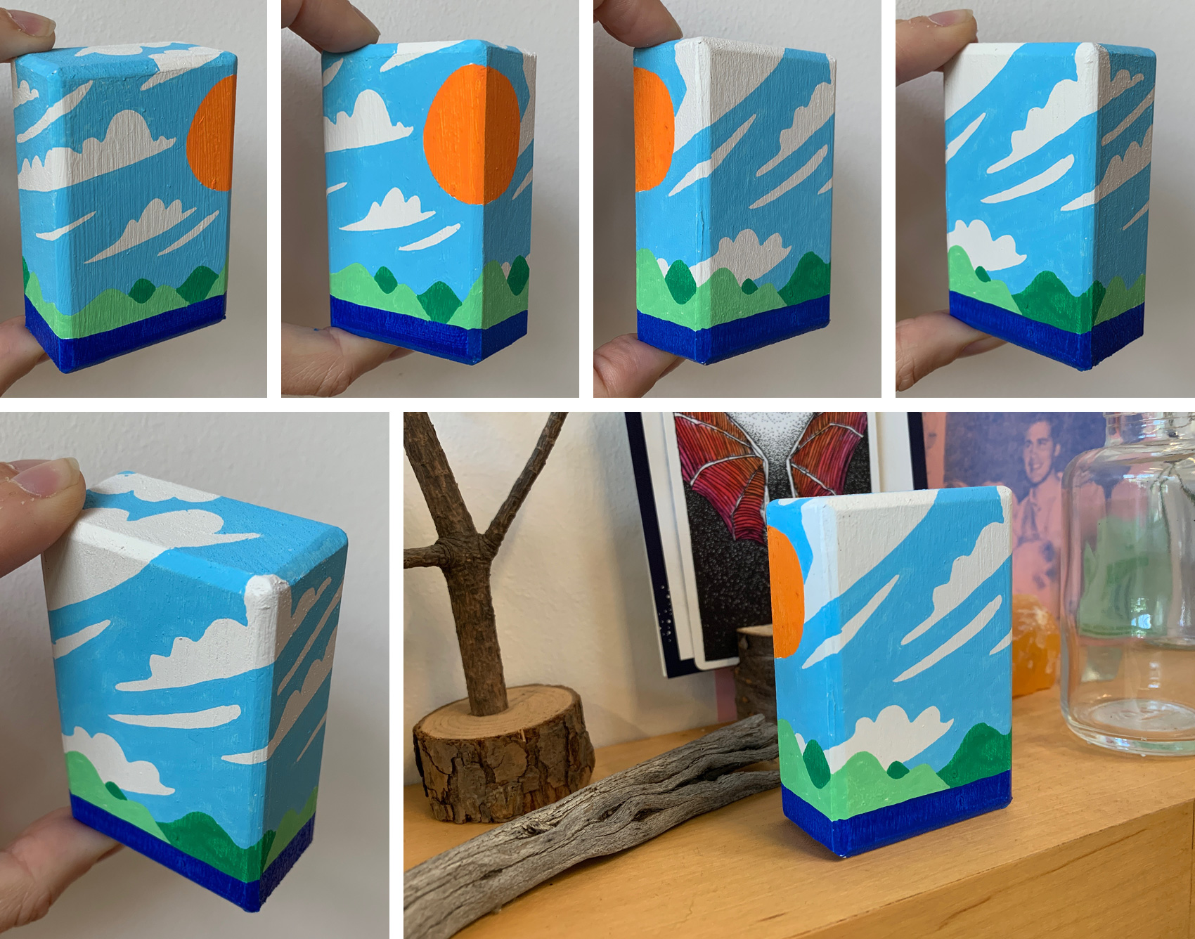
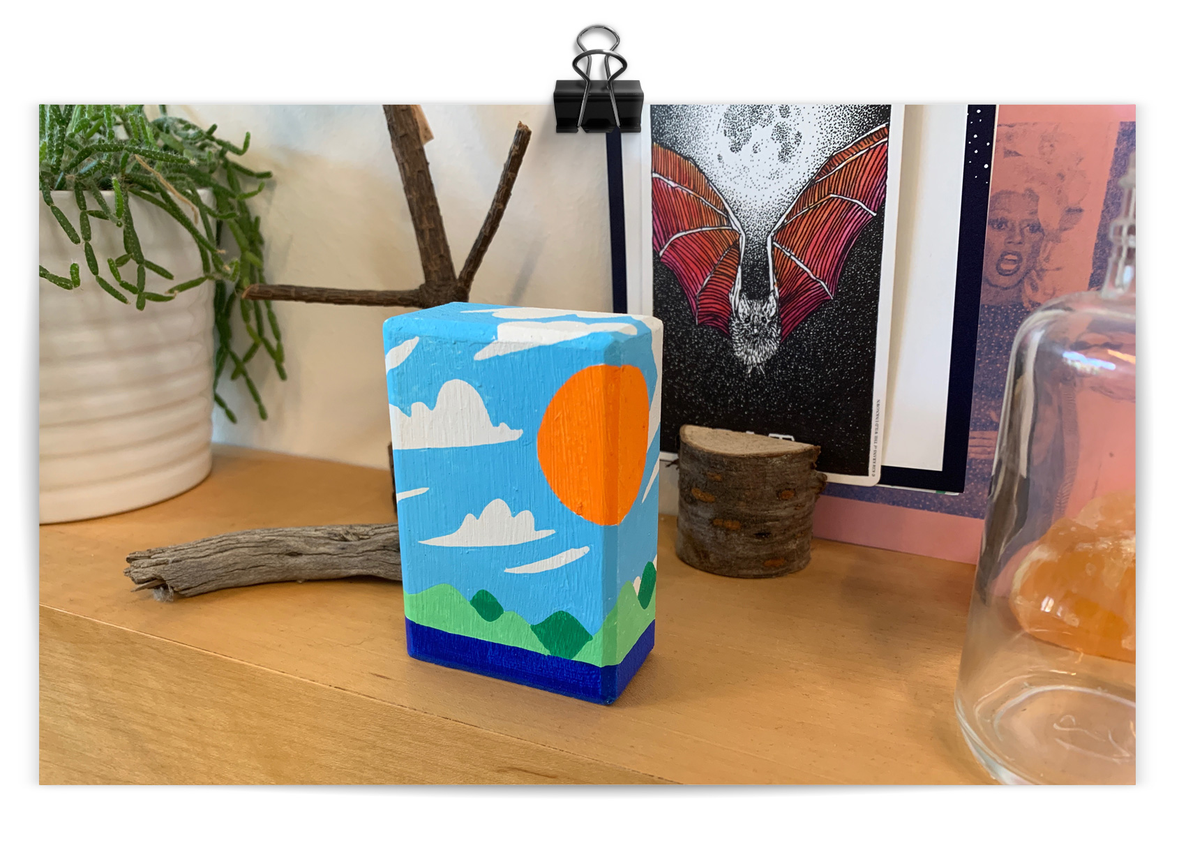
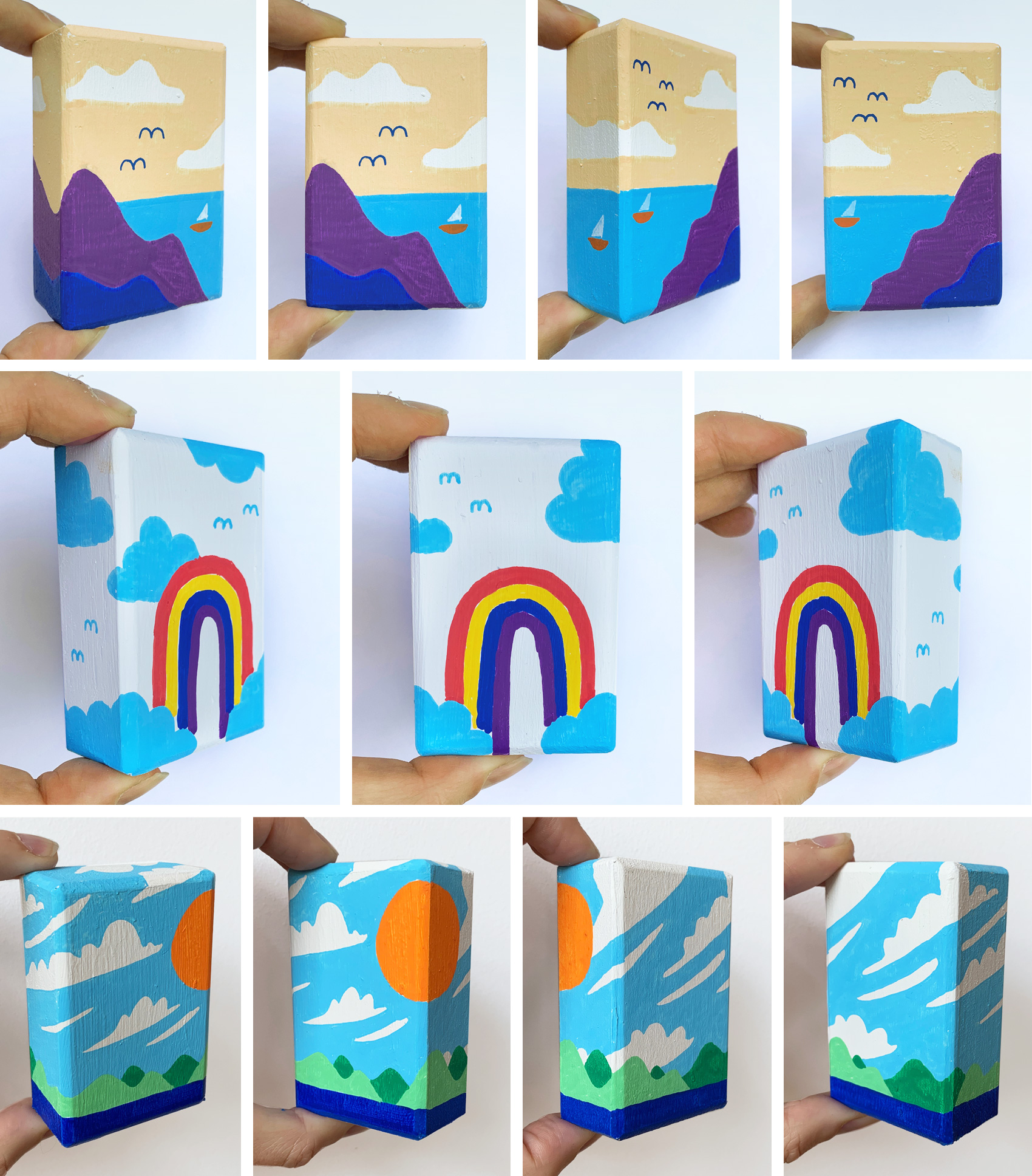
Over the past two years I’ve worked on and off in “box format” – drawing on small wooden boxes. The first series was creating 69 “I think I need a New Heart” boxes for a Magnetic Fields tribute show. The second series were black and white lettering/illustration representations of magical or fantastical products (new heart, dream dust, and several more including my favorite “pocket rainbow”). In its newest iteration, I’m working on landscapes that use the box to emphasize the infinite space of these vistas. My first attempt is an “island in a box” – the box itself being the island – and I’m curious to see where this leads.
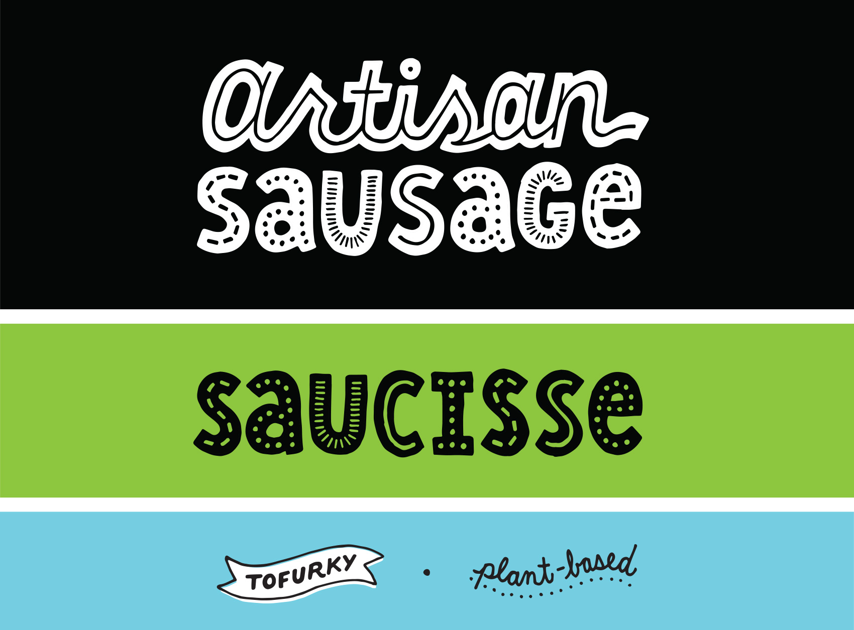
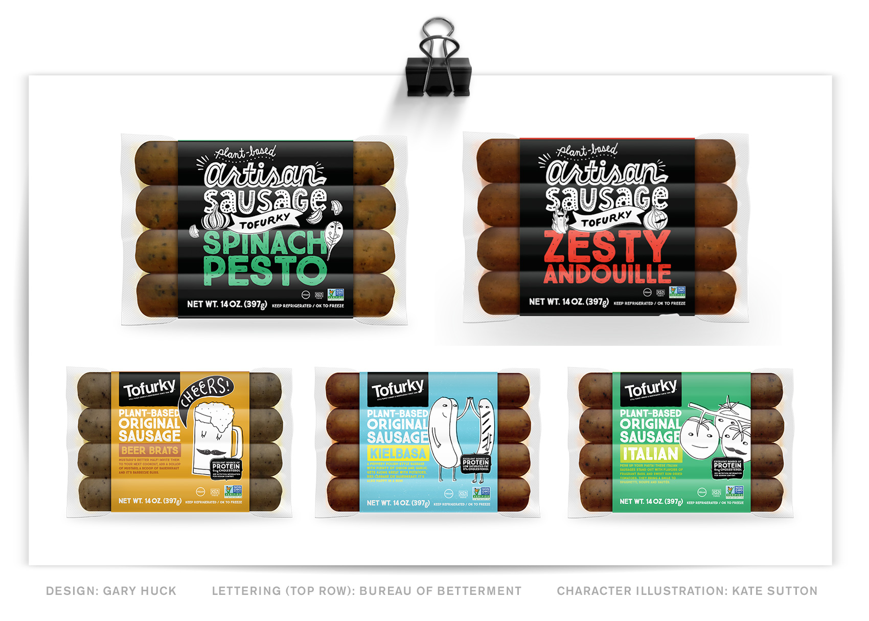
Here is a new lettering project for Tofurky, this time working on their packaging instead of general brand or advertising lettering. This project’s goal was to differentiate their artisan sausage in a way that felt true to the brand, but elevated the artisan product line into another visual space than the regular sausages.
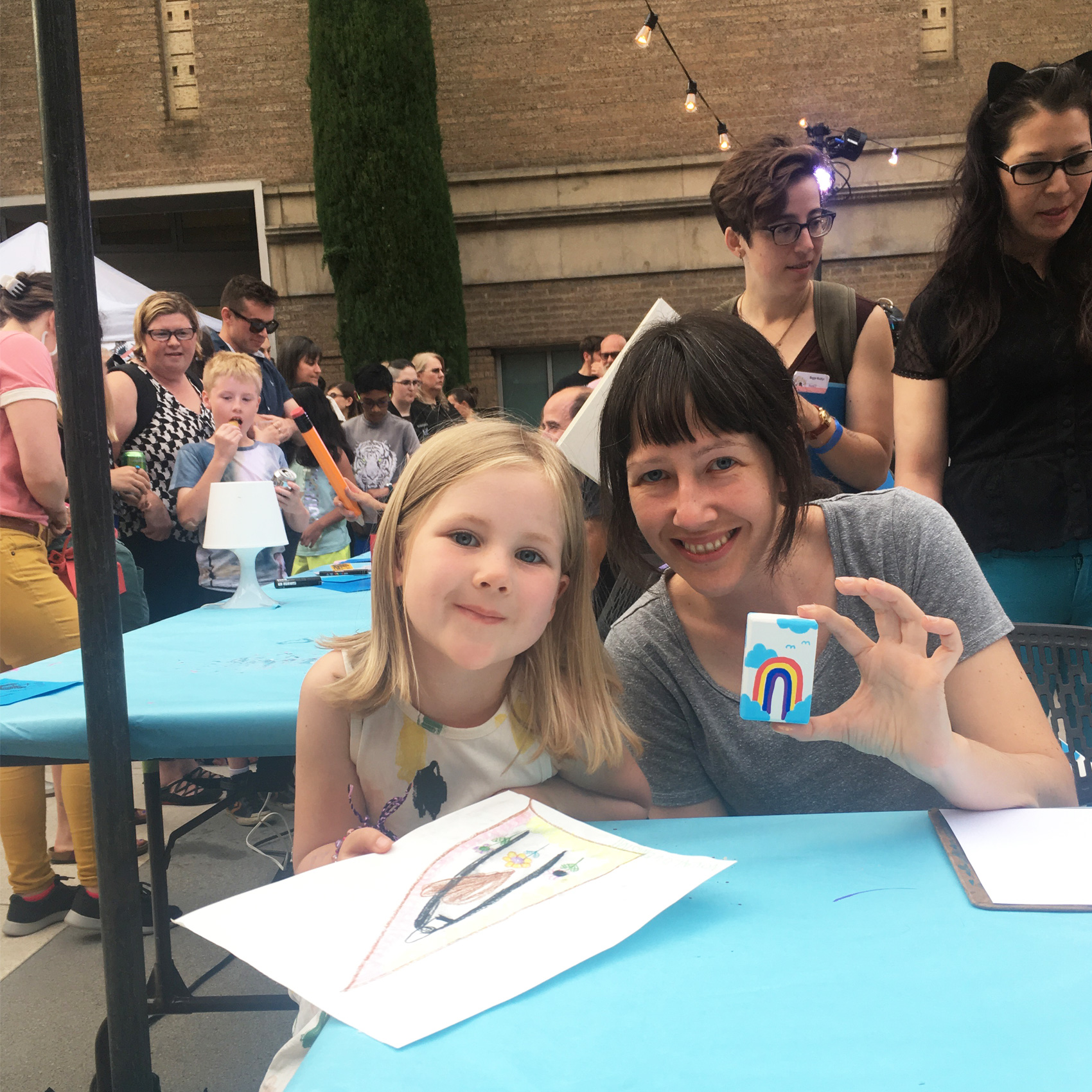
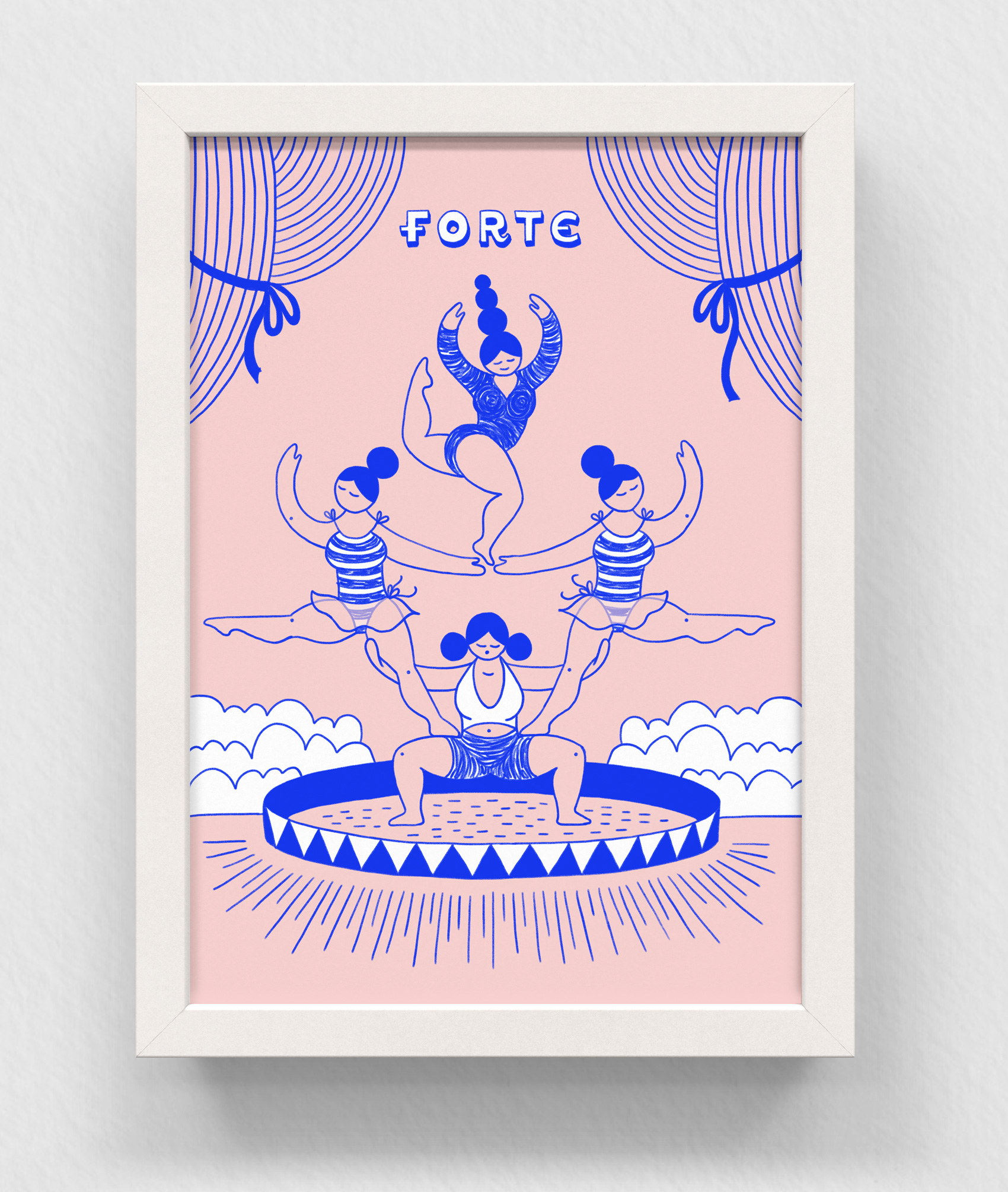
Earlier in July I participated in the fifth annual Portland Monster Drawing Rally. The event is a smorgasbord of artists (75 in all) who donate their time to drawing live at the Portland Art Museum courtyard. As each piece of art is finished, it goes to the auction wall where bidding takes place by drawing straws (with a flat fee for the art).
Proceeds support free school and youth programs at the Museum. It’s a super family friendly event with a kids drawing area. In fact, most of my fun questions come from the 10-and-under crowd as they ogle the process in super-fast-forward speed (each artist gets 1 hour to complete their work).
I’ve done all five drawing rally events that PAM has organized, and each year is different. I’ve tried detailed micron pen illustrations 2 years in a row (hard to finish in an hour, and difficult if you sit next to another artist who is a “vigorous eraser”), black & white magical box contents, and paper pennants with fun lettered sayings.
The boxes seemed to be the most popular so I decided to revisit that form factor this year with a new set of markers – POSCAS! I’m just starting to get the hang of these markers and they were well suited for this purpose. The main challenge of this year were letting various colors dry in between applying new ones, while always switching between multiple boxes. I generally stuck with a theme of “landscapes” but after these few experiments would like to work more on this idea.
Thanks to my brother-in-law, Dan, who made me the wooden boxes!
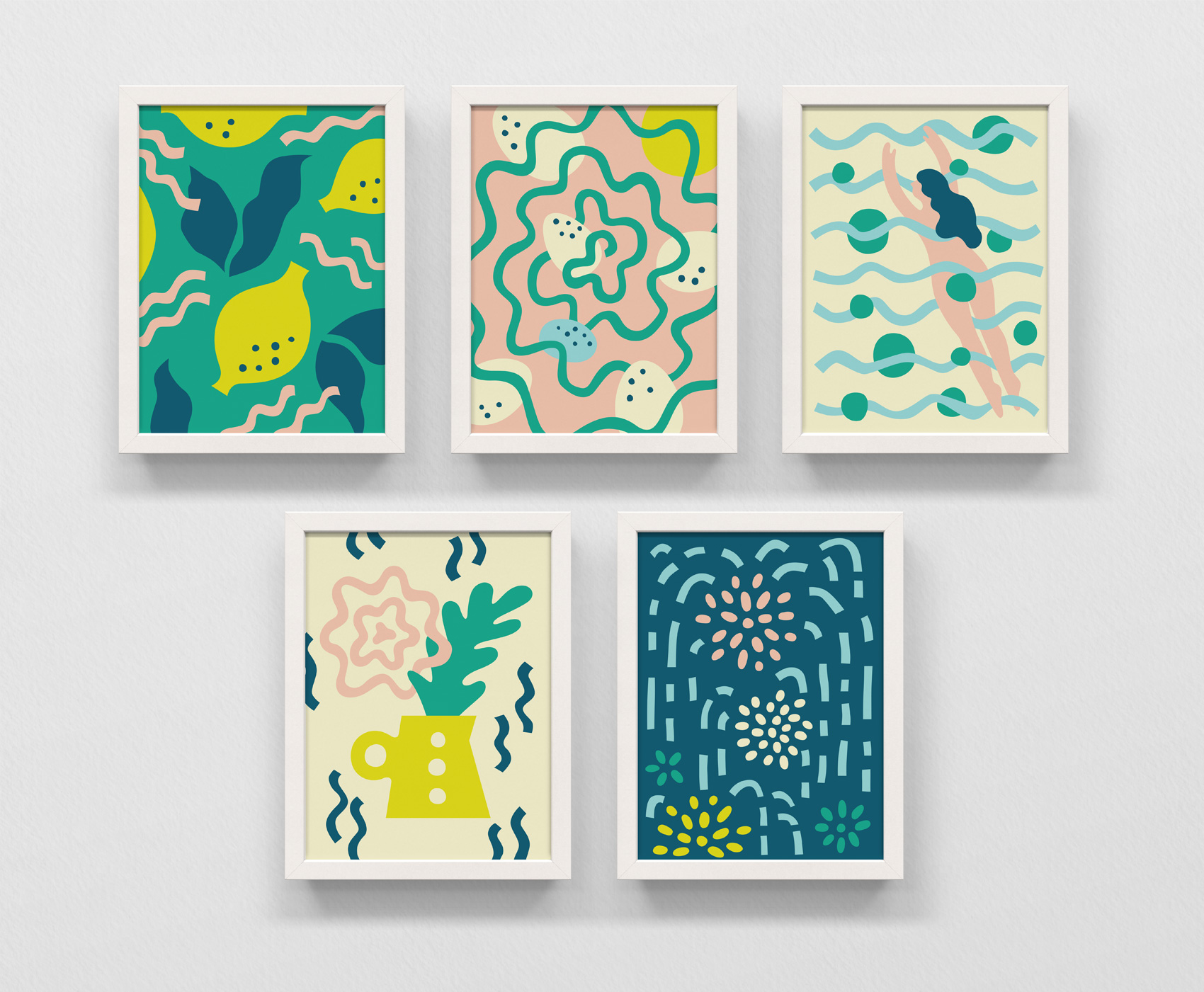
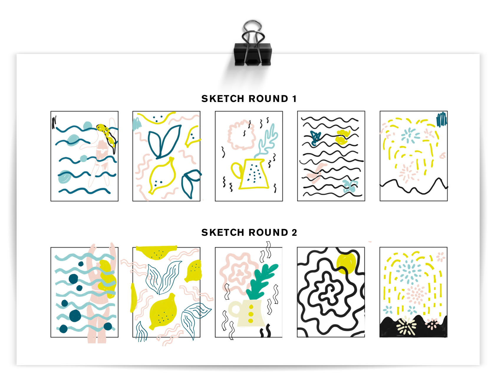
Inspired/triggered by a contest on Instagram, I used some extra time one day to experiment in a new style on the theme slow down. Some of my work is precisely executed (here, here, here and here) so this was good practice in trying to work in a looser, less calculated way while still creating a systematic style for the illustration series. Below you can see the two sketch rounds before working in Adobe Illustrator to make the artwork above: lemonade, bird’s nest, summer swim, fresh bouquet, night fireworks.
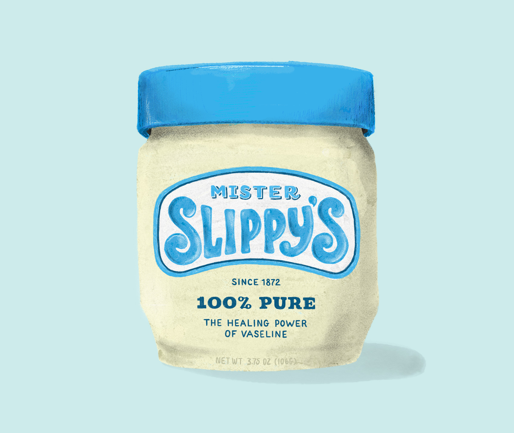
Practicing some more on my iPadPro with different brushes, this time creating a new name and label for an oldie but goodie – Vaseline. The short development history of this product on Wikipedia is pretty interesting in it’s simplicity. Vaseline is one of many products which brand name has become genericized – instead of Vaseline being a specific brand of petroleum jelly, the name is used to describe all petroleum jelly products (more about all that here).
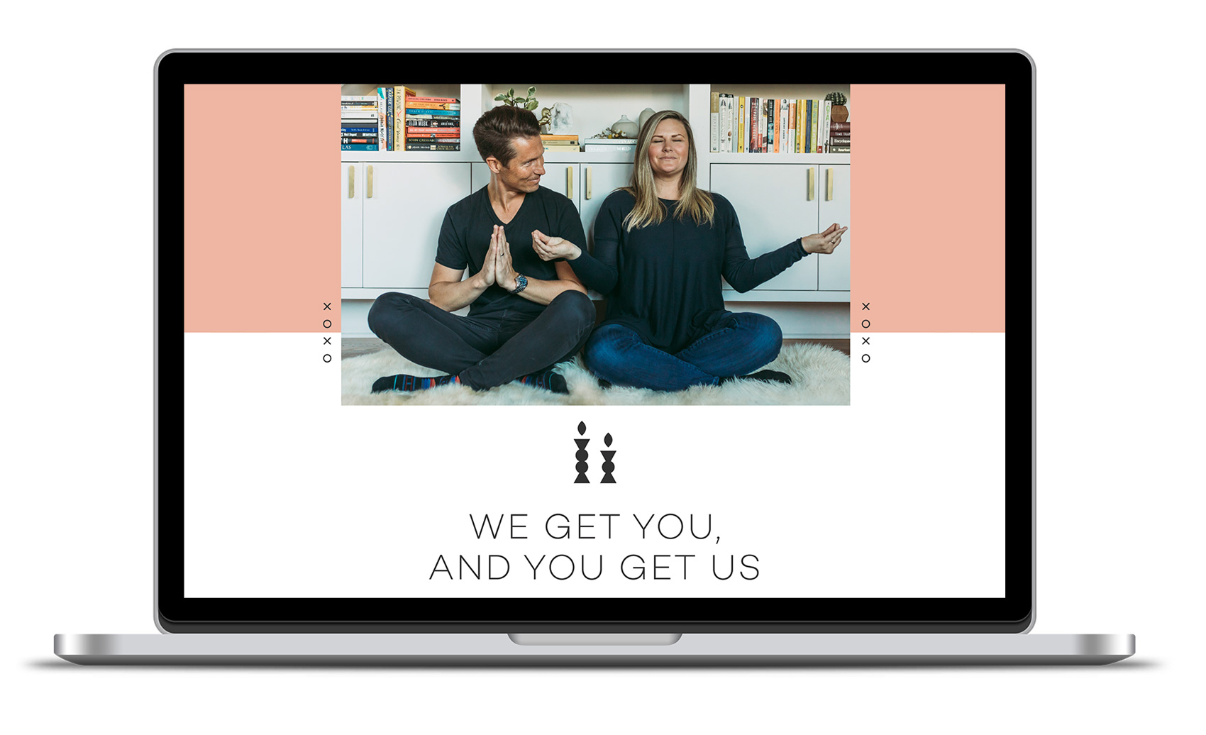
Every once in a while a project comes along where your intuition lines up just right with the vision of the client, so the creative negotiation that is usually a part of the creative process is….gone. This project was like that, and I think I entered something of a “design flow state” while working on it.
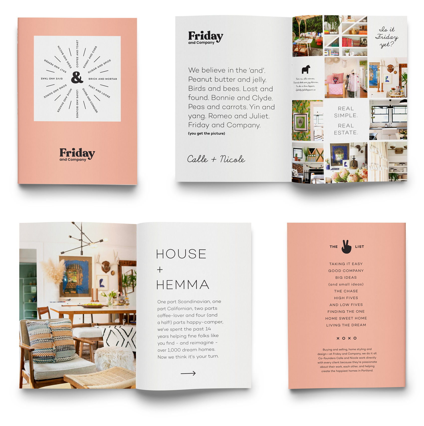
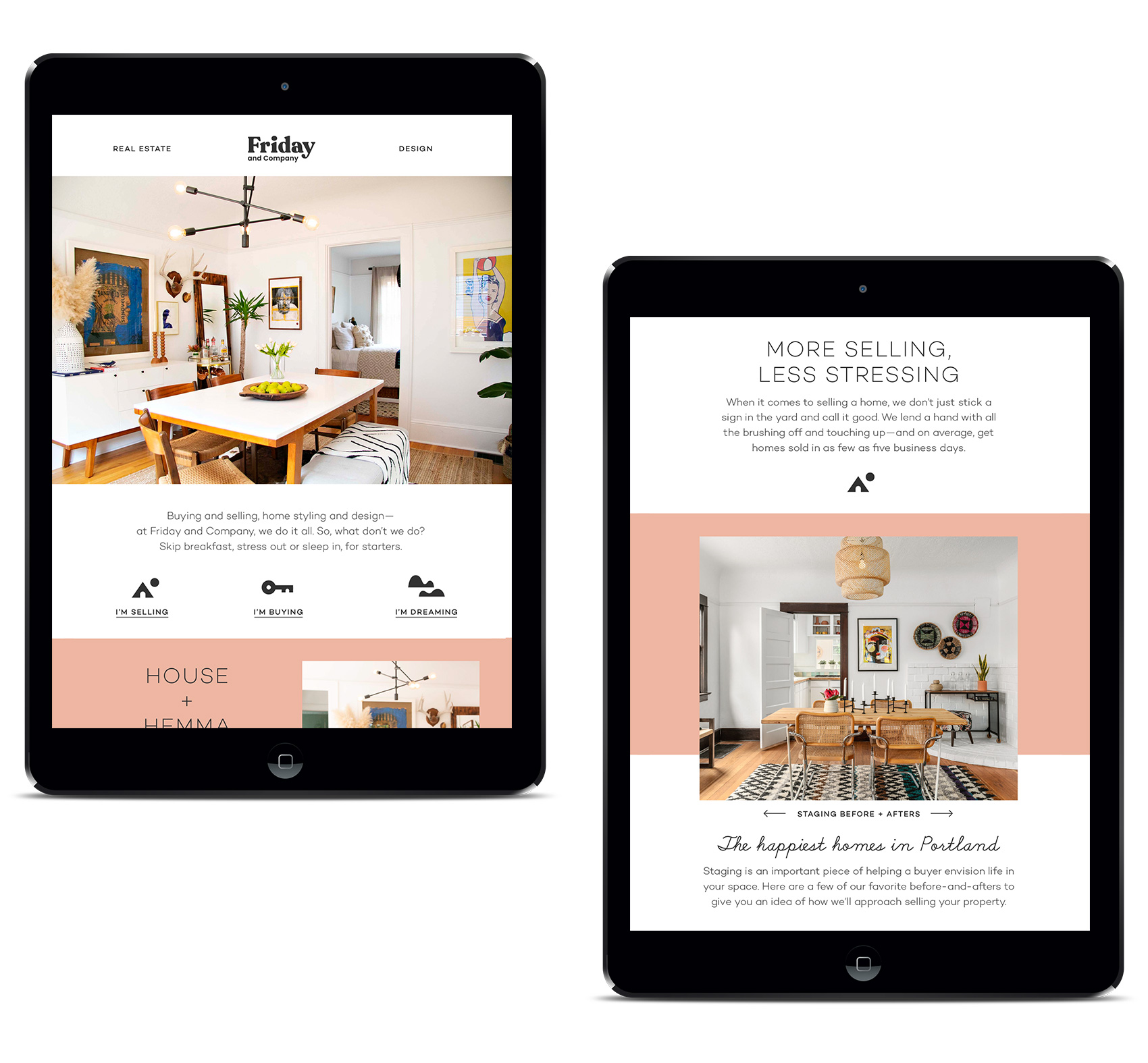
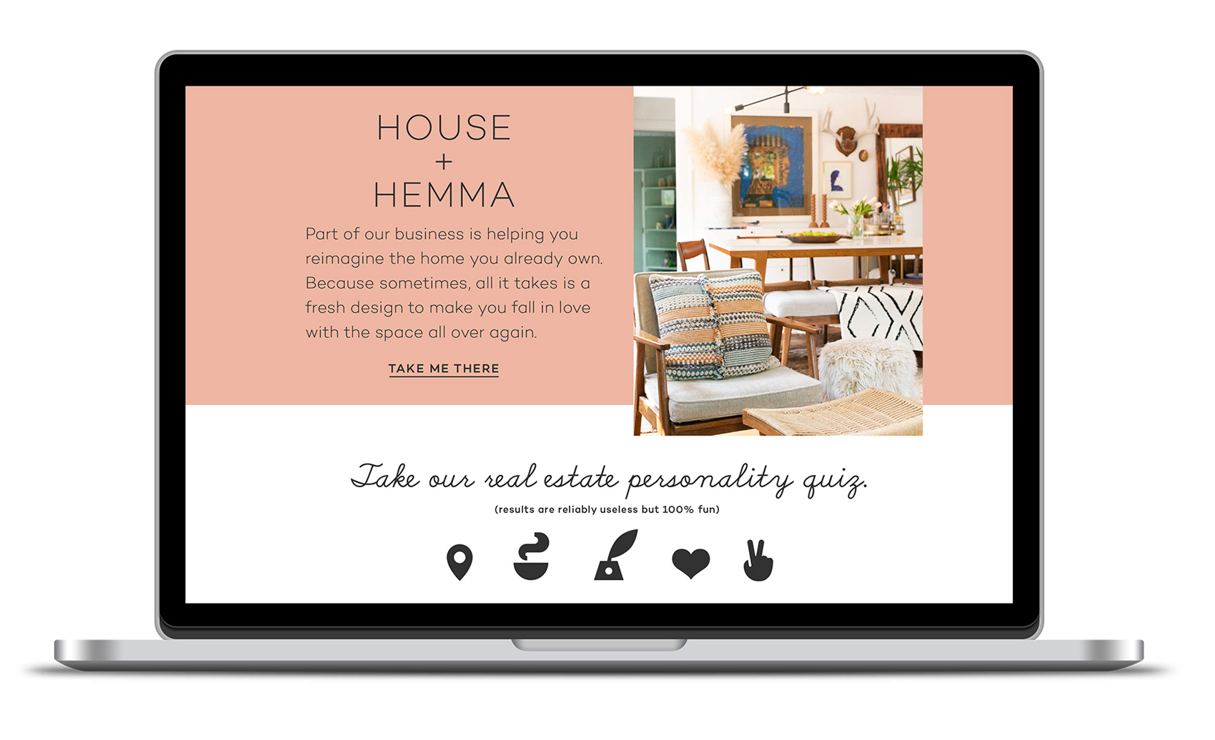
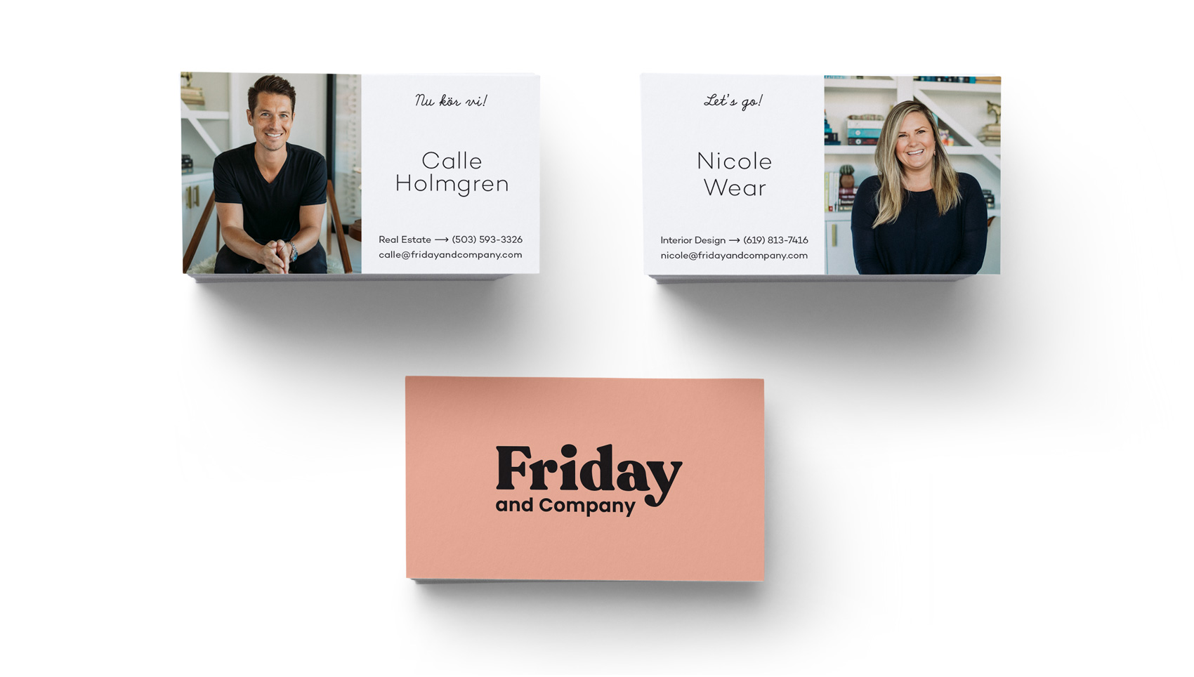
Having roots in Scandinavia means I often veer naturally to the side of simplicity and minimalism (side note: Real Danes might look at this branding and exclaim “oh my! how quaint and busy!”). This turned out to be the perfect match for Friday and Company – a real estate and interior design duo of native Swede Calle Holmgren and American Nicole Wear who has a hard streak of Scandinavian style in her interior design work.
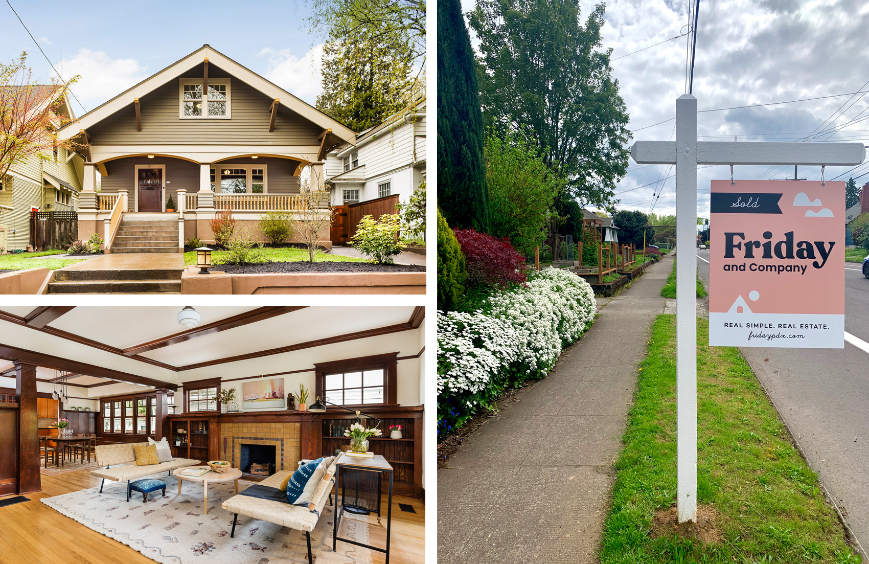
A chunky, friendly logo conveys both the fun Calle and Nicole have at their jobs, but also their approach to working together and directly with their clients. This look also stands out quite a bit in the real estate sector – especially in the real estate signs (below) which are visible from a mile away (possibly even space). To sum up their brand, a series of spreads was created to show the brand from straight-laced to fun-filled in the span of just a few pages.
Online we created a site that was to-the-point and lifestyle oriented, with user flows for selling, buying and design. All roads lead to working with Calle and Nicole, so extra attention was paid to about page and a Q&A section getting to know them (apparently they are very taco motivated). In addition to the site, Friday and Company also has a well-trafficked Instagram feed.
Working with Ryan Galloway on writing and Jessica Berardi on web development was also a real pleasure. Creating a voice, both written and visual, and then having it executed just as imagined is such gift. The print collateral was produced at both Brown Printing and Anders Printing in Portland.
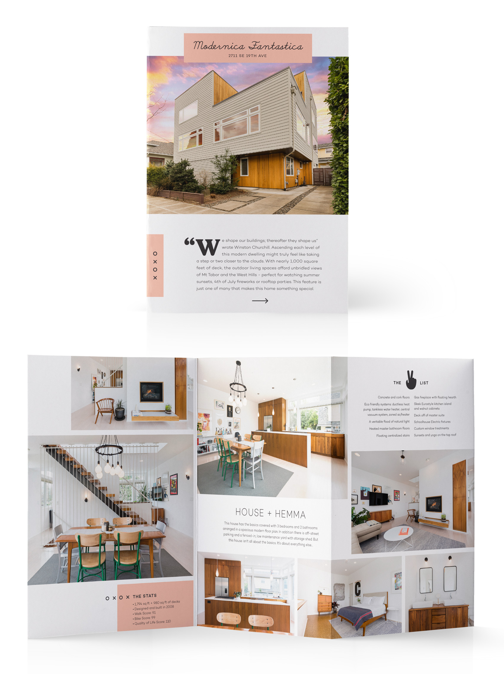
Promotional brochures for each house take on an editorial feel, catering the content of each sales piece to the house it is representing. For this modern house listing I even got to work in this Winston Churchill quote: “We shape our buildings, thereafter they shape us”.
A series of simplistic blocky icons were created to supplement the other brand elements – namely pink, and two nearly mono-line fonts (Campton and School Script (yes, School Script!)). Between these few simple ingredients, a variety of mixing them up allows the brand to be straightforward and serious or offbeat and fun, depending on the needs of the message and medium.
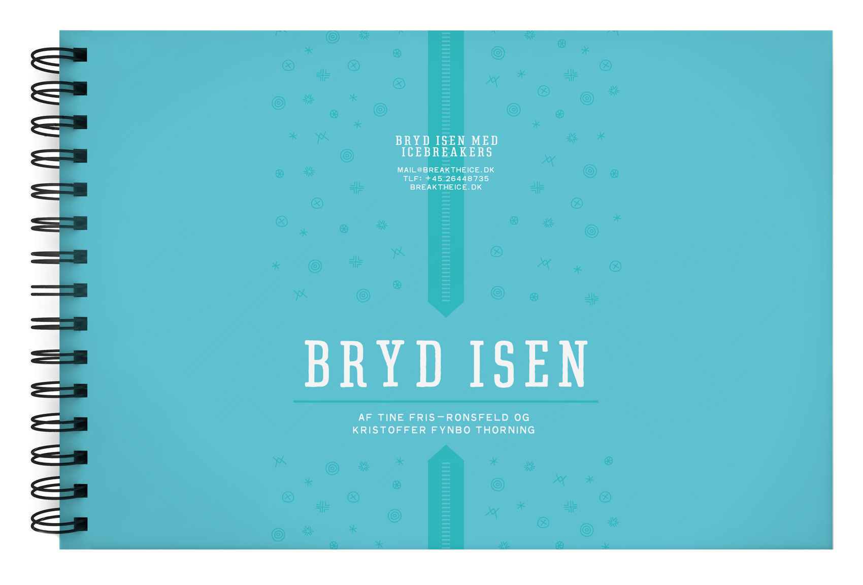
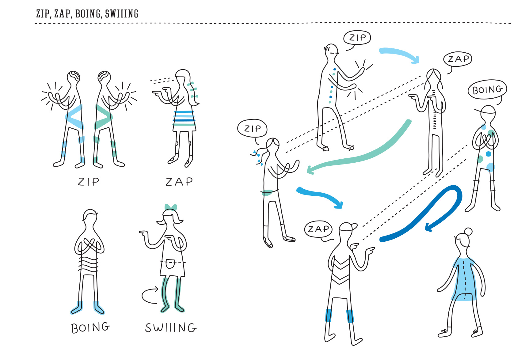
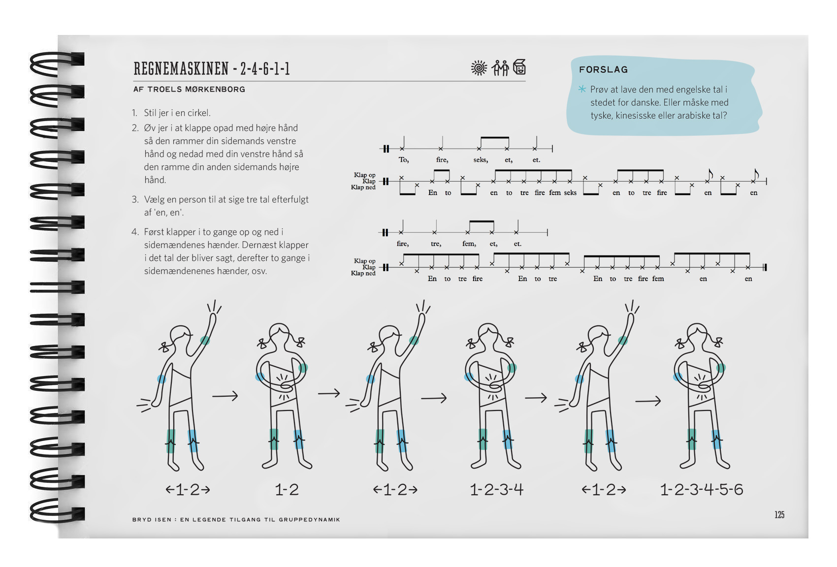
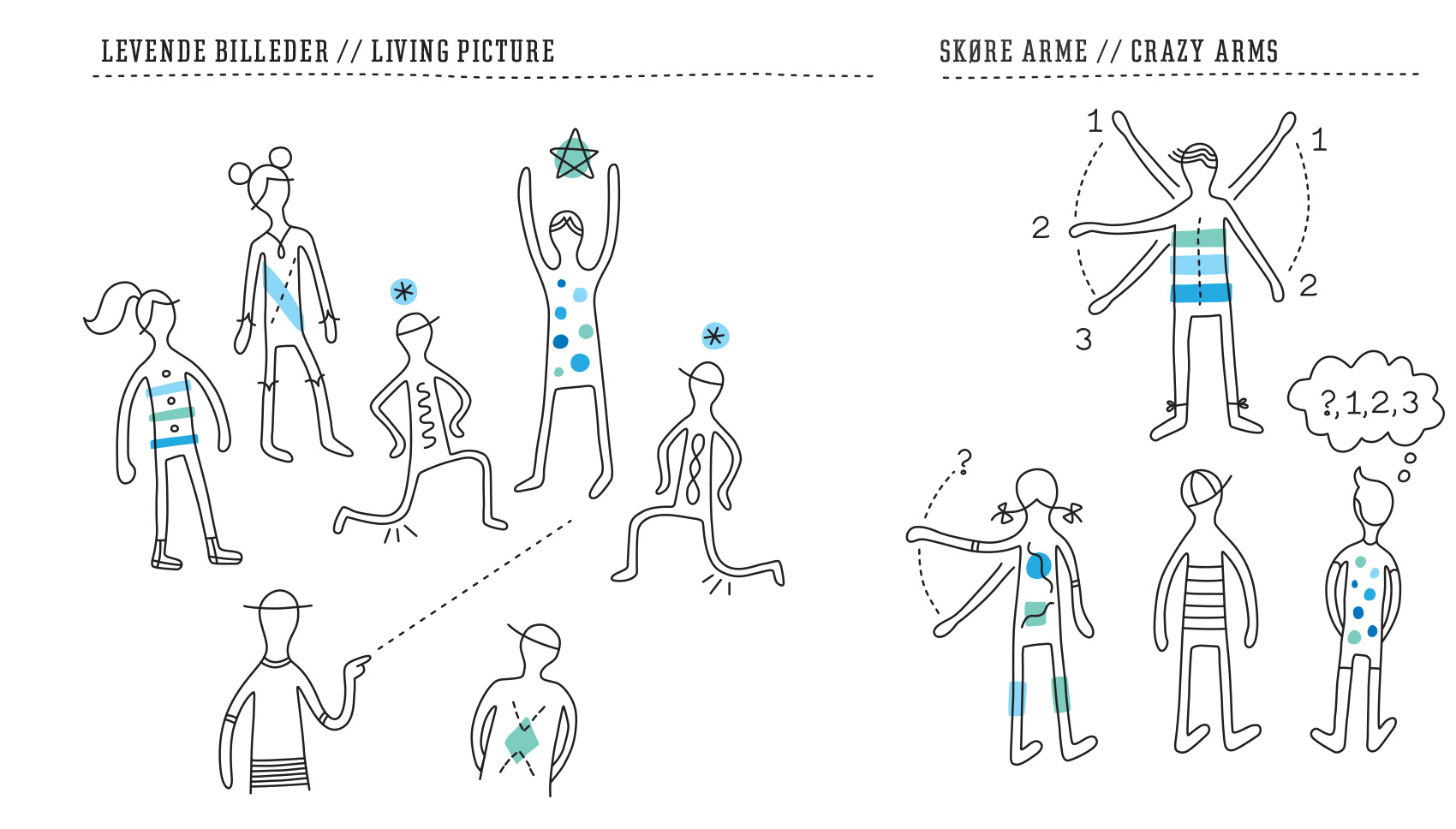
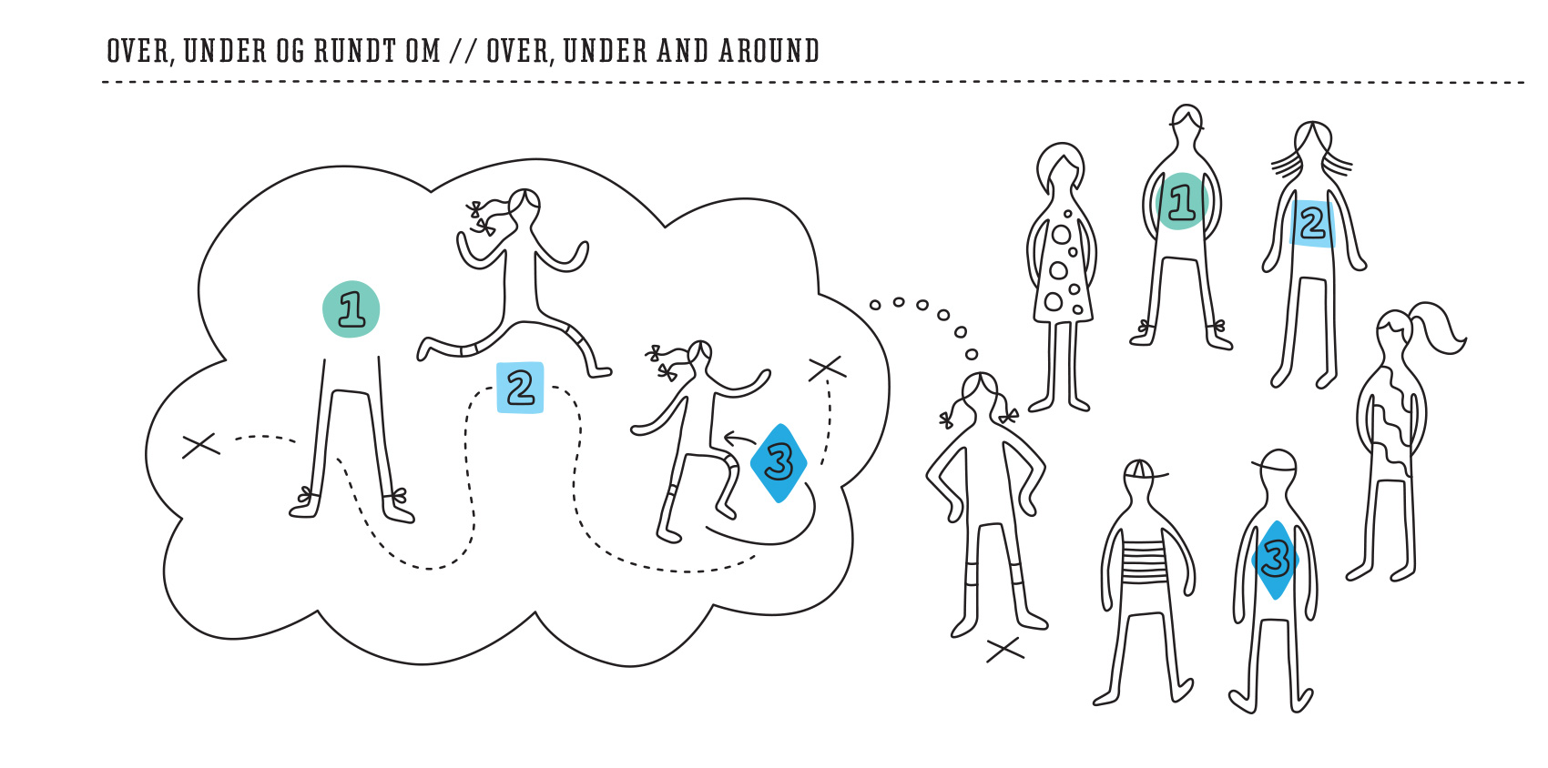
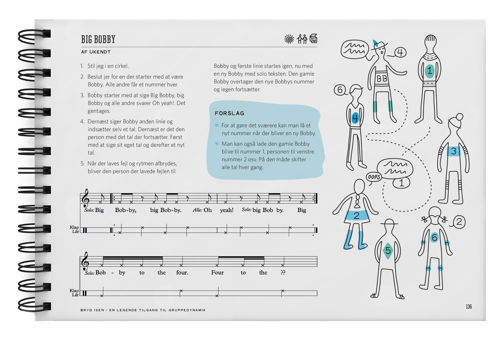
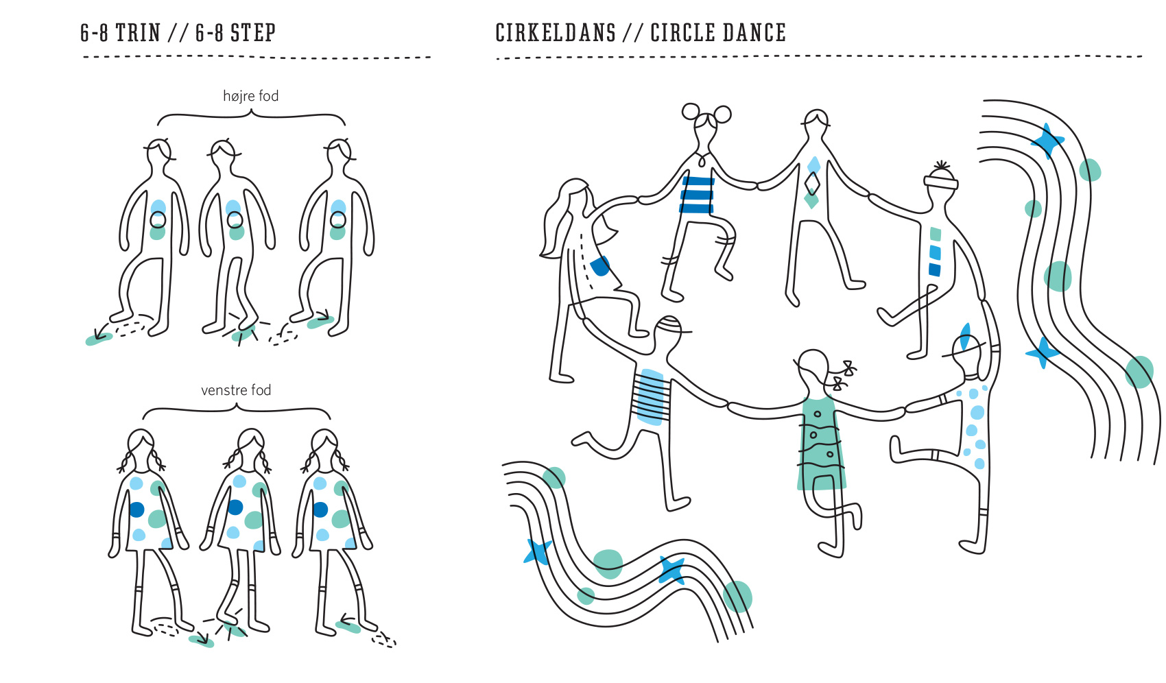
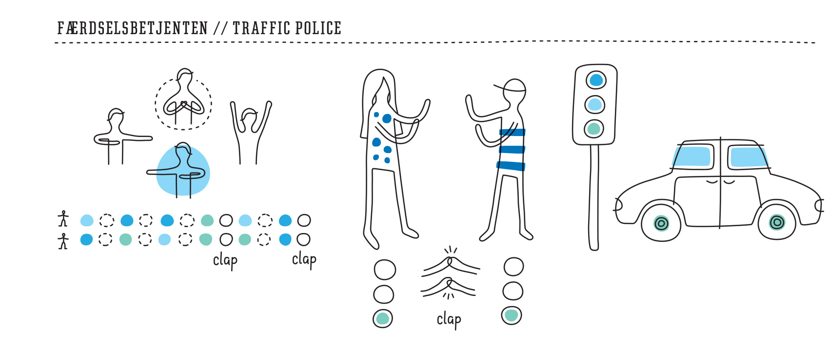
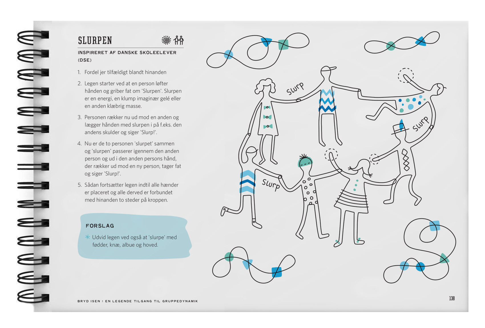
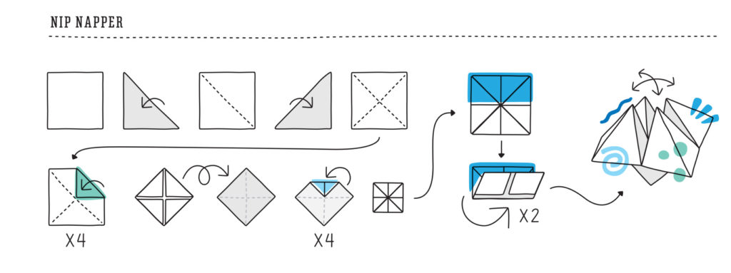
A few years ago I worked on the Icebreakers book – an activity book that combines movement and song to get large choral groups warmed up in a fun way. Developed by a Danish high school classmate and his modern a cappella group Postyr, the book is for sale at Break the Ice.dk.
This spring they published a second edition of the book, so I worked on a new series of diagrams to support the directions for each activity. The style of the illustrations was intentionally loose to allow for easily shaping the characters to various poses and configurations, which focused more on the action of the activity rather than the details of the characters.
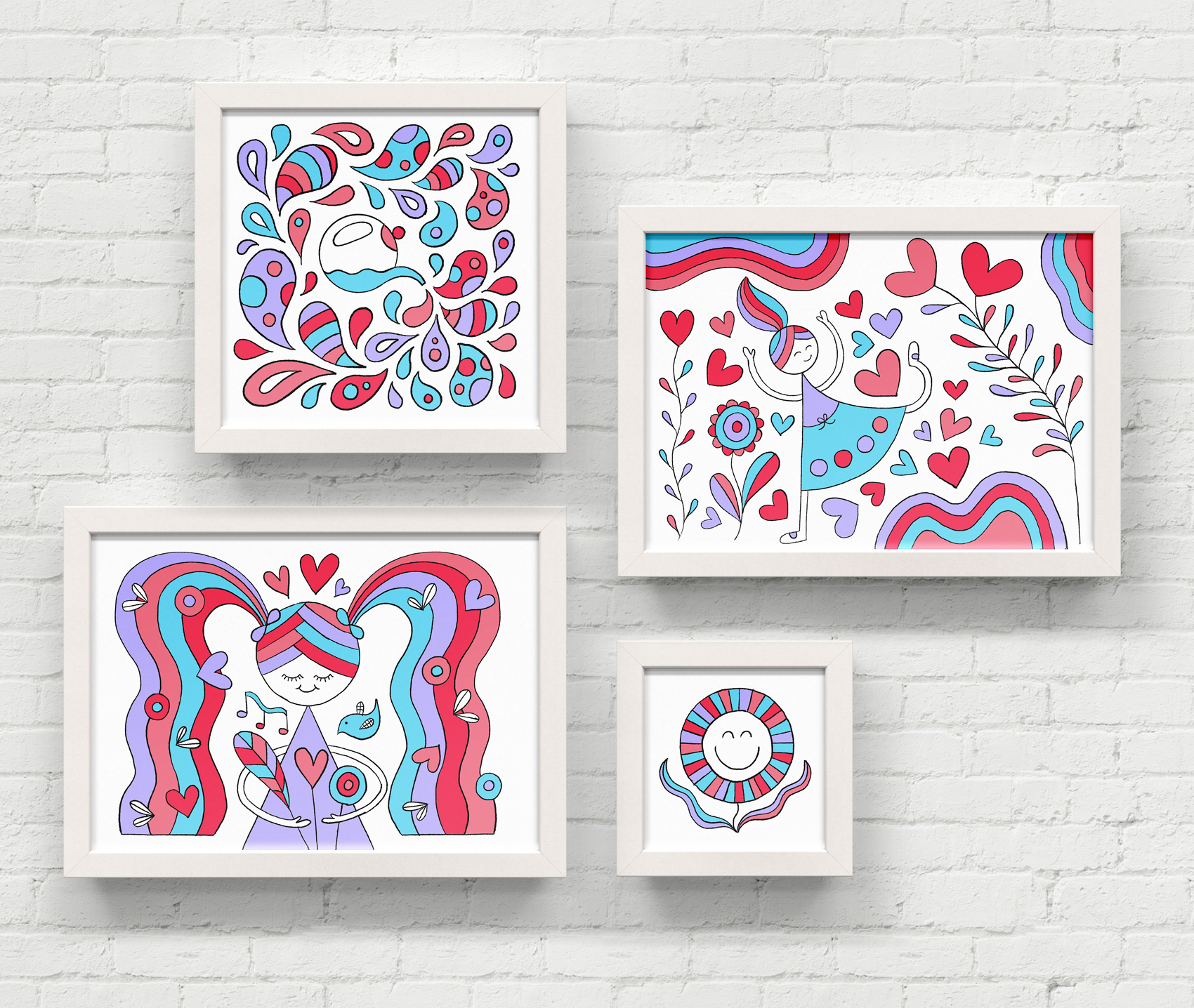
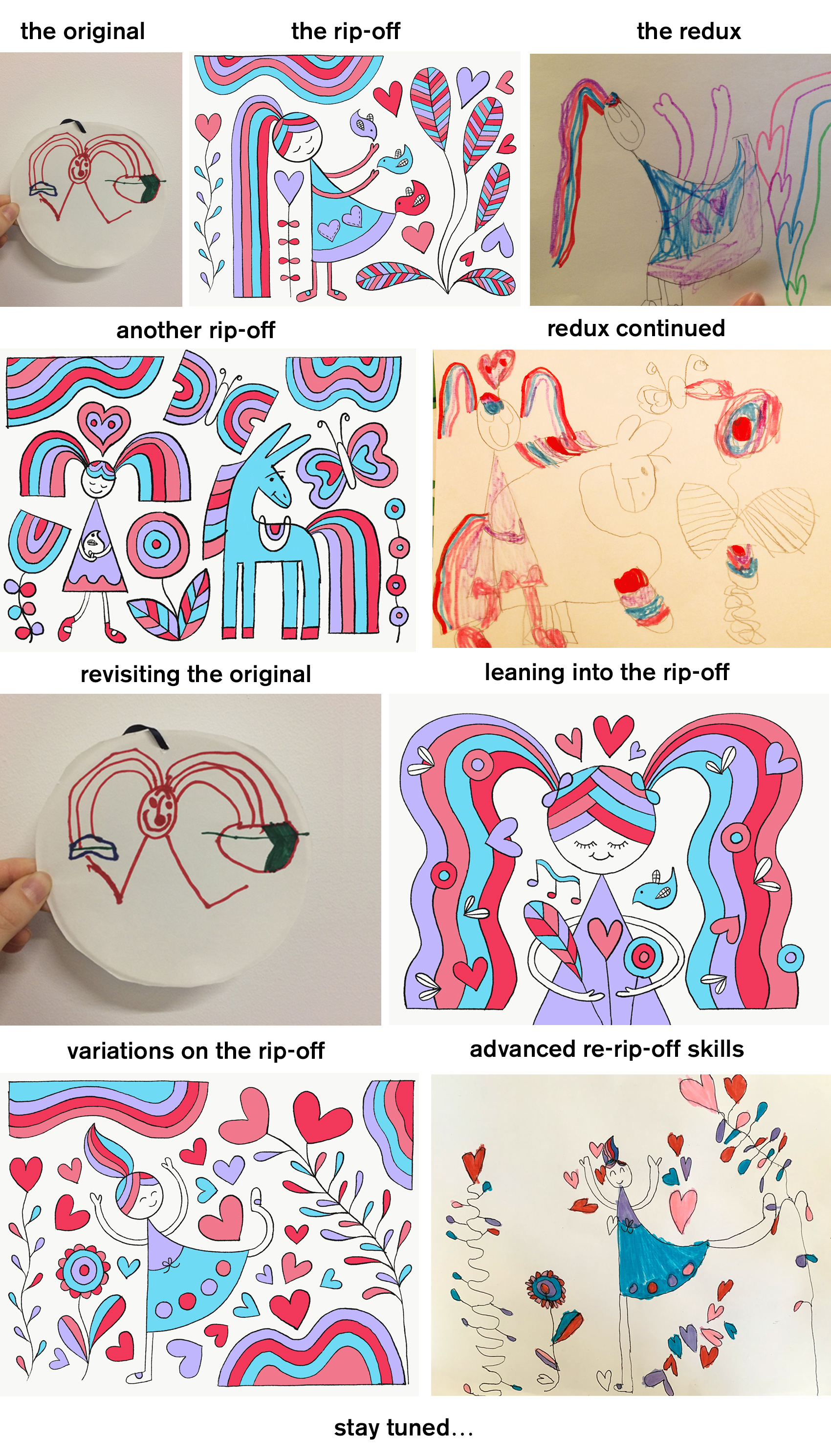
Last year I did a short series called Rainbow World, which explored using my daughter’s drawings as inspiration and subsequent re-inspiration. Here is another set of illustrations continuing in this style, this time influenced by an evening in the backyard watering plants. Below is the back and forth we’ve had copying each other…I am curious how long this thread will go.
Earlier this year I worked on brand explorations for Hire an Esquire, an online service for finding the right legal consultant for a project. The illustrations and icons – set on making the legal profession and process of hiring a lawyer seem approachable, easy and fun – helped the internal team decide the overall direction their rebrand should take.
A blocky bold style was used with the companies selected teal and orange palette. With such strong colors, the rest of the elements were kept very simple and used knockouts of white.
Stand-alone icon style was also explored to show how small visual accents could strengthen the brand presence when used consistently throughout their new site. While the final brand look ended up being a little more serious and traditional, the exploration process was key in helping decide how far to push the needle in their field.