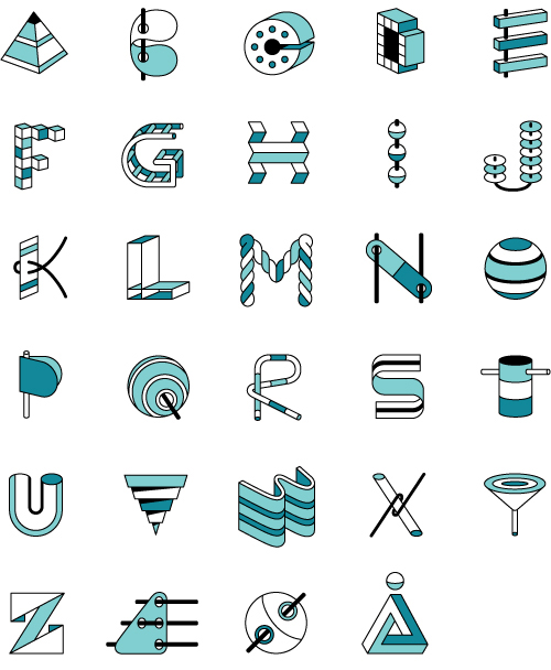
The goal of this personal project, with a self imposed deadline of completing it in a single day, was to create an alphabet where each letter had a 3D property without too many repeating elements. With a little lunchtime feedback from Jip Jip (no, I cannot make the N look like a CAT…not even a POINTY cat), the finish line was reached with fairly good results.
Let me tell you a story. A story of magic and chance and hope and five friendly girls who one afternoon chose to spend a few hours writing messages in a bottle.
Magic. Last year, a girl wrote a message in a bottle. It was a love letter, she was searching, and it was found. A man in a kayak was out enjoying the fjord when he spied her bottle, a surprise from his usual solitary trips at sea. Unfortunately, he was already spoken for – a married man who could not accept the questions posed in her message. But he wanted to help this girl and promised to send the bottle on its way again the next time he was out on the open waters.
Months went by. The girl forgot about her message in a bottle. One day she received an email from a Danish boy who was wind surfing in Tenerife. He too had found the bottle out on the open water. At first thinking it was a joke, he took a picture of it and asked “are you real?”. A letter written by a Danish girl found by a Danish boy so many miles from home seemed like a stretch. But there was nothing false about it, so they started to write back and forth.
Close up lettering.
Chance. The boy and girl met, even though he was living in Barcelona and she in Copenhagen. But while the circumstances were exciting, the pressure of fate was too much and reality unfolded in a more mundane way than Hollywood might have written. They lived so far away, they were unsure, they decided to abstain from pursuing further communication after their first meeting. Let down, both returned to their everyday lives.
Hungry little fish, keep your fins off of my message.
Hope. Not to be discouraged, she returned the next year with the same group of girls to drink another bottle of wine, pour words onto a page and throw it into the big blue sea. Perhaps the message in a bottle itself won’t find what she is looking for. But the process and the action held significance, and being clear in what you seek is often the first step in finding it.
It's really pretty simple, writing a letter in a bottle (click image to zoom).
The flaskepostdating event was organized by Ditte and Lotte, who were inspired to write messages in a bottle after they found one on a beach in Denmark and wondered – what if this message had come from somebody important, meant just for them? Read more about the history and use of messages in a bottle on Wikipedia. The story about the girl and the boy was recounted as one of many past success stories that stemmed from a flaskepostdating event. See you there this coming summer?
I remember as a child an activity my mother would put before my sister and I when she wanted our full concentration on something – i.e., peace and quiet. Bead artwork, where you place small plastic beads with holes in them on a plastic form, after which you melt them with an iron. The final product was never really worth keeping, but I imagine the hours it kept the two of us occupied were priceless.
So when a friend of mine recently went on a bead buying binge at a craft store, I was gripped by nostalgia and later a slight streak of OCD when I started on some bead artwork again. The process was both frustrating and meditative, but after some warm up I was able to pick up two beads at once to place on the gridded plate.
The first plate I made tested my skills in one-bit typography in spelling Oink, Moo, Juhu. The background became a gradient to create the contrast needed for the type to stand out, and because the bead bags I had were a random blend of colors, so there wasn’t enough of one color to make a solid color background. The second plate used all the beads I didn’t use for the first plate in a much simpler patchwork composition.
The words are much easier to see if you close one eye and slightly blur your vision. I suppose a composition with 1500 beads would have given a crisper image, but I also would have had to put my wrist in traction afterwards.
"Oink, Moo, Juhu" and patchwork bead plates at 100% size.
Each of the little plastic beads is 2.5mm in diameter. That is very very small. So small, that picking up beads with your fingers would be near impossible unless you were a hamster. So out came the tweezers to assemble the 784 beads per plate. The bag of beads cost 10 kroner, so I’d say I got my money’s worth based on hours of entertainment per bag.
While making these I also had plenty of time to invent a new party game. Best played in the wee hours after guests are sufficiently inebriated to think just about anything is amusing, I call it “Sweaty Palms”. The rules are:
1. Take a plate of plastic beads
2. Take your hand and place flat on beads
3. Lift your hand and see how many beads stick to your sweaty palm
4. The player with the most beads (by count or by weight), wins the game!
Finally, a game that gives sweaty people the upper hand.
Created for an in-store campaign to promote the health benefits of eating fish, here is some lettering I made for Alaska Seafood. Here fishy fishy fishy…
One of the larger projects I helped on this past summer while completing a freelance contract at Bessermachen was an internal packaging project. It was made for Bessermachen’s parent company, Brandhouse, and was the third annual edition of “CWA”. Twelve archetypes are used communicate Brandhouse’s way of approaching brands, and the delivery method is a series of chocolate packaging. My main role was to develop the typography that portrayed these archetypes.
Choosing or creating a typeface to convey an archetype, and having each archetype be distinct within the group, for an audience that isn’t designers is a good (challenging) challenge. The twelve archetypes included: The Everyman, The Innocent, The Entertainer , The Creator, The King, The Hero, The Adventurer, The Rebel, The Wise Man, The Caregiver, The Magician, and The Seducer.
To see the full case study and packaging series by Bessermachen, visit their website, or check out the packaging featured on the blog The Dieline.
Here is a typography project I worked on for the Portland, OR interactive agency Pop Art for an app called Hauler Challenge (available here). Yes, you can pretend to race Freightliner trucks, the official hauler of NASCAR®. This is one of those things I never would have known existed if I weren’t a designer – being asked to work on such diverse topics as veganism, freight trucks, and monster vending machines is a true pro of this job. Here it is in all it’s glory and genre-fulfilling greatness – CUSTOM SHINY FAST TRUCKER TYPE!
Just in time for the holidays, here is a board game illustration I did for Xplane, a Portland, OR based company that focuses on Business Design Thinking. Basically they make strategies for businesses in visual format, often resulting in interesting diagrams and infographics. The client-provided concept was Chutes and Ladders, which was to be reinterpreted with the theme “corporate holiday party”.
Chutes and Ladders, Xplane Holiday Style
The piece was sent out to clients so they could fill any pre-holiday work breaks with a quick game, trying to avoid the open bottle of Jagermeister and vying to make a good impression with the boss’ spouse. Here is an 11×17 (tabloid) PDF of the game if you’d like to play as well. Try my silent dice.
Close up typography.
This was a fun project because Xplane works with a specific process that involves lots of upfront sketching and getting clear approval at each step of the project. After the initial sketch had been approved it was smooth sailing through the illustration and revision phases. Plus, my pioneer rabbit got to make a sneak appearance under the chute “inappropriate use of the office copy machine”. Poor bunny.
Here is a quick typography study I used to practice for an upcoming project. It’s a funny word when you think about it, that those three letters can be put together in a such a silly looking combination to create an exclamation expressing triumph, approval, or encouragement.
Here are four things I found while thrifting on Fyn, one of Denmark’s many many islands. The shop I stopped by was sadly closing by the month’s end since some new construction in town had decreased foot traffic. Ah well, captured here for internet eternity…
Techno Zoo, where cats always look surprised.Everything looks more charming with strange characters and foreign spellings.Looks like Pippi needs some Ritalin.