Graffiti Type


AIGA Portland is currently showing an exhibition of letters inspired by graffiti as part of Design Week Portland. The 26 letters of the alphabet, each interpreted by a different artist, are on display at Ziba HQ in Portland, Oregon, and my letter K is among them. The show is in conjunction with the premiere of GRAFT by director Jared Levy.
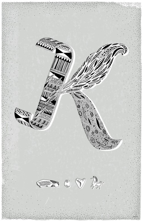
Intricate hand drawn letter K with tribal, feather and mitochondrial patterns.
The letter K.

I’ve recently been drawing things with a tribal and mitochondrial patterns in them. The style felt appropriate to the theme – interpreted as a sort of original graffiti, a mish mash of elemental inspiration. I also signed off my letter with my personal tag in hieroglyphics: a fossilized leaf from Oregon, a rock with a hole in it found on a Danish beach, a heart shaped rock my mom found and gave me, and a figurine of the Black Stallion.

Hand drawn hieroglyphs, three rocks and a horse. The left most rock is a petrified leaf from John Day / Fossil area in Oregon. The horse is a figurine from the Black Stallion movie.
Little personal hieroglyphics - three rocks and a horse.

Drawing patterns in things has become a sort of relaxing meditation time for me – once the basic form and complexity is decided, it’s pure patience and several CDs of Kurt Vile / Carla Bruni / Wilco to reach the end result.
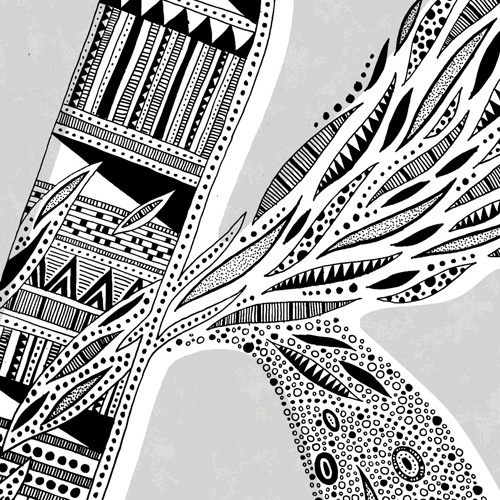
Close up of patterns.

A Flickr set of the entire alphabet can be seen here of the below participating artists.

A – Aaron Rayburn, Portland
B – Jason Bacon, Portland
C – Scrappers, Hawaii
D – Mary Kate McDevit, Portland
E – CERN ONE, NYC
F – Cory Say, Garland, TX
G – Carolyn Sewell, Washington DC
H – Will Miller, Chicago
I – Rachel Caldwell, Philadelphia
J – Taka Sudo, BC, Canada
K – Mette Hornung Rankin, Copenhagen / Portland
L – Christopher Derek Bruno, Seattle
M – Lotta Nieminen, NYC
N – Roxanne Danner, Los Angeles
O – Keegan Onefoot-Wenkman, Portland
P – Bethany Ng, Portland / W+K12
Q – Tom O’Toole, Portland
R – Thomas Bradley, Portland
S – Dana Woulfe, Boston
T – Alanna MacGowan & Cassie Klingler, Seattle / New York
U – Anne Ulku, Minneapolis
V – Dave Foster, The Netherlands
W – Adam Garcia, Portland
X – Zach Johnsen, Portland
Y – Blaine Fontana, Portland
Z – Stephen Holding, Brooklyn
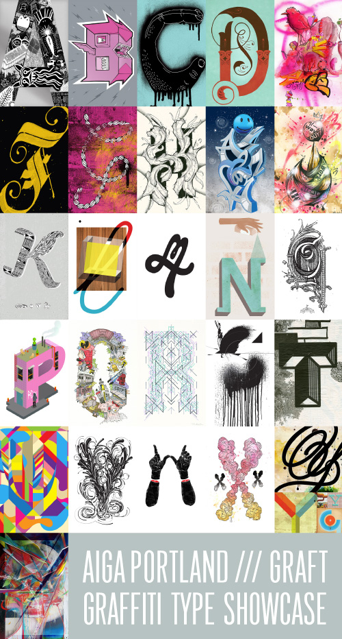
Collaborative alphabet.

Great Things From Portland


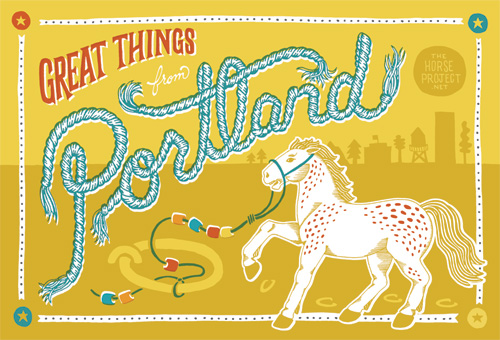
A while back, Portland every-where-man Jason Sturgill asked if I would contribute a postcard design to help promote Pinball Publishing’s new 4 color printing process called Print Pinball. I’m a big fan of Pinball, and was also psyched to collaborate in the series with other local artists Adam Garcia, Jen Wick, Kate Bingaman-Burt, and Thomas Bradley.

The theme was Great Things From Portland, and I didn’t have to dig very deep to pick one of my favorite Portland quirks: the tiny toy horses that are tied to old historic hitching posts around the city. Chronicled on The Horse Project and on Flickr, every time I come across one of these equines in person I feel a little bit happier inside my 12-year-old horse-crazy girl memory.

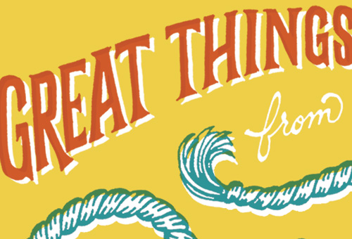
Great Thing from Portland postcard series for Pinball Publishing, featuring a horse from the Horse Project with some rope type and a Portland skyline.
Great Things...
Great Thing from Portland postcard series for Pinball Publishing, featuring a horse from the Horse Project with some rope type and a Portland skyline.
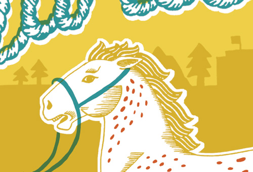
Wild appy stallion with halter.
Great Thing from Portland postcard series for Pinball Publishing, featuring a horse from the Horse Project with some rope type and a Portland skyline.
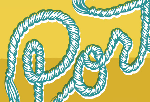
Rope typography starts...
Great Thing from Portland postcard series for Pinball Publishing, featuring a horse from the Horse Project with some rope type and a Portland skyline.
Great Things from Portland postcard design for Pinball Publishing series.

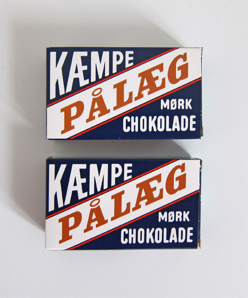
Kæmpe Pålæg Packaging


When my roommate brought home this kæmpe pålæg chokolade and a giant loaf of fresh french bread, then offered that I have some, I nearly squealed in delight. Oh wait, I did squeal in delight.

First off, these small thin pieces of chocolate hold special memories for me…my Danish grandmother would always let my sister and I have a special treat sandwich after our regular lunch of rye bread and pickled herring that consisted of pålæg chokolade on a buttered piece of white bread. In our minds and bellies this was a slice of heaven on top of a slice of heaven, and we called it a Mormor Mad (grandmother sandwich).

Secondly, look at that packaging! Unabashedly simplistic and retro in all the right ways: a strong diagonal and utilitarian color palette, rad Danish letters, and exactly duplicate front and back designs (who needs to know more than that this small cardboard box contains LARGE DARK CHOCOLATE TO PUT ON SANDWICHES?).

I love it. I wish it were a poster. Maybe it will be someday.

Tom's kæmpe pålæg mørk chokolade, chocolate pieces for putting on white bread.

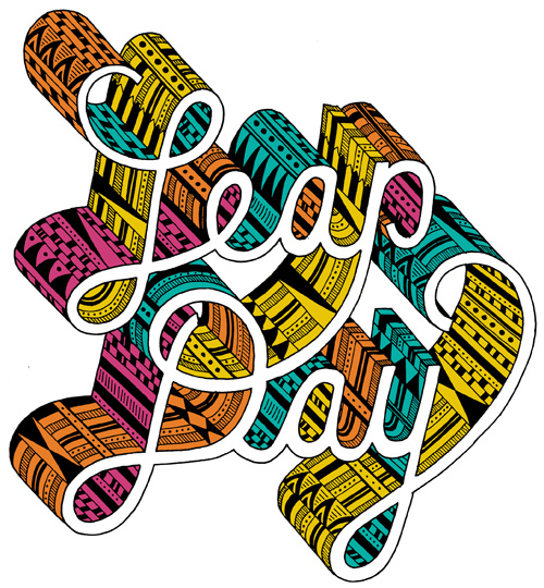
Leap Day


Black outlined LEAP DAY type with various pattern fills such as dots, circles, lines, stripes and triangles. 3D type is filled with magenta, orange, yellow and teal. Welcome to the 80s!

A week ago today was leap day, February 29th, the day that occurs once every four years on a leap year. Good thing we have smart scientist people to tell us that the Earth isn’t always exactly on time, and we need to make up for it every fourth year and every couple of decades with an extra day.

A week ago today I also made a leap. A leap of taking the Bureau abroad to see if the independent designer lifestyle and running a small business could really transcend continents. A leap to see what the next year in life will bring me. And, boy howdy, so far it has brought me a 600% increase in pickled herring consumption.

Leap year also made me pause to consider the markers we all use to gauge time. It’s easy to get bogged down in daily routine, so I choose to look at these anomalies in an otherwise flatline of days and months and years as a time to look back, and look forward. Take stock, rearrange, and make some plans for what you want to accomplish.

What leaps do you want to take?

Between Here and There


A few weeks ago a friend and I were talking about the fractions of life – how events can shift your course depending on the smallest difference in circumstance or how you handle a situation. I feel this acutely every time I walk around my work neighborhood in Portland, a pocket between the Pearl and Chinatown. In the Pearl, well-to-dos get their nails buffed and highlights touched up, while a few blocks away in Chinatown down-on-their-lucks wait in line for a bowl of soup.

Fractions are funny, my friend and I agreed, in that they are intangible and hard to measure until the repercussions of an action are fully unfurled, and sometimes only become apparent when you stack each fraction of change on top of the other. I am somewhere between these two worlds of well-to-do and down-on-my-luck, but walking the line down 5th Street in Chinatown makes me wonder how many steps there actually are, between here and there. #occupywallstreet

Well Vegan (Hold the Pickled Herring)


The most recent project I’ve been working on, Well Vegan, just launched at the New Year. I enjoy eating healthy food frequently and on a regular basis, so when my friend Katie asked if I would help make it easier for vegans to do the same, I jumped on board. I’m not a vegan, but I have some vegan friends, and seeing some of them struggle with finding a variety of things to make that were also meeting their nutritional needs made this project hit close to home. Katie’s personal motivation to start Well Vegan stemmed from having her young daughter suffer from food allergies that were only ameliorated by switching to a vegan diet.

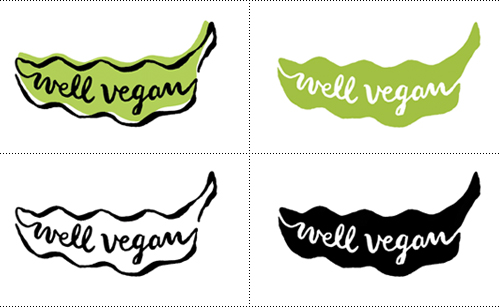
The first task was to create a logo for Well Vegan. After a short design brainstorm, the theme of “it’s in the greens” bubbled to the top, and resulted in a happy pea pod bursting with, well, veganism.

Well Vegan logo in various color ways.

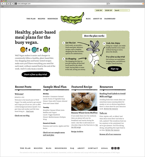
The second and main task was to design a website. Katie wanted the site to reflect her healthy, simple, and homespun take on veganism. Visually, this is reflected by using the approachable and versatile font Skolar alongside rough-edged and spare illustrations.

The font Skolar pared with a simple illustration style.

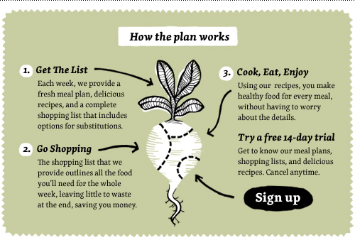
Basically, Well Vegan is a repository of vegan recipes that are partnered with shopping lists and weekly meal plans that take all the hassle out of planning how you are going to sustain yourself. Sure, some people take joy in shopping and figuring out each and every meal, but others just want to get the job done without spending hours poring over recipe books and making lists. Using Well Vegan for $9.99 a month gives you all the tools necessary for eating home-cooked meals most every day. And if that’s what it takes for some vegans to eat healthier on a regular basis, I’m all for it.

How the Well Vegan plan works. Pretty simple, and then you're full. Also, beets are pretty rad.

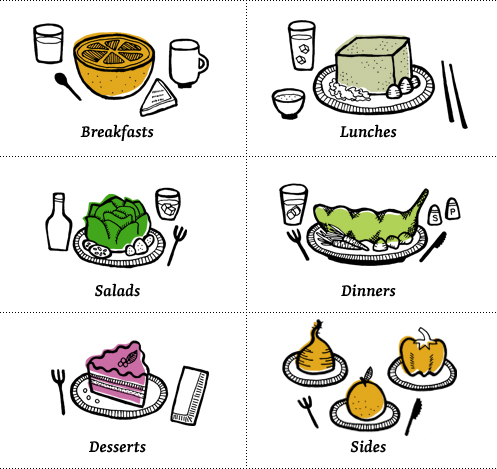
Some people might have the misconception that vegan food is bland, but with the right recipes it can be anything but. A series of illustrations were made to let the ingredients take center stage and focus on the uncomplicated nature of the vegan diet. I’m not sure eating a tofu cube that large is realistic, but it gets the point across! Send me some giant chopsticks and I’ll let you know how it goes.

Food for giants! Or very hungry vegans!

I even got to use my new favorite phrase on the error screen, making this my favorite error screen second only to the consolation trout I made for Under the Table with Jen.

If you’re interested in checking out the site and what Well Vegan has to offer, visit www.wellvegan.com, or follow them on twitter at @wellvegan.

Story Cards


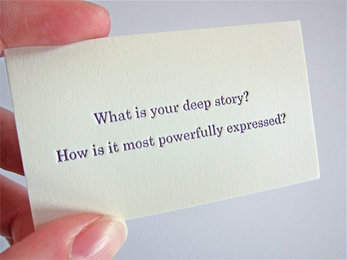
As a follow up to the business cards I designed for Jelly Helm Studio, here are some additional cards that show a little bit about how the studio approaches things. All of the cards were letter pressed on cream colored Neenah Classic Crest #165 cover.

Good questions.

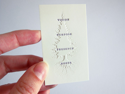
The cards were printed at Brown Printing, where they were very helpful in trying out an unusual combination of printing techniques: first embossing (raising) the paper in a tree shape, and then letter pressing text (pushing the paper down) on top of the tree shape. For all that pushing and pulling of paper with the text being pressed into both the tree and non-tree area, it turned out pretty well.

A very advanced "who, what, where, when, how" diagram.

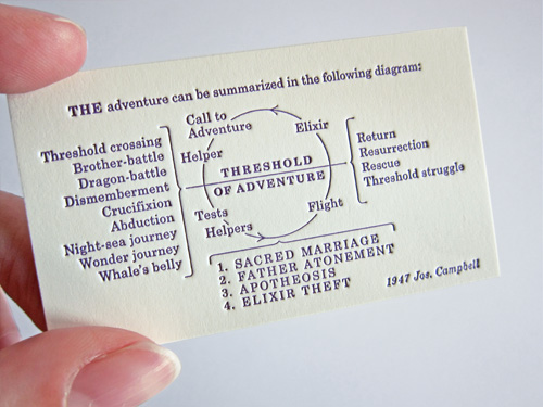
My favorite of the three cards is this reproduction of a diagram by Joseph Campbell. Wikipedia says “…his work is vast, covering many aspects of the human experience”. No small task to fit onto a 1.75×3 inch card, even with some rejiggering on our end so the large original diagram translated well to a tiny version of itself.

This should get you through most situations.

The Goodie Monster Is Here


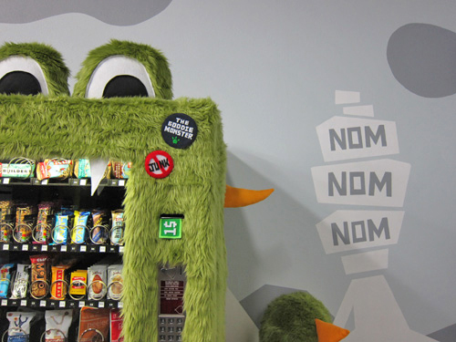
Just in time for Halloween! Over the weekend my friend Mark and I put the finishing touches on the Goodie Monster: a vending machine filled with healthy, tasty snacks. Not only does it taste good, it looks good too. Check out the full project process and see more pictures of us sewing and painting nonstop to create a green fur-clad monster complete with a mountainous environment where pears fly south for the winter. Read more >>