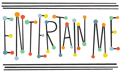
Entertain Me Typography
When all the deadlines are delivered and it is Friday afternoon, the best wind down for a week is sometimes to make some off-the-cuff typography. This time around it was some 50’s circus retro broadway billboard type screaming…
Love, Hanna
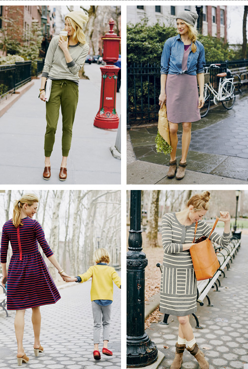
The last few years I have lettered phrases for Hanna Andersson’s catalogue (see it here and here). So when the Portland-based childrenswear company with Swedish roots decided to expand with a new line of clothing for mothers called “love, hanna”, they asked me to letter the logo in a similar style.
The usually jumpy and quirky lettering style was toned down a bit for the logo for consistency and legibility, and a Scandinavian woven heart icon was added under the art direction of Lynda Hodge, who also steered the branding of the line.
The line follows suite to their kid’s line motto of “let kids be kids” with classic basics that wear well – definitely not “mom jeans” while still being comfy and versatile.
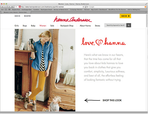
Hanna Andersson is known for their super soft and quality kidswear, so it’s no surprise that the blogosphere is picking up on the new line of easy but still stylish clothes for mom.
Cake Typography
Outfit No. 60
Shortcut
In the shared creative office space where I work, there is an old freight elevator in the middle of the room. It is surrounded by 30-foot peaked ceilings, raw ceiling beams, a view into an inner-courtyard typical of Copenhagen buildings, and all the stark and minimalistic Danish interior decorating trappings such as black and white lights, decor and social areas.
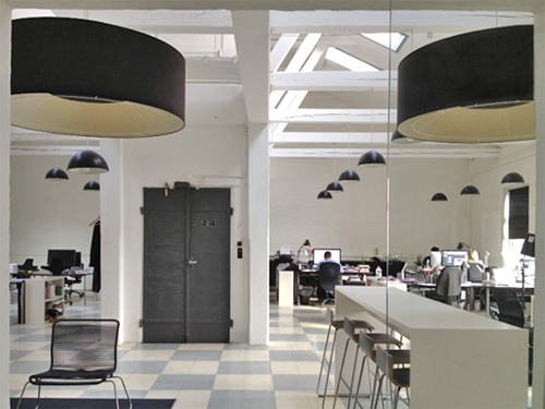
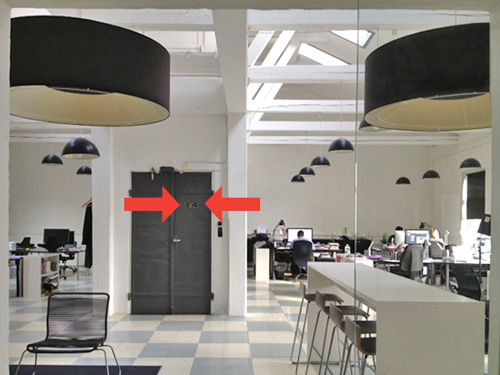
The elevator isn’t used more than once in a blue moon to haul something heavy up to the top floor – I don’t think anybody really notices it. But when I enter the light-filled room and near the elevator door on the the way to my desk each day I’m presented with this small sign, which for a second causes me pause.
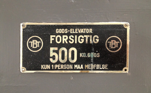
In Danish, it’s nothing special – a “goods elevator”. But in Danglish, a special blend of Danish and English which I use to navigate my multi-culti existence, this is GOD’S ELEVATOR. The full Danglish translation might read:
God’s Elevator
CAUTION
500 kg Gods
Only 1 person may accompany
Gather round all you sinners, all you thieves – I’m starting a new side business selling tickets to heaven. More details to follow once I figure out the logistics. But if I institute a price point that one might expect on such a service, I should be able to retire early.
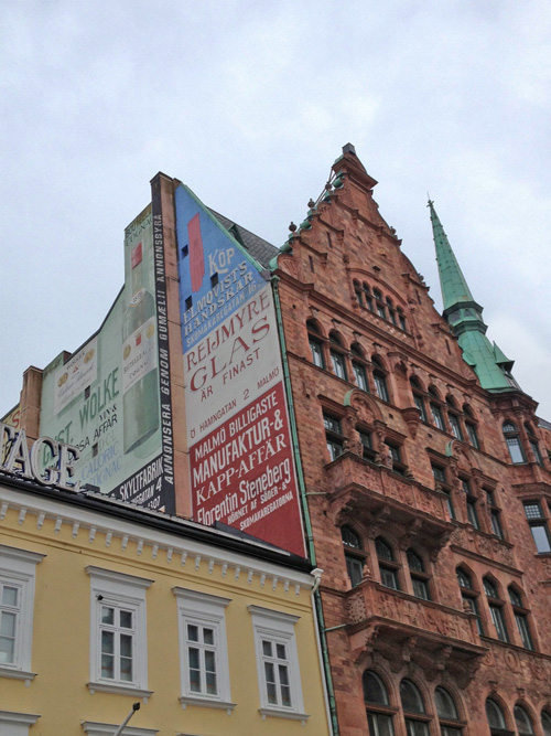
Malmø Sweden Facades
One Free Epiphany
This phrase popped into my head immediately upon receiving a free slip of paper from a lady on the street proclaiming that there was still a chance for my salvation, if only…
The wagging finger of of judgement turned me off, I thanked her politely, and went on my way. What did I want instead? Perhaps change agents for the lord should be giving out “one free epiphany” slips. Until that starts happening, I made one for you…
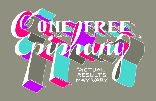
Actual results may vary… Continue reading “One Free Epiphany”
Guatemala Fairtrade Logo
Sometimes a client has a really clear idea of they want. When this is communicated upfront, it can be a great thing – focusing the design efforts of a project in the right direction or providing a starting point to finding a good solution. This was the case on a logo made for Guatemala Fairtrade.
After returning from a long stay abroad in Guatemala and connecting with Maya Traditions Foundation, Ditte Tøfting-Kristiansen was ready to start her own business selling fair-trade Guatemalan products in Denmark. She knew that she wanted the logo to reflect the handmade nature of the products and connect with the town she stayed in, which used a cat as their local embroidery symbol.
Using the client-provided inspiration gave plenty of options within a framework to come up with an embroidered cat icon and hand lettered brush type as the logo. Below are two images to show a great example of visual ‘input’ and ‘output’.
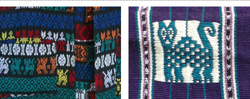
Guatemala Fairtrade currently is on Facebook and has an online shop selling scarves, shoes, bags and other fairtrade items.
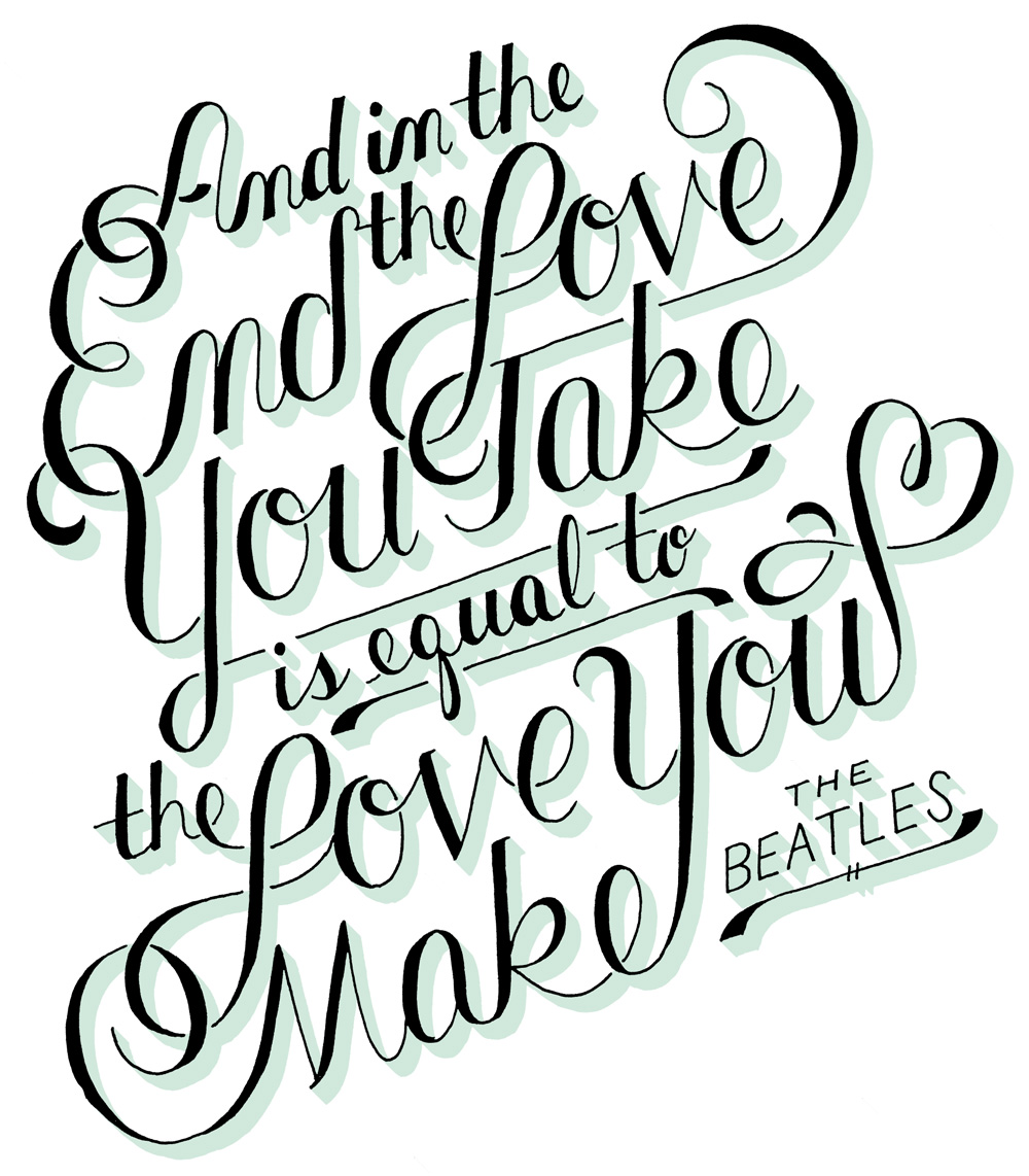
The End
Between designing websites and branding and packaging and logos and books oh my, sometimes it’s nice to take a meditative break and work on some hand drawn typography. This session used one of my favorite Beatle’s quotes from the song The End to practice my script type lettering skills – “and in the end, the love you take is equal to the love you make”. It took four tracing iterations to figure out layout, script details and inking…