The Bad Touch
A follow up to Jungle Animal Rap, this idea started and ended within 3 seconds when the song The Bad Touch popped into my head and I saw this animal collage in my head. The obvious next step is to get it out on paper or screen as fast as possible before you think it’s a bad idea. So here ya go (jury is still out)!
The typography is a hand-drawn creation blending the attributes of Knockout Junior Liteweight and Block Berthold. I wonder if Hoefler & Co ever considered releasing a version called “Knockout Baby Steps”.
Valentine Tats
I found this sketch made during a drawing evening with friends around Valentine’s Day and figured better late than never! So here are some cliche V-Day tattoos that should take care of every stage of your romantic relationship(s). Unless you’re unrealistically optimistic, why not buy in bulk?
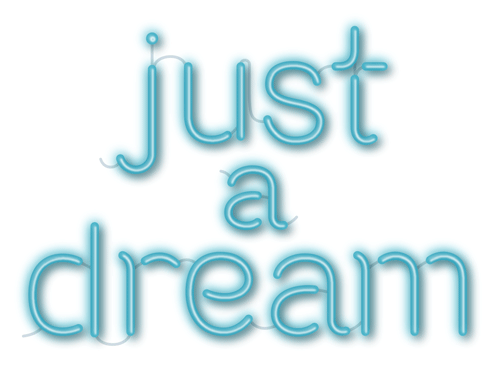
Just (a) Dream Type
Monster Drawing Rally
Recently I participated in a Monster Drawing Rally at the Portland Art Museum as a fundraiser for kids arts programs. Seventy-five artists donated their time and art in three 1-hour drawing bouts. After each drawing was completed it went up for auction for a flat $35. I was on shift #3 and it was a test of speed and dexterity to draw in the dusk while passerby and other ambitious artists made the table jiggle from bumping it or vigorously erasing.
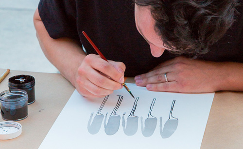
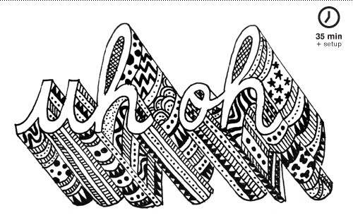
I surprised myself and cranked out two typographic pattern pieces. The first one was from my daughter’s favorite word du jour (uh oh) took 35 minutes plus the set up time of getting my materials out (Office Depot printer paper on a clipboard and a.01 micron pen). The second (oh my) was completed in 20, the last 5 being used to quickly decide on how to most efficiently fill up the type sections (big dots and sub par stippling).
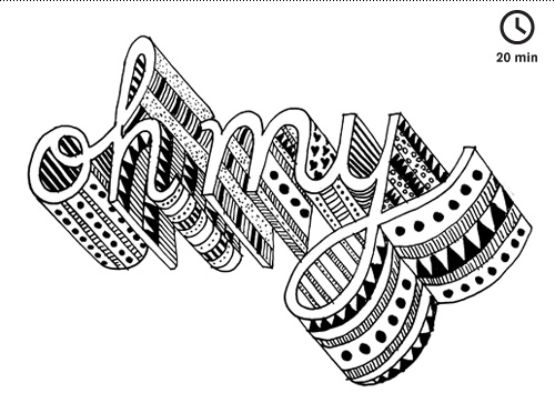
Kids had fun giving suggestions on the patterns to fill the sections with (hearts, zig zags, leopard print, stars). Usually these typographic terrain pieces are two to three times bigger and take at least a few hours to complete, or more, if I plan them out in advance. It was fun to see that I could do this type of drawing without planning it at all, although the results also showed the haste and split second decision making that took place. While not super pro, it was super fun, and I hope more of these kinds of events happen.
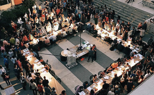
Event Documentation
Photo set by Cody Maxwell | Video by Paul Searle
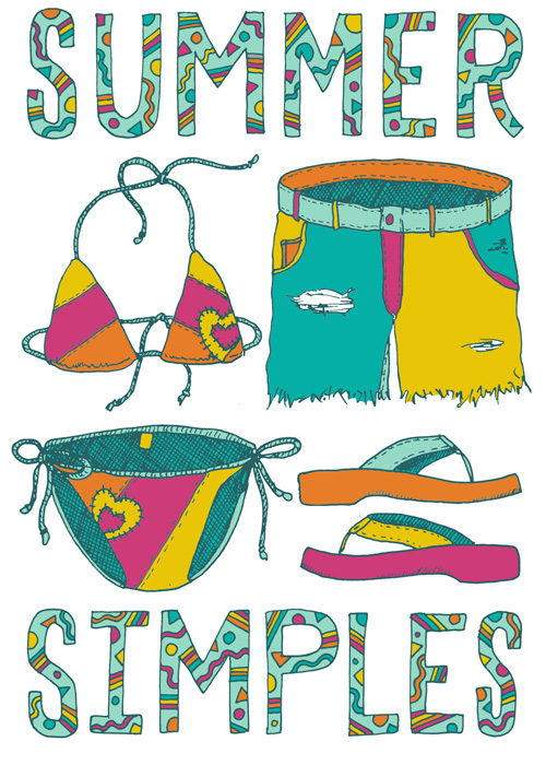
Summer Simples
While this outfit might seem a bit fantastical in coloring, I owned a pair of shorts in the mid-90s that are very similar to this illustrated pair. What is even more amazing than that pair of shorts is the pride with which I wore them because they were so cutting edge in my pre-teen mind (the same mind that thought it was ok to wear sweatpants tucked into cowboy boots because A) sweats are comfy and B) I like cowboy boots).
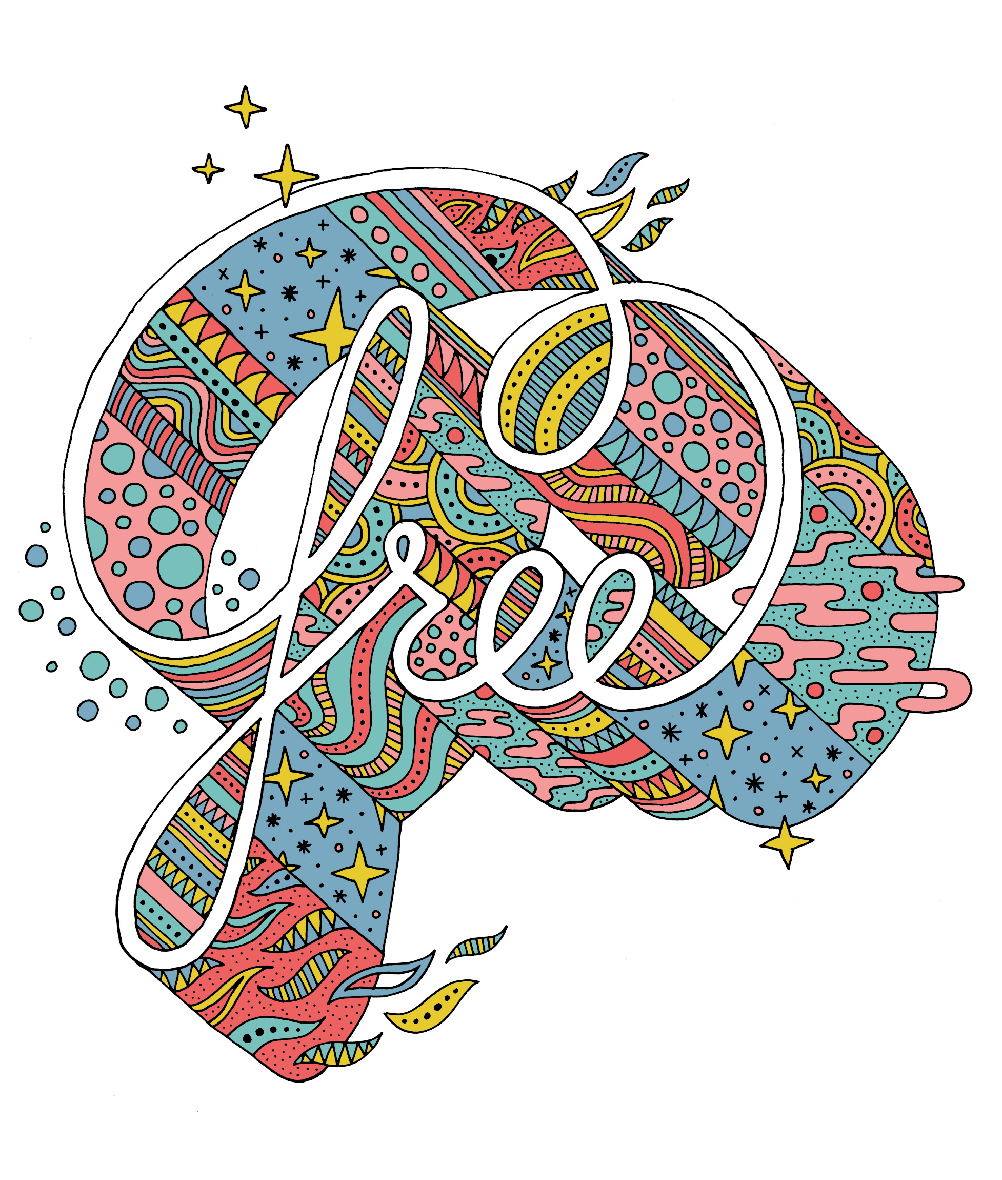
Free Typography
Over the years I’ve worked on pairing type and pattern together in my illustration in various levels of complexity. Of all the kinds of typographic illustration and tests that I do, this is the style I keep coming back to when given carte blanche. Here is the latest iteration of what I am finding rewarding in this realm, and a sidebar story on how it was put to the test in public at the Portland Art Museum’s monster drawing rally.
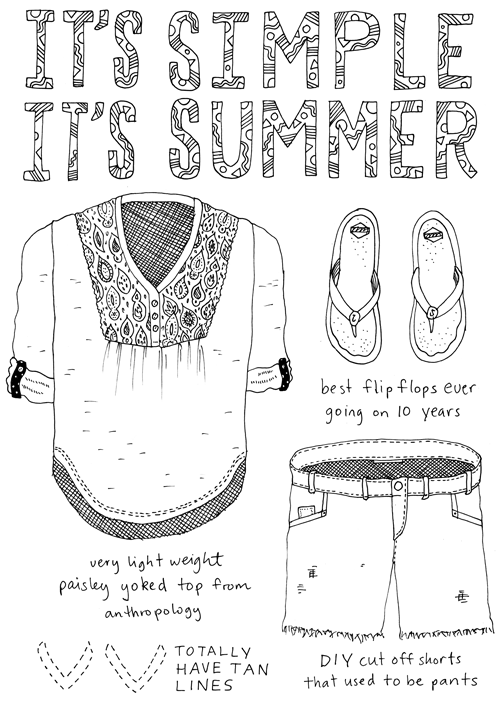
Outfit No. 65
SHARE: Typographic Fire Doodle
Last night I went to an improv creator’s night called SHARE. The format of the event involves bringing together a group of creatives, giving them a one-word prompt, and then seeing what they make over the course of 2 hours that is related to the word. At the end, each person shares what they have made.
I had attended several years before and made some felt collages. This time I decided to use the evening as an exercise in practicing a certain style of illustration. The only materials I brought with me were pencils & pens, and a light table.
The prompt: FIRE.
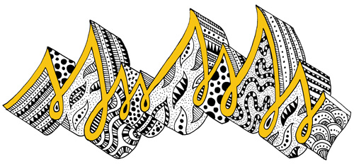
I immediately thought of some music quotes that used the word fire, and wanted to make a typographic illustration. After some sketching it became clear that two hours wasn’t enough time to complete this idea, so I switched to doodling instead. The doodles felt a bit like typography in their rhythmic nature, so I decided to make a representation of fire that felt typographic.
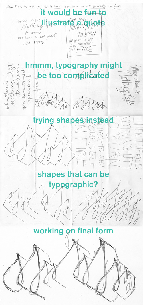
I spent about 15 minutes pre-snacking, 45 minutes sketching, a 5 minute snack break, 45 minutes illustrating, and 10 minutes staring out the window. While illustrating, I kept track of how long each panel took, so I would be sure I could finish in time. This is also where the motto “when in doubt, stipple” was put into practice. Here is the finished illustration created from the prompt FIRE.
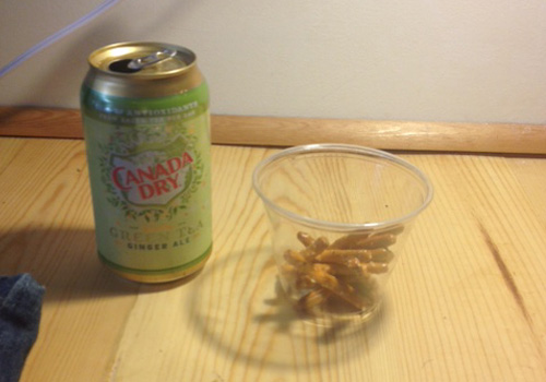
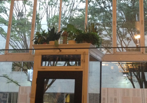
While drawing, I had a snack that reminded me of airplane trips. When I was done, I took additional advantage of the snack table and looked out the very tall windows and doortop plant arrangement.
SHARE #23 participants included:
Dave Benz, artist
Brad Cohen, writer
Alex Harris, designer
Kathleen Lane, writer
Katherine McDowell, visual artist
Leann O’Rourke, photographer
Alyson Osborn, actor
Jennifer Rabin, conceptual artist/writer
Mette Hornung Rankin, designer/illustrator
Liz Scott, writer
Toni Tabora-Roberts, multi
Cara Ungar, thinker
Bill Wadhams, musician
Gary Wiseman, artist
SHARE is organized by Margaret Malone and Kathleen Lane.
Hip Hip Portland
As a native Oregonian who grew up on the east side where tumbleweeds blow and it took an hour to drive to the “local” movie theater, Portland was the mecca of civilization. Malls, stoplights, and my grandma’s house were all big city attractions that wowed me during childhood visits in the 80s and 90s. As an adult I moved to Portland after getting degreed to chase the creative dream. So far so good.
After a solid stretch in Portland, I moved to Copenhagen Denmark for a few years. When I returned to Portland, my memory of the up-and-coming town was forced to reconcile with all the changes that had occurred while away. Now, Portland was…hip. So, so hip. It was no longer just a simple place to be, but self aware.
So here’s a typographic ode to my burg that has changed so much over the last 3 decades for good and for bad. I still love you Portland, just please don’t get too big for your britches.