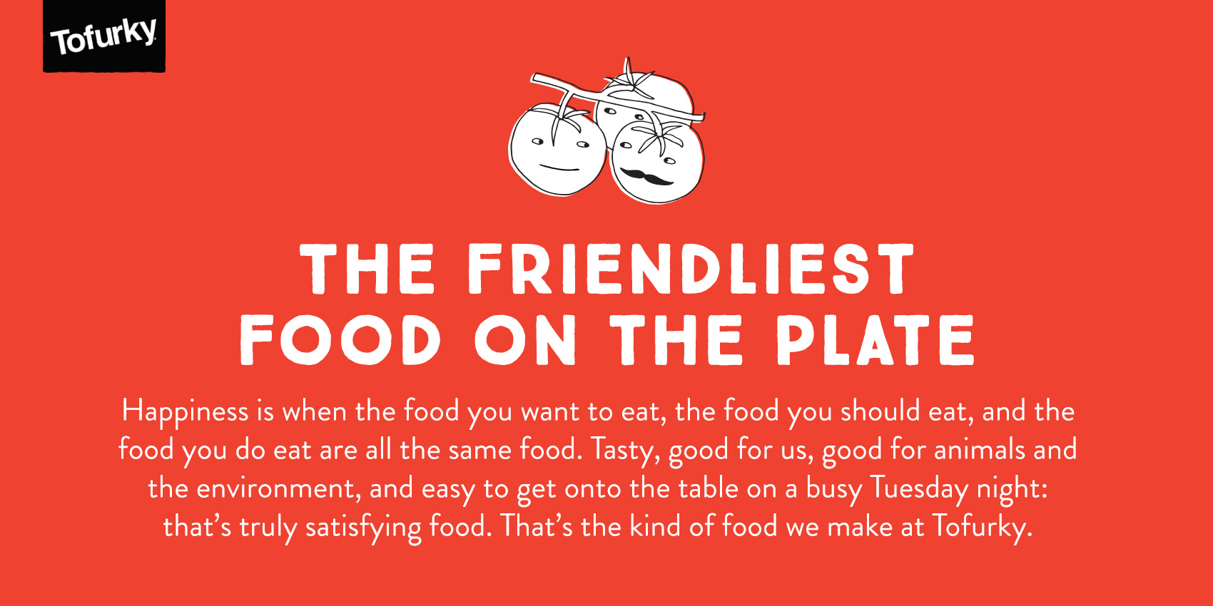
This summer I’ve been working with Tofurky on various projects, all rated very high on the level of fun had. Tofurky is a local company from Hood River, Oregon that makes meat-alternative products, including their inaugural product of a non-Turkey that also gave the company its name (a spoonerism of FAUX and TURKEY). While not a vegetarian myself, the brand resonates with me because of its positive and intentional mission as well as the playful way they communicate it. Food should be fun after all!
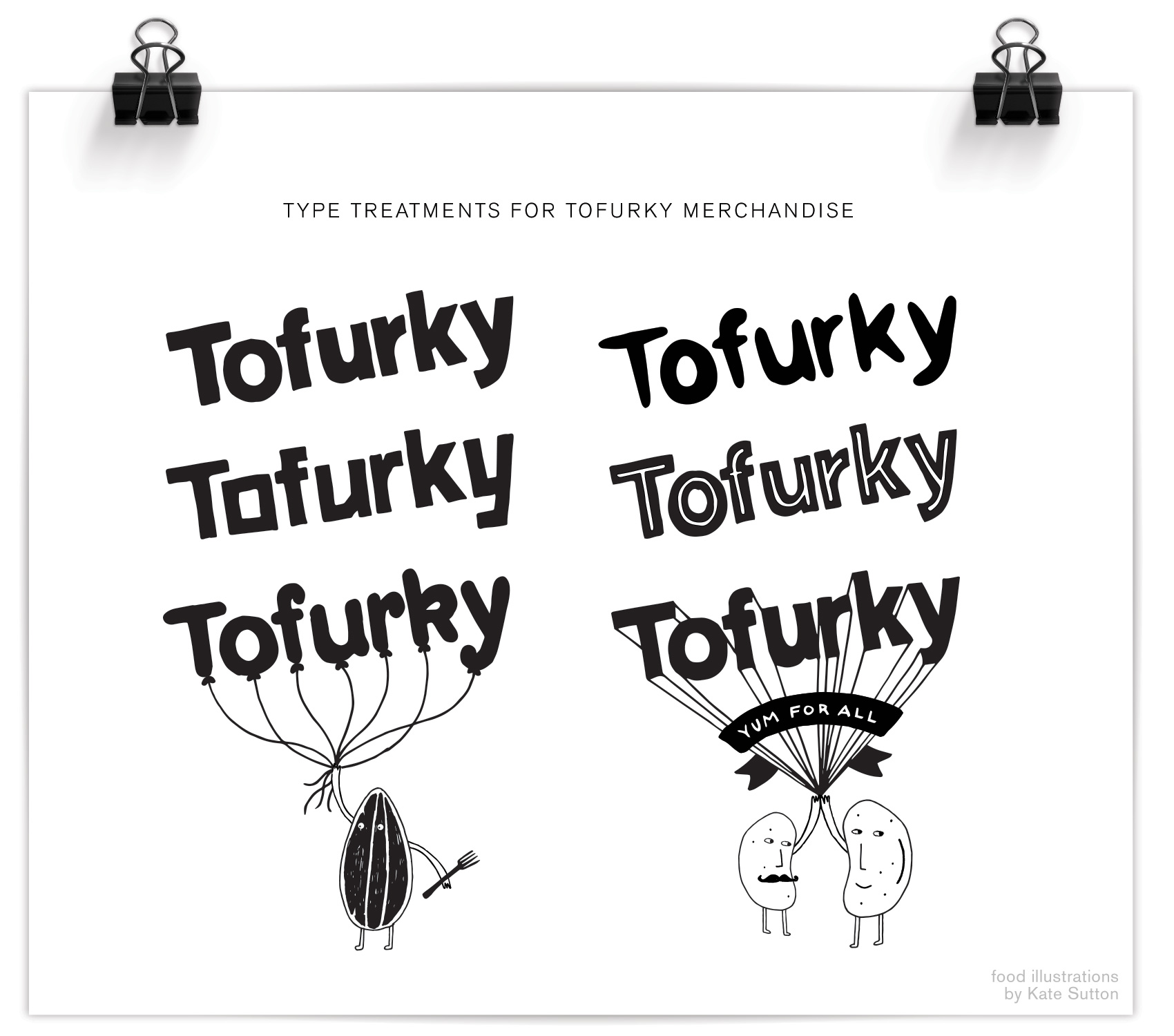
The first part of the project was to make some logo spin-offs so there was a casual and unique way to insert the Tofurky brand into secondary branding without feeling too serious. Two sets of Tofurky “nametags” were created, the first of which is shown below. For this series the defining feature was mimicking the angle and basic form of the Tofurky logo, but altering the letterforms so they are more playful. It also involved working with Tofurky’s current brand assets, which included an awesome set of illustrations done by Kate Sutton of animals, trees and little beans and lentils just doing their thing. Integrating these brand assets into the new work was both fun and a good way to illustrate in a specific style. Success? Well I’ve never seen a pair of beans high-five that hard, so yeah.
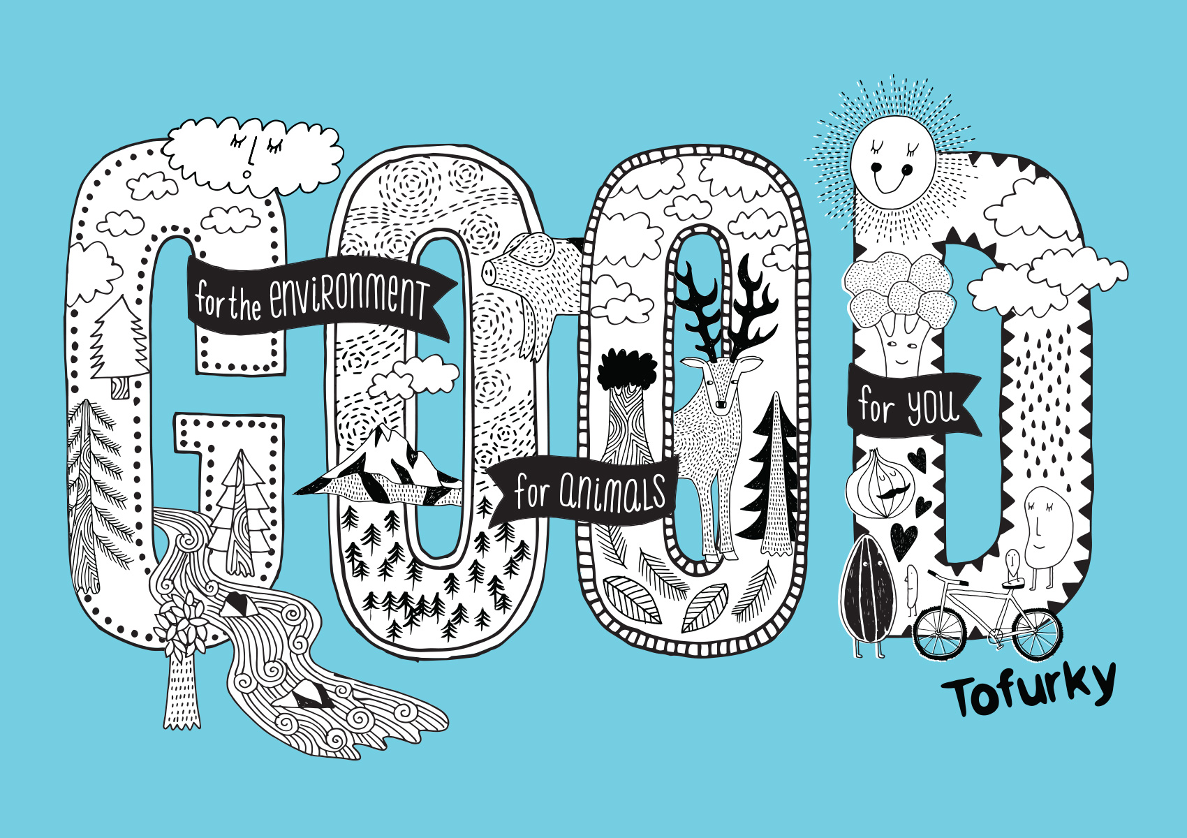
The next step of the project was to build a library of hand drawn lettering assets to use in their merchandise and promotion. Working with independent creative director Gary Huck, we made a slew of brand sayings and lettering/illustration combos, the first of which is being used on a tote bag and is a great representation of the Tofurky mindset: good for people, good for animals, and good for the environment. Hard to argue with that. We focused on the repeated word so it was a quick read and compact compositionally, with details of the saying appearing in banners around the main message: GOOD. A combination of Kate’s and my illustration fill the GOOD type so it’s a complete mash-up of type & illustration. My favorite kind!
That’s it for now – stay tuned for more work from the Tofurky lettering project…