Monster Drawing Rally – Dream Dust Test


Tomorrow evening on Friday, July 14th the Portland Art Museum will host Portland’s third annual Monster Drawing Rally in its courtyard from 6-9:30pm. The event entails three 1-hour rounds of 25 artists creating art that is immediately put up for auction. All pieces are a flat $35 and proceeds fund free school programs at the museum. In addition to the live drawing auction, there is a kids drawing activity and food, drinks & music.

I’ve participated as a contributing artist the last two years and am excited to draw for a third year. This year I decided to veer away from the usual paper and pens – instead I’ll draw on tiny 3D boxes, creating packaging for contents you might not be able to pick up at your local SuperMart. Since I’ll have only an hour to work, a practice round was needed to time how long it took to complete a simple packaging design. Most of my ink drawings take at least several hours to make, which is not scalable to this event’s timeframe. “Dream Dust” was created in about 15 minutes, so I hope to knock out four boxes during my round. Box contents TBD…any ideas?

[update: see how the Monster Drawing Rally went]

Dream Dust faux packaging. An illustration test on a 3D white wooden box for the Portland Art Museum Monster Drawing Rally 2017.

Testing: New Hearts


Here are some tests I have been working on for a group art show at Land Gallery happening February 10th titled 69 Love Songs. The show pays tribute to the Magnetic Fields album 69 Love songs with artists each interpreting a song. My song is “I Think I Need a New Heart”, and I’ve been working on tiny heart packaging (think cigarette package size) using painted wooden blocks and 2 colors of liquid paint Markal markers. It’s definitely a medium with limitations, which has been fun to work with.

new-heart-tests-1

new-heart-tests-2

Ducks VS Beavers “Civil War” Beer Design Series


Each year, Oregon descends into sports madness when the Ducks (University of Oregon) and Beavers (Oregon State) face off at the “Civil War” football game, the biggest sporting event in the state. The tradition dates back to 1894 with over 115 games on record. Every November sport pennants fly proudly from cars, allegiances are sworn and catcalls are common. For the most part, I stay completely out of the mêlée. Until this year.

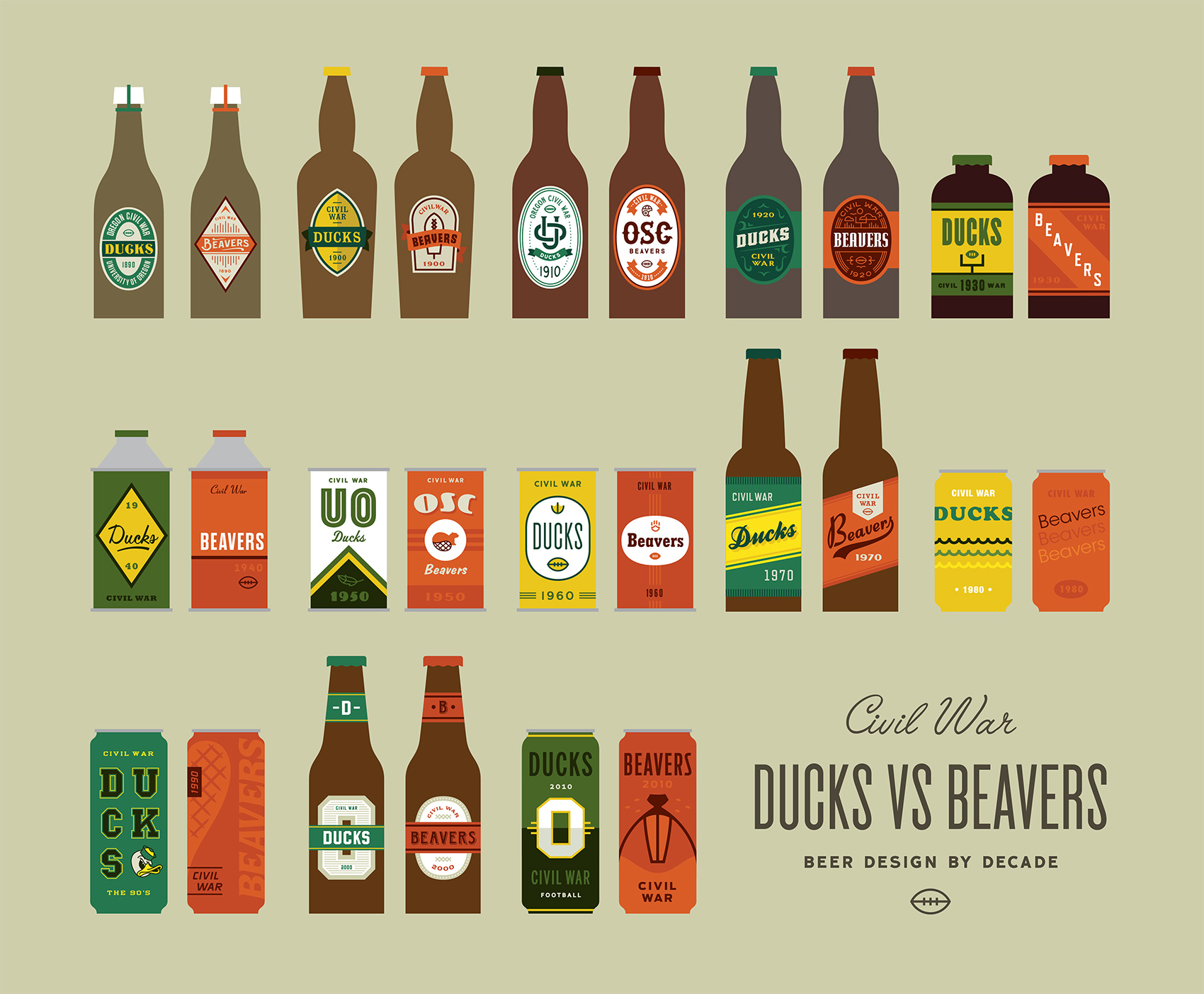
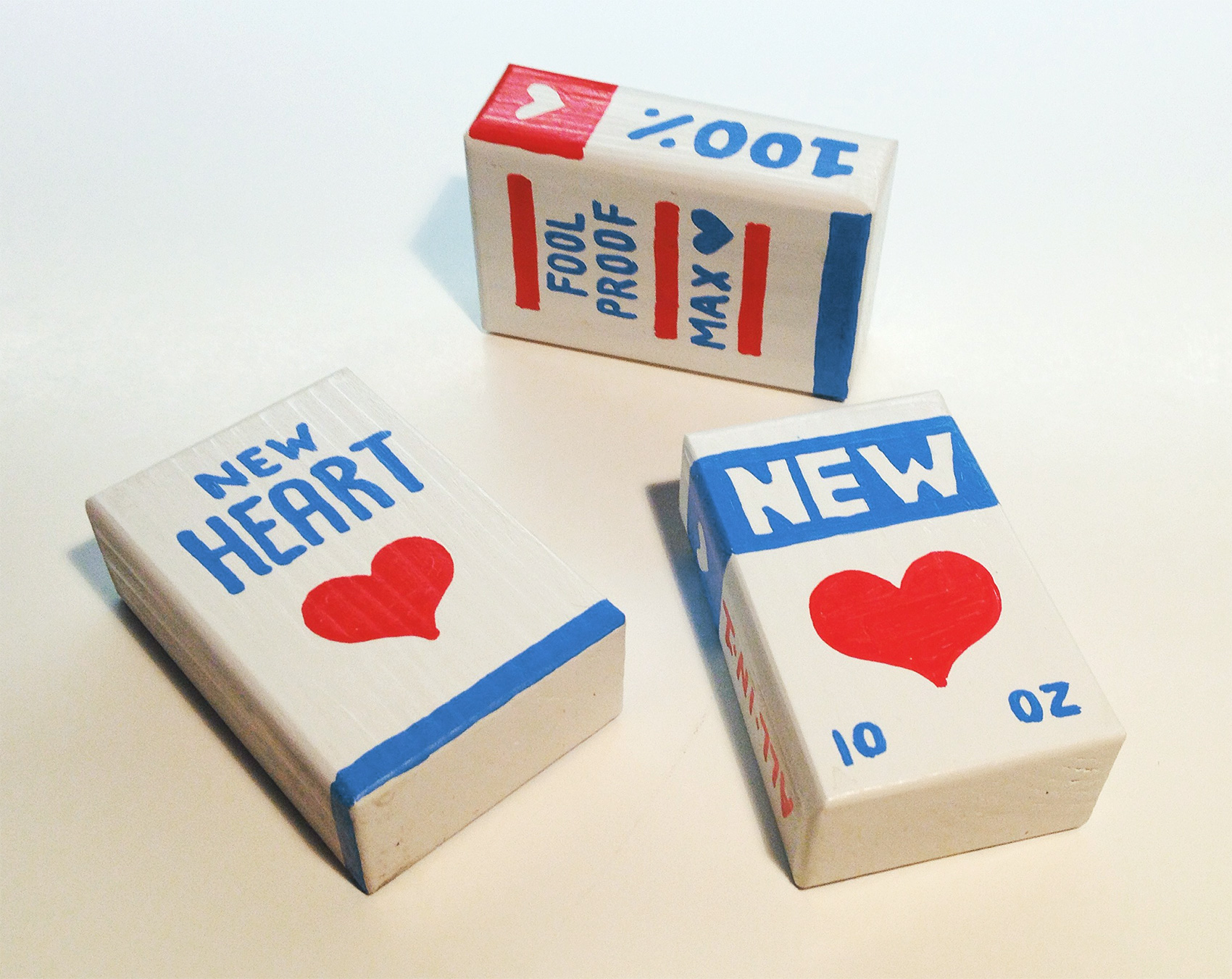
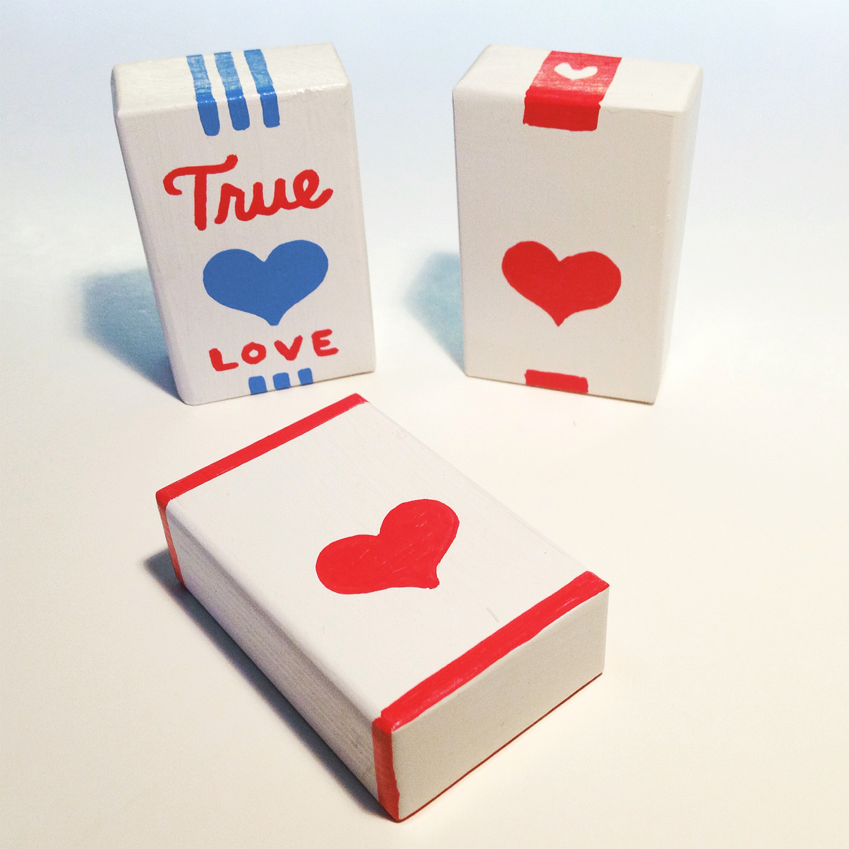
Which brings me to the Ducks VS Beavers Civil War “Beer Design by Decade” project! For every decade that the Ducks and Beavers have been competing against each other I created a beer label for both teams. Design wise I focused on the simplest execution possible to represent the styles, tropes, themes and feeling from that decade.

13 decades of beer designs for the Oregon State Beavers and University of Oregon Ducks.

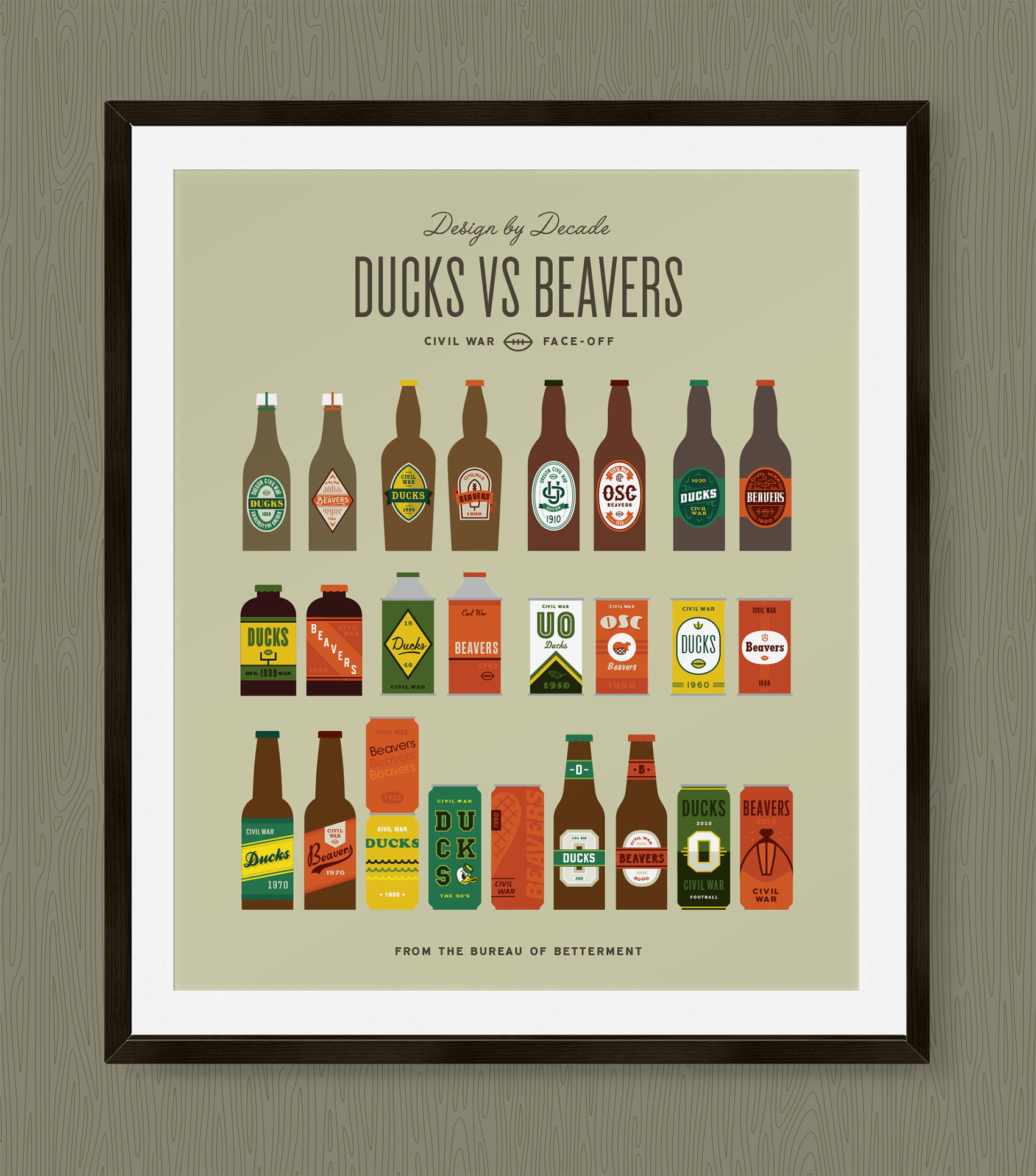
While having participated in sports in high school with great fervor but mediocre talent, most of my 20’s and 30’s have been spent in front of a computer or a book. My sister, on the other hand, can most often be found cheering on her favorite sports team and alma mater: the Ducks. She probably inherited this from my dad who used to have a sport for every season which he watched dutifully and on the edge of his seat, can of peanuts and Pabst in hand. Realizing that my sister’s fandom would probably never subside, I decided to join in the only ways I knew how – eating guacamole during games and designing beer labels for the respective teams. Here are the labels zoomed in and side by side for each decade.

ducks-vs-beavers-civil-war-beer-design-final

Oh yeah, this years Civil War is on Saturday November 26th at Reser Stadium.

Thanks to:

Hayden Walker, a new Portland design transplant who helped with research and design as I balanced client work and a project effort that I underestimated greatly. See his work or Dribbble. Also to Tess Wojahn for helping with research (I’m sure a process post with inspiration images will follow at some point). See her work.

My playground friends from Madras, Oregon circa 1988 for spurring my alternative sports involvement when we wrote a rap about how great the Trail Blazers were (those were the days!).

My dad, who watched sports and drank beer and seemed to know infinitely more than both coaches and players based on the color commentary provided. He probably did know quite a bit as an ex-college and army ball player in both baseball & basketball. Those tense moments of accidentally running in front of the TV during an important play or daring to speak during a key game decision and being reprimanded with the Rankin glare will never be forgotten.

There you have it!

Ducks VS Beavers civil war beer design by decade

Home Cranked Packaging


I’m excited to finally say TA-DA and share a special project from last year – packaging and branding for Home Cranked ice cream mix. This is an organic and premium quality ice cream base that you can use to make any flavor imaginable, brought to you by the folks at Naia Gelateria. Just use the plain base to add any ingredient to make crowd pleasing flavors or perhaps a palate-testing flavor for your more adventurous ice cream eating cohorts. Or if you’re in a pinch, chug the plain base straight from the carton to satisfy instant ice cream cravings. Any way you cut it, YOU WIN.

Packaging design for Home Cranked ice cream mix.

This project was in my wheelhouse for oh so many reasons. First, ice cream. I mean, ICE CREAM. Second, it was a print packaging project which had the fun limitations of being 4 colors and printed with flexography that has certain parameters in which it looks good. The design also needed to accommodate for potential new products. Lastly, I got to work with a crack team.

Carton packaging design for Home Cranked ice cream mix, showing all three side of the carton.

I was brought in by Owen Jones to help Naia create the Home Cranked brand from scratch. The Bureau created the logo, packaging, illustrations, branding and guidelines while Owen managed the project, implemented the site, marketing, social media strategy, and additional brand efforts. I even got to pull in food writer Jen Stevenson to make a delicious contribution of words that really made the packaging sing. Having worked with both Owen and Naia in the past, it was a trifecta of design positivity and collaboration. Or, as Jen would say: scoop savant, this is your destiny!

Currently Home Cranked is on a test run in Whole Foods Markets in California, but if things go well it could be coming to a store near you. Stay tuned for a more in-depth post on the logo, branding and icon set soon…in the meantime check out Home Cranked online.

Aalborg Akvavit Label Illustration


In my younger days I lived and went to school for a year in Aalborg, Denmark. There you can find a street called Jomfru Ane Gade where liquor flows freely from the plethora of bars and raucous ‘cheers!’ can be heard up and down the famous street the city of Aalborg is known for.

So when Line Krüger contacted me to commission an illustration for the schnapps company of the same name I had just a few flashbacks before promptly accepting the job. Basically anytime someone calls you up and asks “can you draw some meat on a stick?” you have to say yes.

aalborg-akvavit-grill-bottles

If there is something the Danes like more than getting a tax cut or drinking schnapps, it’s consuming pork and other meat products. So combining the latter two activities seems like a surefire bet for Aalborg Akvavit, who created this new product for pairing with summer grill food. The label itself was designed by Line who also creative directed the illustration process.

Meat on a stick.
Meat on a stick.

Usually associated with the popular and omnipresent event of December, the julefrokost, schnapps (or akvavit) is consumed in large quantities even though the glasses that carry the liquid from bottle to mouth are minute. I’m convinced this small beverage vessel was created with the hidden agenda of giving the Danes the maximum number of opportunities to shout SKÅL before reaching full inebriation.

Enjoying summer with many tiny glasses of akvavit.

Photo credit: Kristine Hansen

Gelato Tub Packaging


Several years ago I created a logo and packaging for Bar Gelato through Substance. The product did well in stores, which spurred the birth of gelato in a tub. Naia Gelateria requested creative direction for a packaging line that related to the original bars and stood out on the shelves as straightforward and modern.

Chocolate gelato made with TCHO Chocolate.

It was an interesting project with the task of blending the brand recognition of Bar Gelato with the original store brand of Naia Gelateria. To capitalize on shopper recognition for a product that was positioned in two different areas in the grocery store, we repurposed the hand drawn Bar Gelato logotype to read just “Gelato” by Naia.

A universal lid reinforced the original Naia brand.

The results were a packaging series with a strong color presence on shelf and a small ingredient icon to differentiate flavors. Using a universal orange lid reinforced Naia’s hand while the scalloped butcher paper and fonts referenced Bar Gelato.

Strong color differentiation helped distinguish flavors on the shelf.

Currently the tubs are available at specialty markets in Northern California, or you can check out Naia’s selection of Bar Gelato. Similarly to Bar Gelato’s release, interest in carrying the tubs has been positive so expect availability to increase exponentially!

bar-gelato-trio
The original and inaugural packaging for Naia’s first in-store product, Bar Gelato.

54-40 Packaging Prototype


My dad was a geography teacher, so growing up in a small town in Central Oregon my family participated in the local radio station’s morning Geo Quiz with the 3 other families in town who were also partial to such shenanigans. Over the years of answering questions correctly I collected a world placemat, spin-top globe pencil, globe keychain, and numerous stickers and erasures.

While the days of the Madras Radio Geo Bee are long gone, I still have a fondness for geography related trivia. So when I met Greg Jones at an ADX Feedback Loop event where he presented an idea for a topographic series of state products, I was psyched to help him make it a reality.

After some talk, we decided to collaborate on packaging prototypes for a small batch of products he wanted to sell to gather interest in his idea: a set of magnetic-backed US states made out of laser cut wood that show the topography of America. AWESOME!!!

Continue reading “54-40 Packaging Prototype”

Kæmpe Pålæg Packaging


When my roommate brought home this kæmpe pålæg chokolade and a giant loaf of fresh french bread, then offered that I have some, I nearly squealed in delight. Oh wait, I did squeal in delight.

First off, these small thin pieces of chocolate hold special memories for me…my Danish grandmother would always let my sister and I have a special treat sandwich after our regular lunch of rye bread and pickled herring that consisted of pålæg chokolade on a buttered piece of white bread. In our minds and bellies this was a slice of heaven on top of a slice of heaven, and we called it a Mormor Mad (grandmother sandwich).

Secondly, look at that packaging! Unabashedly simplistic and retro in all the right ways: a strong diagonal and utilitarian color palette, rad Danish letters, and exactly duplicate front and back designs (who needs to know more than that this small cardboard box contains LARGE DARK CHOCOLATE TO PUT ON SANDWICHES?).

I love it. I wish it were a poster. Maybe it will be someday.

Tom's kæmpe pålæg mørk chokolade, chocolate pieces for putting on white bread.