Tofurky Holiday Headline


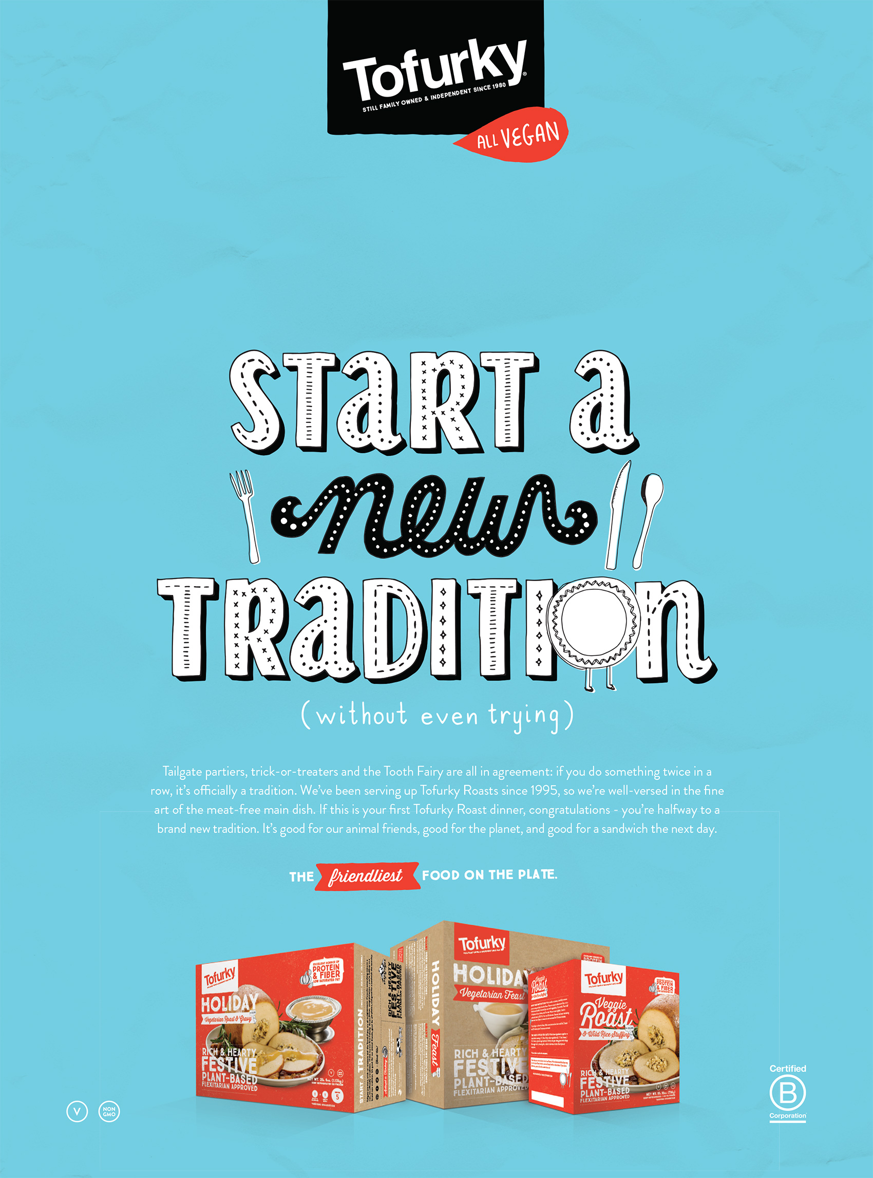
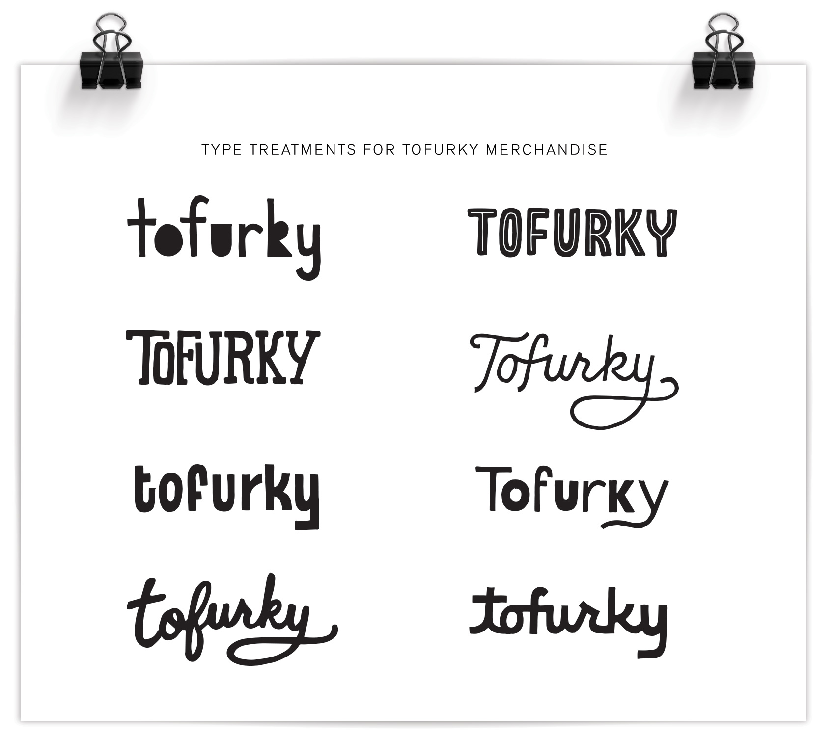
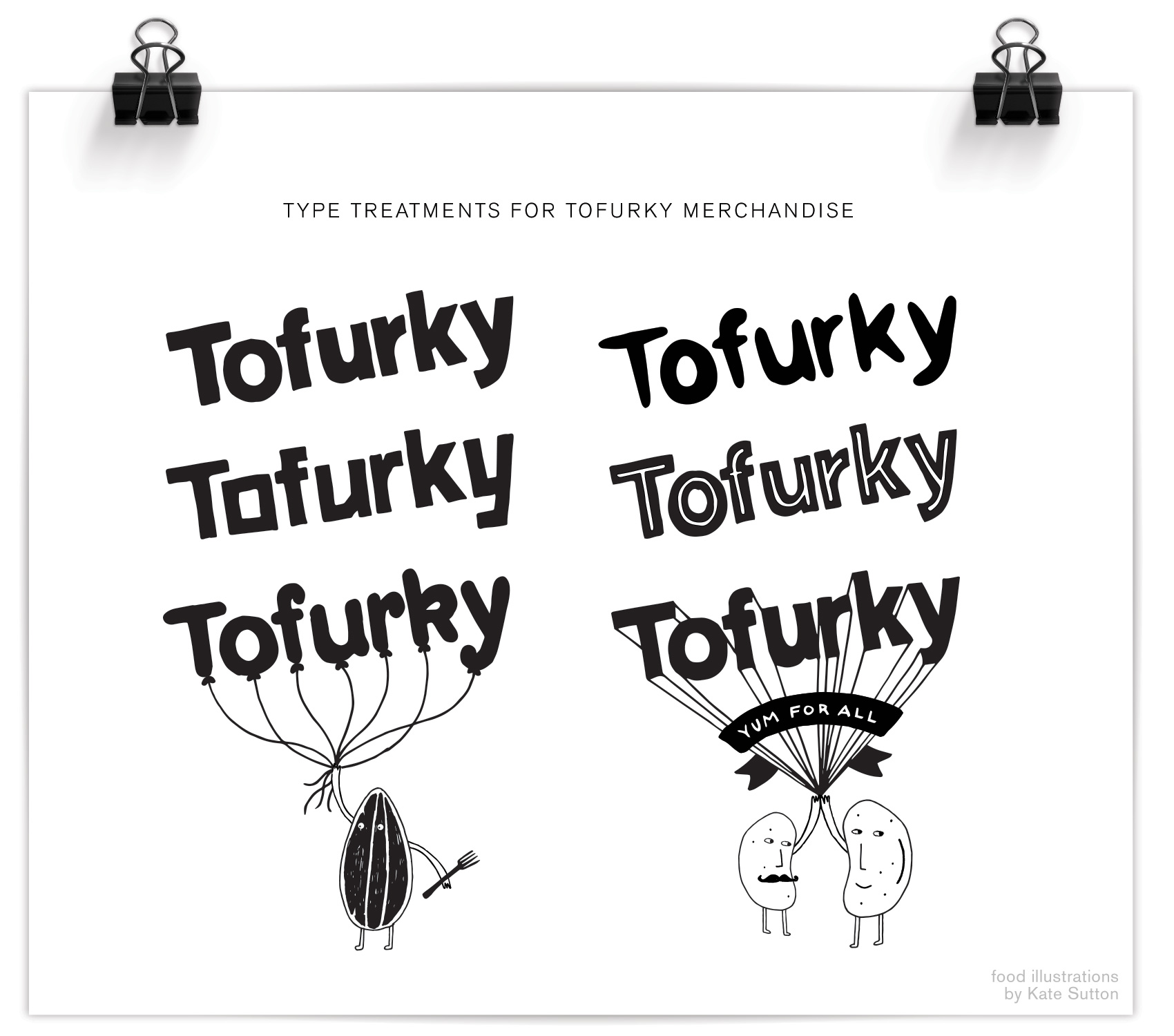
Here is a headline I lettered for Tofurky (through CD Gary Huck) to use in their holiday ads promoting their meat alternative products geared towards Thanksgiving, Christmas and the like. It was created in the same vein as the lettering library I created for Tofurky, but with a (relatively) more formal feel to the piece.

tofurky-holiday-headline

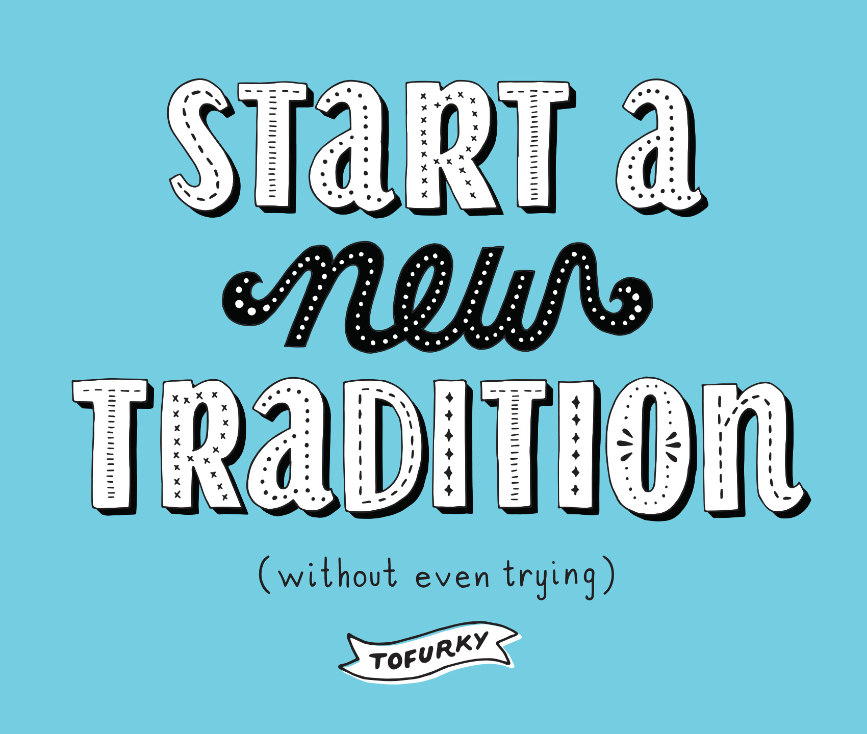
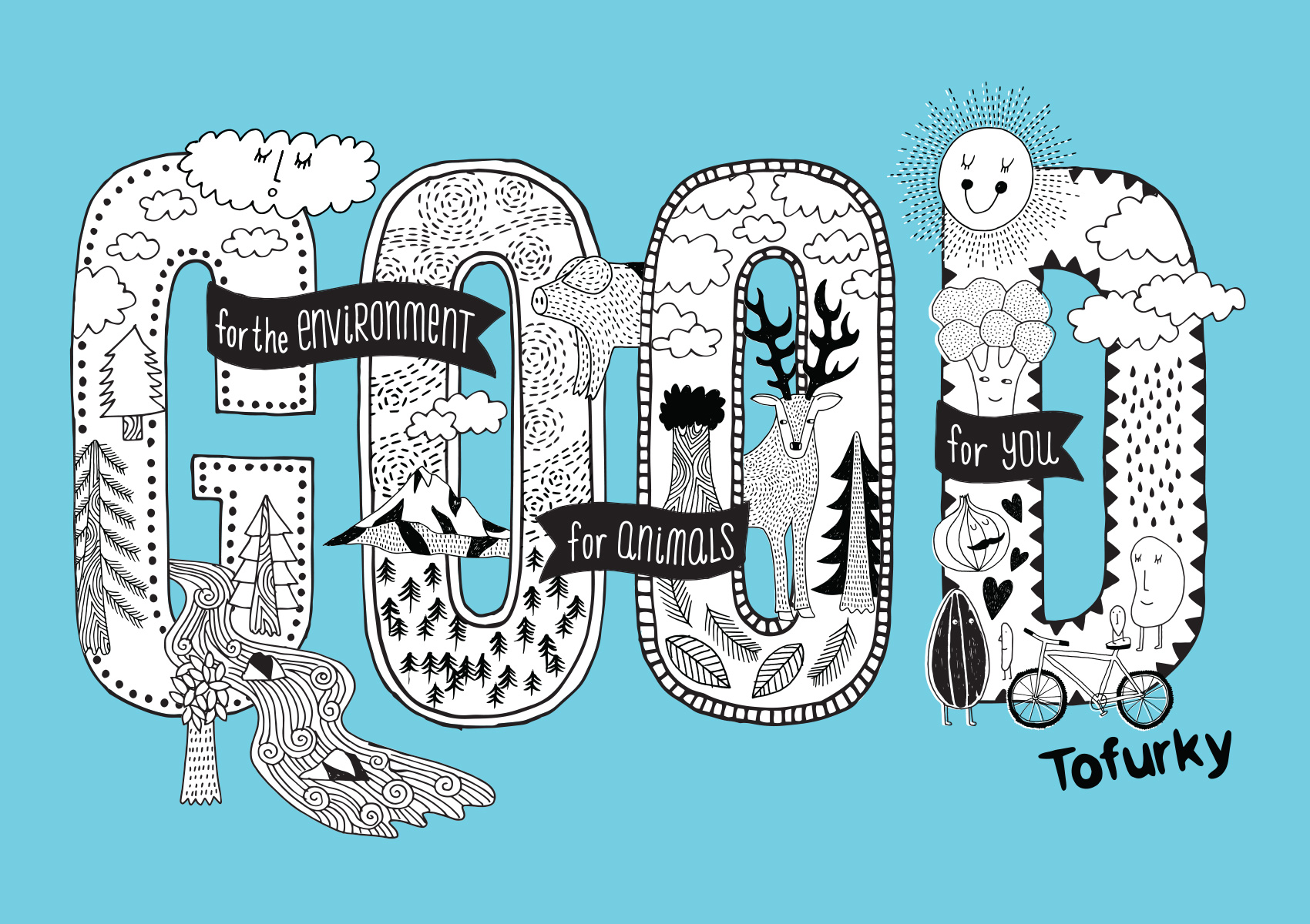
As a person very focused on food, and traditions, and therefore food traditions, I liked the message of this. Being a carnivore, I skate carefree through each meal eating whatever I please. Pretty much the only thing that stops me in my tracks is a stewed cabbage. For vegetarians and vegans it isn’t always as easy, especially during traditional meals centered around meat or in areas where people aren’t as aware of what being vegetarian/vegan means. So all you vegginuts, Tofurky has you covered for whatever tempeh/soy/non-meat based holiday feast you might want to gorge on. Here is the lettering incorporated into one of the ads.

tofurky-holiday-headline-ad

More Tofurky Lettering


Here is another snippet from a longer-term lettering project I’ve been working on for Tofurky. Below is the second set of two series exploring their company name in a casual, hand drawn style (see the first set here).

Tofurky-merchandise-type-treatments

As part of their online content the company posts recipes and tips under the name Counter Culture, which I gave some bling in this lettering piece. I also got to draw a bunch of small ingredients to go along with the type (matching their current brand illustration look), and implement one of the type treatments from above.

Tofurky-counter-culture-typography

Tofurky Lettering


This summer I’ve been working with Tofurky on various projects, all rated very high on the level of fun had. Tofurky is a local company from Hood River, Oregon that makes meat-alternative products, including their inaugural product of a non-Turkey that also gave the company its name (a spoonerism of FAUX and TURKEY). While not a vegetarian myself, the brand resonates with me because of its positive and intentional mission as well as the playful way they communicate it. Food should be fun after all!

tofurky-brand-banner

The first part of the project was to make some logo spin-offs so there was a casual and unique way to insert the Tofurky brand into secondary branding without feeling too serious. Two sets of Tofurky “nametags” were created, the first of which is shown below. For this series the defining feature was mimicking the angle and basic form of the Tofurky logo, but altering the letterforms so they are more playful. It also involved working with Tofurky’s current brand assets, which included an awesome set of illustrations done by Kate Sutton of animals, trees and little beans and lentils just doing their thing. Integrating these brand assets into the new work was both fun and a good way to illustrate in a specific style. Success? Well I’ve never seen a pair of beans high-five that hard, so yeah.

Tofurky-merchandise-type-treatments-2

The next step of the project was to build a library of hand drawn lettering assets to use in their merchandise and promotion. Working with independent creative director Gary Huck, we made a slew of brand sayings and lettering/illustration combos, the first of which is being used on a tote bag and is a great representation of the Tofurky mindset: good for people, good for animals, and good for the environment. Hard to argue with that. We focused on the repeated word so it was a quick read and compact compositionally, with details of the saying appearing in banners around the main message: GOOD. A combination of Kate’s and my illustration fill the GOOD type so it’s a complete mash-up of type & illustration. My favorite kind!

Tofurky-good-typography

That’s it for now – stay tuned for more work from the Tofurky lettering project…

Home Cranked Packaging


I’m excited to finally say TA-DA and share a special project from last year – packaging and branding for Home Cranked ice cream mix. This is an organic and premium quality ice cream base that you can use to make any flavor imaginable, brought to you by the folks at Naia Gelateria. Just use the plain base to add any ingredient to make crowd pleasing flavors or perhaps a palate-testing flavor for your more adventurous ice cream eating cohorts. Or if you’re in a pinch, chug the plain base straight from the carton to satisfy instant ice cream cravings. Any way you cut it, YOU WIN.

Packaging design for Home Cranked ice cream mix.

This project was in my wheelhouse for oh so many reasons. First, ice cream. I mean, ICE CREAM. Second, it was a print packaging project which had the fun limitations of being 4 colors and printed with flexography that has certain parameters in which it looks good. The design also needed to accommodate for potential new products. Lastly, I got to work with a crack team.

Carton packaging design for Home Cranked ice cream mix, showing all three side of the carton.

I was brought in by Owen Jones to help Naia create the Home Cranked brand from scratch. The Bureau created the logo, packaging, illustrations, branding and guidelines while Owen managed the project, implemented the site, marketing, social media strategy, and additional brand efforts. I even got to pull in food writer Jen Stevenson to make a delicious contribution of words that really made the packaging sing. Having worked with both Owen and Naia in the past, it was a trifecta of design positivity and collaboration. Or, as Jen would say: scoop savant, this is your destiny!

Currently Home Cranked is on a test run in Whole Foods Markets in California, but if things go well it could be coming to a store near you. Stay tuned for a more in-depth post on the logo, branding and icon set soon…in the meantime check out Home Cranked online.

Well Vegan Promo


At the start of the year resolutions are in full effect, and if your goal is to go vegan then here is the plan for you! Long-time client Well Vegan and I teamed up again to create a simple promo postcard to be included in the first box of goodies in 2016 from Vegan Cuts.

While the service might seems simple – meal planning and shopping lists – you can find much more on wellvegan.com including a ton of free recipes, a basic guide to tofu, and how to make kid-friendly vegan lunchables.

Front of postcard illustration for Vegan Cuts promotion.

Mod Burger Concept Menu


Trying new illustration styles is always fun, but sometimes there isn’t time or budget for experimentation, or a client has a specific style they want from the start. On this recent project for Must Have Menus, there was plenty of creative leeway to create something from scratch.

The Must Have Menu’s website provides editable online menu templates for restaurants so that they can manage, update, and print their menus directly. The assignment was to use their menu building tool to show how templates can vary from the stock set of layouts provided online.

Mod Burger typography.

The concept of a modular burger restaurant influenced a mod-retro type treatment and a layered “paper cut” digital illustration of iconic burger parts. Choosing any ingredients from a long list of options and building your own perfect burger? Get me a reservation!

Mod Burger exploded view diagram and six sub-category icons.

Hoping to photograph the piece turned out to be too time consuming for this small project’s limited budget, but using textures and Photoshop did enough of the trick to get the idea across.

Testing, testing…early paper cut photo didn't make the cut.
Testing, testing…early paper cut photo didn’t make the cut.

Well Vegan Illustrations + Site Update


I’ve enjoyed working on the Well Vegan brand over the years, starting with their initial logo and branding and continuing with an eBook cover, promo materials, and a series of DIY postcards (here, here, here, and here).

Our latest collaboration was to update their website based on user analysis to increase sign-up and promote their new eBook Starter Guide. To do this we streamlined the front page with a large either/or graphic focusing on the plan and the book.

New Well Vegan header graphics focus on the meal plan and the e-book.

The Plan and The Starter Guide got their own secondary pages that had more in-depth information that was previously outlined on the homepage. And all that new content was a great excuse to create more small plates!

Small plates, plan icons and testimonial fruit & veggie characters.

The homepage was also adjusted below the fold to highlight the resources section and recipes section, and make the all of the content more scannable. Four resource icons were made for this.

Four resource icons for the Well Vegan homepage.

Even though I’m not a vegan, vegetarian, or any other label of imbiber other than equal opportunist, I enjoy getting their weekly newsletter of recipes – always handy when veggie-only friends visit. If you need a hit of cooking inspiration, just visit their extensive library of home-tested recipes.

Well Vegan Breakfast Bowl


Fall is here and that means layering…your breakfast bowl. There’s nothing better than sitting down to a steaming dish of gruel, Oliver, than feeling like it was put together by the best bed and breakfast in town. While it might not quite trump Sweedeedee’s breakfast bowls, following these instructions will get you mighty close.

Breakfast Bowl: 1. FRUIT: blueberry, banana, strawberry, raspberry, blackberry, raisins, figs, apple slices, dried cherry, dates, pear, currants, dried cranberry, dried apricot, peaches. 2. NUTS: almonds, walnuts, sunflower seeds, hazelnuts, pecans. 3. EXTRAS: hemp seeds, flax meal, chia seeds, dried coconut, lemon zest, oat bran, coconut oil, vanilla, flax, nutmeg, syrup oil, brown sugar, dairy-free yogur. 4. GRAINS: quinoa, rolled oats, buckwheat, wheatberries, groat, farina, muesli, amaranth, millet, kasha, farro, couscous, pearled barley, brown rice.

For more details on how to make a perfect morning meal, check out Well Vegan’s breakfast bowl post. Or see others in this series, including how to make a salad in a jar, mix and match ingredients for a perfect smoothie or expertly stack a sandwich.