Here is a book project I have been working on with Kristoffer Fynbo Thorning and Tine Fris, both Danish musicians who also enjoy collaborative group processes. They have combined their interests into a book filled with icebreakers that focus on musicality and movement to help groups get into the groove.
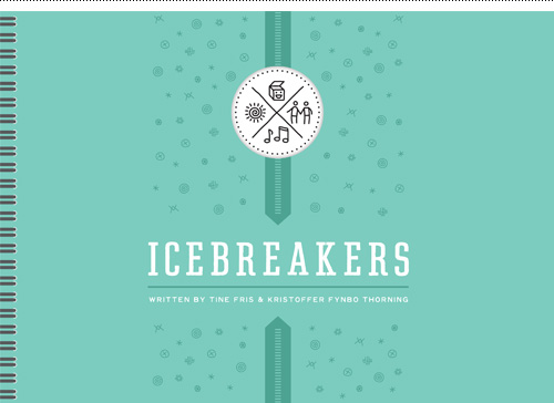
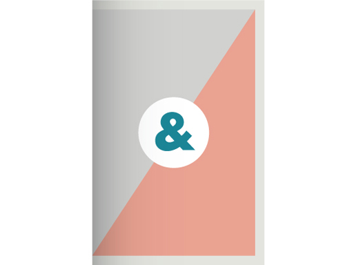
Icebreakers book cover design.
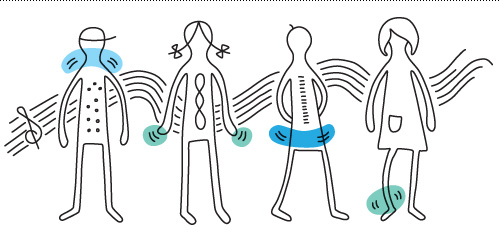
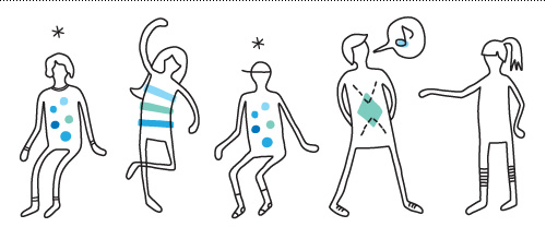
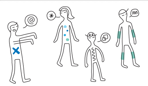
The book is still in progress so at the moment I can only show the cover design and a few illustrations from the exercises in the book. Design-wise, the client wanted a fun and informal look while still feeling professional enough for a variety of groups. An illustration style was developed to clearly show exaggerated body shapes, emphasize movement & sound, as well as maximizing the quantity of illustrations created for a start-up budget.
Icons for four main categories of icebreaker.Illustration for the icebreaker “body jazz”, where participants use different body part movements in conjunction with sounds to create a group song.Illustration for the icebreaker “memory”, which involves matching pairs of body shapes, sounds or movements that people perform for the game player.Illustration for the icebreaker “zombie”, in which participants use unique sounds to let the ‘zombie character’ hone in on their prey while trying to escape – all with eyes closed.
On a personal note, I saw Kristoffer, Tine, and their musical group Postyr Project perform a concert in Copenhagen at a local church. The exact opposite of a born again revival, it was an evening of interesting a cappella combined with digital experimentation (imagine a singer waving their hands over an iPad to control a series of sound loops while funky IKEA lights turn on and off in the background depending on what tones are sounded). AND there were snacks and alcohol served afterwards in the vestibule. That’s just how the Danes roll.
Here is one of my favorite songs from the evening called “My Future Self”. It was performed live pretty much in the same incarnation using four voices and an iPad.
Check out their website for the Icebreakers book here, where they also have an IndieGoGo campaign in progress for helping fund production, outreach, marketing, and design.
Living in Copenhagen means that you own a bike, and that bike is like an extension of your body. The idea of driving through the city doesn’t even register as an option because it is much faster to cycle. Not only that, but the act of riding a bike makes you feel free as a bird.
Indeed, my current city of residence is the origination of the super cool Copenhagen Parts magnetic bike light and bike porter, a myriad of bike paths along with proper a PDF usage guide, and the mayor is the main sponsor behind the Copenhagen Wheel. Bikes rule the road and rightly so.
However, it is also a metropolitan area so frequently bikes go missing. So often, in fact, that the process to log a stolen bike and get insurance money for a new one is just a few clicks on your local county website. Because a Dane without a bike is like an American without a car – a panic stricken mess of transportation worry. How will I get to the bakery/pub/mini-mart 3 blocks from my house WITHOUT MY BICYCLE? It’s a relationship of dependency and affection.
It is with that affection that I have always given my bikes names. My first real two-wheeler was a saucy crimson piece dubbed the Red Rocket. Later my sister named her yellow cruiser Daisy, while I gave my gold city bike the more human moniker Olsen and the following black mountain bike was named Jack. If only my bikes would come when called, I might not have to write this blog post.
Which brings us to my most recent trusty steeds. Over the past year, both my partner and I have had our bicycles stolen from right under our noses in front of our apartment building, arriving at a depressingly empty bike rack spot to find…nothing. But even though our bikes might not have lasted long, they deserve a sort of remembrance in the form of these custom winged bike logos. Dear dear departed.
2012 Bike Line-up
The Black Lightning
The Black Lightning was a cheap city bike with straight handlebars and a funky sound when you changed gears, and not particularly comfortable to ride on due to a narrow hard seat. I’m not sure what precipitated its purchase, but in retrospect it wasn’t a big loss since its successor, The Green Falcon, was superior in all aspects.
The Gray Goose
Conversely, The Gray Goose was a miracle of efficiency with just the right number of gears (7), a nice neutral color that hid dirt like a charm, and a basket on both the front AND back. This bike could transport 24 beers or an entire ingredient list for making 100 glasses of lemonade. It was a true workhorse and is still missed during large trips to the grocery store.
2014 Bike Line-up
The Green Falcon
The Green Falcon is a classic Van der Falk “grandpa bike” in forest green. Any rider is forced into an upright, stately position that makes passer by notice the dapper nature of the cyclist. Unfortunately it is not tricked out with any sort of baskets (that would be unmanly) and occasionally has a faulty back light, but all-in-all is a much better ride than its predecessor, The Black Lightning.
The Sage Stealth
Bought approximately 2 hours after the discovery of the missing Gray Goose (when you need to get somewhere, you need to GET THERE), The Sage Stealth is also a Van der Falk in the women’s model with a step-through frame and an added aluminum (rust free!) front basket. Unfortunately, after a few months on the road the identifier “stealth” no longer applies, as the front brake has a tendency to get stuck and make an irritating squeaky noise.
There you have it – my household’s last few years of bike ownership. If you had to make a logo for your bike, what would it look like?
Here is a small logo project I made for an acquaintance, Michela Fabiani, who recently made a career transition into business and life coaching. Based on client provided themes, the final logo is an abstract stair stepped path symbolizing the road her clients travel to reach new heights. The color scheme was inspired by her sunny and coastal homeland, Costa Smeralda in Sardinia, Italy.
Celebrating Christmas in Denmark is a very specific and special experience. Growing up in small-town Madras, Oregon with a Danish mother afforded a chance to experience a kind of Christmas celebration bubble. While at school the preparations were All American, at home they were focused on the motherland. Making paper crafts, lighting candles on the tree, and eating the Danish holiday foods were all very different from what everybody else in town did. My sister and I happily lived in a cocoon of Nordic tradition that we shared with just each other, until I decided to move to Denmark.
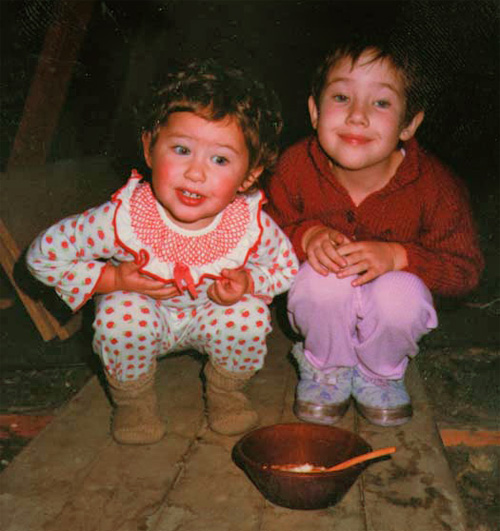
My sister and I pondering where the risengrød (rice porridge) went after putting it in the attic for the nisser (Christmas gnomes). I am the one NOT wearing a clown suit.
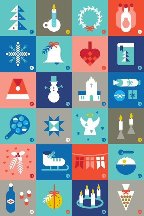
Residing in Demmark for Christmas this year, I understand how my mother was able to hold so steadfastly to her traditions through all the years – they were ingrained in her as if it was a part of her DNA. Experiencing all of these traditions as part of a group instead of just within my childhood family of four caused me to recognize the patterns and cultural norms which resulted in creating the above set of 24 icons that symbolize what almost every Dane recognizes as Christmas. In fact, the entire month of December is practically a collective countdown of the 24 days of Christmas.
That Danish Christmas DNA my mother imported to Oregon has roots in a proud and nationalistic country. Denmark is a small, homogenous land that has only recently been subjected to cultural diversification through immigration. The holiday traditions belong to the people of Denmark almost as if they were a small tribe, insulated from dilution and variation in a way that is very secure and nearly ritualistic. In the USA Christmas is big, but there is always an awareness that many people don’t celebrate it or do it “another way”. In Denmark, there is no “other way” – it’s the Daneway or the highway.
For example, I once asked a Dane if we could use a different varietal of jam to serve with æbleskiver (pancake balls). Hey, who cares if it’s blackberry or raspberry or strawberry jam? DANES DO. The facial response I received told me I was pretty much off my rocker for suggesting this, and I was told “Well, theoretically you could use any jam…”. Jam theory, let’s discuss. To be honest I’m still not sure if the “right” answer is hindbær or jordbær jam; I guess that’s what makes me only 1/2 Danish. Another time I ate risengrød (rice porridge) on a plate instead of a bowl to which a Dane passing through the kitchen exclaimed “My! I’ve never seen THAT done before!”. How I rock the boat in this little country entrenched in quaint and sometimes baffling rules.
These are minor examples, but not recounted to overshadow the fact that such deep traditions bind a people together in a special way. Below are some of the things that are the glue of the Danish Christmas experience…
Key code to the twenty-four icons of Danish Christmas
1. juletræ
You got it, a Christmas tree – decorated with Danish flags and live burning candles. 2. kalenderlys
A large candle with 24 numerals on it, meant to burn down a little bit each day in December leading up to the 24th, when all Danes celebrate Christmas Eve. 3. krans
Holiday wreath. 4. julebryg
Beer you drink around Christmas. Put the word “Christmas” (jul) in front of it, and anything goes in December. 5. sne
Denmark is about the same latitude as Anchorage, Alaska – so the days are dark and sometimes filled with snow. 6. klokker der kimer
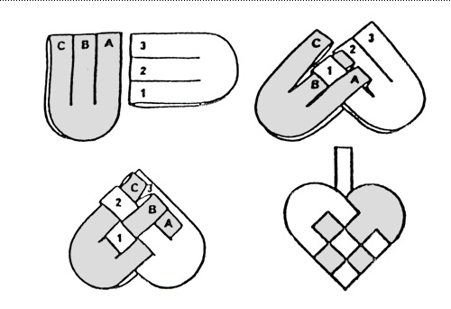
Churches abound in Denmark, so the chiming of bell towers is prevalent across the land. 7. flettede hjerter
Braided paper heart baskets that can be hung on the tree and filled with treats (esp. #24 pebernødder). 8. julesange
On Christmas Eve, the songbook comes forth as the entire family dances around the tree and sings songs before opening presents. Sometimes, a conga line is even formed through the entire house to sing “Nu er det Jul igen” (“Now it’s Christmas again”), after which participants collapse in a heap of exertion and bellies full of duck or pork roast. 9. nisser
Christmas gnomes that, as opposed to US elves that help Santa, instead run around the entire holiday making mischief (an example that one Danish Christmas song documents is “peeing in the piano”). 10. snemand
Kids who live in snowy areas somehow know how to build these suckers, no directions required. 11. kirke
Even though most Danes pay tax to the state church (which is Lutheran), Christmas might be the only time they ever attend. 12. pakkeleg
A brutally competitive dice game where players steal each other’s gifts. 13. æbleskiver
Small pancake-like balls formed in a special pan, served with marmalade and powdered sugar. Not just any marmalade, the RIGHT KIND. Which as far as I can deduce is raspberry. 14. julestjerne
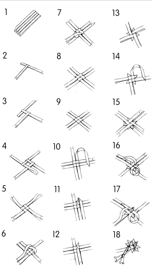
A complicated paper craft involving weaving 4 strips of paper into a 3D star. 15. engel
Find them in churches, in snowy fields of play, or in heaven. 16. hygge
Replicate as follows: get together with friends, make a warm drink, light some candles and have a good time. 17. mistelten
Danes are an amorous bunch from time to time – mistletoe combined with a julefrokost* (Christmas lunch) and schnapps (#21) is a dangerous combination. 18. skøjter
Town squares are often filled with ice for skating. 19. flag
As with any Danish time of celebration, use of flags is omnipresent and overwhelming. 20. risengrød
A rice porridge served with butter, cinnamon and sugar – often left in the attic to appease the mischievous nisser (#9). 21. snaps
Highly alcoholic and served at all Danish julefrokost* (Christmas lunch). 22. mandarin-dekoration
Take an orange or mandarin, stick some cloves in it, and hang it up with a red ribbon for an aromatic decoration. 23. advent
The Sundays before Christmas are celebrated by burning candles, and lots of hygge (#16). 24. pebernødder
Delightful tiny cookies with a distinctive cardamom and pepper flavor, often sold in triangular bags called ‘kræmmerhuse’.
I hope you can enjoy your own slice of Danish Christmas, wherever you are in the world. Glædelig Jul!
*A Julefrokost is a traditional lunch that would require its own set of 24 icons. It involves about 6+ hours of eating, all supervised by a strict set of culinary rules that DO NOT involve putting herring and cheese together in any manner.
Bonus Materials
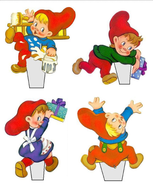
Try making a braided heart, cut out a few kravlenisser (clambering gnomes) and display them on a bookshelf by bending back the grey tab and putting under books, or attempt weaving a 3D star ornament based on this tutorial or color coded directions. Or, if you’re downright insane, try this.
Make a paper braided heart basket.Kravlenisser make mischief on any shelf you put them on.Test your finger dexterity on this 3D paper star craft.
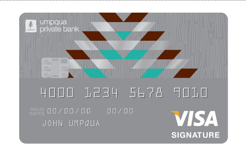
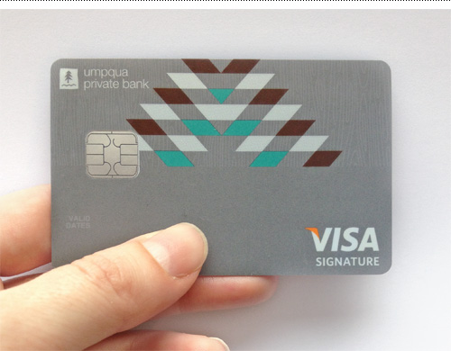
One of the more unique projects I’ve worked on recently is designing a Visa card for Umpqua Private Bank’s customers. These people have serious money and need a card to go along with it. Ka-ching^10! The Visa card was created in conjunction with launching a new site for Umpqua Private Bank in 2012.
After working on various nature-based and Pendeleton-themed designs under the art direction of Kate Zimmerman and Mark Jacobs at Umpqua, we chose a final design that combined a geometric sunrise in the UPB color palette with a wood pattern background that mirrored the website background. The silver parallelograms received a special foil treatment for that extra bling.
Make it rain.The card in real life – a blank version of the Visa card design for Umpqua Private Bank.
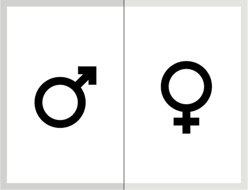
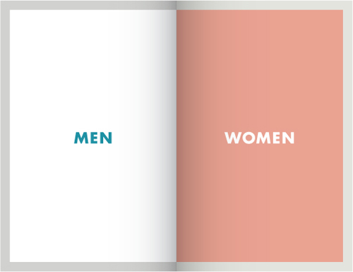
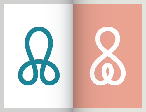
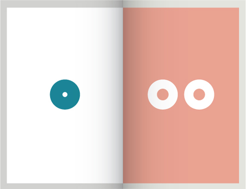
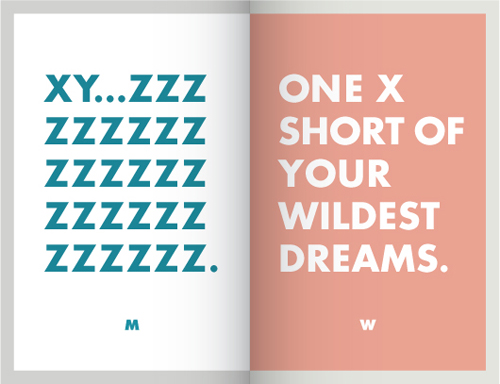
I’ve never really understood the gender symbols. As a kid, they were so far from being representative, I always wondered how people knew which was which. If they had been used to label restrooms, I probably would have chosen the wrong door half the time in confusion due to the arbitrary placement of a circle and some lines.
As an adult, my sarcastic interpretation might be that obviously the ladies had very large brains and the gents had very small…anyways, perhaps subconsciously I felt that there was a need for improvement in this graphic system, because I have now redesigned the gender icons. Without even really meaning to, here is how it happened…
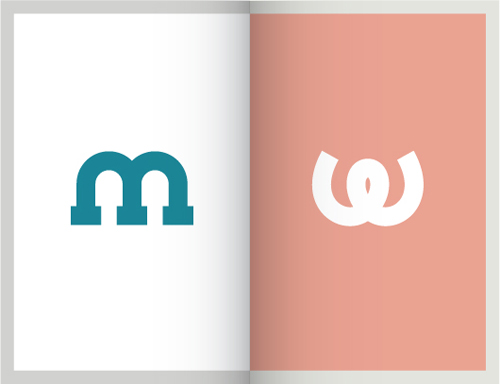
Before
While doodling during a phone conversation one day, some scribbles appeared that I liked. Often I will fill an entire sheet of paper with the same shape or squiggle as I talk on the phone or listen to muzak while on hold with the various Danish Governmental Offices that have very specific opening hours and very long telephone waits. Most of the time, the doodles are just time fillers – but these popped out as prettier than usual and I immediately wanted to use them for THIS SPECIFIC PURPOSE. Muzak = instant faux miniature branding projects? The creative process can, indeed, be confounding.
Sometimes a client has a really clear idea of they want. When this is communicated upfront, it can be a great thing – focusing the design efforts of a project in the right direction or providing a starting point to finding a good solution. This was the case on a logo made for Guatemala Fairtrade.
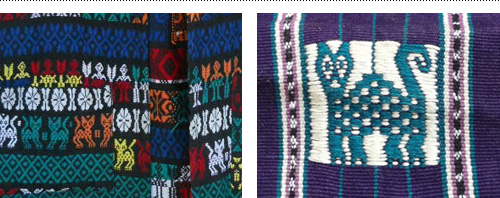
After returning from a long stay abroad in Guatemala and connecting with Maya Traditions Foundation, Ditte Tøfting-Kristiansen was ready to start her own business selling fair-trade Guatemalan products in Denmark. She knew that she wanted the logo to reflect the handmade nature of the products and connect with the town she stayed in, which used a cat as their local embroidery symbol.
Using the client-provided inspiration gave plenty of options within a framework to come up with an embroidered cat icon and hand lettered brush type as the logo. Below are two images to show a great example of visual ‘input’ and ‘output’.
Client-provided inspiration for local Guatemalan cat icon and embroidery.Guatemala Fairtrade logo series in tag format.
Guatemala Fairtrade currently is on Facebook and has an online shop selling scarves, shoes, bags and other fairtrade items.
Recently I worked on a fun redesign project for two interior space designers who wanted their logo and website revamped. While logo redesigns aren’t always about doing something new and crazy, it’s a good design challenge to keep enough of the existing logo around for client recognition while updating it to something new and better.
Left: before – Right: after, with additional signature icon and DC pattern.
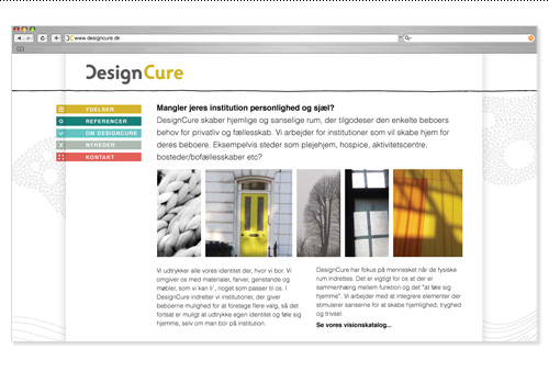
One of the design goals for their new website was to combine Danish simplicity with an organic, textural and hand-drawn feel. To accomplish this the structure of the site was kept simple with utilitarian fonts and text formatting, which allowed the few color pops and hand-drawn elements stand out but not overwhelm the simplicity.
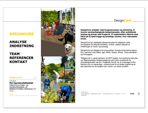
Old DesignCure website design.New DesignCure website design.
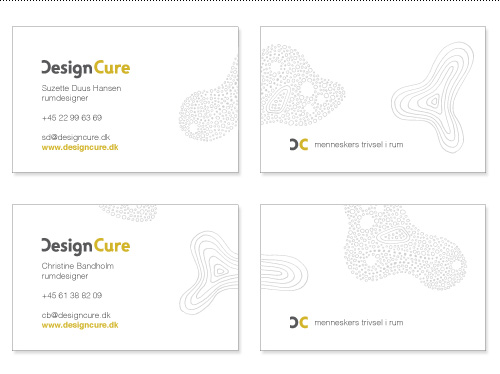
The patterned shapes were also used on the business cards to support the tagline and DesignCure’s thinking that space is organic and evolving, not structured and rigid, and even institutional spaces can be designed to feel at home in.
Business cards with variable organic shapes wrapping around the card. Tagline translates roughly to “peoples’ well-being in space”.
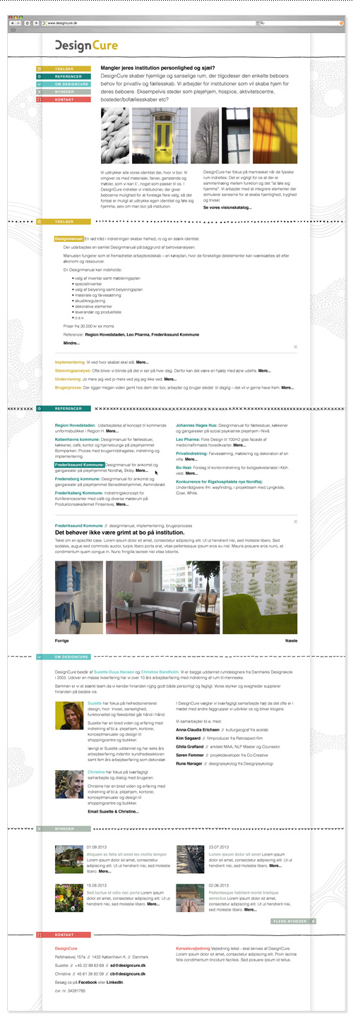
The amount of content on the site was minimal, so we opted for an all-on-one page design to make it easy to get to everything. The site was built in WordPress to allow for easy client updates. You can see an expanded view of the site design below, or visit the DesignCure website here. Big thanks to Refresh Media and Jip Jip for working together across continents to make the technical part of this site happen.
Almost all of the projects posted on the Bureau blog are real, live, produced projects. Hardly ever do I post a speculative project, and if something is made for personal gratification it is duly noted. Along with posting nearly 100% original content, transparency was one of my goals when starting a blog – showing what I made for fun, what I made for money, and how I got there.
To me, is important to show design that has been through the filter of client feedback, changing project needs, production specifications, budget requirements, and multiple rounds of design. So much of design is what happens between the initial idea and the end result. But a part of the job of being a designer is also getting things killed, which I’d also like to share.
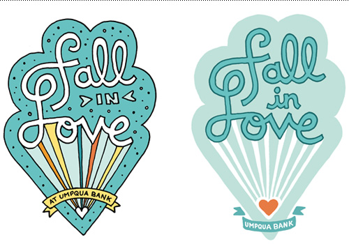
A recent project for Umpqua Bank didn’t make it through a budget shift, but I am proud of the result and got permission to show some work that would otherwise never see the light of day. The project was to create a promotional sticker for a video with the title “Fall in Love”. A love parachute was drawn with Umpqua’s blue color palette, the cloud shape subtly alluding to the clouds used in their branding. The sticker evolved from a detailed illustration to a more simple line drawn design. Produced or not, the message is positive and I’m happy I got the chance to work on it.
Almost all of the projects posted on the Bureau blog are real, live, produced projects. Hardly ever do I post a speculative project, and if something is made for personal gratification it is duly noted. Along with posting nearly 100% original content, transparency was one of my goals when starting a blog – showing what I made for fun, what I made for money, and how I got there.
To me, is important to show design that has been through the filter of client feedback, changing project needs, production specifications, budget requirements, and multiple rounds of design. So much of design is what happens between the initial idea and the end result. But a part of the job of being a designer is also getting things killed, which I’d also like to share.
A recent project for Umpqua Bank didn’t make it through a budget shift, but I am proud of the result and got permission to show some work that would otherwise never see the light of day. The project was to create a promotional sticker for a video with the title “Fall in Love”. A love parachute was drawn with Umpqua’s blue color palette, the cloud shape subtly alluding to the clouds used in their branding. The sticker evolved from a detailed illustration to a more simple line drawn design. Produced or not, the message is positive and I’m happy I got the chance to work on it.