Ruby Receptionists icons


Over the past year I’ve done several projects with Ruby Receptionists. A virtual receptionist company that focuses on friendly service, their brand is characterized by colorful and cute 50s-60s inspired illustrations of Ruby and her cohorts. And when I say “friendly service”, I really mean it. Think about the warm fuzzy feeling you get from, say, watching an old episode of Sesame Street where all the characters hug after an adventure. Well, that’s how it feels to correspond with Ruby. In that vein, one of my efforts was working with Marcella Vail, Director of Employee Engagement, to create an icon library for internal use in presentations, powerpoints, online media and generally peppy publications for the Ruby team.

Ruby Receptionist icons

Copenhagen Mind Map for Archie’s Press


Here is a recent collaboration with Archie’s Press that I’m super excited to share: a conceptual “mind map” of Copenhagen, Denmark. So many aspects of the project spoke to me: the history, the design challenge, the process, and the city itself.

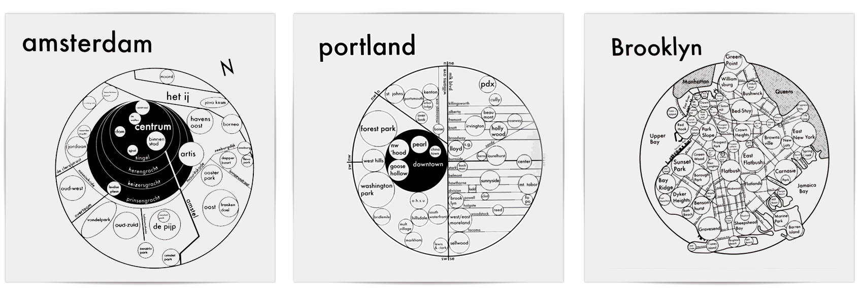
Archie Archambault and I met almost a decade ago when we were both members of Em Space, a letterpress & book making collective. He was a bright eyed and idealistic printer/maker and I was an agency designer who liked to relax with a good stack of paper and a letterpress. He made his first map of Portland, which was pretty different from everything else out there at the time. I quit the agency life and started the Bureau of Betterment as a freelance designer. Over the years we crossed paths here and there. He moved to Amsterdam; I visited. I moved to Copenhagen (and back to Portland again); he kept in touch. And he made maps – lots of them – first of places he lived or visited, then collaborating with local designers on new maps.
archie-map-trio

As you can see, Archie’s maps are built with circles. As he explains on his site, research indicates that GPS’s are hindering our ability to create mental maps of our surroundings. His aim is to install a “Map from the Mind”, simplifying structures and neighborhoods in the most efficient and beautiful way possible. The circle, our Universe’s softest shape, is the clearest graphic to convey size and connection.

A few months ago, Archie got in touch and asked if I would collaborate with him on a map of Copenhagen, based on my knowledge of the city and his system of designing maps. I said YES. Having lived in Copenhagen for several years, it was a project close to my heart. I spent time looking at historic maps, reading about the city like I hadn’t done before, and interviewing both Danes and expats living in Copenhagen (thanks Niklas, Christa, Lise, Emil, Michelle & Carli).
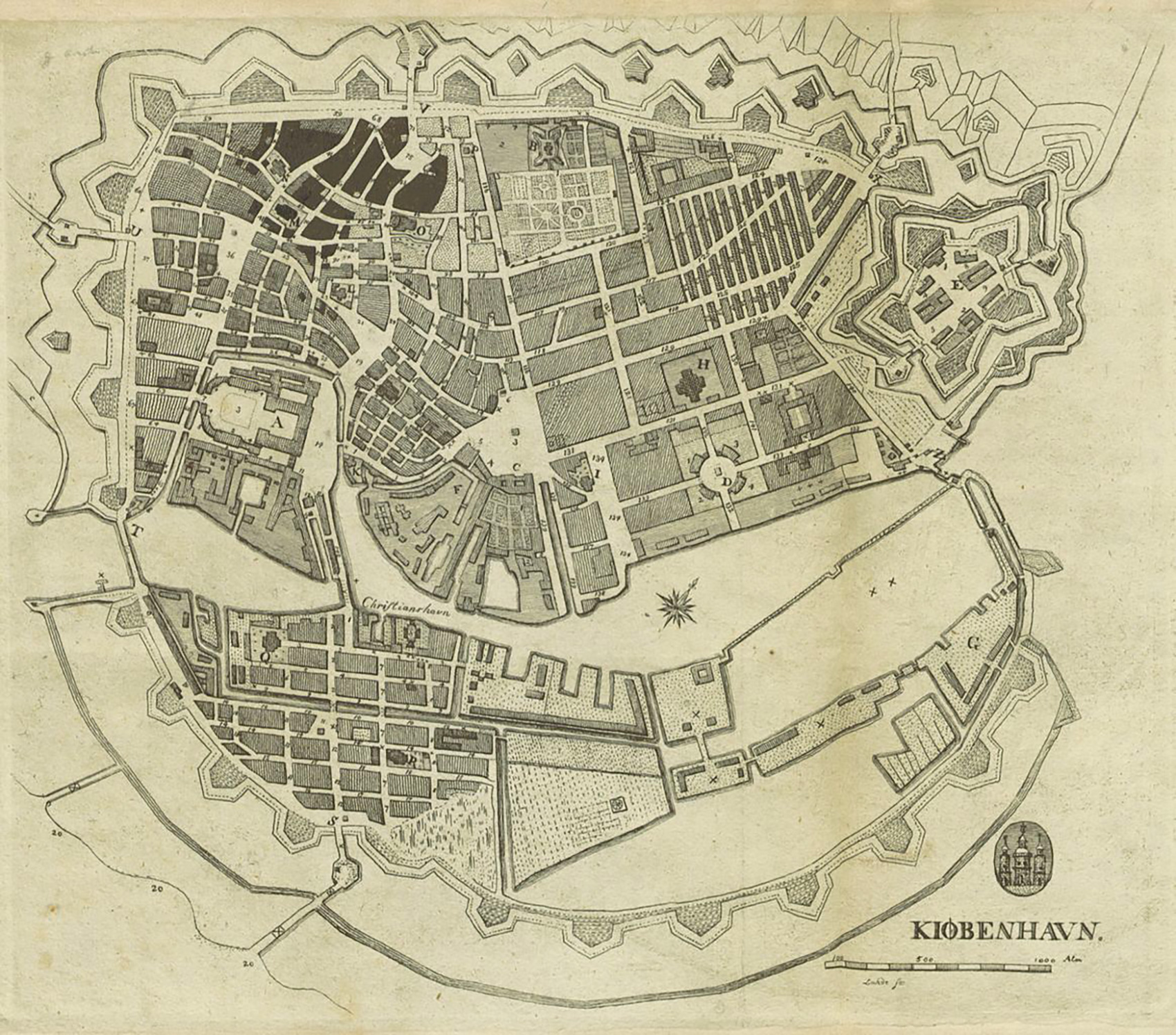
old-copenhagen-map

Creating a “mind map” is different than a regular A-to-B map, and boy does that make me happy. How do people use the city and how do they get around? How do they explain the city to others? How does the city feel? How are the parts connected in the mind? What are the bare essentials for wayfinding while also understanding how the city is organized? And as a design piece, how do we make it visually engaging? I started with the basics, not even entering design mode until we had figured out the underpinnings of what was important.
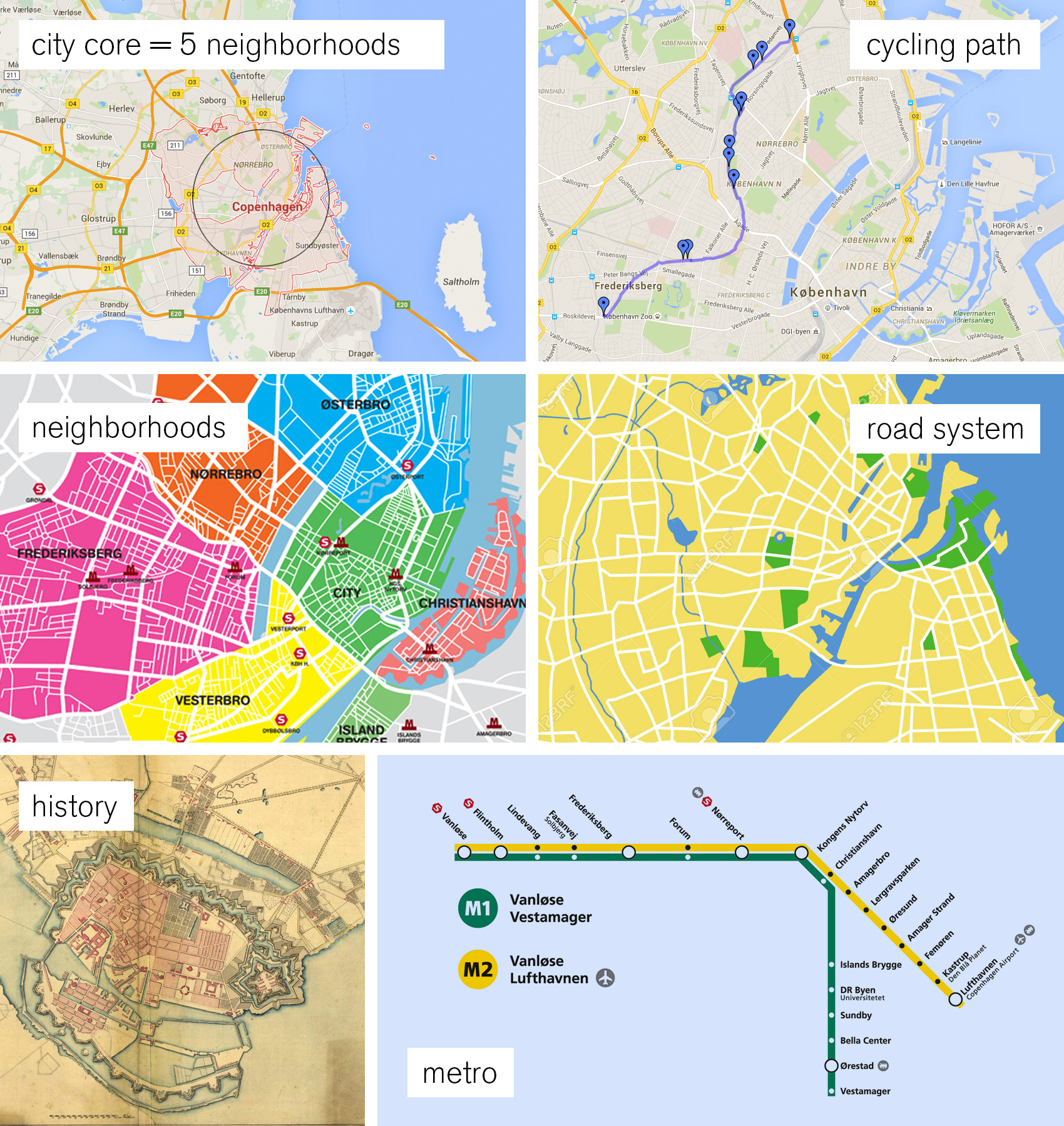
copenhagen-map-core-elements

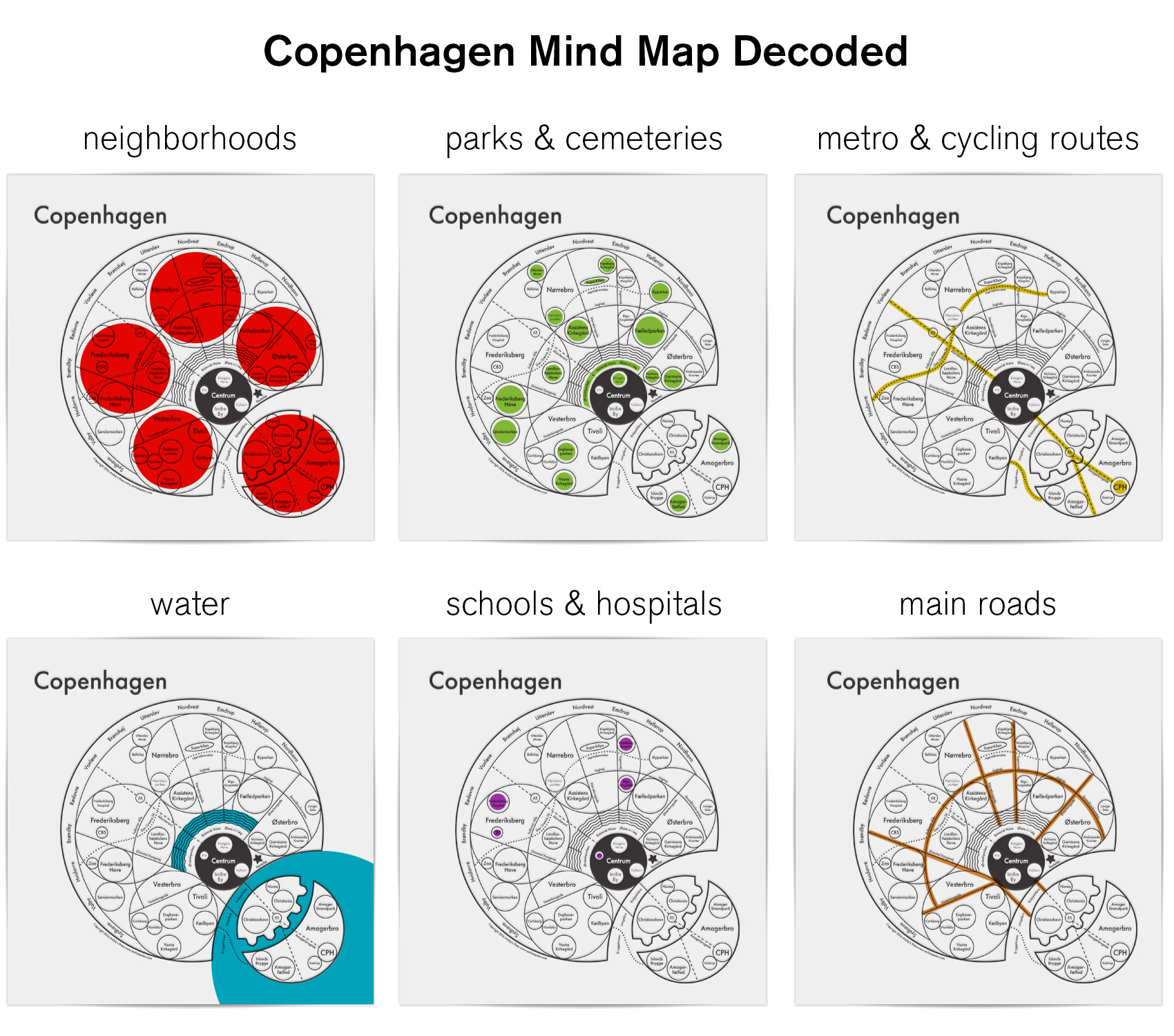
Roads might seem obvious as a heavy hitter, but Copenhagen is different. Its’ roads don’t follow a grid pattern, and sometimes the same road changes name four times within a kilometer. When my interviewees were given the choices of 1) neighborhood, 2) landmarks, 3) water, 4) major roads, 5) a specific address and 6) public transit as wayfinding tools, the clear winners were neighborhoods and landmarks with water and public transit coming in second. Roads were last, even scoring low among those who used cars as their main method of transportation. That is why we only included the critical inner ring road that connects the neighborhoods and the “5-finger” spoke roads that were part of Copenhagen’s city plan from way back when. Simplifying the public transportation system was a tough choice. Archie and I decided that the Metro was the public transit mode to feature – there were too many bus lines and the train system wasn’t exclusive to the city, but the Metro is on the move and connects to the airport.
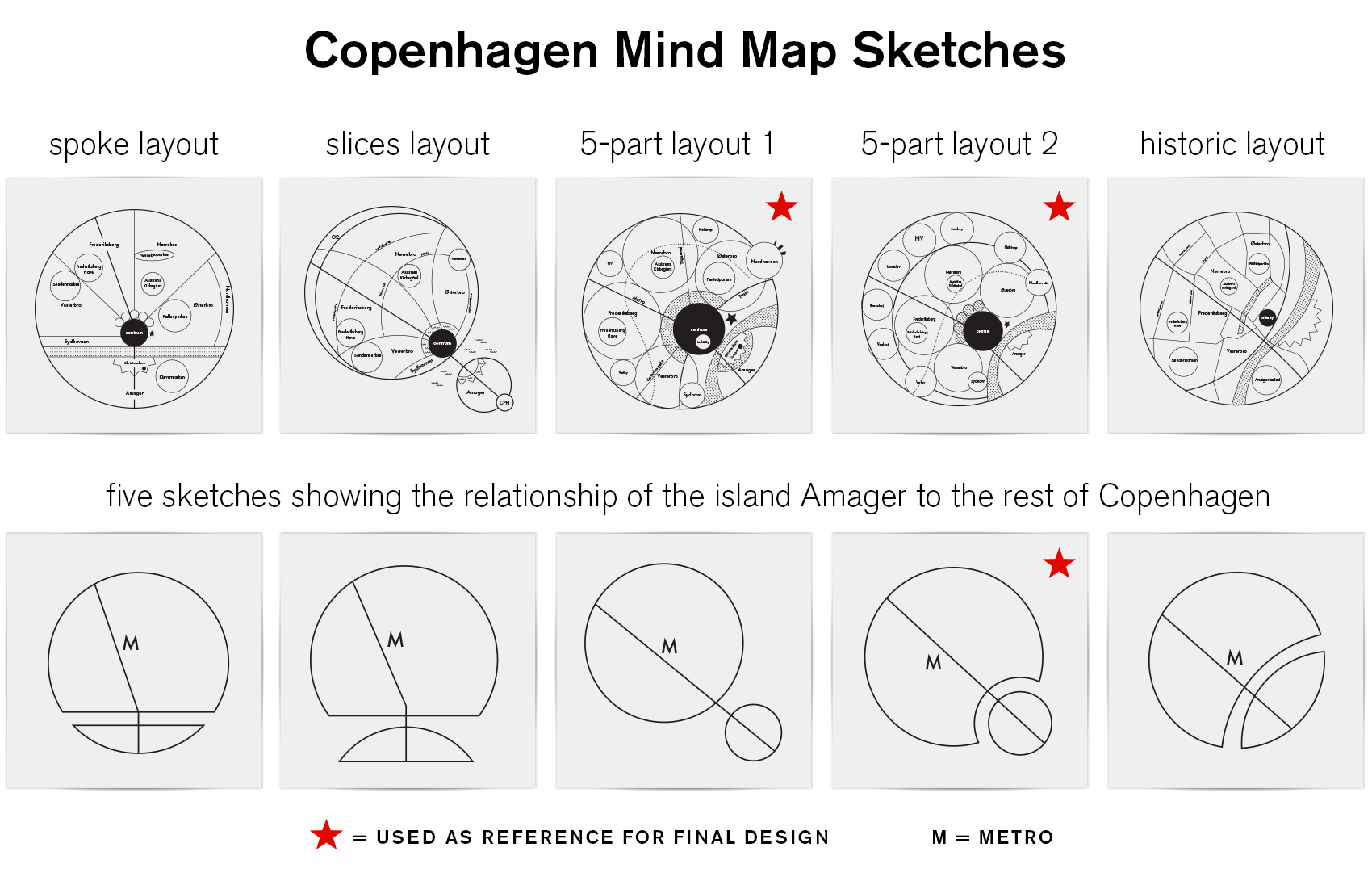
preliminary-copenhagen-map-sketches-copy

After much exploration I settled on a structure that featured the defining neighborhoods (or “broer”, which means bridge in Danish) – Østerbro, Nørrebro, Vesterbro, Amagerbro and Frederiksberg. These neighborhoods are top of mind when describing how to traverse the city and have very distinct vibes that define them: quiet and well-to-do Østerbro, multi-cultural and diamond-in-the-rough Nørrebro, established and monied Frederiksberg, the cool hipster feel of Vesterbro, and the up-and-coming Amager which has both unique merits and suffers from the stepsister syndrome. The map prominently features the main bike thoroughfare that thousands use daily on their commute and provides a serene way to bike with minimal interaction with regular roads. Unlike most of Archie’s circle maps, the Copenhagen map puts emphasis on public parks as well as schools and hospitals that allude to the Danish social system.
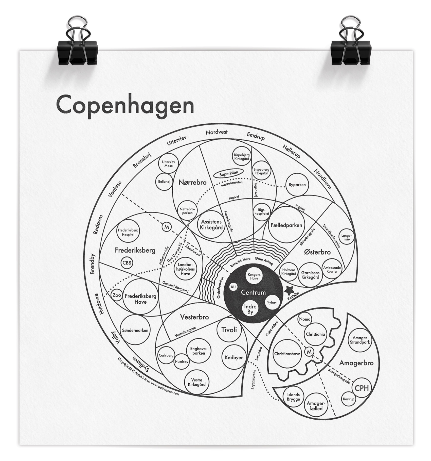
copenhagen-mind-map

Many challenges lay in the details: getting the placement and proportions right so that major roads connected accurately to parks and water, dividing the lakes correctly with the bridges that crossed them, and having the metro pass through the right areas while still hitting their end destinations that are used as the line names when boarding (Vanløse, Lufthavn, Vestamager). All while using circles, circles, and more circles!

A favorite part of the map for me is the integration of the lakes circling the city, which visually connects to the remainders of the old defensive moat system from the Middle Ages (the triangular points on the south side of the harbor on Amager). The northern contained lakes are a central gathering point for tourists, runners, and locals enjoying the banks of the lake for a quick take-out meal. I also love the juxtaposition of the free city-state Christiana right next to the world-class restaurant Noma – two experiments on different ends of the spectrum. And even though we didn’t follow a structure based on the quaint maps of centuries gone by, where everything spreads out from the oldest and most central part of the city, I’m happy that a little bit of the historic “radiating city” feel was retained in this modern interpretation.

The Copenhagen map has been reviewed by a Danish magazine, Magasinet KBH, which focuses on city life and the changing architectural spaces of Copenhagen. You can use google translate, but the general opinion was that the map was simple and clear to understand – which from the Danes is a pretty good review!

While the map has been deemed simple and clear by the natives (and hopefully to visitors as well), here is a decoder key so you can quickly get an idea of all the parts and how they interact. The ring of names around the outside/northwest are suburbs, and following Archie’s system the city center (Centrum) is black. All smaller localized areas, tourist spots and notable locations are in individual circles (the zoo, Tivoli Gardens, Noma, Islands Brygge, the airport, etc), as well as parks, hospitals, schools and the overarching neighborhoods.
copenhagen-map-explanations

The Copenhagen mind map is available at Archie’s Press in letterpress (8×8″) or screen print (17.5×17.5″) editions.* Some of my favorite pieces of Archie’s are from the Outer Space series, including The Moon, The Sun, and The Milky Way – even the product descriptions make me smile. Thanks for reading – now you know way more than you probably need about designing a mind map of Copenhagen.

*Tim May, I have you covered.

SS Halo Logo: Study for Singled Sided Hearing


This illustration was a done as a favor for a friend in the medical field. The project was for a grad school course involving a mock research grant proposal for a study on single-sided hearing – the proposed research would invoke youth with single sided hearing loss and quality of life outcomes.

The Seattle-based team wanted a ship to represent their study, called SS Halo, and from a few digital sketches chose this one to use as their icon. The only requirements were that it should have some orange and blue to feel connected to the Seattle Children’s Hospital and the name be prominent in the clean and simple illustration.

One of the options not chosen was a more whimsical style that led to the series “Famous Ships in Bottles”. I often find that cast offs from paid creative work is what I am most drawn to and helps inspire side projects and personal illustrations.

The SS Halo
The SS Halo

Umpqua Promo Magazine


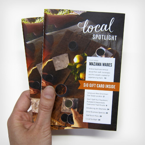
I’ve done many projects with Umpqua Bank, from the buttoned-up online identity for their Private Bank to a giant mural of a birds nest for a new store opening. Our latest collaboration was no less ambitious in the greatest direct mail piece I’ve ever seen. Yes, I have designed my first ever direct mail piece, and I’m proud of it!

umpqua-direct-mail-cover-in-hand

Just the phrase “direct mail” sends shivers down my spine, so one goal while working on the piece was to make it as personal and relevant as possible. Sewn binding on the book and having a precisely fit clear sleeve presented it well from the outside. Inside, working with a great photo library was a boon – nary a stock image was used! Professional architectural photos of Umpqua as well as brand images from Mazama Wares created a cohesive visual narrative. A diminutive format (the magazine fits easily in your hand) and 32 pages of editorial and lifestyle centered content made it both useful and interesting.
Continue reading “Umpqua Promo Magazine”

Upward Partners Branding


A recent collaboration with a Portland-based consultant resulted in rebranding his small company to present a more cohesive visual front. Upward Partners is a company that builds infrastructure for fast growing companies, and its founder, Brian, wanted a brand that reflected his way of doing business: results driven but also fun and innovative.

Working primarily with numbers, data, money, and other cold hard facts doesn’t always lend itself to an inspiring logo. To stand out in the field of CFO’ing and COO’ing we opted for a Northwest influenced motif of a mountain range. With a ‘slight chart & graph’ vibe, the icon also reinforced his positively-geared business name.

Geometric and data based mountain range inspired logo for Upward Partners.
A geometric mountain range.

The typography was set to focus on the action part of the name and give it the same uplifting feeling as the mountain icon. Combining that with a nuanced color palette gave plenty of options for leeway in future materials. The font Adelle proved its worth by being both approachable and serious in its serif and sans versions.

A friendly yet respectable color palette and serif/sans combo of typography.

Various illustrated elements were combined into a banner graphic that did some heavy lifting on the homepage, which had previously been bare of graphic elements save for a background pattern.

The path of running a business can be long and winding.

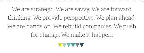
A large part of this project was determining Upward Partners’ written voice, as the previous site had been a somewhat dry list of business ingredients. Jargon-free speech and easily digestible explanations of complex business scenarios made it easy to understand their approach and work. A mantra-like introduction was created to describe the essence of the business, leaving the technical points for sub copy.

Mantra text summing up what Upward Partners brings to the table.

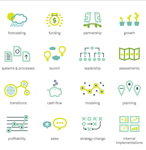
Using icons to support key areas of expertise upgraded the straight-forward content from bullet points, and let the new long-form content call out the key differentiators Upward Partners asserts – a pre-engagement fit assessment and no middle-men in the work process leads to tangible results from their consulting efforts.

business icons for forecasting, funding, partnership, growth, documentation, launch, leadership, planning, transitions, cash flow, modeling, profitability, sales, strategy change, and internal implementations.
Sixteen icons visualizing main areas of expertise.

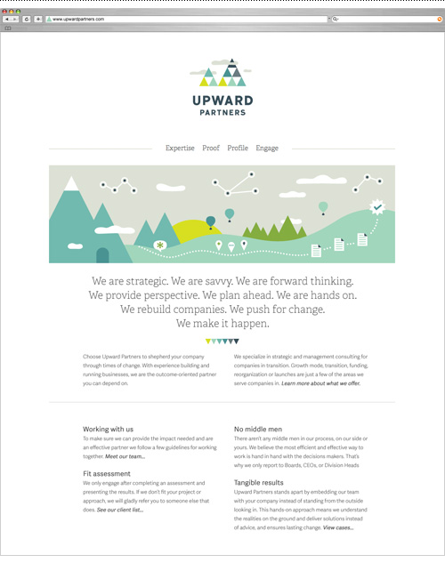
The culmination of writing, designing, and organizing resulted in a new website to be used in presenting Upward Partners’ work to both current and prospective clients. The site was built in Squarespace to allow full editing capability by the client. Check it out at www.upwardpartners.com.

Homepage design with all elements in play.

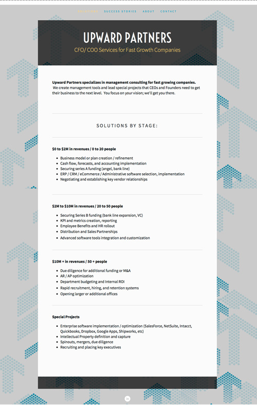
And because before and after shots are so satisfying…

A before shot of the Upward Partners website.

I’m excited to debut this small business rebrand and hope it helps Brian go forth and conquer. I look forward to expanding this flexible and fun brand to bring a fresh look to a category of business I don’t usually work with. Maybe I’ll even pick up some additional business acumen along the way…but for now I’ll just keep on keeping on with some kpi and metrics creation to optimize securing some series b funding. Or something like that.

upward-partners-mountain-range

Well Vegan Illustrations + Site Update


I’ve enjoyed working on the Well Vegan brand over the years, starting with their initial logo and branding and continuing with an eBook cover, promo materials, and a series of DIY postcards (here, here, here, and here).

Our latest collaboration was to update their website based on user analysis to increase sign-up and promote their new eBook Starter Guide. To do this we streamlined the front page with a large either/or graphic focusing on the plan and the book.

New Well Vegan header graphics focus on the meal plan and the e-book.

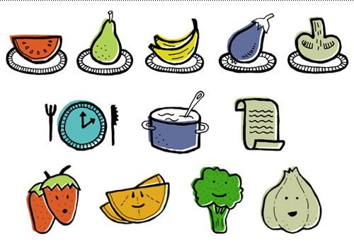
The Plan and The Starter Guide got their own secondary pages that had more in-depth information that was previously outlined on the homepage. And all that new content was a great excuse to create more small plates!

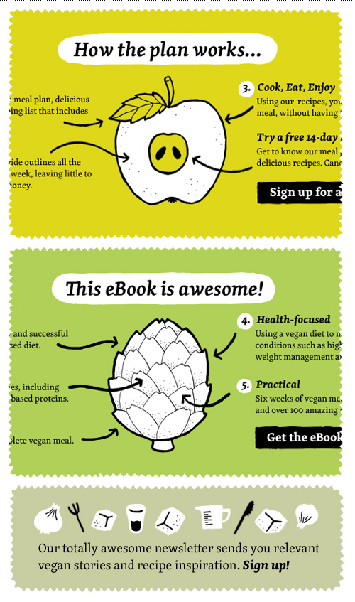
Small plates, plan icons and testimonial fruit & veggie characters.

The homepage was also adjusted below the fold to highlight the resources section and recipes section, and make the all of the content more scannable. Four resource icons were made for this.

Four resource icons for the Well Vegan homepage.

Even though I’m not a vegan, vegetarian, or any other label of imbiber other than equal opportunist, I enjoy getting their weekly newsletter of recipes – always handy when veggie-only friends visit. If you need a hit of cooking inspiration, just visit their extensive library of home-tested recipes.

Umpqua Bank Bella Voce Collateral


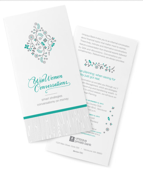
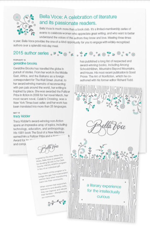
A client I have always enjoyed working for is Umpqua Bank, which was the case again in my latest project with them to create branding for an event series duo. The two part branding was for a book event series (Bella Voce) and follow-up educational talks on wealth management and planning (Wise Women Conversations). The collateral needed to be upscale and feminine for an audience of women aged 40-60 with money to manage.

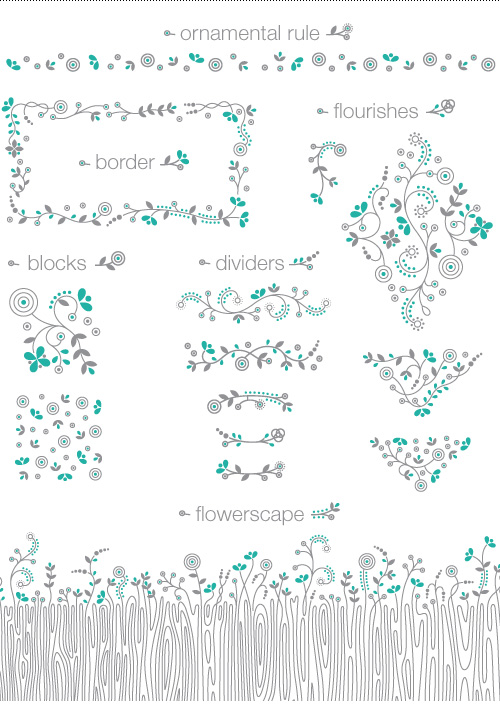
Taking cues from Umpqua’s Private Bank branding, the new collateral uses a woodgrain pattern paired with intricate but modern flourishes to adorn the range of 16 pieces created for the two event series. This simple structure is combined with a brand color palette – the gray + chocolate (or brown, as most people call it) used for UPB is shifted to a gray + teal combo while still staying on brand.

The two logotypes were hand-lettered by Mary Snow, and Kate Zimmerman art directed the project. To learn more about the events, visit Bella Voce’s page or the Wise Women page on Umpqua Bank’s website.

Wise Women Conversations brochure and event card.
Bella Voce brochure and guest card, two of thirteen deliverables in the collateral series.
Bella Voce brochure and guest card, two of thirteen deliverables in the Bella Voce collateral series.
Bella Voce illustration library.

Scoop Love Branding


Just in time for the end of summer, here comes another ice cream project (I hear the first project, Gelato by Naia, is available at Zupan’s on Belmont – after tasting 6 flavors I can guarantee they are delicious)!

This gig was for a small home-grown ice cream vendor from Charleston, South Carolina, who works under the name Scoop Love. More grassroots than most, the ice cream is only available at the local farmer’s market with scoops being served from a small ice cream cart.

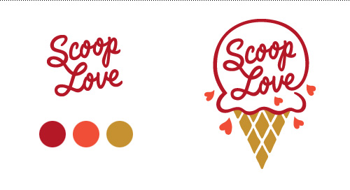
Logo, palette and main icon.

Inspired by the 50s ice cream culture and parlor style, the branding is as simple as possible in a throwback analog way. Most items are 2 colors and the use of elements is repetitive and straight forward. The entire system relies on only an iconic waffle cone pattern, a circle, and a heart here and there.
Continue reading “Scoop Love Branding”

Gelato Tub Packaging


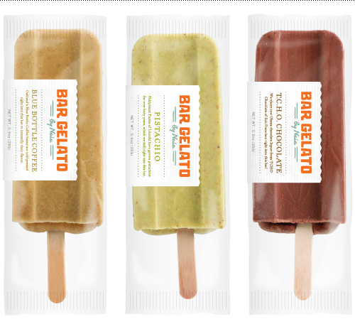
Several years ago I created a logo and packaging for Bar Gelato through Substance. The product did well in stores, which spurred the birth of gelato in a tub. Naia Gelateria requested creative direction for a packaging line that related to the original bars and stood out on the shelves as straightforward and modern.

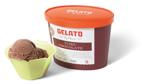
Chocolate gelato made with TCHO Chocolate.

It was an interesting project with the task of blending the brand recognition of Bar Gelato with the original store brand of Naia Gelateria. To capitalize on shopper recognition for a product that was positioned in two different areas in the grocery store, we repurposed the hand drawn Bar Gelato logotype to read just “Gelato” by Naia.

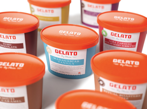
A universal lid reinforced the original Naia brand.

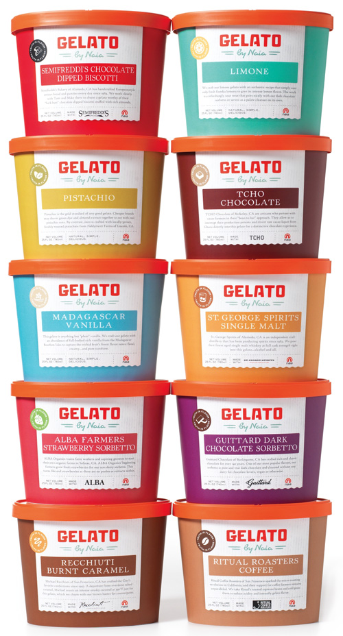
The results were a packaging series with a strong color presence on shelf and a small ingredient icon to differentiate flavors. Using a universal orange lid reinforced Naia’s hand while the scalloped butcher paper and fonts referenced Bar Gelato.

Strong color differentiation helped distinguish flavors on the shelf.

Currently the tubs are available at specialty markets in Northern California, or you can check out Naia’s selection of Bar Gelato. Similarly to Bar Gelato’s release, interest in carrying the tubs has been positive so expect availability to increase exponentially!

bar-gelato-trio
The original and inaugural packaging for Naia’s first in-store product, Bar Gelato.

Mark Creelman, PhD


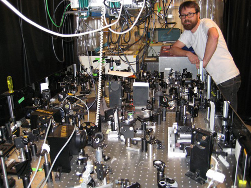
Remember when I made up fake research titles with my friend Jonathan, hoping to sound smarter than I actually was? Well I also have friends who make real research titles that resemble tongue twisters to us regular folk…titles such as “Femtosecond Time-Resolved Optical and Raman Spectroscopy of Photoinduced Spin Crossover: Temporal Resolution of Low-to-High Spin Optical Switching”. Introducing my buddy Mark Creelman.

Mark Creelman in his natural habitat...surrounded by laser equipment.
Mark Creelman in his natural habitat…surrounded by laser equipment.

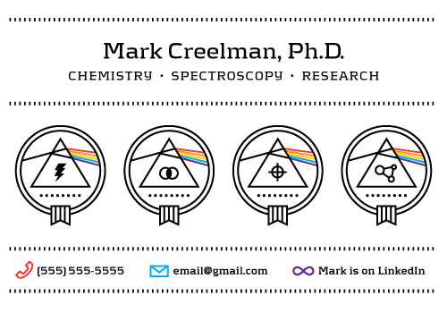
Mark recently requested a business card now that he was officially done with school and on the job hunt (after undergrad at Lewis & Clark and a mere 8 years at Berkeley). Not only is he an expert in Raman spectroscopy and complex laser systems, he is also an Eagle Scout. To make him the hippest science dude on the spectroscopic job market, I created four badges for him to choose from and paired it with a respectable but techy (and coincidentally Danish-designed) font called Kontrapunkt, with a solid hit of pop-culture reference.

Now you know who to contact for all of your needs concerning “Structural Dynamics of a Noncovalent Charge Transfer Complex from Femtosecond Stimulated Raman Spectroscopy”. Or you need a voice actor who can pronounce femtosecond fives times fast like a pro.

Note: For the scientist’s privacy all contact information above is generic. Let me know if you want to get in touch with Mr., I mean, Dr. Creelman.