
At the end of last year I was lucky enough to help create branding for an idea called Mister Museum. Sometimes when a new client crosses your path, you just KNOW it was meant to be. Here is a stylized version of the Bureau’s first meeting with the man behind Mister Museum.
MM:
- I’d like to promote the content that museums and educational institutions curate, but in a more interesting manner so that it engages the general public. Basically, this would be a venture for increasing art and science literacy, with a point of view.
BB:
- LEARNING IS THE COOLEST!
MM:
- My target audience is people that are curious about things in general with access to up-to-date technology.
BB:
- THAT’S ME! SCREW INTERNET EXPLORER 6!
MM:
- I don’t want this to be any old museum-y logo. It should be fun!
BB:
- I LIKE FUN!
As you can see, I was psyched to help build a voice for such an interesting client. We decided a logo, website and e-newsletter were the best things to start Mister Museum off on the right foot. So, I got to work. I started with a typical brainstorming exercise, the word cluster, a very useful tool in case you get stuck in a creative fire swamp.
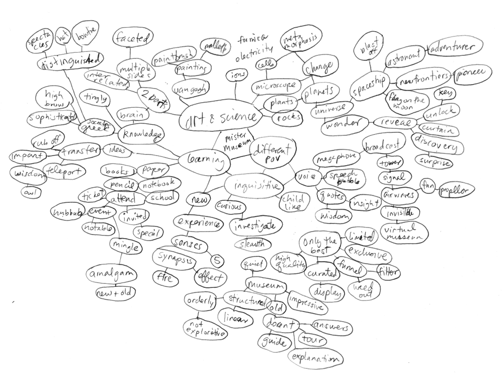
Fairly soon into the logo process there was a clear winner: a very curious M with a perma-magnifying glass. The client loved it as it embodied his personality to a T, as well as fulfilling a several technical considerations. The type portion of the logo was easily transferred to a variety of Mister Museum’s platforms for spreading interesting tidbits through video clips and informational guides. Another key attribute needed in this logo was scalability, especially in small sizes for use in social media and co-sponsor situations.

While working on the business card I went a little overboard. What with that M staring at me with that big magnifying glass, what was I supposed to do? So I made a miniature booklet that would get people interested in what Mister Museum is all about. Here are a few example panels:

And last but not least, here’s a preview of the Mister Museum home page. Stay tuned for more, because once Mister Museum gets going I think that this little M is going to be making tracks all over your cerebral cortex.

Very nice little M man logo!
Thanks for the insight into good logo design process.. simple, effective, strong message and works at small sizes.. Im sure it would look fine in monochrome too.
Looking forward to the site launch.. saved the url to my delicious bookmarks.
They’re some very cool facts on the booklet too.. What fonts have you used on them?.. can I get a booklet when printed?
.. oh and where did you find the Escher Lego Art.. amazing!
@Russ – 1) fonts used are Gesta & Ronnia. 2) I’m sure if you met up with Mister Museum a booklet business card would be granted. 3) The Escher Lego art is only one of Andrew Lipson’s many lego creations – the image was used For Placement Only in the website mock-up: http://www.andrewlipson.com/lego.htm
Awesome work as always Mette. Love the M!