Rainbow World Series


Series of four illustrations done in four rainbow-tastic colors. A girl and her mule, a bifurcated heart, rainbows everywhere, and a rainbow world interpretation of the Cinderella dress scene.

Looks like I’ve reached the stage in my side project career where much of my work will be inspired by: 1) my 4-year-old daughter’s drawings, 2) my daughter’s imagination, or 3) my daughter and her future. As an ever-changing subject matter, we’ll see how this appropriation of content develops over time.

Update: I showed my drawings to my daughter and told her she inspired me (ensue a long discussion about what the word inspire means), after which she demanded to copy my artwork. Below is the original that inspired me, and the redux inspired BY me. I foresee a long and fortuitous/contentious working relationship…

Return of the Love Bird


Another month, another Launch art show! Last month I showed an excerpt of ever-changing feathers. This month I am contributing a new format of my Love Bird enamel pin – namely giving it a frame and a bit more blue sky. In addition to a framed pin, there will be a gaggle of pins for sale at the very affordable art price of $10. Come to the show (info below), or read more about the original inspiration for my little love bird.

Portland’s First Thursday @ Conversa
Theme: Proud as I am
June 7, 2018 from 6-9pm
734 NW 14th Ave, Portland OR

Thanks again to Aldo, Susan and Julio for organizing!

Enamel bird pin blowing a heart kiss with rainbow pride wings.

Proud as I am launch art show at Conversa

Chocolate Wafer Concept Packaging


One of my favorite types of design projects is packaging – specifically food packaging. It is also one of the more fickle types of projects. Sometimes products miss their window of opportunity, sometimes start-ups aren’t able to get an investor to put the product on shelves, sometimes budgets fall through or a product line is re-oriented. Specialty products are sometimes explored up until launch, at which point they are deemed unviable. Once an entire project was derailed due to a macadamia nut shortage. You just can’t plan ahead for these kinds of things!

Because of this, I have worked on almost as many packaging projects that have been shelved than have actually reached shelves. Gelateria Naia is my one exceptional client that has taken every product I’ve worked on to market (see a few projects here and here, with more in the works!). Even the packaging projects that make it to market often take a YEAR OR TWO between packaging design and hitting shelves. This is like 1,948,465 years in “designer years” – it’s definitely not an exercise in instant gratification.

Last year I worked on chocolate wafer packaging for a company that packages US and European products for the Chinese market. Because of quality perception and some food scares, the design brief presented an interesting mix of designing in a way the Chinese market was used to (bold, zingy, pop!) while making the product look and feel European-based. Unfortunately the project was put on hold, but I wanted to share a direction from the initial design round (with a placeholder product name). A more traditional approach was selected as the final, where I got to practice drawing the Swiss Alps and milk splashes, but is not shown here because it hasn’t been released. So while not everything makes it to market, it doesn’t mean it isn’t sweet!

Concept packaging for chocolate wafers in four flavor ways: chocolate, vanilla, milk chocolate, and hazelnut. Illustration in a modern style but with traditional European motifs.

F/Yeah/That


A few years ago I made a short series of lettering pieces called Typographic Terrains, which I enjoyed drawing greatly. They were time consuming to make, though, so I stopped after a small collection had been made. Recently I was looking through some sketches from a Letter PDX event where the prompt was “blackletter”. One F caught my eye, and became something bigger than originally intended. This one was created on my iPad Pro in Adobe Sketch, so it has a slightly different/rougher quality.

patterned lettering F-yeah / F-that combo

I Think I Need A New Heart


Magnetic Fields "I think I need a new heart" new heart package

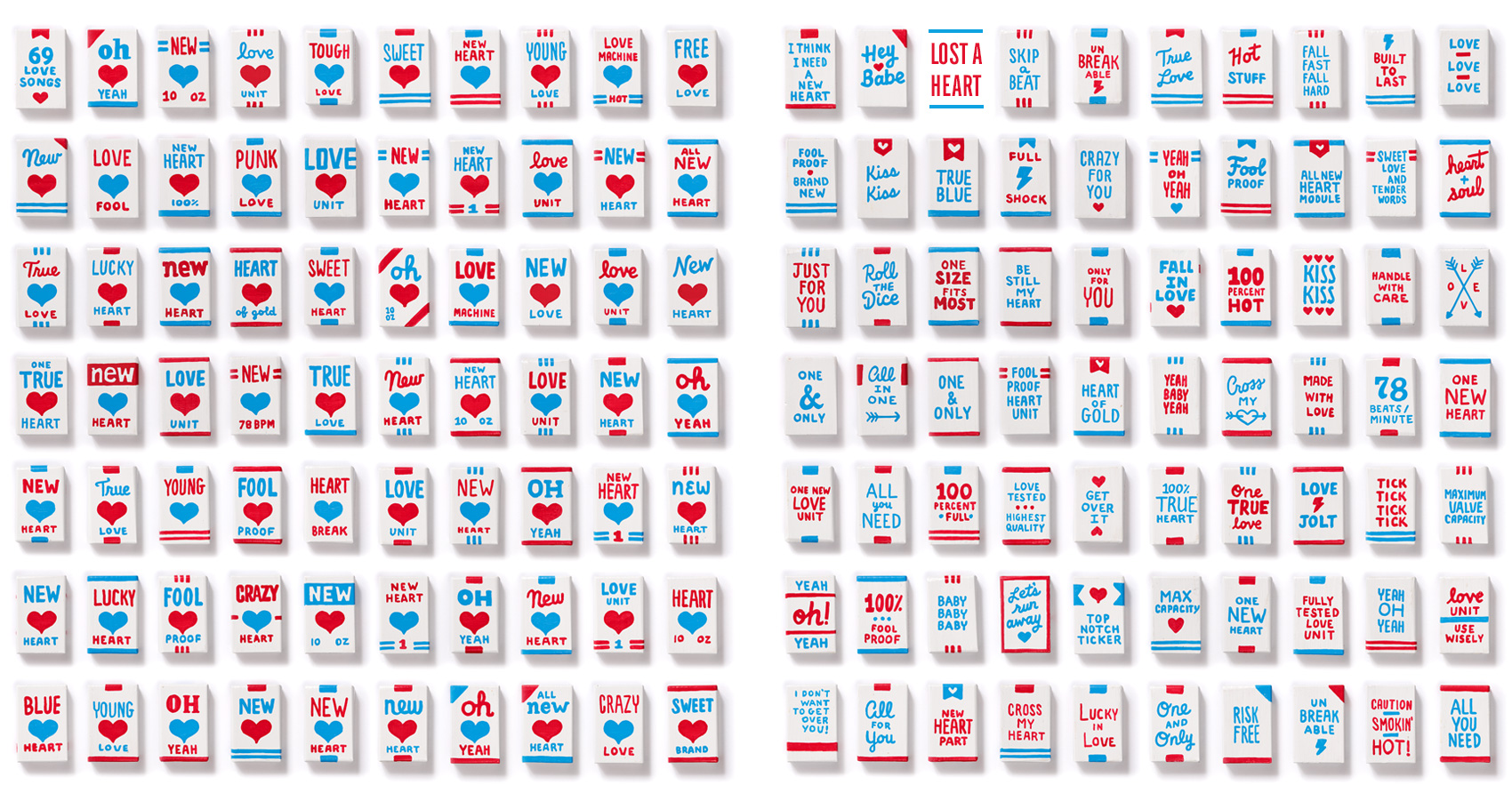
A year ago I participated in an art show at Land Gallery in Portland, Oregon organized by two design friends, Cielle & Michelle. The show was a tribute to the band The Magnetic Fields’ album 69 Love Songs, which has precisely that number of songs in varying genres. Cielle and Michelle rallied 69 designers and artists to each choose a song and make a piece of art about it. My song to interpret was “I Think I Need a New Heart”.

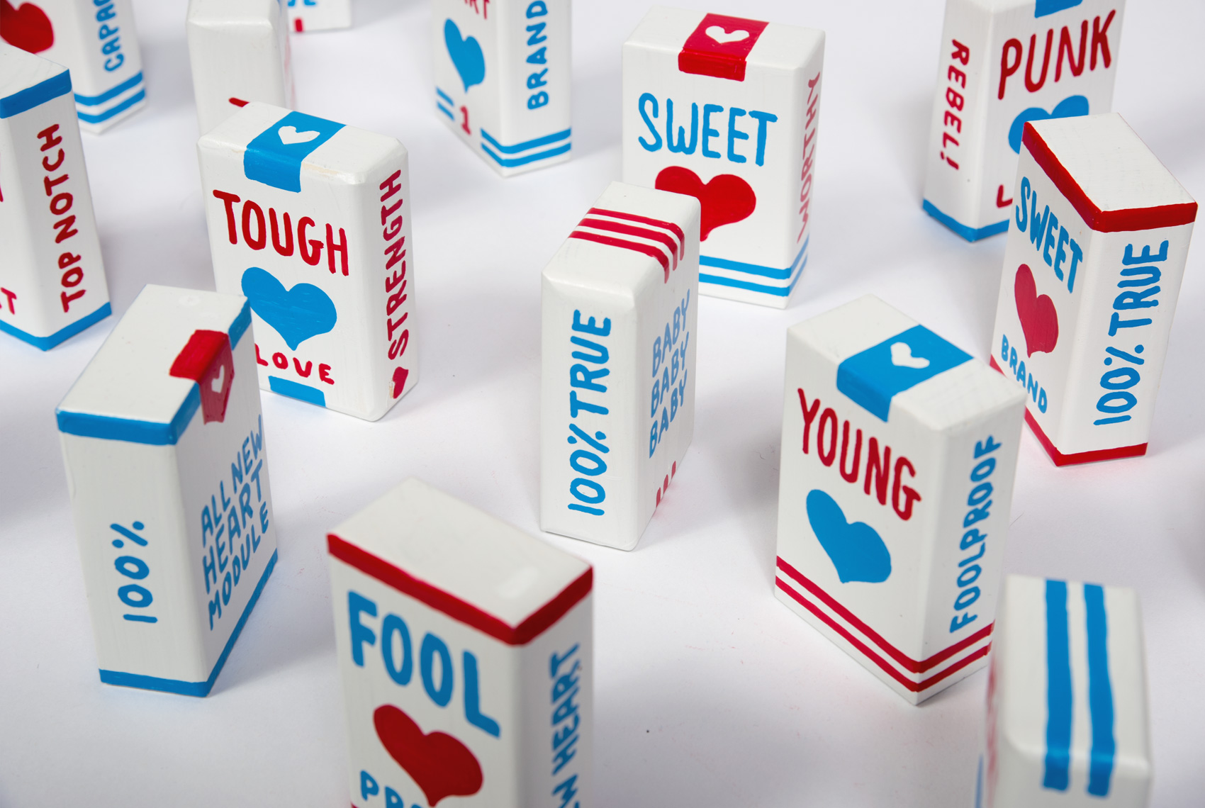
After signing up to participate, I immediately formed a task force within my shared studio space to work on the project in a more collaborative way. Two of my studio mates joined the show (hi Jen & Drew), and we spent many afternoons brainstorming and working on our projects. My initial idea of illustrating a new heart morphed into a packaging project (my favorite kind of project) that would feature not just one package, but SIXTY-NINE packages of new hearts. In 3D. Because you don’t buy just one raisin, you buy a whole lot of them. Historically I have a tendency to go all in, whether it’s outfits, rabbits, feathers, pianos or books, books, books, and this was no different.

Magnetic Fields "I think I need a new heart" new heart packages - fronts, batch 1

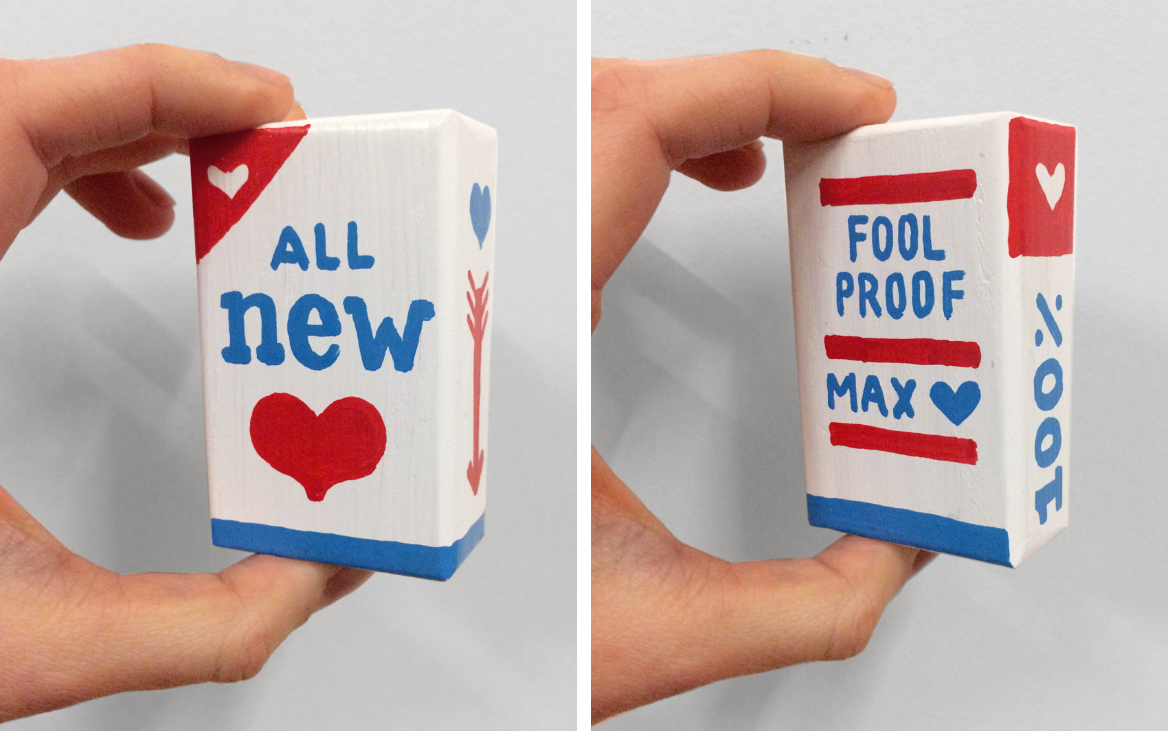
The first major decision was what format the package would take. Paper seemed too flimsy – I wanted people to be able to pick it up with confidence, set it on their windowsill and not have it tip over at the slightest breeze. Something that could fit in your hand and had a good heft to it. A few years earlier I had painted a piano, and the idea of painting little wooden boxes seemed attainable* and would give the right feel to the packages – real but not too overbearing.

*Hahahaha you silly fool.

Magnetic Fields "I think I need a new heart" new heart packages - fronts, batch 2

Lacking a skill saw of my own, I scoured Etsy for a resource to make me a lot of tiny wooden boxes. I found several people who made giant Jenga sets, which were kind of like the boxes I wanted. After several estimates and questions about wood paint later, Anthony Mirra made me a custom set of blocks to the size of 3x2x1 inches and painted them blank white.

Magnetic Fields "I think I need a new heart" new heart packages - fronts, batch 3

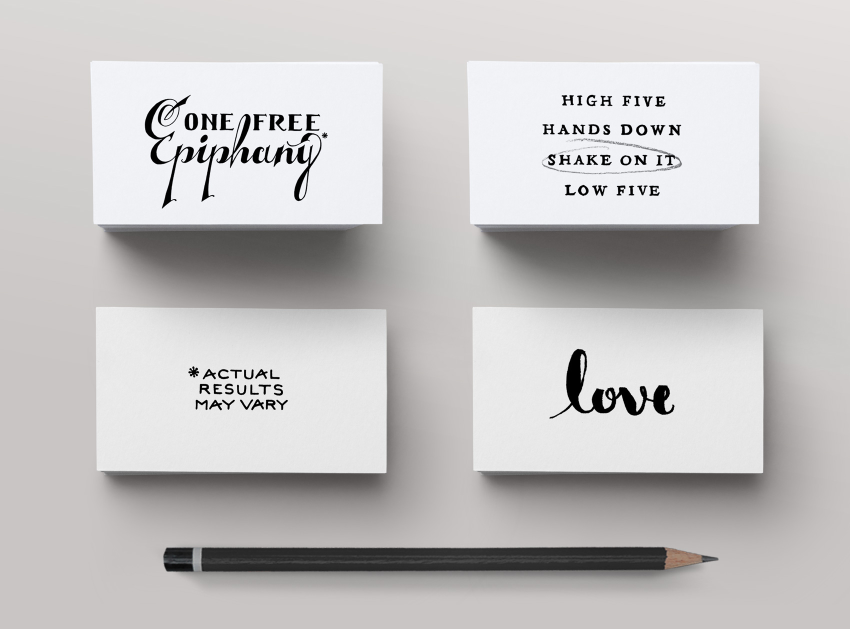
From my piano project I had a bunch of extra markers I hadn’t used that were industrial strength construction markers by Markal. They are thick, require lots of shaking before each use, and are made for withstanding outdoor construction site environments. EXACTLY the marker strength needed for making new heart packages. Luckily I had ordered a batch of blue and red markers which fit this project well in being limited in palette and representing the colors of blood both seen and unseen. In retrospect, I wished I had skinnier markers as the fat markers were hard to work with and limited the amount of text I could fit on a 3×2″ box.

Magnetic Fields "I think I need a new heart" new heart packages - fronts, batch 4

Materials in order, it was now time to start drawing so I whipped out 12 boxes and thought….boy that took longer than I expected. And those markers take a lot of shaking to get the ink to flow just right. In fact, their industrial smell is making me feel a bit light headed. Right around this point in the project I reached the DESPAIR & DOUBT phase that is a part of many creative projects. Will I be able to finish it? What have I DONE??? This was a terrible idea! How was I going to think of phrases for 69 box fronts, 69 box backs, and 138 box sides?!?!? The main reason for PANIC was that time was running short, and I had 57 more wooden boxes to paint in addition to a full client work-load.

Magnetic Fields "I think I need a new heart" new heart packages - fronts, batch 5

So I did what usually works well when I’m stressed out – applied my efficiency factor to the project. The initial set of 12 boxes had enough elements that I could apply them to batches of blocks at a time: 12 boxes of “triple stripes”, 12 boxes of “over the top ribbons”, 12 boxes of “top & bottom borders”. Combining that system with varying phrases in different lettering styles gave me 69 boxes at a much faster clip than the original 12. It also allowed the basic box elements to dry while I lettered other boxes, so I didn’t have to be quite so careful when holding the box and drawing on it (FYI drawing on a small angled 3D box with a fat liquid paint marker is harder than drawing on flat paper).

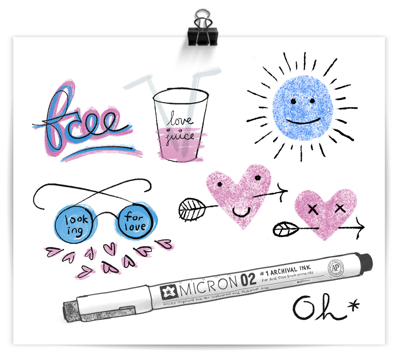
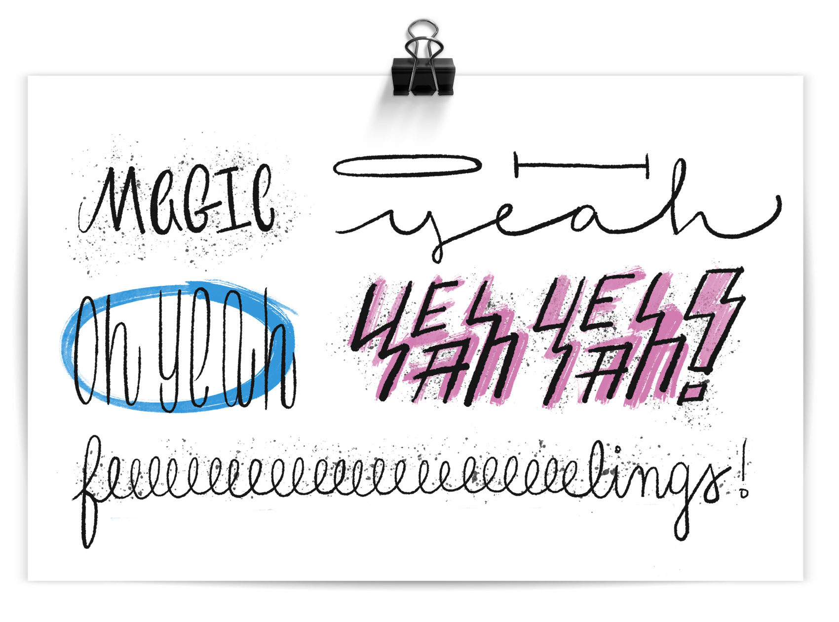
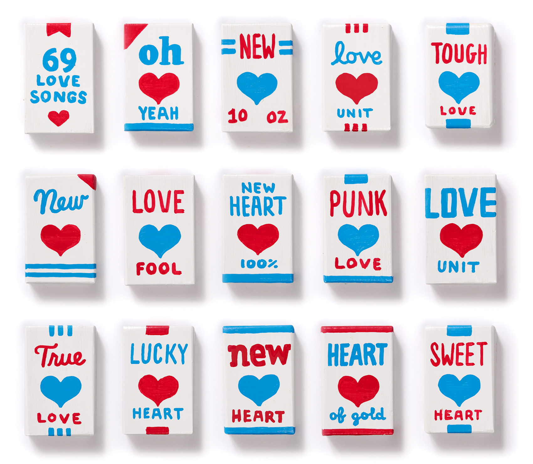
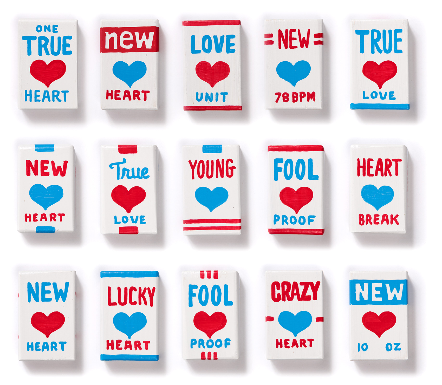
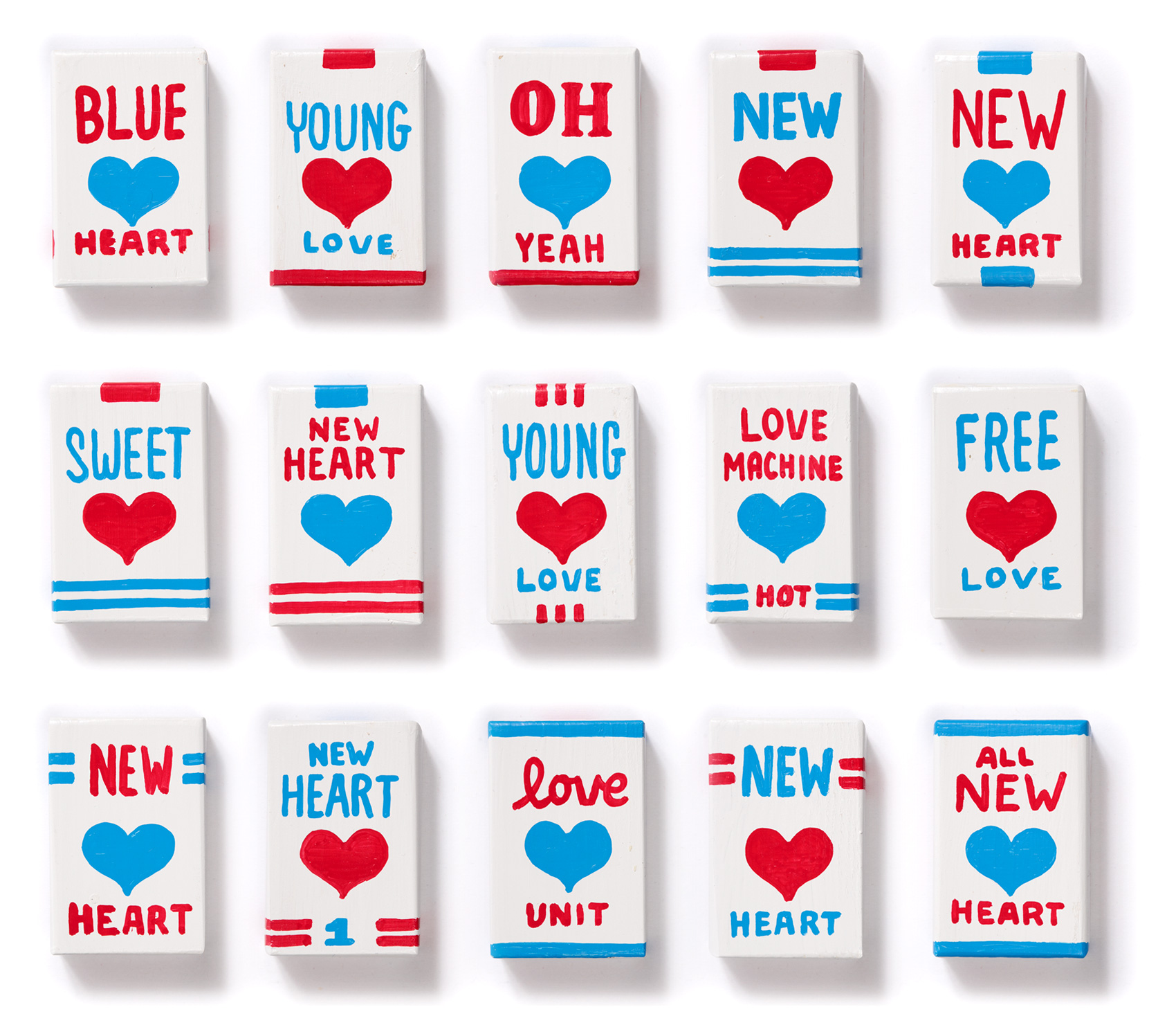
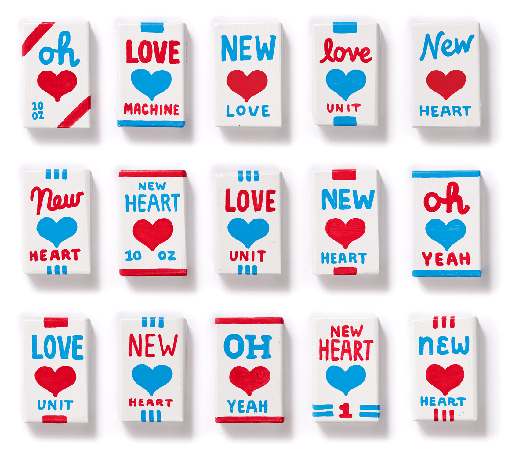
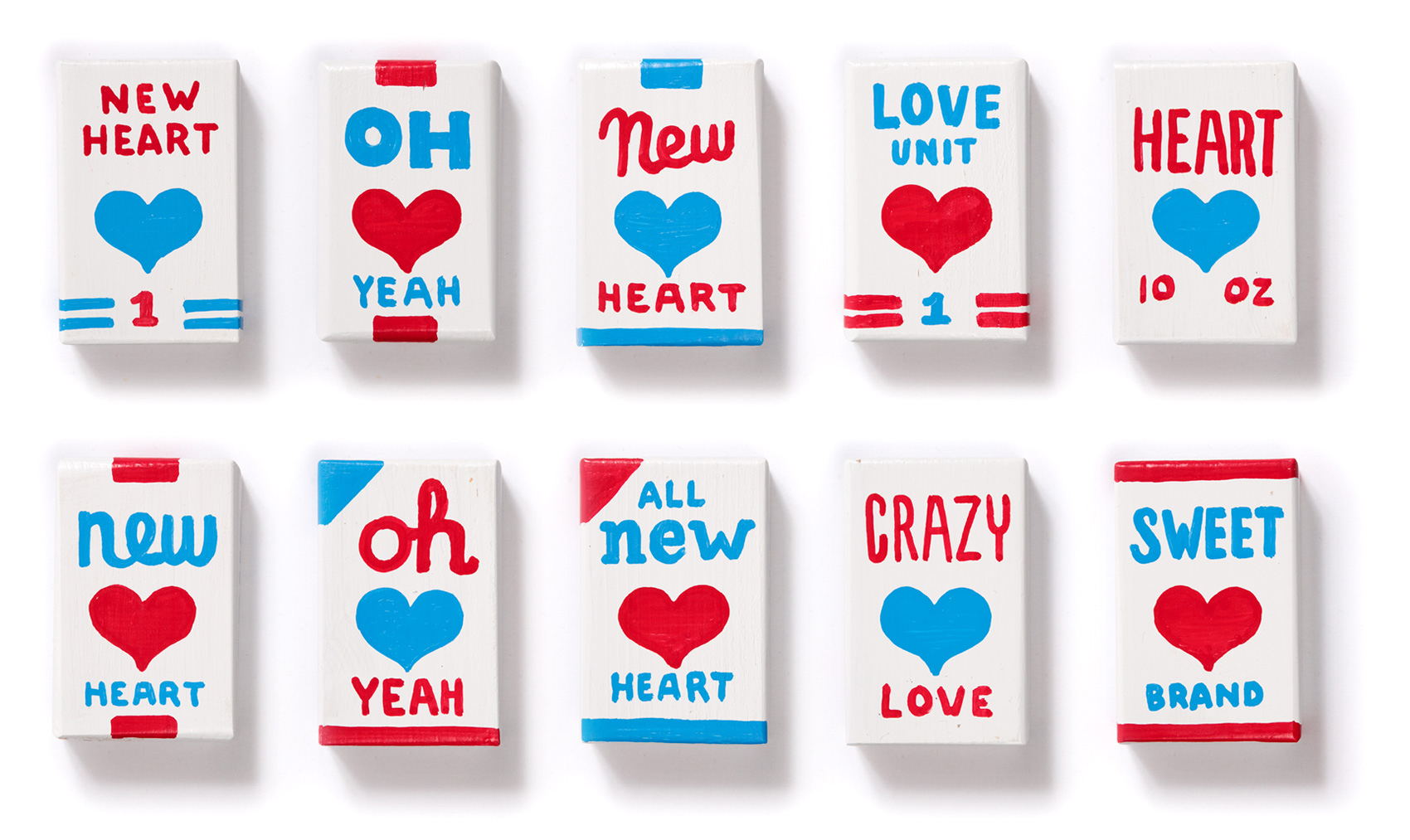
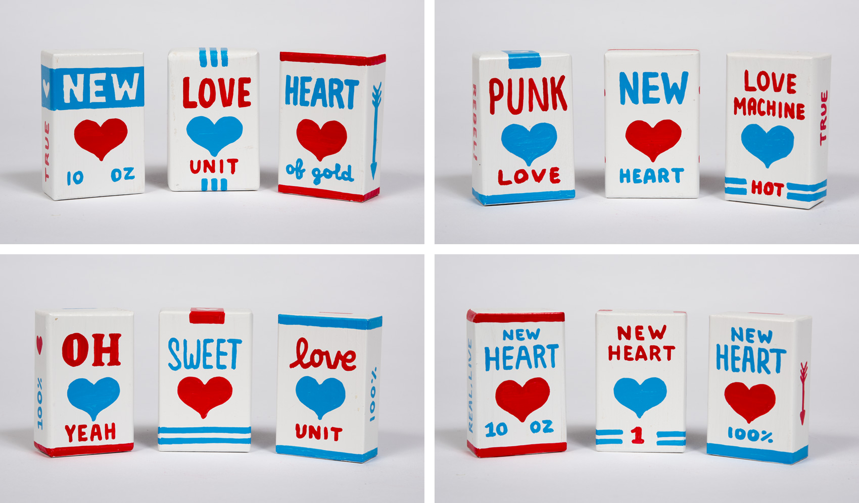
Sprinkled in between the New Hearts and Love Units are boxes with lyrics that reference other songs on the 69 Love Songs album such as “Yeah oh yeah”, “I don’t want to get over you” and “Crazy for you (but not that crazy)”. Each and every new heart is a one-off, numbered from 1-69, with almost the same amount of red hearts as blue hearts. Here are a few of my favorites…

Magnetic Fields "I think I need a new heart" new heart packages - favorites: oh, oh, oh / new, new new / oh sweet fool

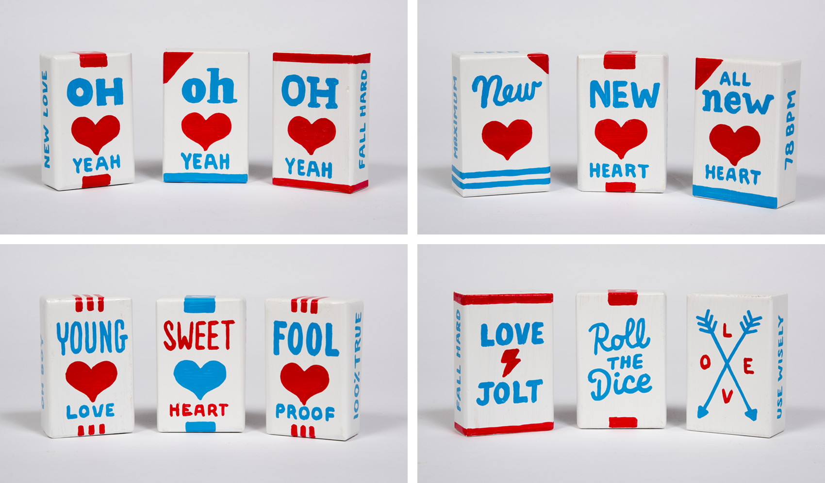
For anyone who has experienced heartbreak (once, twice, a thousand times?), you know it comes in all forms. Accordingly, each new heart was made to fix, make light of, or prevent the endless variations of heartbreak. One of my favorite side effects of the project is how groupings of the boxes read in a lyrically repetitive way that seem to have a life of their own – Sweet young fool heart! Oh new lucky love! New true love unit!

Magnetic Fields "I think I need a new heart" new heart packages - favorites:  new, love, heart / punk, new, love machine / oh, sweet, love / new heart, new heart, new heart

Shout outs for this projects go to many – Michelle & Cielle for having a fun idea for a show and making it happen – my studio mates for giving feedback and enduring endless hours of marker-shaking sounds – and all the influences in my life that have somehow instilled in me the desire and ability to follow through on projects that bring me satisfaction – go big or go home, right?

Magnetic Fields "I think I need a new heart" new heart packages - side view

Magnetic Fields "I think I need a new heart" new heart packages - wandering hearts

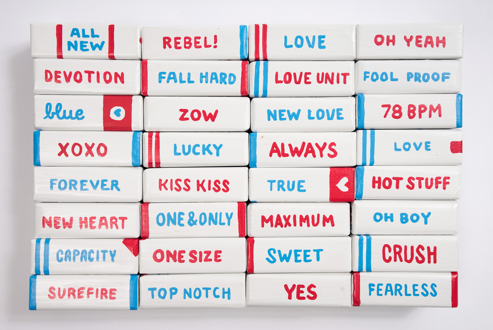
Looking back, I’m glad I went the extra 68 miles because I think the project benefits from the scale in quantity. The box-by-box execution is sub-par but I love the idea that heartbreak/new love/fresh starts/first loves/last loves/ is both so prevalent that we definitely need a stockpile of New Hearts, but in each single instance it is small and mundane – ubiquitous yet excruciatingly personal at the same time. Good luck to us all.

Magnetic Fields "I think I need a new heart" new heart packages - pyramid

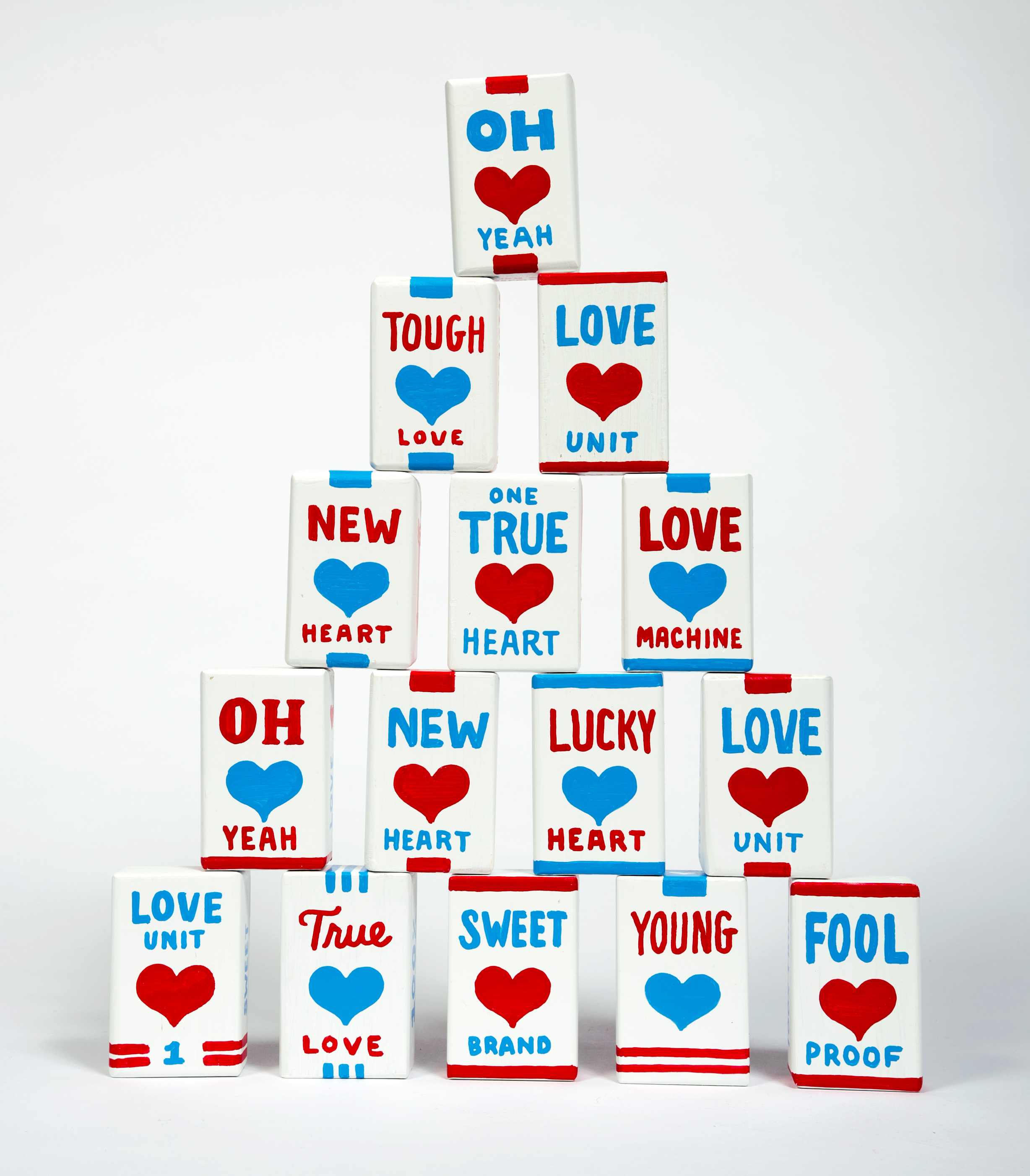
Thanks to Ian Whitmore for photographing the new heart packages and suggesting that we make a giant stack of them. Because if there is anything more precarious than Oh New Lucky Love then it’s a whole stack of it.

Magnetic Fields "I think I need a new heart" new heart packages - all 69 fronts and backs, and the title block

Mouse Eating Peanuts and Other Drawing Practice


Last year I bought an iPad and decided I should try to utilize it in my work to (hopefully) save time and try something new. Old dog, new tricks. So far it has been equal parts frustrating, fun, and frustrating. Yes, frustrating is two of those parts – one for the technology part and the other for having to retrain yourself how to draw when you’ve been used to a Micron pen and Office Depot laser paper for the last 7 years.

So far it has been most useful for creating the sketch phase of work in a fidelity that is higher than sketching on paper, but I haven’t been able to transfer any tasks I do 1-to-1 yet. Here are some of my more successful practice drawings, including a blue mouse in pink pants popping unshelled peanuts.

free typography, love juice cup, looking for love glasses, micron pen sketch

Strangely, the VERY FIRST thing I drew on the iPad was my Micron pen. The spatter brush is very addicting so I hope for a resurgence in 80s graffiti style so I can use it in excess. Also, whatever party this mouse is headed to, I want an invite. Look how confident he is in his high rise pants and low rise belt combination. This is a mouse with panache!

a blue mouse in pink pants carrying some cheese and eating peanuts

In summation: magic oh yeah, oh yeah, YEAH YEAH, feeeeeelings. I feel the beginnings of a catchy millennial pop song coming on…now only if my iPad could teach me how to play the guitar, I’ll be set!

hand lettering and illustrated typography: magic, OH yeah, 80s graffiti YEAH YEAH, and feeeeeeeeelings

Code/Art Participant Pins


Woohoo! To follow up on the Code/Art donor pin from last month, I’m happy to share a series of three pins designed for Code/Art participants – girls in their tweens and teens who explore code through art & creativity in guided Code/Art workshops. I had my own button and pin collection in my younger years (read: 1985-1990) so working on this series was flashback fun. Plus any time I can work with an organization that helps girls GO FOR IT, it’s all I can do not to hire a skywriter.

enamel pins for girls who code - a "code girl" banner, </> heart, and code sunglasses

MOO cards has been a steady companion of mine to provide pin backers that are sturdy and good looking, and this time was no exception. Along with the pins, participants also get stickers to kit out their computers, peechees (do those even exist anymore??), or other flat surfaces. The style and colors were derived from their core brand, but the project had lots of room for exploration. Read more about Code/Art on their website.

stickers for code/art girls including "code girl" banner, code sunglasses, </> heart, <xx/> and code girl brooch

Triple Threat


image of three women - triple threat - carrying a stack of books, a briefcase, and a young baby - march march marching

File this one under “procrastiworking” on a Friday afternoon. I have a lot of sketches in this realm, loosely grouped under the idea of a love economy, inspired by #thefutureisfemale and #metoo, Time’s person of the year, and the general movement of strong, able, contributing women coming together for good. While I don’t always feel strong, able or like a contributor, knowing there is steam behind an idea sure helps in not feeling alone and wanting to rise to the challenge. This little ditty was small so it got stuck on a stamp. More to come…what do you think?