Yahoo Yeehaw
Monster Drawing Rally 2017
This year I participated for the third time in the Portland Art Museum’s annual Monster Drawing Rally. A fundraiser for art programs at the museum, it’s a night of fun and exploration with a special area for kids to draw and display their work. Spectators and artists of all kinds join for an evening of fast-paced art making. One of my favorite parts of participating is talking with the kids who watch me draw, seeing how curious they are and how art can place a 6-year-old and 36-year-old on such equal footing if you give it a chance. You like to use markers? Me too. You draw zebras? Yeah, I try that sometimes. You like the color pink? I mostly use black and white but colors are nice too. Art can be whatever you want it to be, that’s the great part.
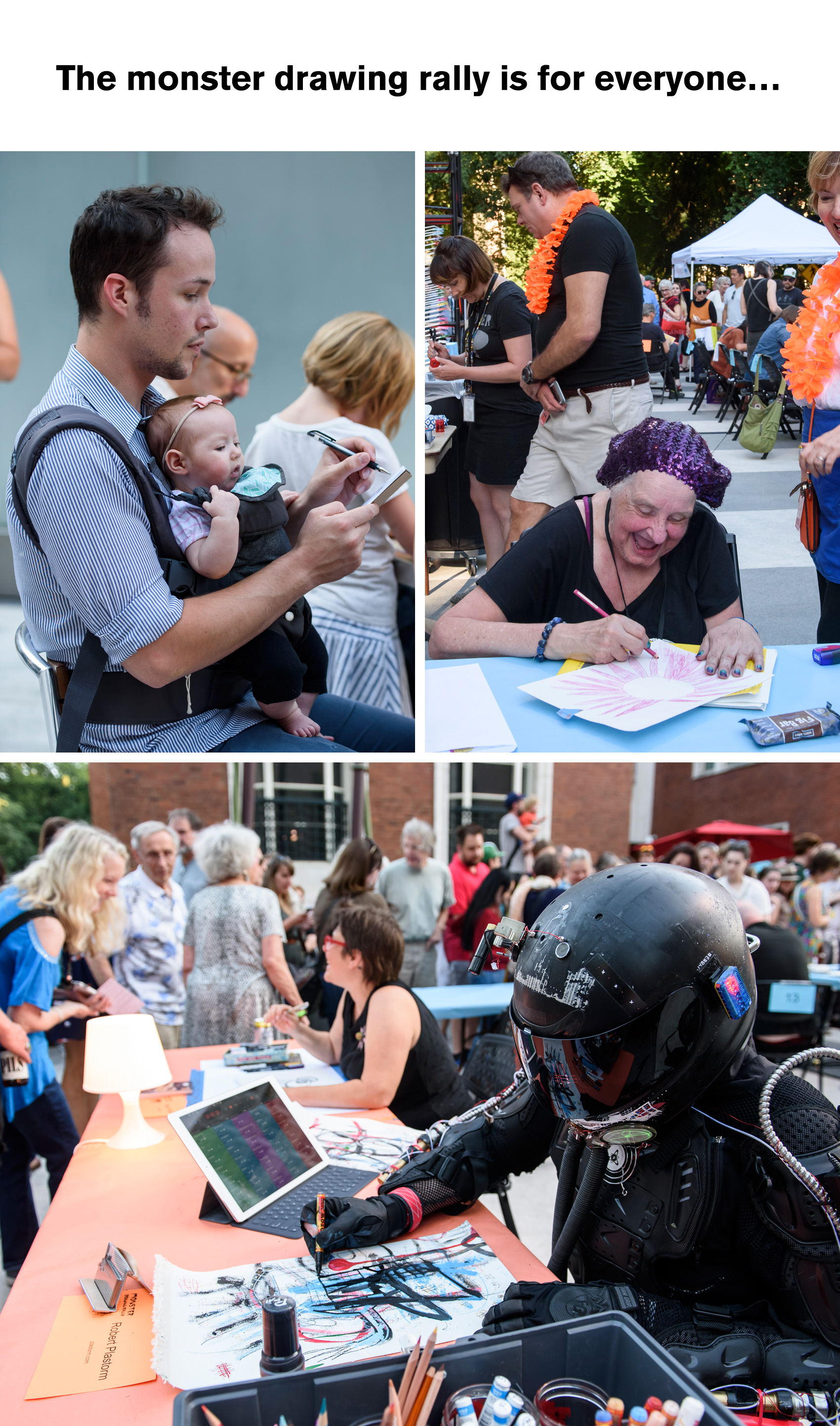
How exactly does the Monster Drawing Rally work? The format is simple, but it does help to know the basics when you arrive. Three rounds of artists each draw for an hour from 6-9:30pm, with 25 artists in each round. Each time an artists finishes a piece it is taken to the bidding wall, where whoever wants to buy it raises their hand. If multiple people “bid”, the winner is chosen by drawing from a deck of cards as artwork is all sold at a flat fee of $35. So it’s best to keep an eye on when an artist finishes their work and follow it straight to the wall so you can hopefully bid on it before anybody notices it’s there!
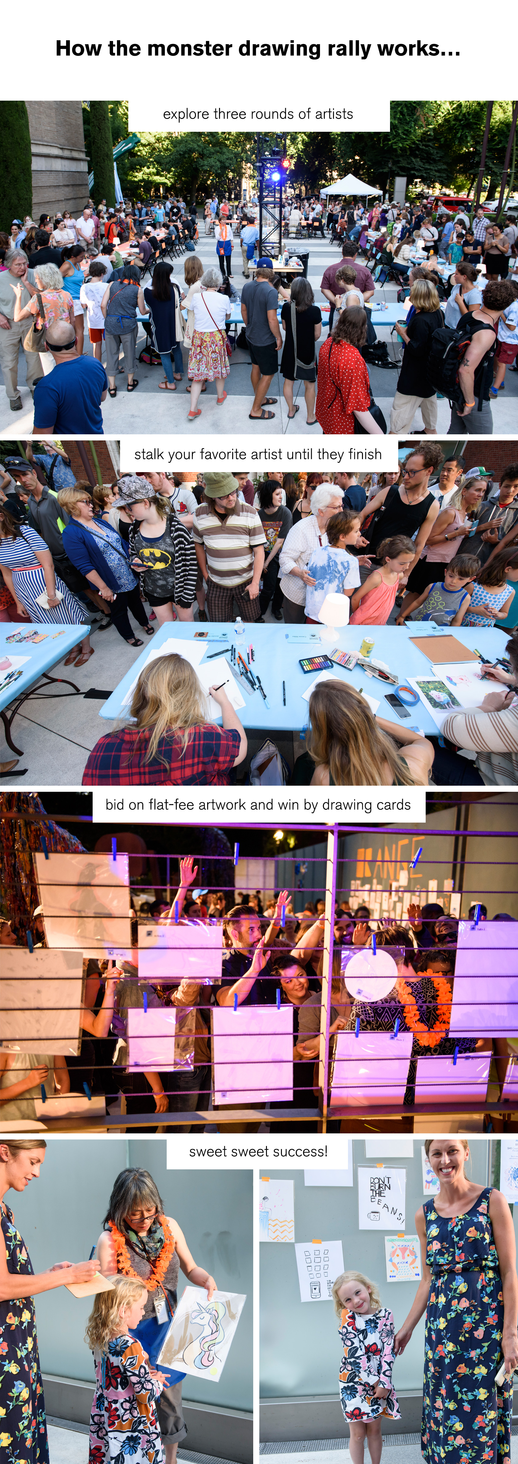
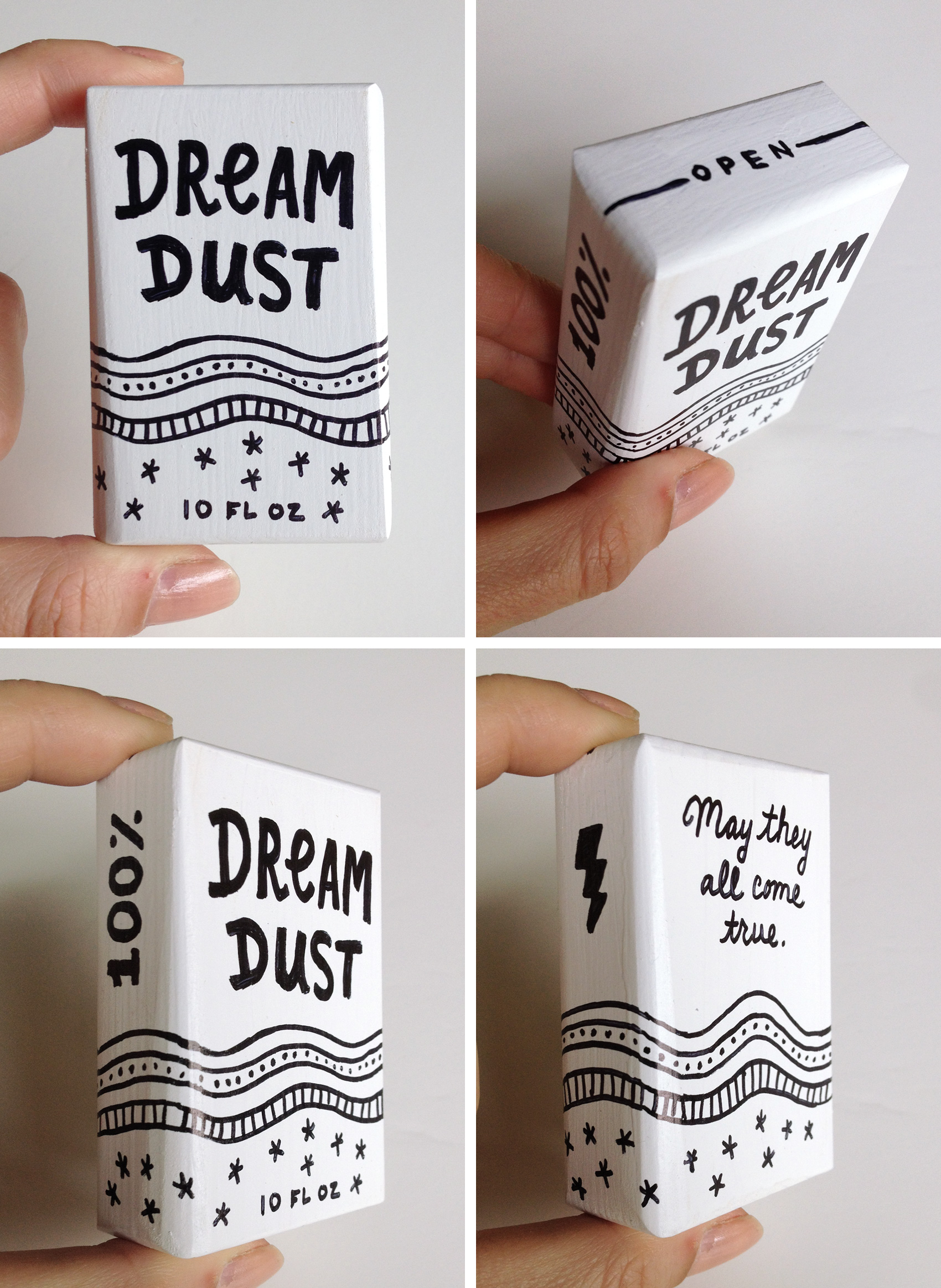
This year I decided to draw on some leftover white wooden boxes I had from another project (still documenting that one…). In the past two rally’s I had created some lettering similar to these typographic terrains, but they were much too complex to finish well in an hour at any kind of large scale. Having a very small format would let me create more pieces – I started the evening with a goal of four, and completed four! Doing a test box to make sure the timing was somewhat accurate helped a lot so I could just have fun and know I would be able to finish.
“Magic Boxes” was my personal theme, filling the imaginary packages with fantastic product that you can’t buy at your local supermarket. The first box was Pure Magic (with a warning to “use wisely”), but I forgot to take a photo of it. The rest of the boxes were Unicorn Tears (super rare!), a Pocket Rainbow (one all-terrain multi-color arc), and a White Hot Bolt of Lightning (fully charged, handle with care). One person suggested I put a puppy in a box but now that’s just silly!
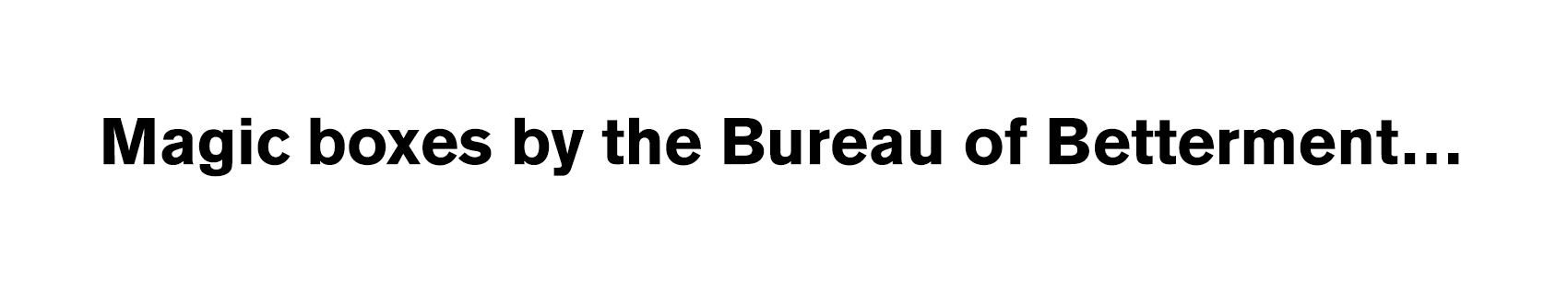
Even though I had planned ahead, no art project dos 100% smoothly. The markers I had planned on using somehow didn’t transfer well when I was outside, so I had to revert to a thicker-tipped liquid based marker. This meant all the phrases I thought would fit on a 2×3″ box were suddenly 30% wider, so it was a challenge to do tiny fat letters. Other than a few lines trailing off into super condensed letters, it went alright. Enough that all my little boxes flew off the bidding wall and I hardly got to see them after I had finished. One buyer even sent me a photo of their Pocket Rainbow box at home on their bookshelf – so cute!
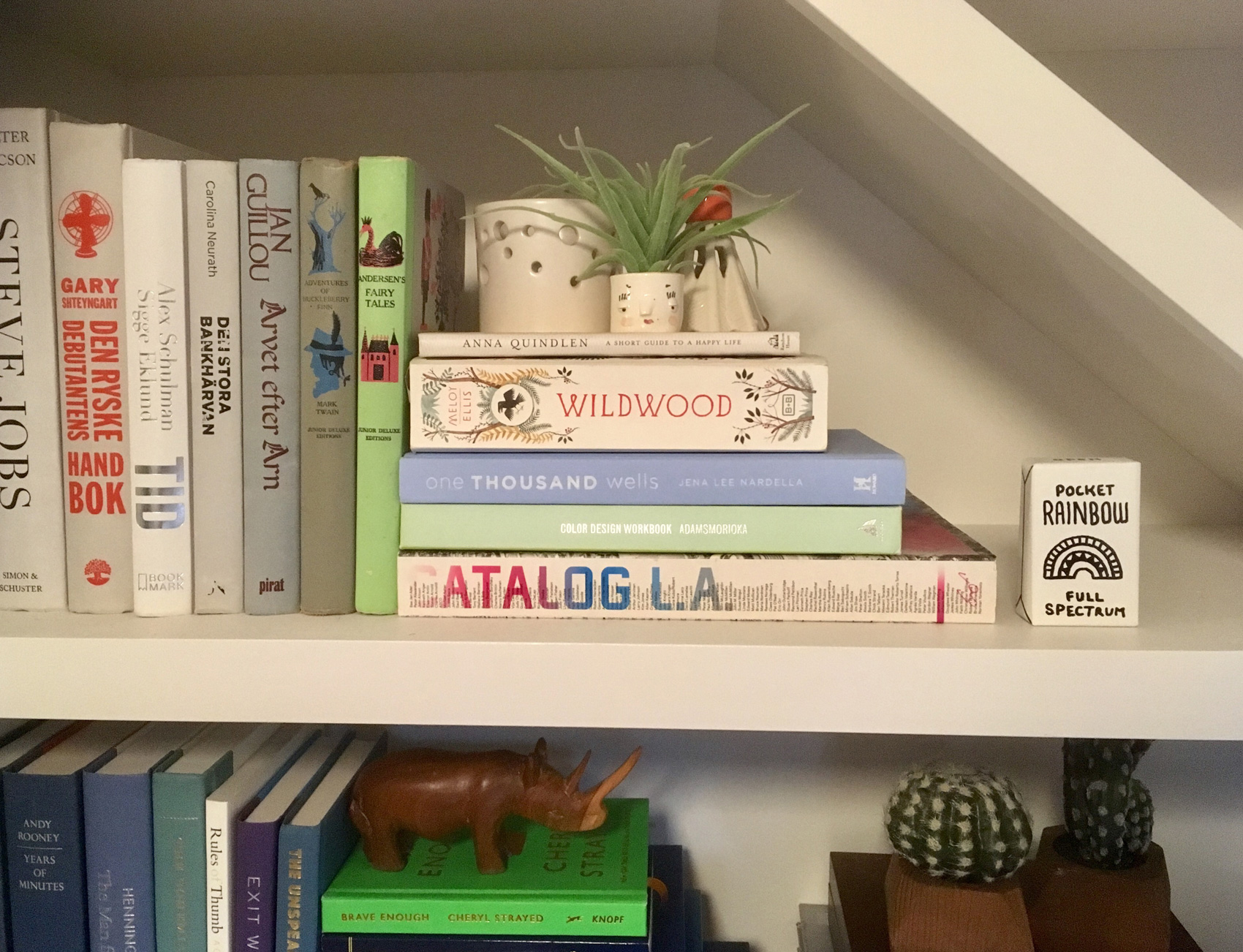
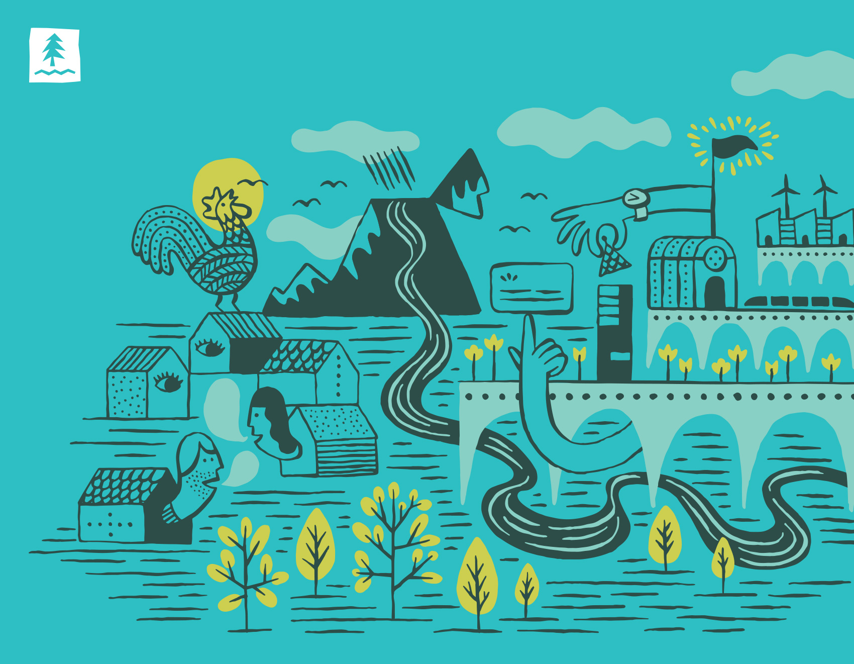
Illustration Test for Umpqua Bank
Following up on the icon and pattern tests I worked on for Umpqua Bank, the most relevant style was used to create a more in-depth scene to show how that style would play out on a larger scale. The result was a friendly ecosystem of neighbors, businesses, nature and city drawn with a brush pen and colored digitally. The drawing was geared towards animation, balancing simple and complex so that small details could easily find movement on screen.
Monster Drawing Rally – Dream Dust Test
Tomorrow evening on Friday, July 14th the Portland Art Museum will host Portland’s third annual Monster Drawing Rally in its courtyard from 6-9:30pm. The event entails three 1-hour rounds of 25 artists creating art that is immediately put up for auction. All pieces are a flat $35 and proceeds fund free school programs at the museum. In addition to the live drawing auction, there is a kids drawing activity and food, drinks & music.
I’ve participated as a contributing artist the last two years and am excited to draw for a third year. This year I decided to veer away from the usual paper and pens – instead I’ll draw on tiny 3D boxes, creating packaging for contents you might not be able to pick up at your local SuperMart. Since I’ll have only an hour to work, a practice round was needed to time how long it took to complete a simple packaging design. Most of my ink drawings take at least several hours to make, which is not scalable to this event’s timeframe. “Dream Dust” was created in about 15 minutes, so I hope to knock out four boxes during my round. Box contents TBD…any ideas?
[update: see how the Monster Drawing Rally went]
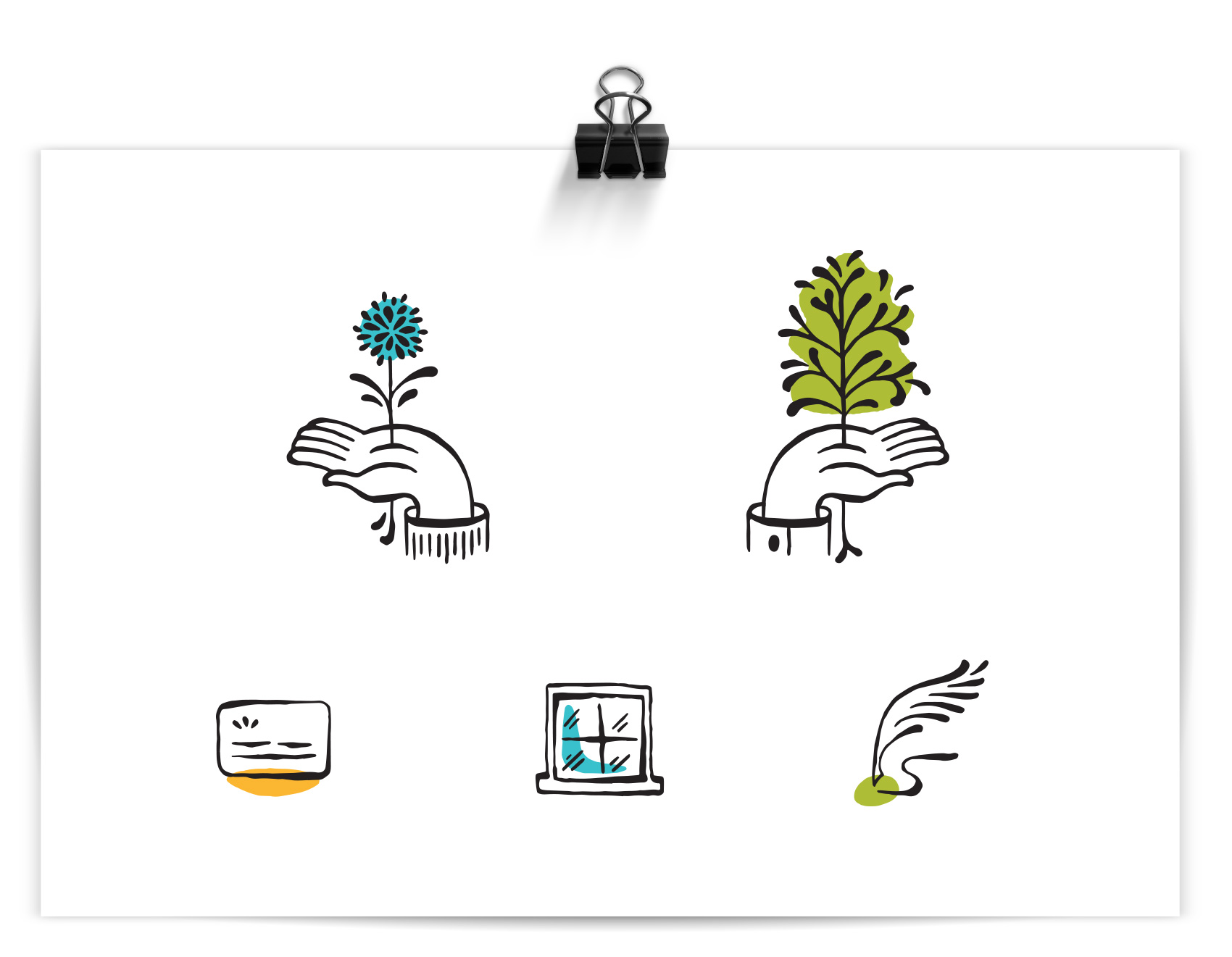
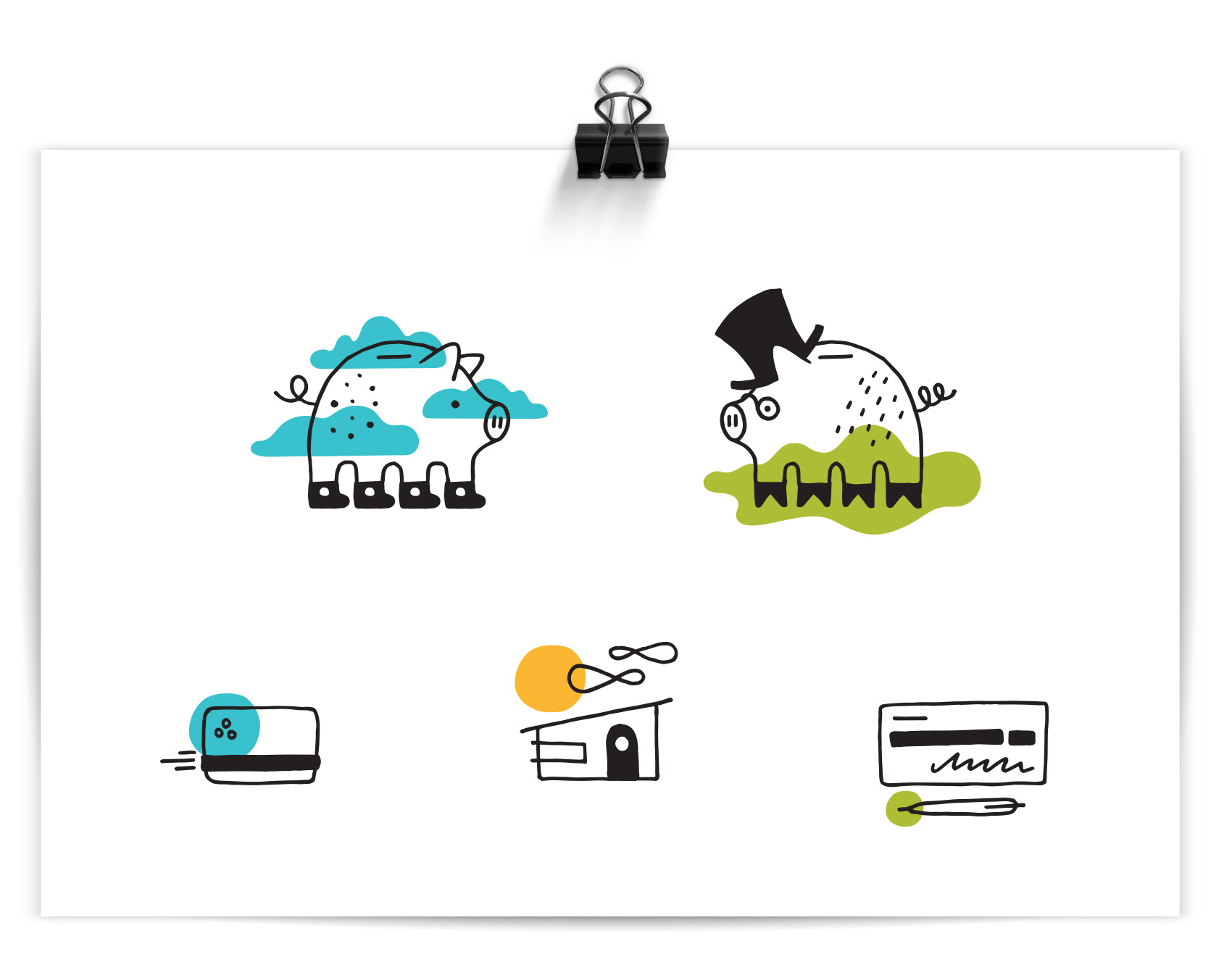
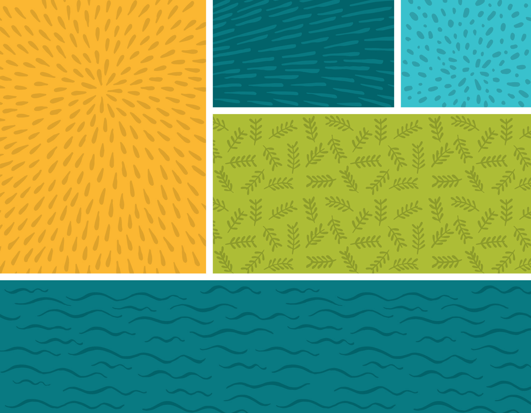
Icon and Pattern Tests for Umpqua Bank
I’ve enjoyed working on so many projects for Umpqua Bank over the years, from building murals to 30-page mini magazines to postcards to desk calendars to identity systems. The most recent project was more experimental and without a true end deliverable – testing out different illustration styles to see what might be useful to a brand. In the spirit of sharing process and behind the scenes, here it is…
The work below represents a single round of illustration tests for icons and patterns. Personal banking & business banking was depicted as well as credit cards, home loans, and checking. Most of the patterns are generic and nature based to show style. The goal of the exercise was to test the limits of what styles might be appropriate for stretching their visual library. I drew towards ‘more fun’, ‘more ephemeral & cosmic’, and ‘more sophistication’.
Unless there is a clear style set from a brief, often my intent with the first round of of illustration trials is to provide a wide range so that comparisons are clear and to get a variety of feedback. Learning the pros and cons of three very different styles is much more educational than comparing three similar styles. After all, it’s not until the very end that you have to yell NAILED IT! Everything up until then is learning as much as possible so you can get it right in the end.
MORE FUN
Out of all the banks I know, Umpqua is the friendliest and most playful in their branding. What if I only focused on that, and tried to forget it was a bank after all? The result was a piggy in converse and a piggy in a topcoat and spectacles, because duh. Color accents are used reinforce the icon message or provide flair. This direction was presented as “FUNBANK”: Approachable with a wink, using simple linework with pops color, and themes covering everyday life and twists on “banking as usual”.
MORE EPHEMERAL & COSMIC
Straying furthest from their current brand, this direction took inspiration from some specialty projects I have worked on for Umpqua Bank that were less mainstream. Intricate patterning with almost a tattoo-like quality were not the top pick, but an interesting study. The sparkly “magic factor” used throughout the series was meant to communicate Umpqua’s ‘special factor’. IF ONLY personal banking consisted of drinking coffee and eating cookies. This direction was presented as “IT’S MAGIC”: Playful and intricate with unexpected, detailed linework, this direction explores themes of service, delight, and magic in the mundane.
MORE SOPHISTICATION
This style was a favorite and used as a starting point for further exploration (future post coming soon!). A controlled brush line provided a humanistic quality and felt more editorial and high-end than their current icon library. This direction was presented as “THE HUMAN TOUCH”: Refined and organic, using gestural linework with themes of growth and movement. (side note: this direction also gave me hand cramps)
That’s all folks – a work-in-progress showing the process of testing illustration styles for an un-banky banking place.
And then there was that time I made a bunch of icons for Walmart.
![]()

![]()
![]()
PROJECT NOTES
This library of icons, infographics and spot illustrations was used in Annual Enrollment materials for Walmart. // Annual Enrollment explains the benefits provided by an employer to all levels of employee; the content for the various pieces relied on variable content. // The illustrations were developed in the Walmart brand palette. // The work featured is a snapshot showing about one third of the illustration work completed. // All work was created for Liquid Agency with CD Kylie Emers & ACD Aldo Mollinedo for the end client Walmart.
Well Vegan Brand Refresh
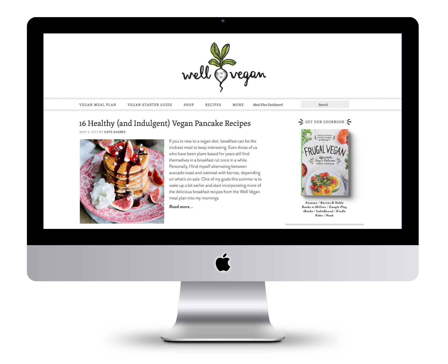
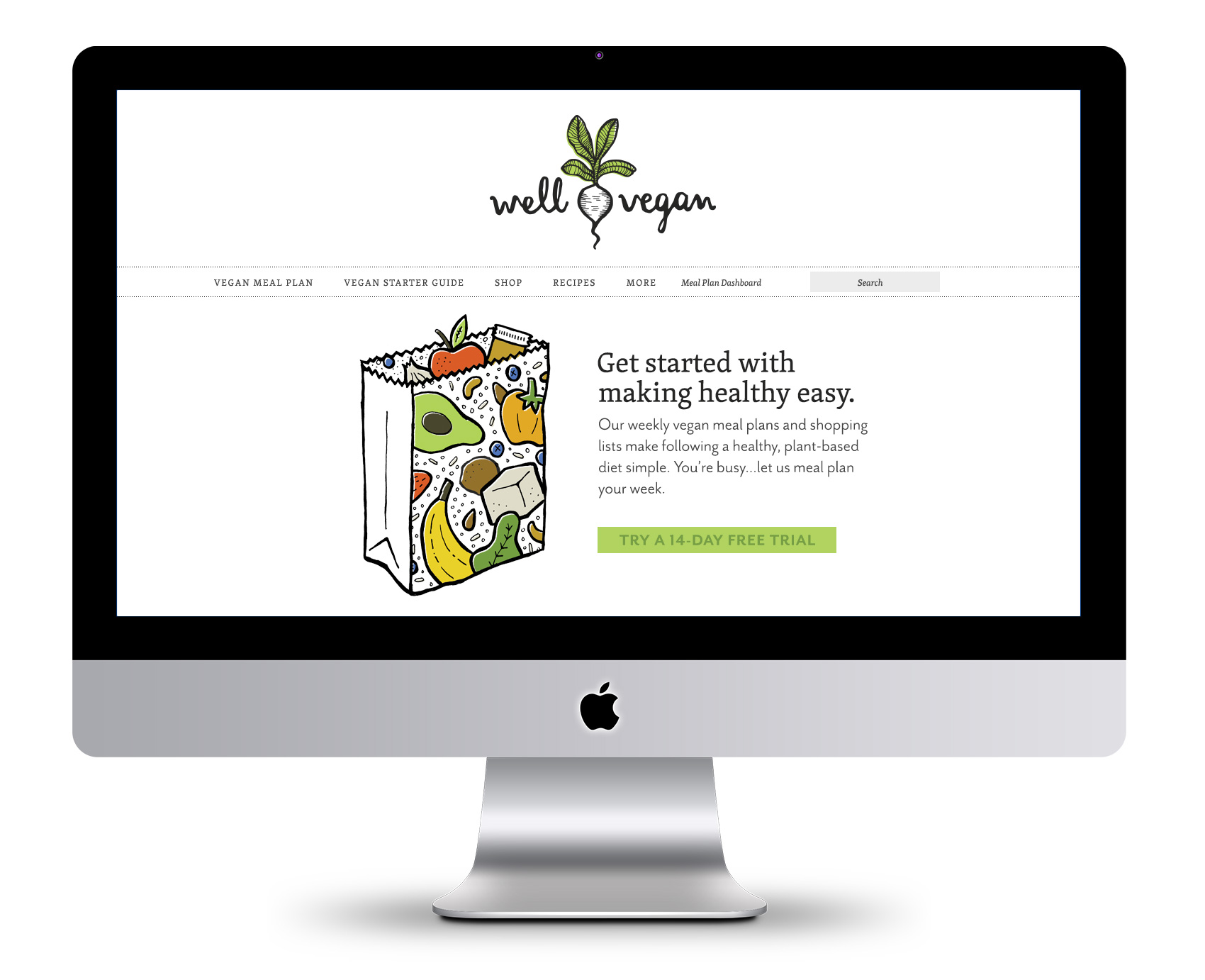
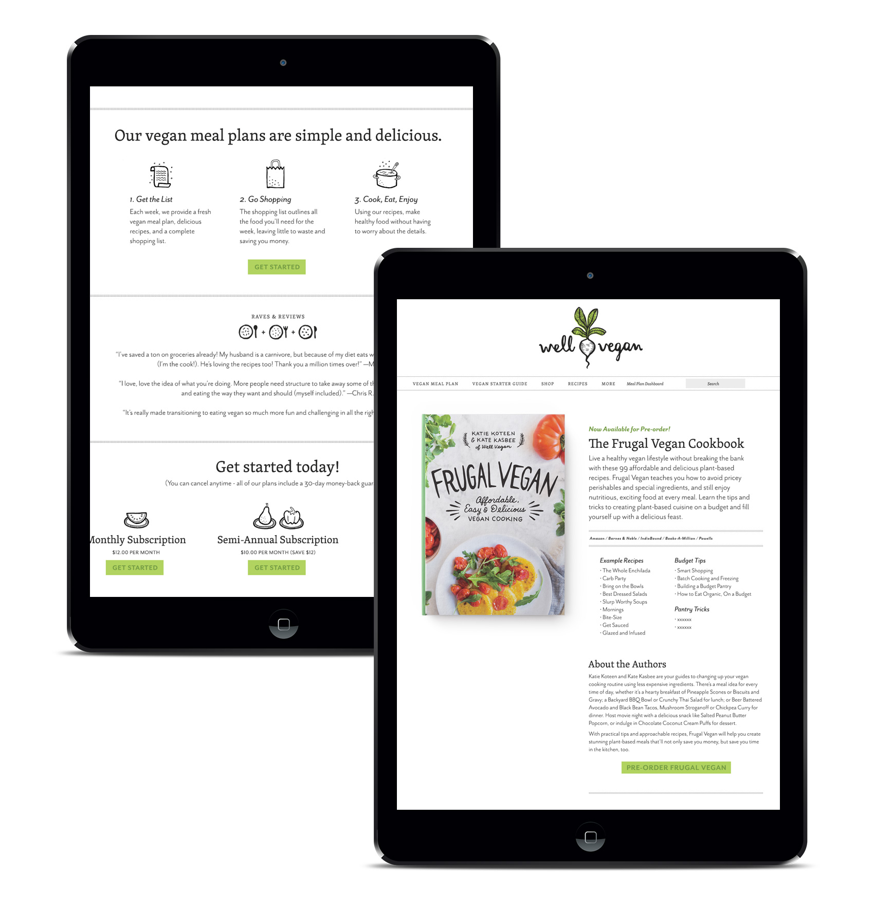
Six years ago marked Well Vegan’s launch when Bureau developed the brand from scratch for food-entrepreneur Katie Koteen to market her vegan meal plan subscription service. This spring, with a ton of new site features and her first cookbook under her belt, Katie wanted a refresh for the logo and website.
The first thing on the docket was a logo update. The friendly hand drawn script was a keeper, but legibility was increased by redrawing it on a level baseline and separating the two words with a visual – one of Katie’s favorite illustrations from the initial branding, a white radish. A pop of green was retained in the radish leaves, but the overall impression was more toned down.
![]()
The inaugural 2011 branding for Well Vegan included lots of hand drawn elements, borders, spot illustrations and illustration as main images (see it here). In 2017 Katie wanted to update the site based on the increase in photography and recipe posts, as well as make the site feel a bit simpler and cleaner rather than the homespun start-up it used to be.
![]()
A major area of focus was paring down the use of illustration and color to allow the food photography to shine. Instead of being the main focus, illustrations were used as accents and often in black & white instead of full color. The fonts also were refreshed – headline and accents were kept in the friendly legacy font (Skolar) while body and informational text was updated to the lighter, brighter Mr. Eaves.
In the instances where illustration is used for main effect, we stuck with the black line-work style with color accents. This also left room for future promotional illustrations which had been a heavy favorite over the years with subscribers and the Pinterest crowd.
The new streamlined feel was leveraged lightly throughout the site and in the cookbook design, featured on the cover and as page accents. The book is currently available.
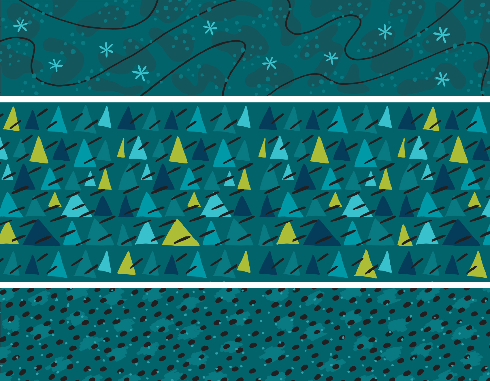
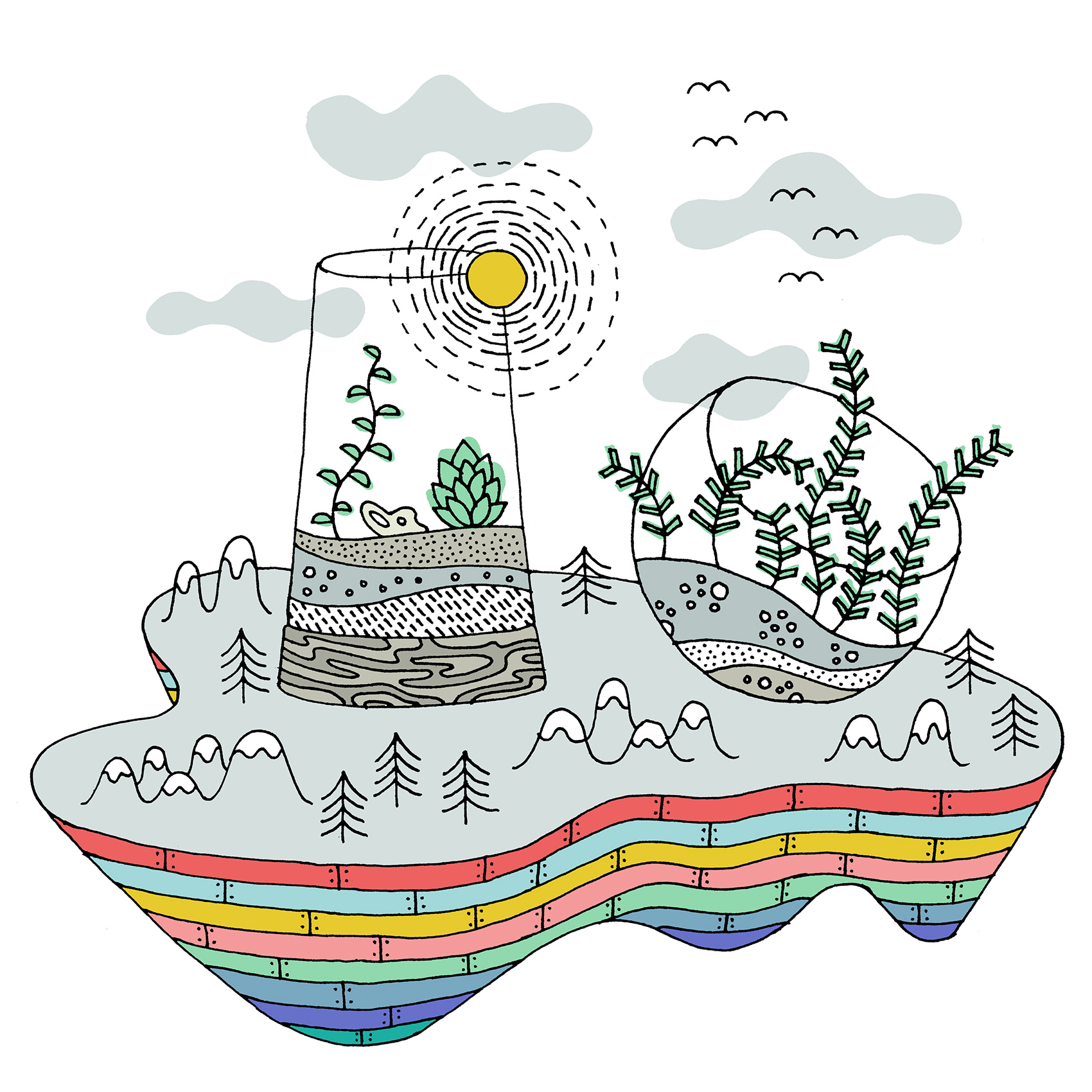
Terrarium World
All Roads Lead To…