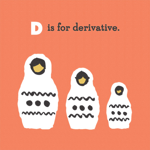
“D is for Derivative” is part of an on-going alphabet series for kids using math, science and geography vocabulary. Have an idea for a good word? Send it my way.
“D is for Derivative” is part of an on-going alphabet series for kids using math, science and geography vocabulary. Have an idea for a good word? Send it my way.
In my younger days I lived and went to school for a year in Aalborg, Denmark. There you can find a street called Jomfru Ane Gade where liquor flows freely from the plethora of bars and raucous ‘cheers!’ can be heard up and down the famous street the city of Aalborg is known for.
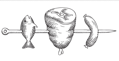
So when Line Krüger contacted me to commission an illustration for the schnapps company of the same name I had just a few flashbacks before promptly accepting the job. Basically anytime someone calls you up and asks “can you draw some meat on a stick?” you have to say yes.
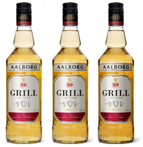
If there is something the Danes like more than getting a tax cut or drinking schnapps, it’s consuming pork and other meat products. So combining the latter two activities seems like a surefire bet for Aalborg Akvavit, who created this new product for pairing with summer grill food. The label itself was designed by Line who also creative directed the illustration process.
Usually associated with the popular and omnipresent event of December, the julefrokost, schnapps (or akvavit) is consumed in large quantities even though the glasses that carry the liquid from bottle to mouth are minute. I’m convinced this small beverage vessel was created with the hidden agenda of giving the Danes the maximum number of opportunities to shout SKÅL before reaching full inebriation.
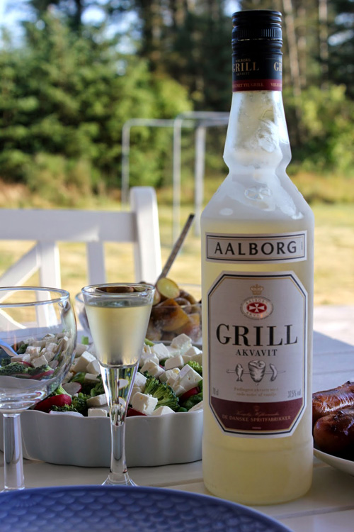
Photo credit: Kristine Hansen
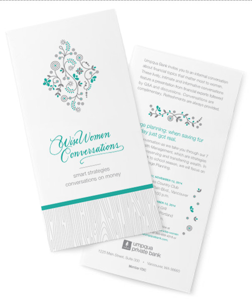
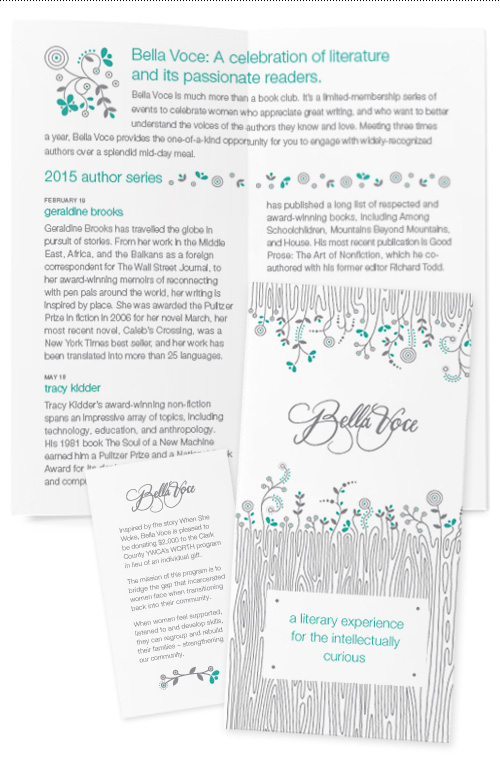
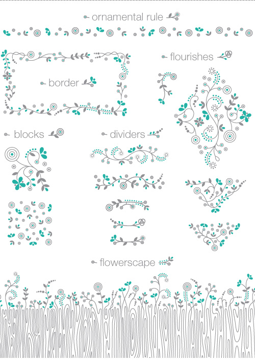
A client I have always enjoyed working for is Umpqua Bank, which was the case again in my latest project with them to create branding for an event series duo. The two part branding was for a book event series (Bella Voce) and follow-up educational talks on wealth management and planning (Wise Women Conversations). The collateral needed to be upscale and feminine for an audience of women aged 40-60 with money to manage.
Taking cues from Umpqua’s Private Bank branding, the new collateral uses a woodgrain pattern paired with intricate but modern flourishes to adorn the range of 16 pieces created for the two event series. This simple structure is combined with a brand color palette – the gray + chocolate (or brown, as most people call it) used for UPB is shifted to a gray + teal combo while still staying on brand.
The two logotypes were hand-lettered by Mary Snow, and Kate Zimmerman art directed the project. To learn more about the events, visit Bella Voce’s page or the Wise Women page on Umpqua Bank’s website.