Almost all of the projects posted on the Bureau blog are real, live, produced projects. Hardly ever do I post a speculative project, and if something is made for personal gratification it is duly noted. Along with posting nearly 100% original content, transparency was one of my goals when starting a blog – showing what I made for fun, what I made for money, and how I got there.
To me, is important to show design that has been through the filter of client feedback, changing project needs, production specifications, budget requirements, and multiple rounds of design. So much of design is what happens between the initial idea and the end result. But a part of the job of being a designer is also getting things killed, which I’d also like to share.
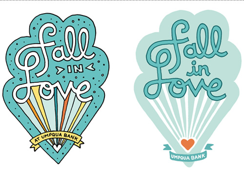
A recent project for Umpqua Bank didn’t make it through a budget shift, but I am proud of the result and got permission to show some work that would otherwise never see the light of day. The project was to create a promotional sticker for a video with the title “Fall in Love”. A love parachute was drawn with Umpqua’s blue color palette, the cloud shape subtly alluding to the clouds used in their branding. The sticker evolved from a detailed illustration to a more simple line drawn design. Produced or not, the message is positive and I’m happy I got the chance to work on it.