There’s That Blue Again
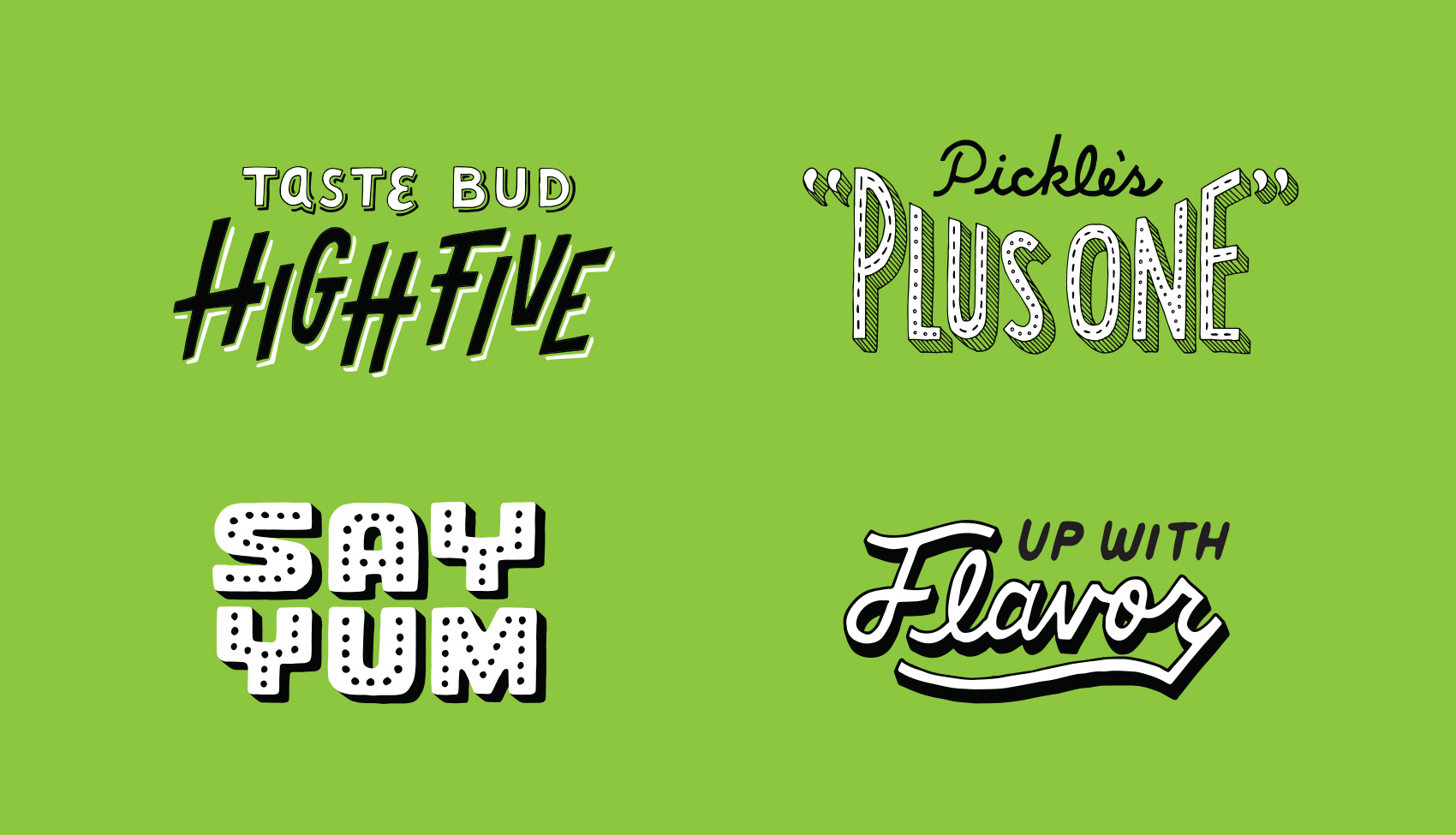
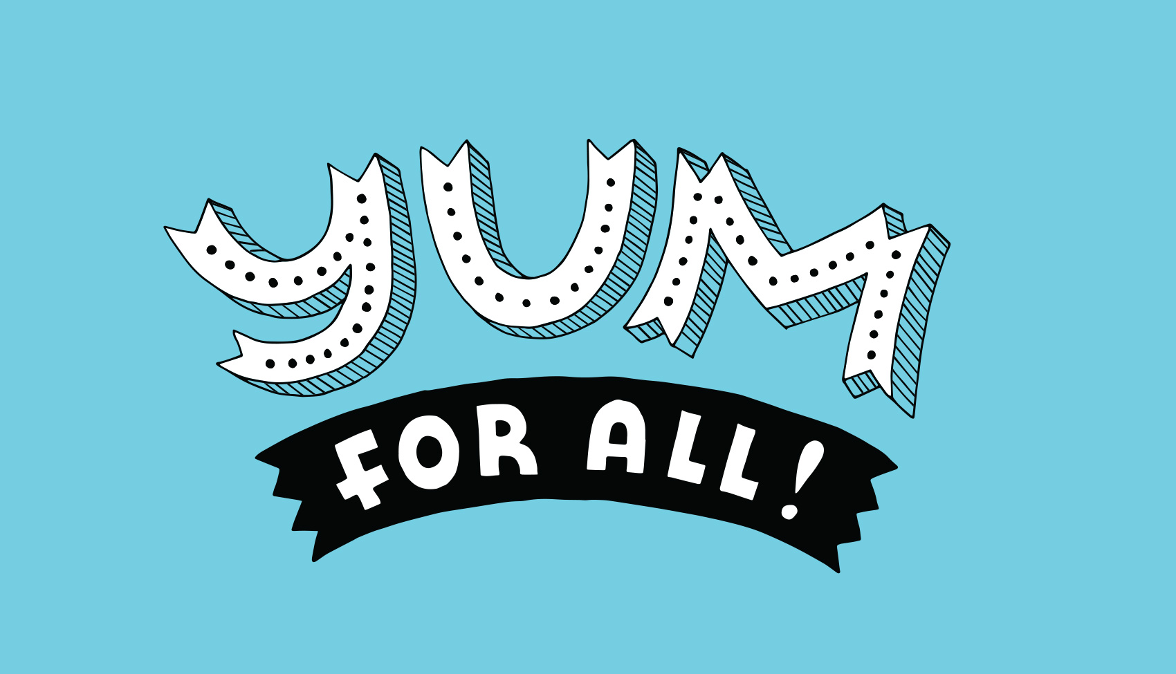
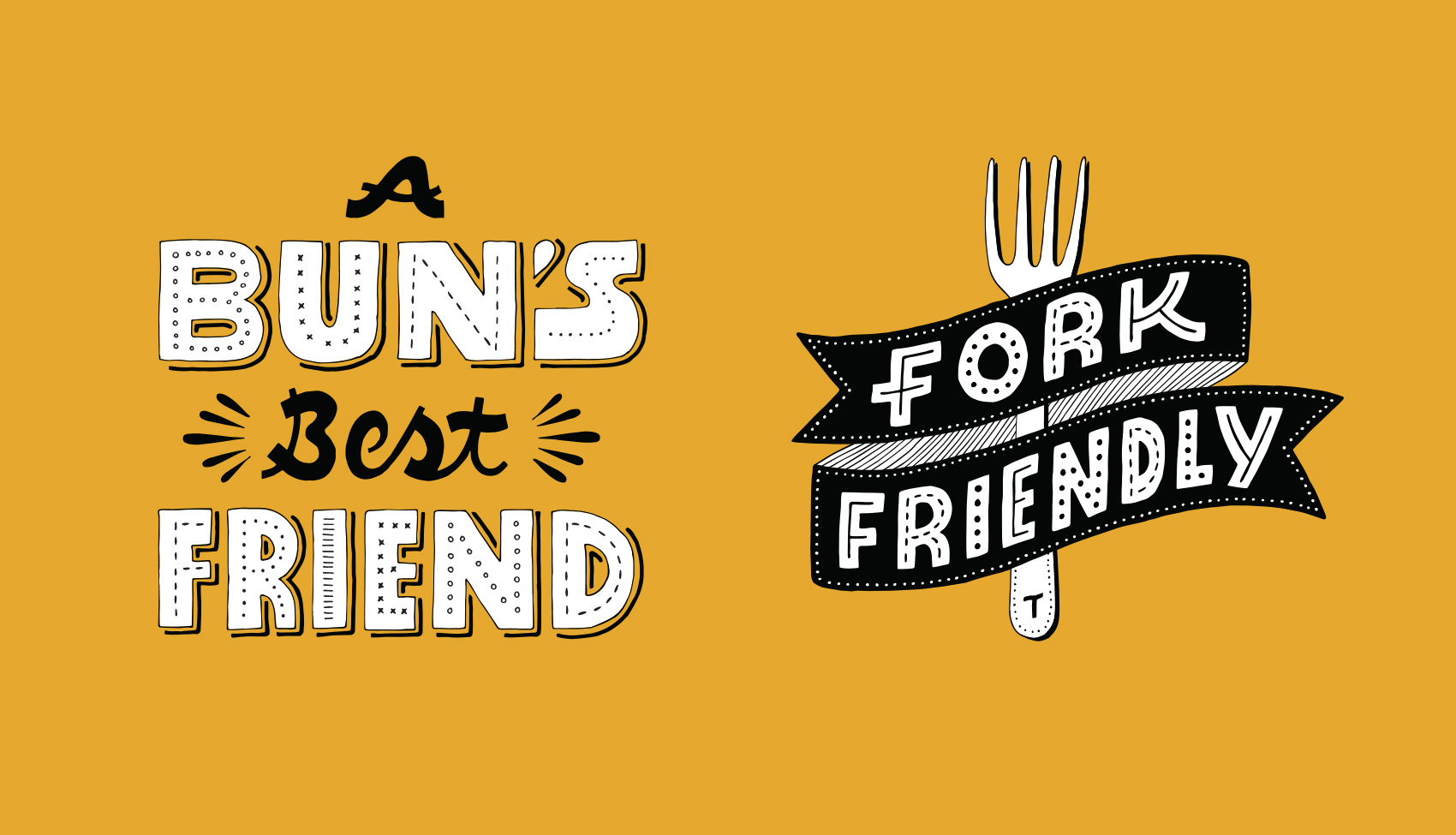
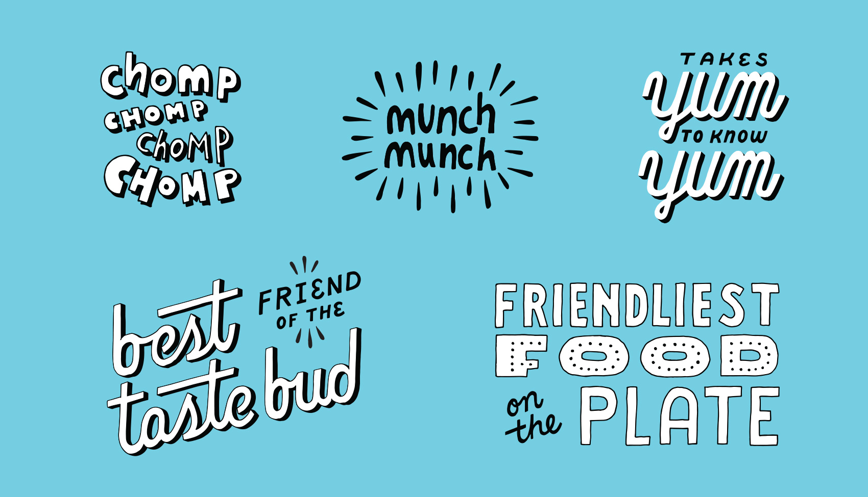
After the first round of brand lettering done in 2016 went over well and was used extensively, Tofurky requested another batch of phrases to be illustrated to build out their brand assets even further. While a variety of lettering styles is represented, two main goals of this series was to have some consistent details throughout and have each phrase take up about the same proportion of space so they were easy to use in groups or in similar areas of packaging, POS, and other areas of branding.
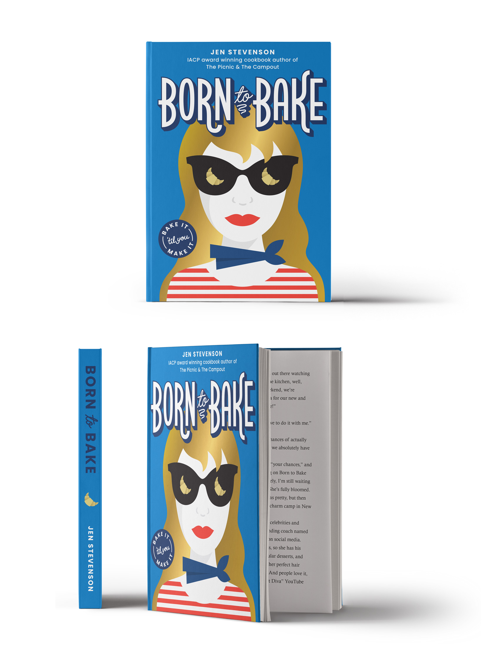
Over the years I have done many projects and non-projects with my intrepid foodie friend, Jen Stevenson. From her first guidebook and blog, to watching her become an award winning author for The Picnic and The Campout, we have eaten our way through a decade of friendship.
On the side, Jen churns out young adult literature and publishes them as e-books – the latest being Born to Bake, a story about a teen who enters a baking competition to earn money to go to culinary school in France. To add another book collaboration under our belts, I created the cover for it. Bake it ’til you make it!
It’s that time of year again! The time when Danes, half-Danes, quarter-Danes and honorary-Danes go deep into Danish Christmas traditions, as previously documented here, here, here and here.
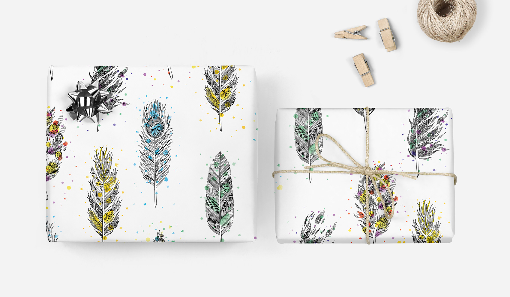
This year is extra special because I had the opportunity to design some scandinavian-inspired promotional gift wrap paper in collaboration with Laura Luethje from West Coast Paper Solutions and Randy Murray from Brown Printing. So without further ado…
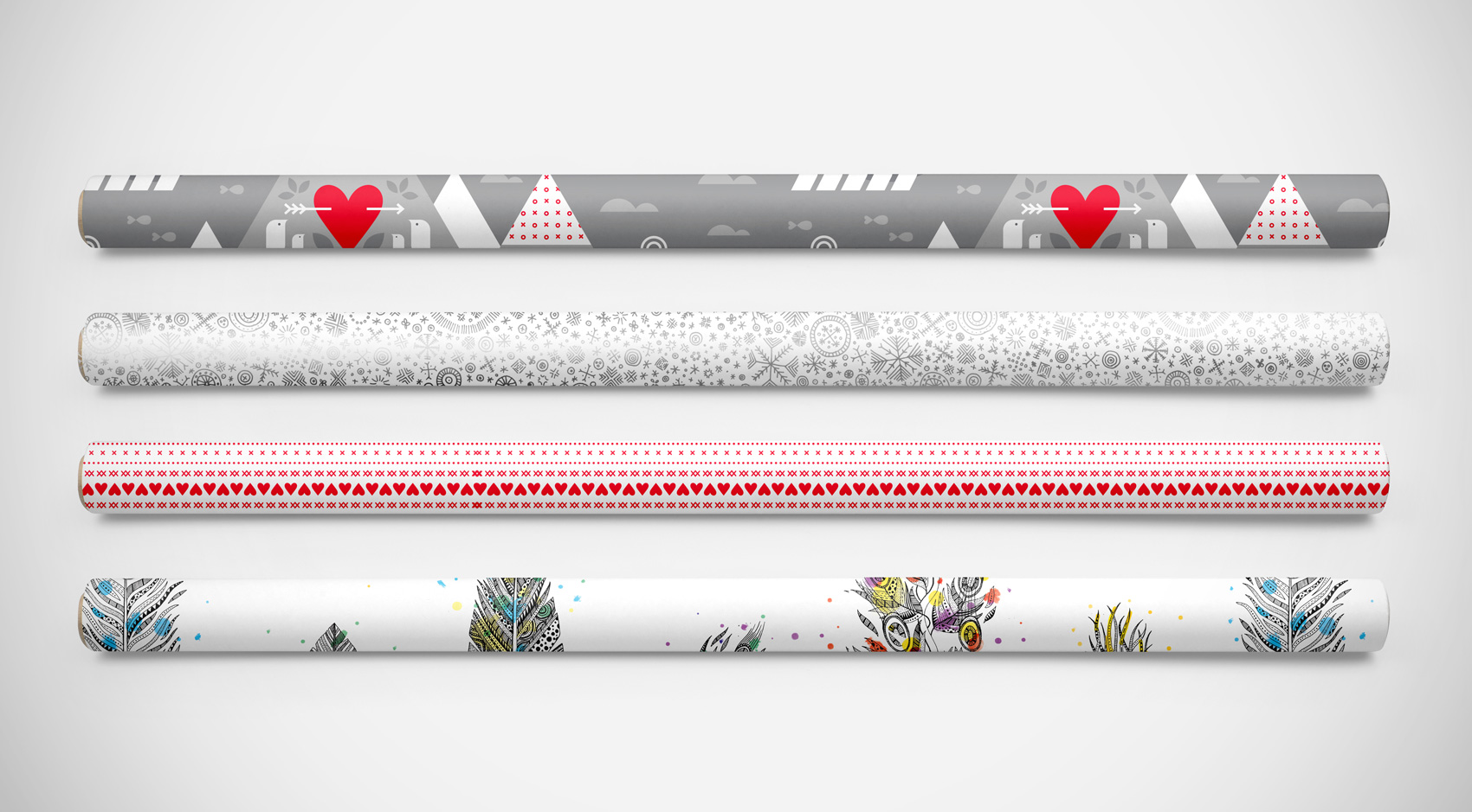
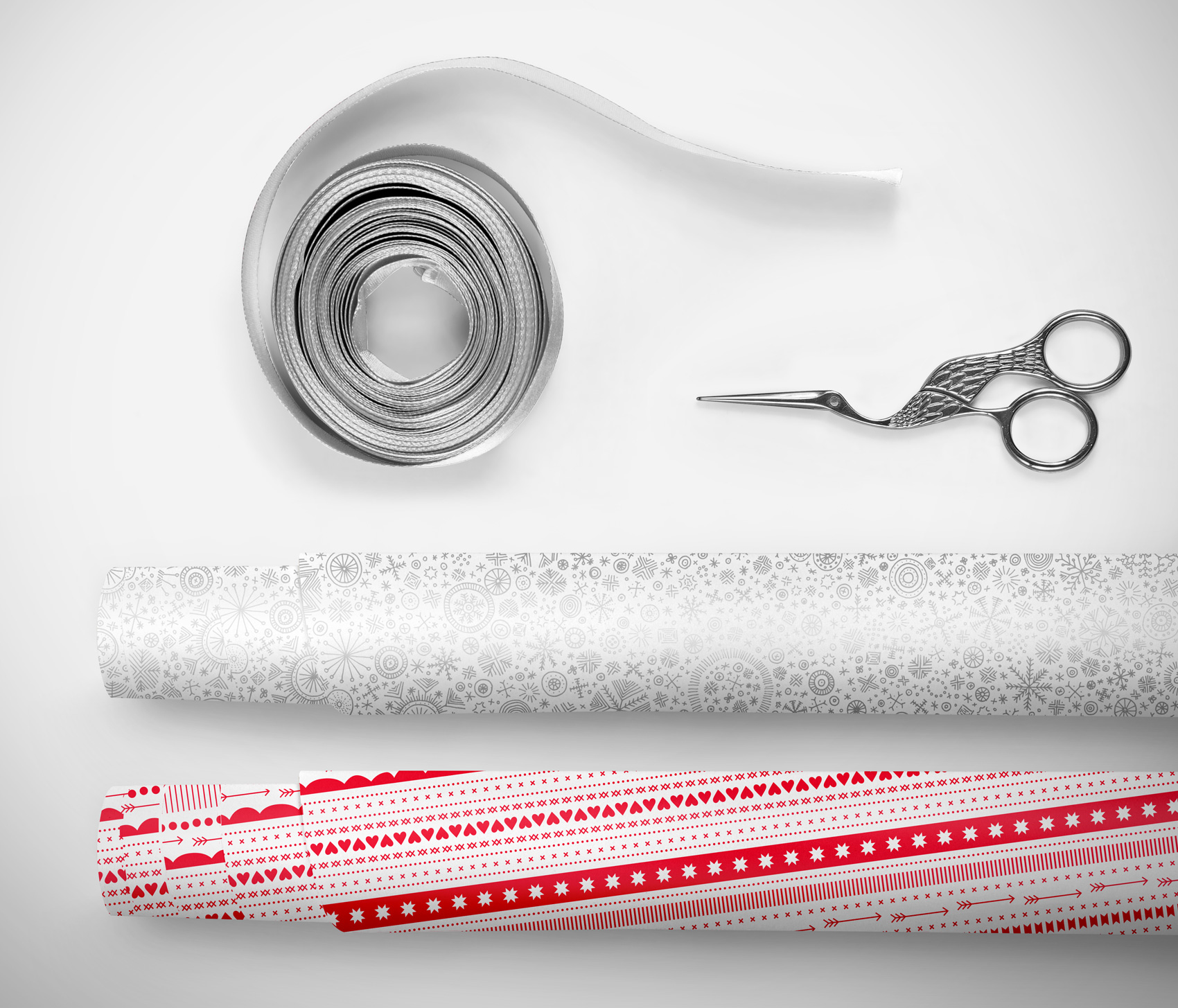
To create a series that was Christmasy without being too over the top, I opted for some patterns that kept it classy – abstract red ribbons and a snowflake flurry. On the back a tiered landscape of wintertime activity is revealed in tonal grays with pops of red, making it easy to mix and match between the three designs.
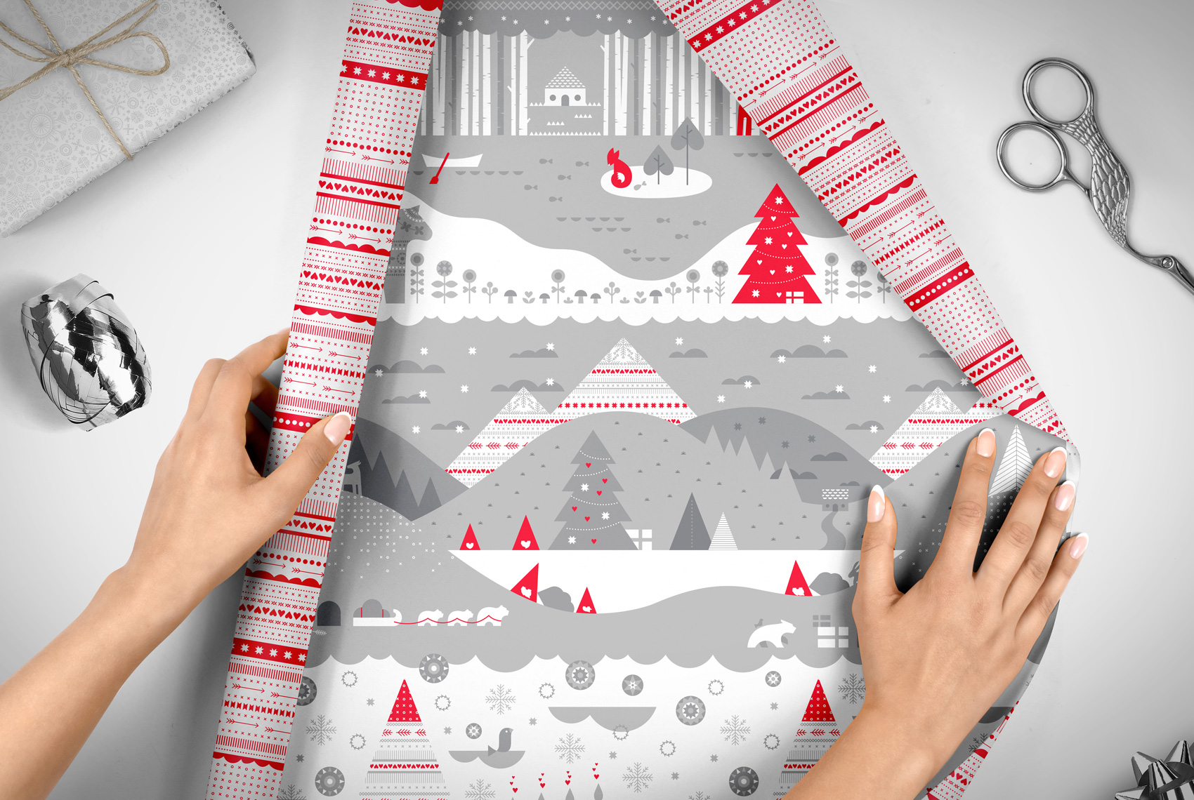
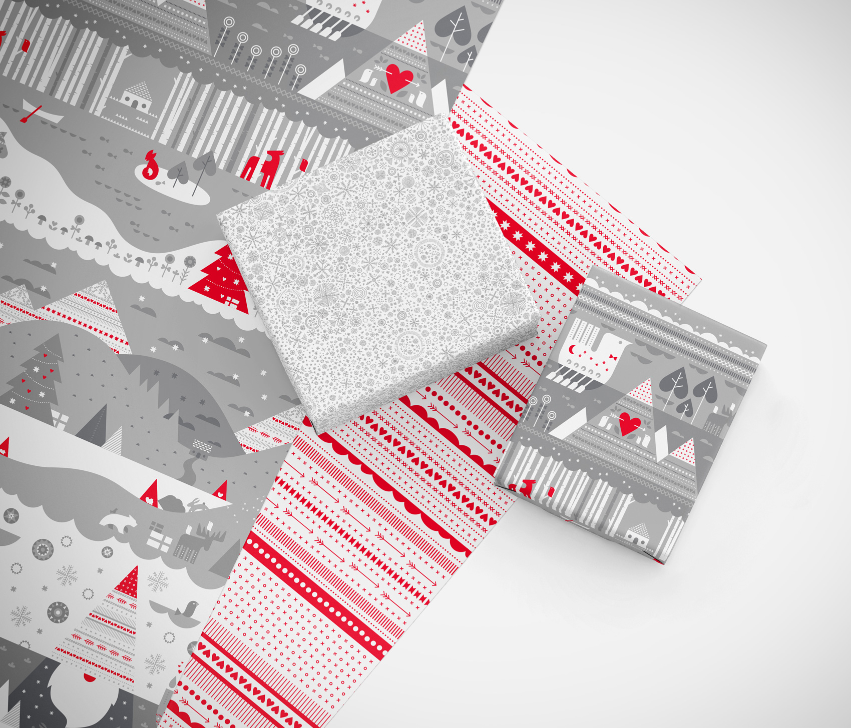
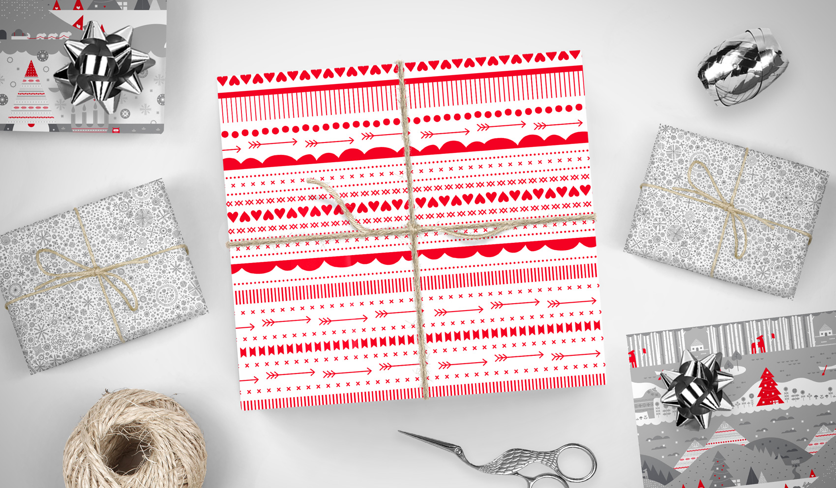
The WCP holiday wrap promo happens every year, and this year I was lucky enough to have Laura ask if I would create the designs. While West Coast Paper donated paper and I donated design, Brown Printing donated printing for a final product of two 2-sided promotional sheets produced on 70# Titan Dull Text.
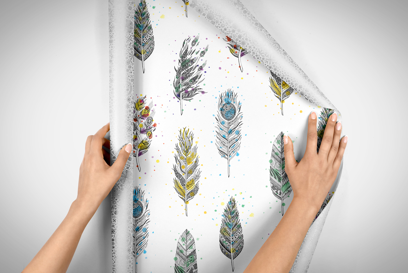
As a bonus, I slipped a non-holiday side onto one of the sheets. Hand drawn with black ink and digitally colored, the feather pattern is an excerpt of a twelve feather series from a few years ago. Hopefully it gives the gift wrap a life past December.
Another test in using Posca markers, this time in a smaller format and combined with collage paper bits taken from the Mohawk Paper Maker’s Quarterly publication.
I’ve been testing out working with Posca Markers, which are opaque liquid ink markers. Advertised as “mark vividly on any surface” I’ve found that the type of paper used really makes a difference in how they lay down (or tear up the paper), and that some colors seem more opaque than others. Testing out a new tool or material always takes some getting used to, especially if you have an idea of how it’s supposed to work versus how it actually works. So far the best success I’ve had with Posca Markers are for simple pieces.
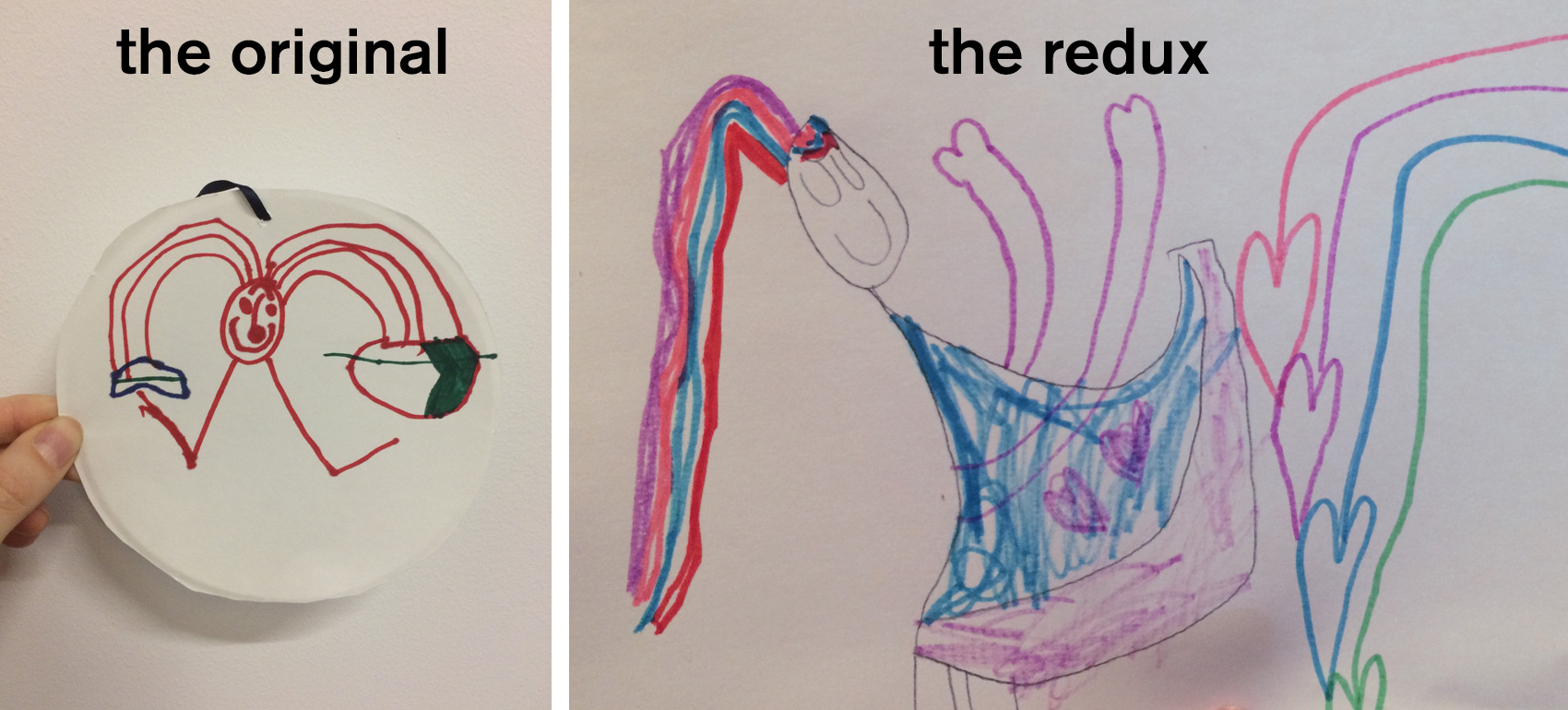
Looks like I’ve reached the stage in my side project career where much of my work will be inspired by: 1) my 4-year-old daughter’s drawings, 2) my daughter’s imagination, or 3) my daughter and her future. As an ever-changing subject matter, we’ll see how this appropriation of content develops over time.
Update: I showed my drawings to my daughter and told her she inspired me (ensue a long discussion about what the word inspire means), after which she demanded to copy my artwork. Below is the original that inspired me, and the redux inspired BY me. I foresee a long and fortuitous/contentious working relationship…
Most projects I work on have piles and piles of unused work that don’t make it past the concept phase. This gets archived and usually never looked at again, unless I have a future project where I can use it as reference. Some of this backlog of work reminds me of all the times I tried something new or different, only to have the client choose a style that was safe or most matched my portfolio. Sometimes I’ll take rejects and rework them for my own personal edification. Mostly they languish…unless I post them on my blog!
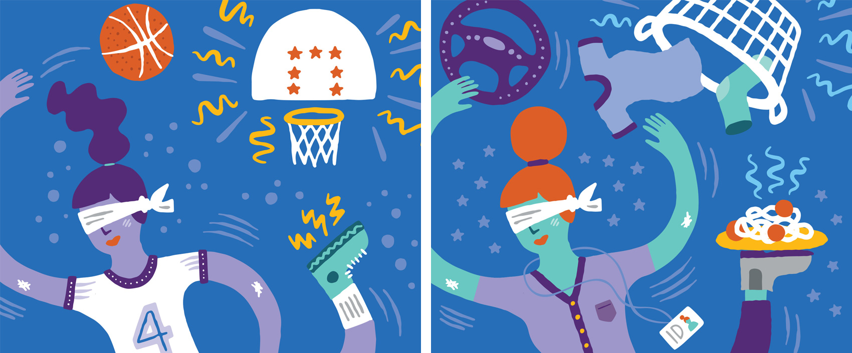
Here are two images created for a campaign targeting both parents and teens on the same subject matter, with the headline “You got this”. This direction didn’t make the cut during an A/B social media test, in which some of the feedback was so cutting you’d wonder if people would say this to you in person. Some of the best outtakes went something like this “I hate this so much I want to look away”, “This is ugly. It looks like a child made it”, and “Pointless. Stupid”. The chosen direction (not shown) had similarly scathing comments (of course in conjunction with perfectly neutral and positive comments). Can’t please everybody!