Earlier this year I worked on this fun book series project for Mattt Zmuda, author of a series of guides for various coding and development topics. As founder of Flight School, he explores “essential topics in iOS and macOS development through concise, focused guides created for advanced Swift developers“. Mattt previously founded NSHipster and worked for Apple as a technical writer.
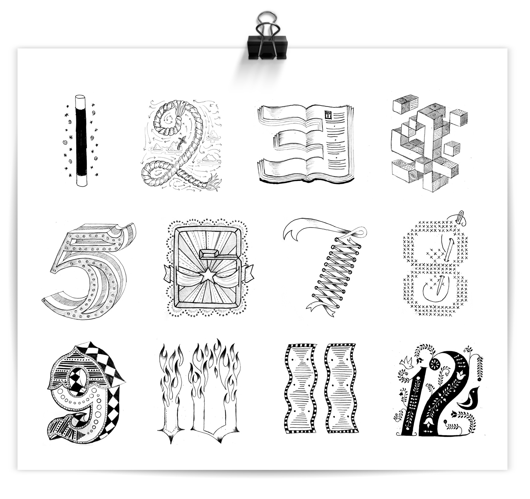
A technical writer I am not, but I do love to create visual systems for interesting topics and people, and this project was no exception. Mattt came to me with the brief of 1) wanting to stand apart from the standard look of development books, and 2) having the book series be flight/aviation themed (as many examples in the books use aviation to explain things). After some exploration we landed on a bright, eye catching, somewhat retro-inspired poster-like style for the covers.
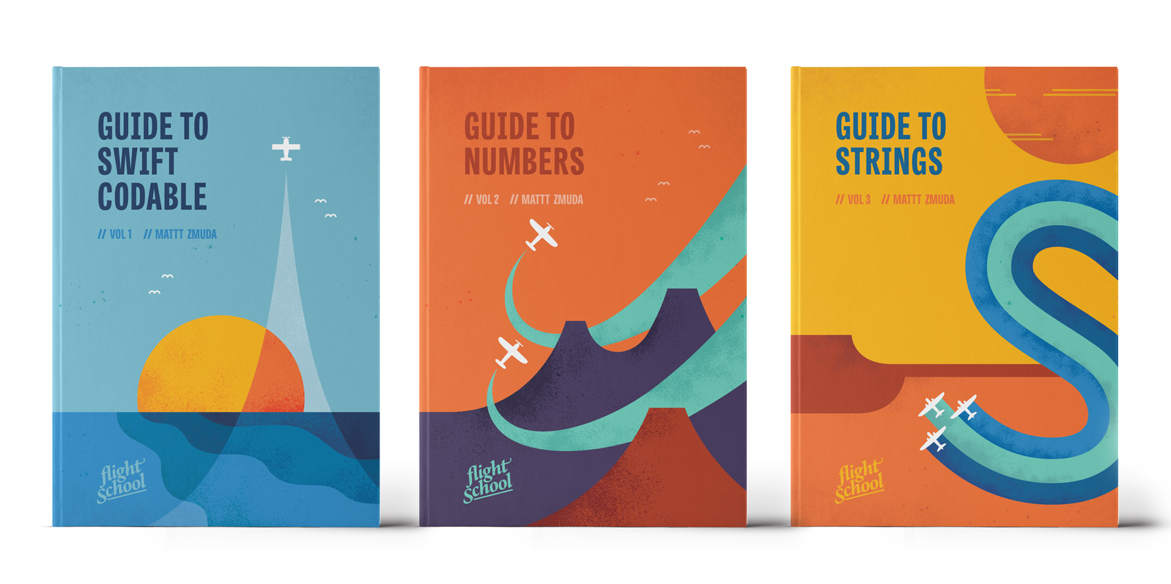
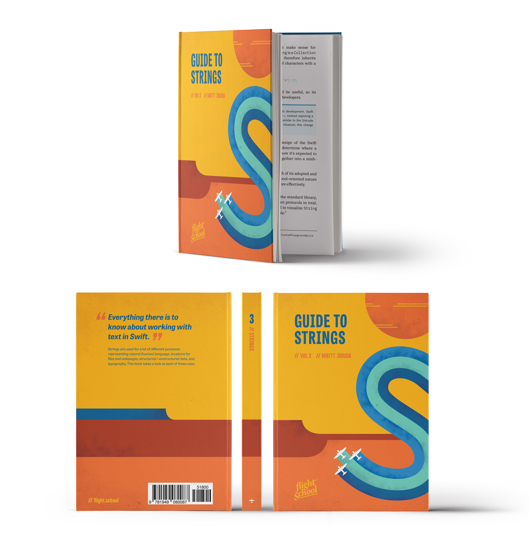
Although there are three books currently available, the entire series will total eight books once they are all released. It was fantastic that Mattt already had a plan for all 8 titles as it allowed me to have freedom to build a cohesive system, which at the end is meant to be a set.
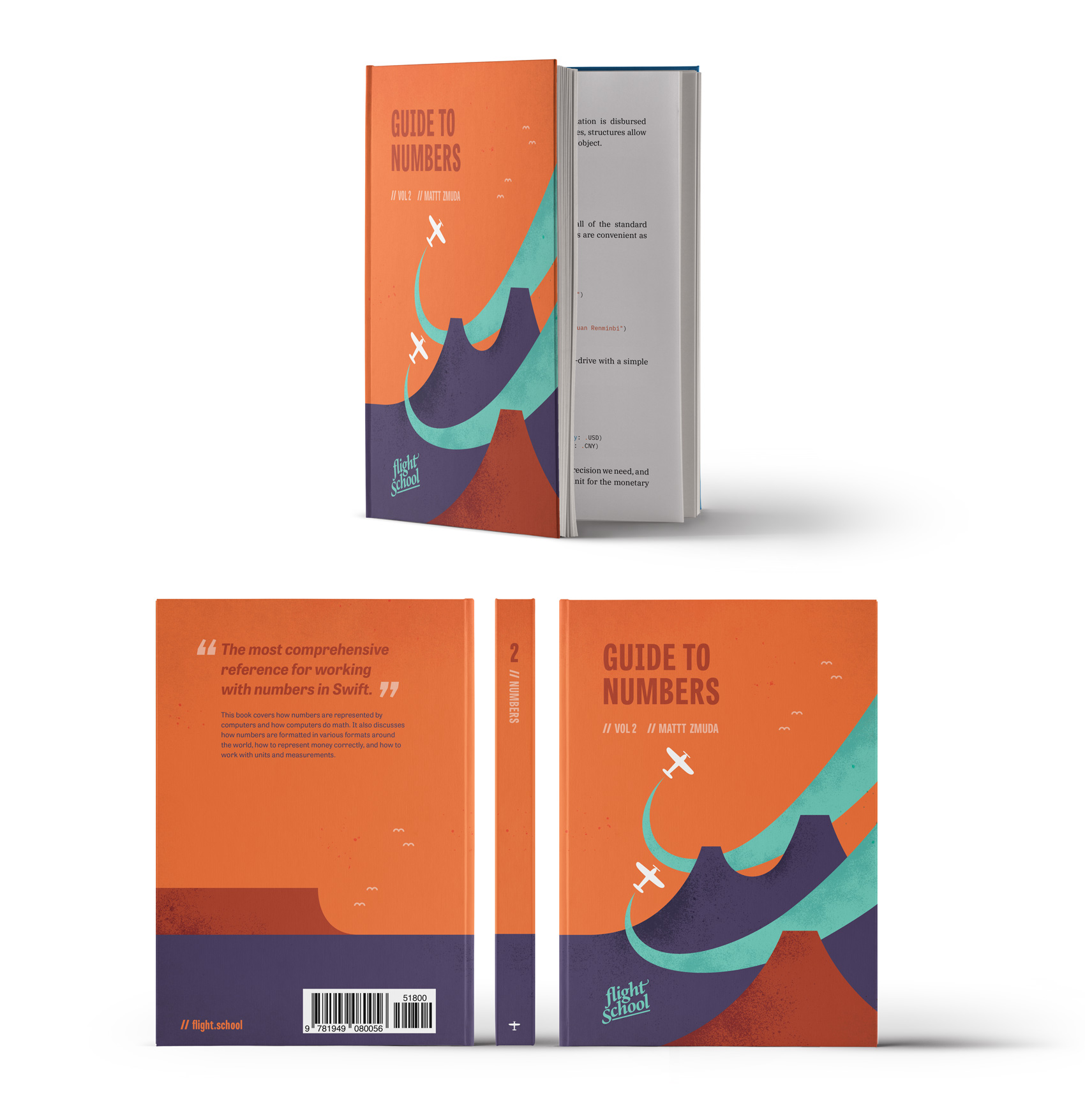
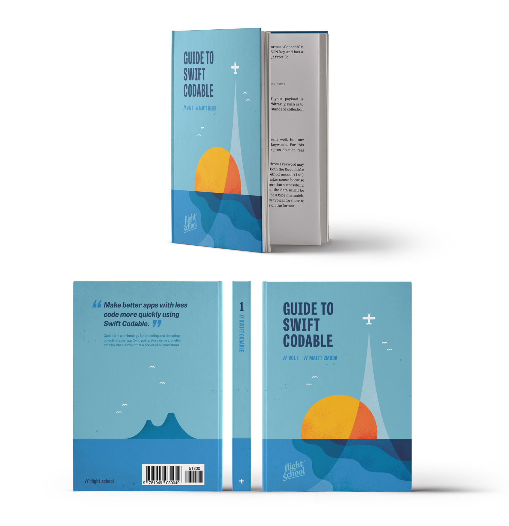
Each title has a number of planes on it (1-8), corresponding to the sequence in which it is released. The cover image in some way supports the general idea of the book topic, and between titles there are shared elements that bridge the landscapes together (for example, the volcanos on the back of book #1 become the foreground mountains on the front of book #2).
As the series progresses, each cover gets more complex with the number of planes, organization of their flight paths, and color overlays. I can’t wait to show the entire series, but for now, here are the first three volumes: Guide to Swift Codable, Guide to Numbers, and Guide to Strings.
Book covers are a type of project I always enjoy – they combine learning about new topics, condensing large amounts of information into a visual time capsule (the cover), and finding interesting and unusual interpretations of content. As a bonus, sometimes they also allow you to explore new styles of design or illustration that don’t pop up in other work such as branding projects.
+++++++
Founded in 2018, Flight School is an independently-published book series whose “mission is to write the kinds of programming books we wish we had when we were first starting out — material that connects the computer science theory with practical insights from experience working in the software industry.”
Get the guides at flight.school. Follow at: @flightdotschool / @NSHipster / @mattt.