Most projects I work on have piles and piles of unused work that don’t make it past the concept phase. This gets archived and usually never looked at again, unless I have a future project where I can use it as reference. Some of this backlog of work reminds me of all the times I tried something new or different, only to have the client choose a style that was safe or most matched my portfolio. Sometimes I’ll take rejects and rework them for my own personal edification. Mostly they languish…unless I post them on my blog!
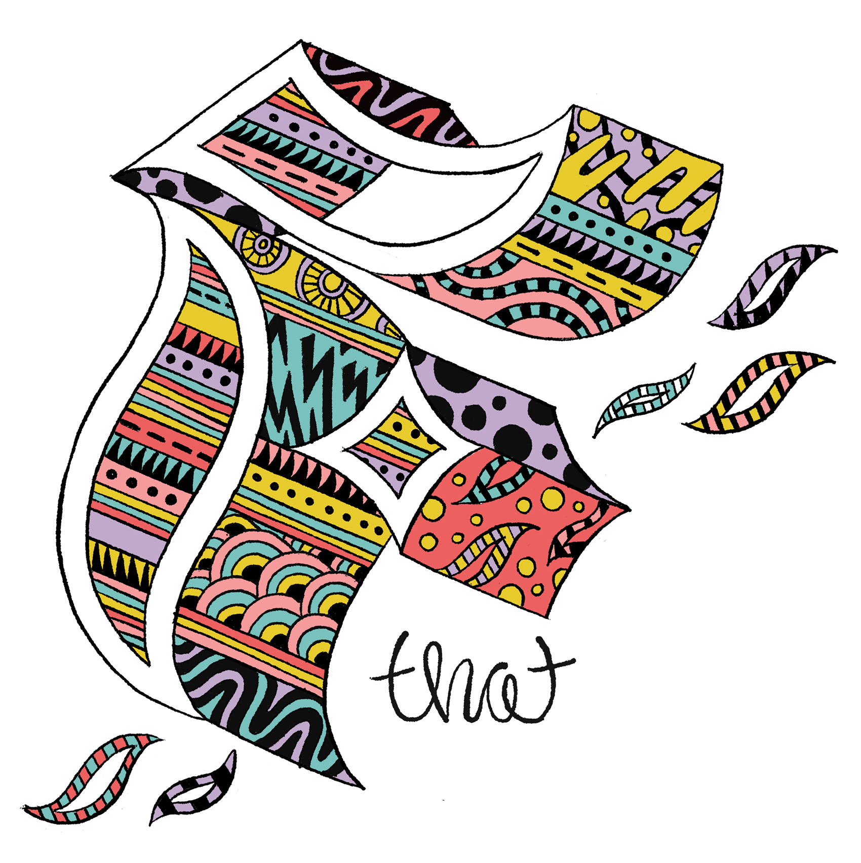
Here are two images created for a campaign targeting both parents and teens on the same subject matter, with the headline “You got this”. This direction didn’t make the cut during an A/B social media test, in which some of the feedback was so cutting you’d wonder if people would say this to you in person. Some of the best outtakes went something like this “I hate this so much I want to look away”, “This is ugly. It looks like a child made it”, and “Pointless. Stupid”. The chosen direction (not shown) had similarly scathing comments (of course in conjunction with perfectly neutral and positive comments). Can’t please everybody!