A recent collaboration with a Portland-based consultant resulted in rebranding his small company to present a more cohesive visual front. Upward Partners is a company that builds infrastructure for fast growing companies, and its founder, Brian, wanted a brand that reflected his way of doing business: results driven but also fun and innovative.
Working primarily with numbers, data, money, and other cold hard facts doesn’t always lend itself to an inspiring logo. To stand out in the field of CFO’ing and COO’ing we opted for a Northwest influenced motif of a mountain range. With a ‘slight chart & graph’ vibe, the icon also reinforced his positively-geared business name.
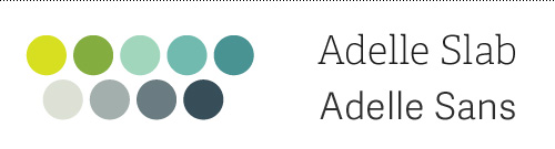
The typography was set to focus on the action part of the name and give it the same uplifting feeling as the mountain icon. Combining that with a nuanced color palette gave plenty of options for leeway in future materials. The font Adelle proved its worth by being both approachable and serious in its serif and sans versions.
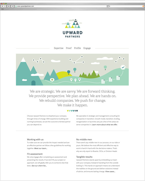
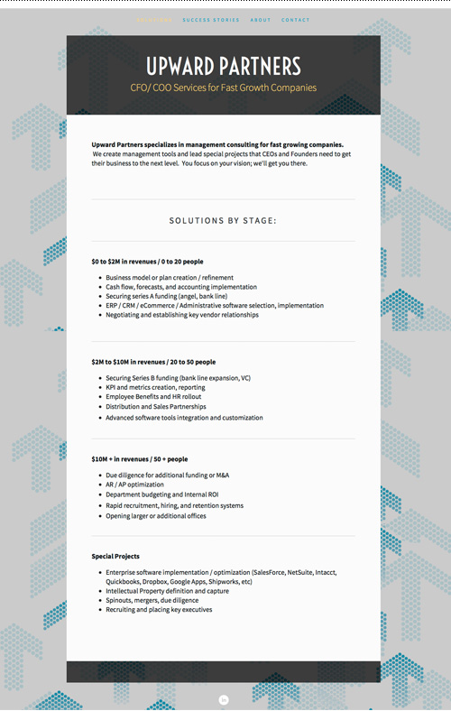
Various illustrated elements were combined into a banner graphic that did some heavy lifting on the homepage, which had previously been bare of graphic elements save for a background pattern.

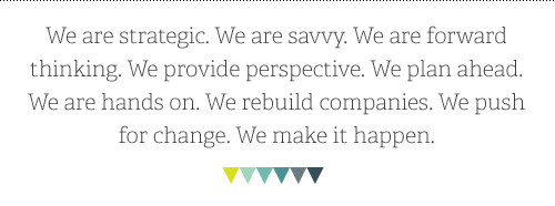
A large part of this project was determining Upward Partners’ written voice, as the previous site had been a somewhat dry list of business ingredients. Jargon-free speech and easily digestible explanations of complex business scenarios made it easy to understand their approach and work. A mantra-like introduction was created to describe the essence of the business, leaving the technical points for sub copy.
Using icons to support key areas of expertise upgraded the straight-forward content from bullet points, and let the new long-form content call out the key differentiators Upward Partners asserts – a pre-engagement fit assessment and no middle-men in the work process leads to tangible results from their consulting efforts.
The culmination of writing, designing, and organizing resulted in a new website to be used in presenting Upward Partners’ work to both current and prospective clients. The site was built in Squarespace to allow full editing capability by the client. Check it out at www.upwardpartners.com.
And because before and after shots are so satisfying…
I’m excited to debut this small business rebrand and hope it helps Brian go forth and conquer. I look forward to expanding this flexible and fun brand to bring a fresh look to a category of business I don’t usually work with. Maybe I’ll even pick up some additional business acumen along the way…but for now I’ll just keep on keeping on with some kpi and metrics creation to optimize securing some series b funding. Or something like that.