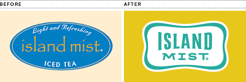
I’m excited to finally share a project I worked on at the beginning of 2011 for Boyds Coffee. The project entailed updating their logo and branding for Island Mist, a line of iced teas. Their previous logo used the font Papyrus, and the people at Boyds wanted to nix it…I felt like I had hit the designer jackpot! The new logo is a refined version using a “cool pool” border and some slightly retro island-inspired type.

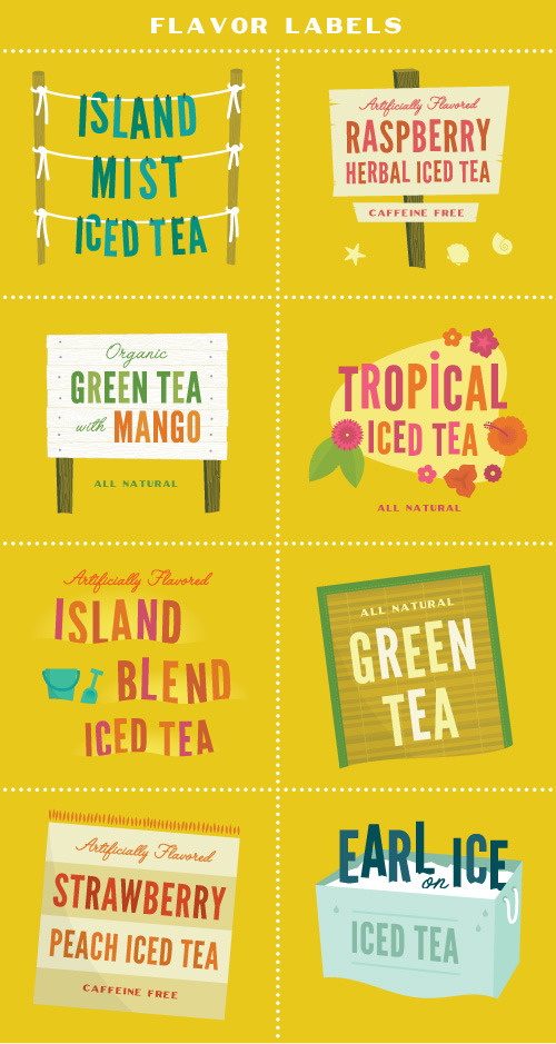
Another portion of the project was to create flavor labels for dispensers in restaurants and convenience stores. Most of the competition used giant images of iced tea in a glass, usually splashing out of it with lots of ice everywhere. It kind of looked like watered down coke. It’s my belief that you don’t always have to SHOW people watered down coke to make them want iced tea. So for Island Mist’s new dispenser wraps we chose the next closest thing to induce thirst: a series of summer beach illustrations.

A bevy of spot illustrations were also created to populate the wraps and be used in various point-of-sale and marketing materials. Here are a few of them…


