Olympia Provisions Catalog


My most recent project for Olympia Provisions was creating their consumer catalog – a curated line-up of OP’s best charcuterie in a small, fun digestible size and format. It is used promotionally at farmer’s markets and trade shows and sent directly to customers, and later in the year will also function as a holiday gift guide. From a designer’s perspective it was also a lovely project because it combined a photoshoot with David Reamer, working with one of my favorite food copywriters Jen Stevenson, and detailed page layout (yum, stylesheets!).

While working “out of season” always feels a little strange, many holiday pieces are created in early summer to allow for wholesale order planning, product production, etc. In fact most of my work in May was focused on the Christmas season…

A bright red cover in a hand-held size of 5×7 inches catches your attention merrily and is festooned with a border of bow-tied sausage links. The cover artwork was painstakingly created from scanning vintage cuts, or letterpress images, and piecing them together to create the scene we wanted. Of special note is the The Whole Shebang spread, technically described as half a pig. Read more about the creation of the photo here, and may you never experience a pork shortage again!

Olympia Provisions holiday catalog - a red booklet with stack of sausage on display

Welcome letter from Eli  for the Olympia Provisions holiday catalog.

Olympia Provisions clubs of the month: salami, sausage, pickles and pates.

Charcuterie gift sets from Olympia Provisions from their 2017 holiday catalog.

The Whole Shebang - half a pig from Olympia Provisions, with all the cuts of charcuterie arranged in the shape of a porky pig.

Eli Cairo's honey glazed ham recipe.

Olympia Provisions spread of Good Food Award winning charcuterie.

Build your own charcuterie board with Olympia Provisions.

Evergreen Calendar for Umpqua Bank


One of the reasons I love working for myself is getting to use most parts of my brain: design, intuition, research, organization, efficiency, critical thinking, non-critical thinking, and chocolate consumption. Which is exactly why I enjoyed this Umpqua Bank project designing an evergreen calendar – there were many interconnected parts that created the end result. The goal was to create a keepsake piece for new employees that reinforced the philosophy of Umpqua, which employees had just learned during their on-boarding training. The format chosen by the client was a desk calendar featuring 12 tenets, and that is where my work started…

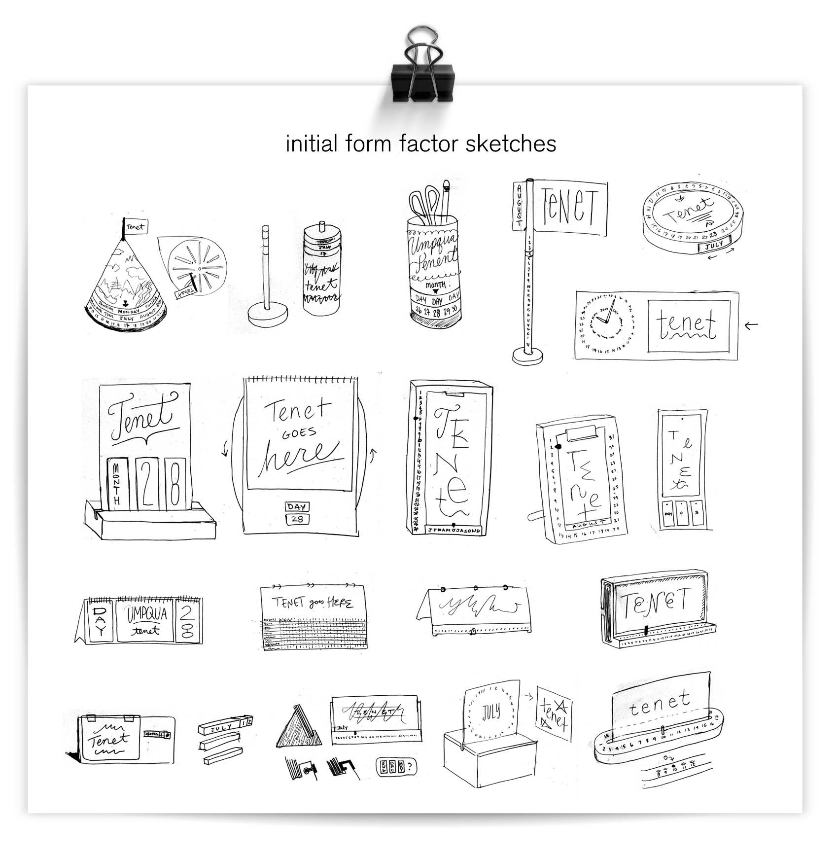
An initial round of sketches was created to explore an “evergreen” form factor, ease of usability, creativity, and how it lined up with the per unit production budget. Everything from rotating columns, flippable panels, turnable magnets, reversible cards, and game-inspired counters and pegboards were a part of the first round.

initial form factor sketches for an evergreen calendar

After the sketch presentation, the array was narrowed to three main form factors to price specifically. Umpqua wanted to focus on premium materials so some simpler options were chosen to give more of the budget to materials rather than form complexity.

three refined evergreen calendar sketches

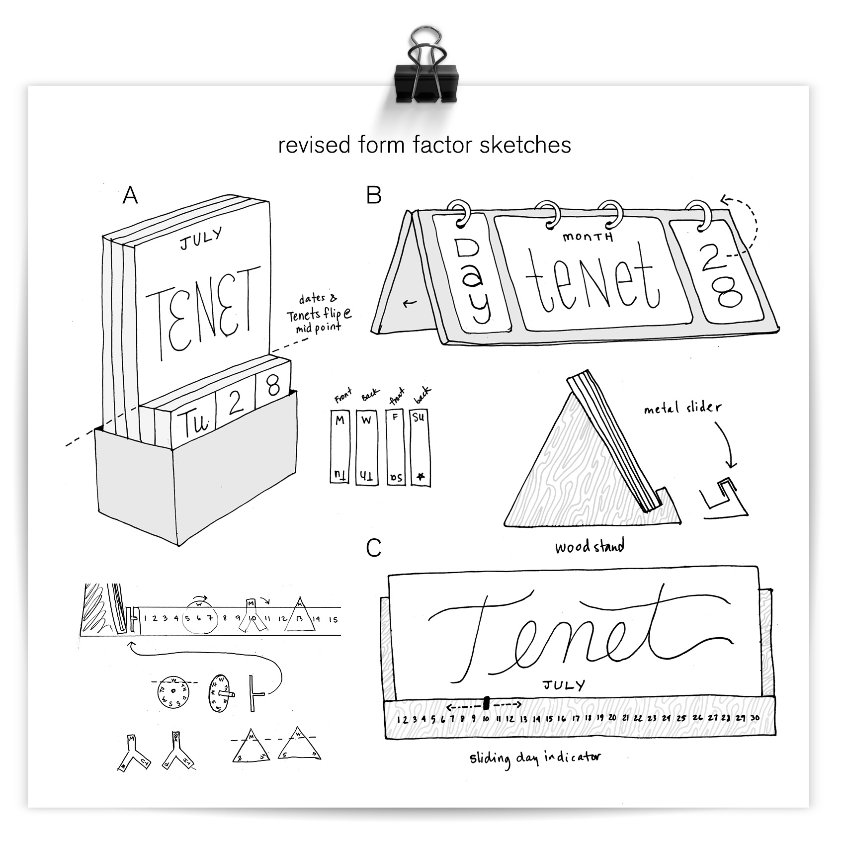
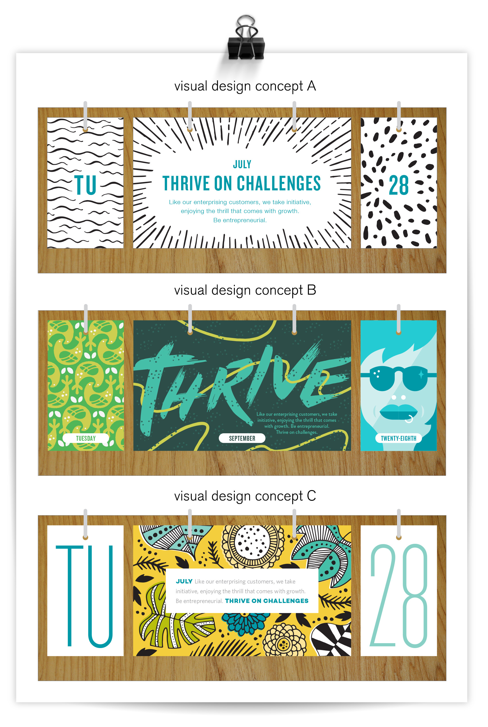
A combination of B and C was chosen to move into the visual design phase, with some modifications to meet the budget. After the form factor was nailed (for now), visual directions were explored to find the right balance of “Umpqua”, banking, fun, and feeling like a custom piece that could hold its own on a desktop. A few focus areas in the initial design process were how much emphasis to put on the date (month, day), how integrated the messaging and illustration should be, what style the illustration should have, and what color impression the calendar should have. The option chosen (C) placed the most focus on the tenet, leaving the dates to be purely functional to highlight the messaging and illustration.

initial design concepts for Umpqua Bank evergreen calendar

Throughout the production process, the per unit budget was the major factor in determining the final form. The more parts there are to assemble in production, the higher the cost, so a simple solution was needed. In the end a compromise between materials and functionality was reached. A triangular wooden stand with a powder coated lip met the cost requirement, and could hold the tenets and dates in a nice presentation. A bit of functionality was ceded in that the panels have to be manually rotated instead of flipping them on fixed rings from front to back of the stand. Real projects = real budgets. IT BE REAL, FOLKS!

wood triangle stand with powder coated metal lip to hold evergreen calendar date and tenet panels

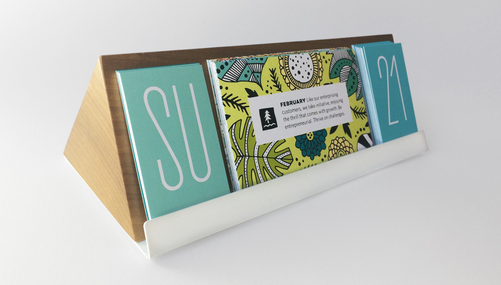
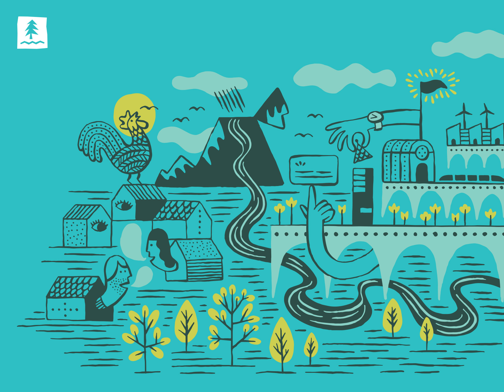
When the term evergreen calendar is used it usually refers to a calendar that can be used for any given year because it isn’t dated specifically. We took the term “evergreen” to the next level so both the information panels AND the form factor were evergreen. Umpqua wanted the option to switch out the panels, so the structure was designed to accommodate rotating messaging without it being a hassle to change out and didn’t create too much waste. An added bonus of the form factor was that it could also serve double duty as a picture rail, note holder, whatever, if users took the tenet and date panels out.

wood triangle stand with powder coated metal lip to hold evergreen calendar date and tenet panels

tenet panel series

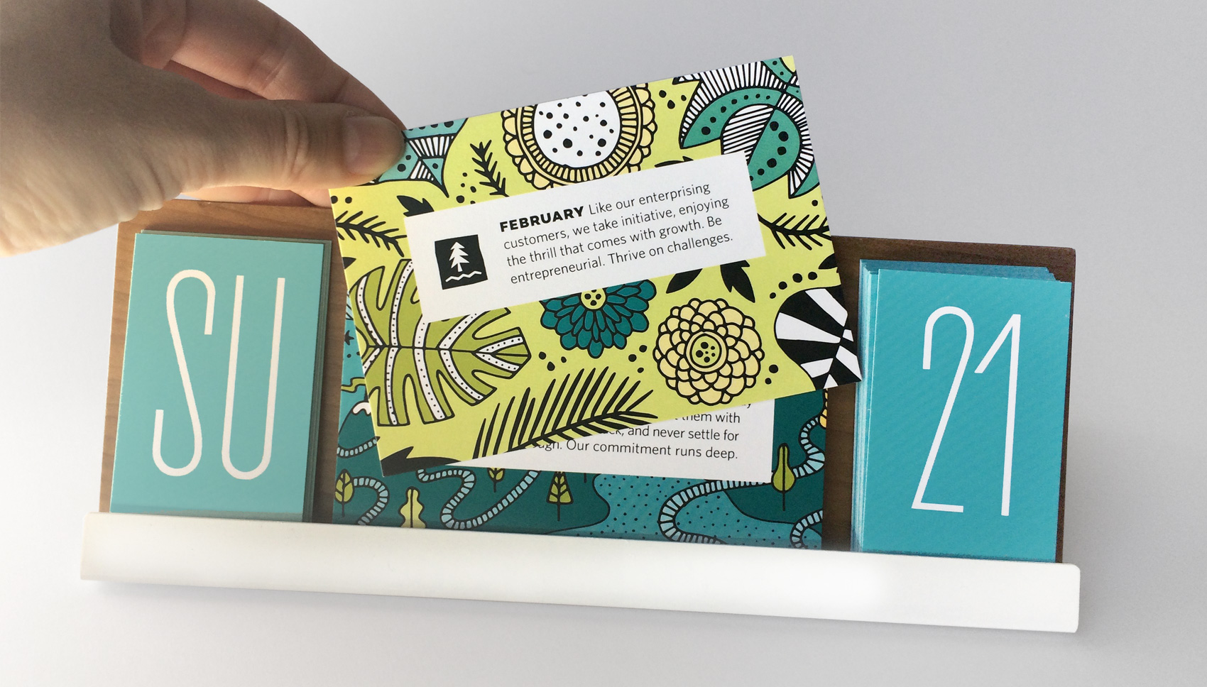
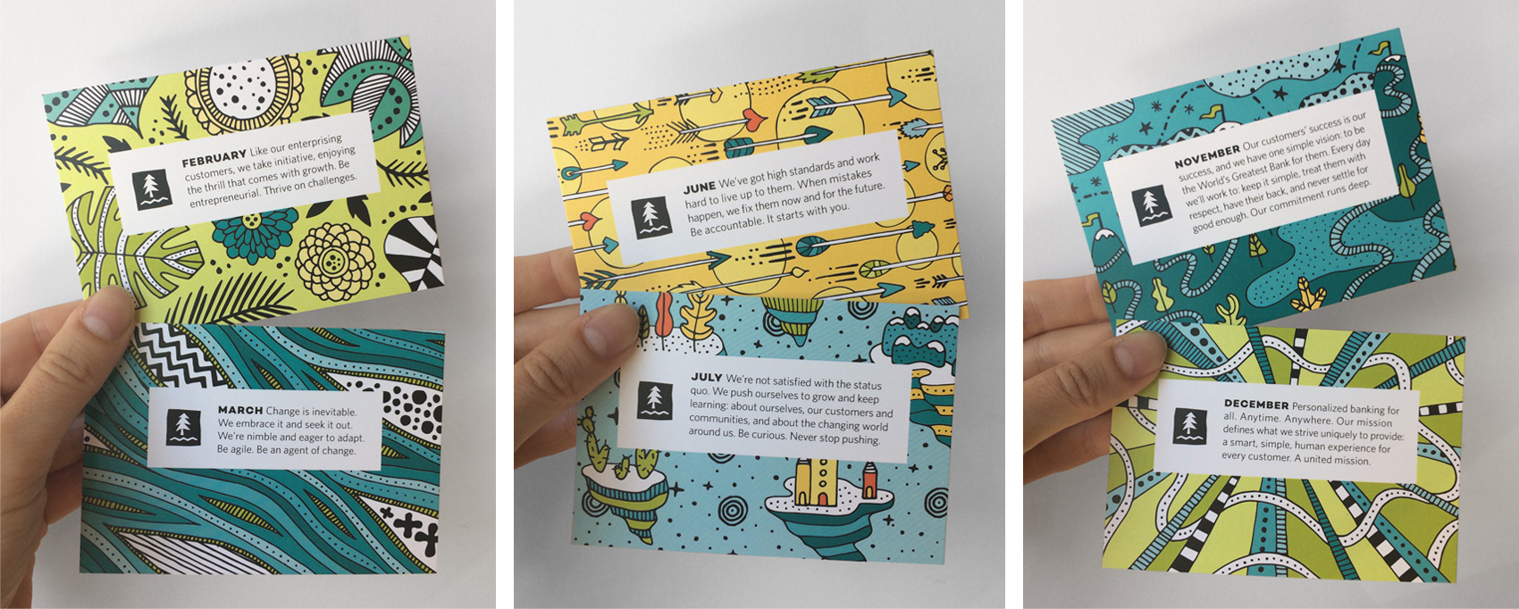
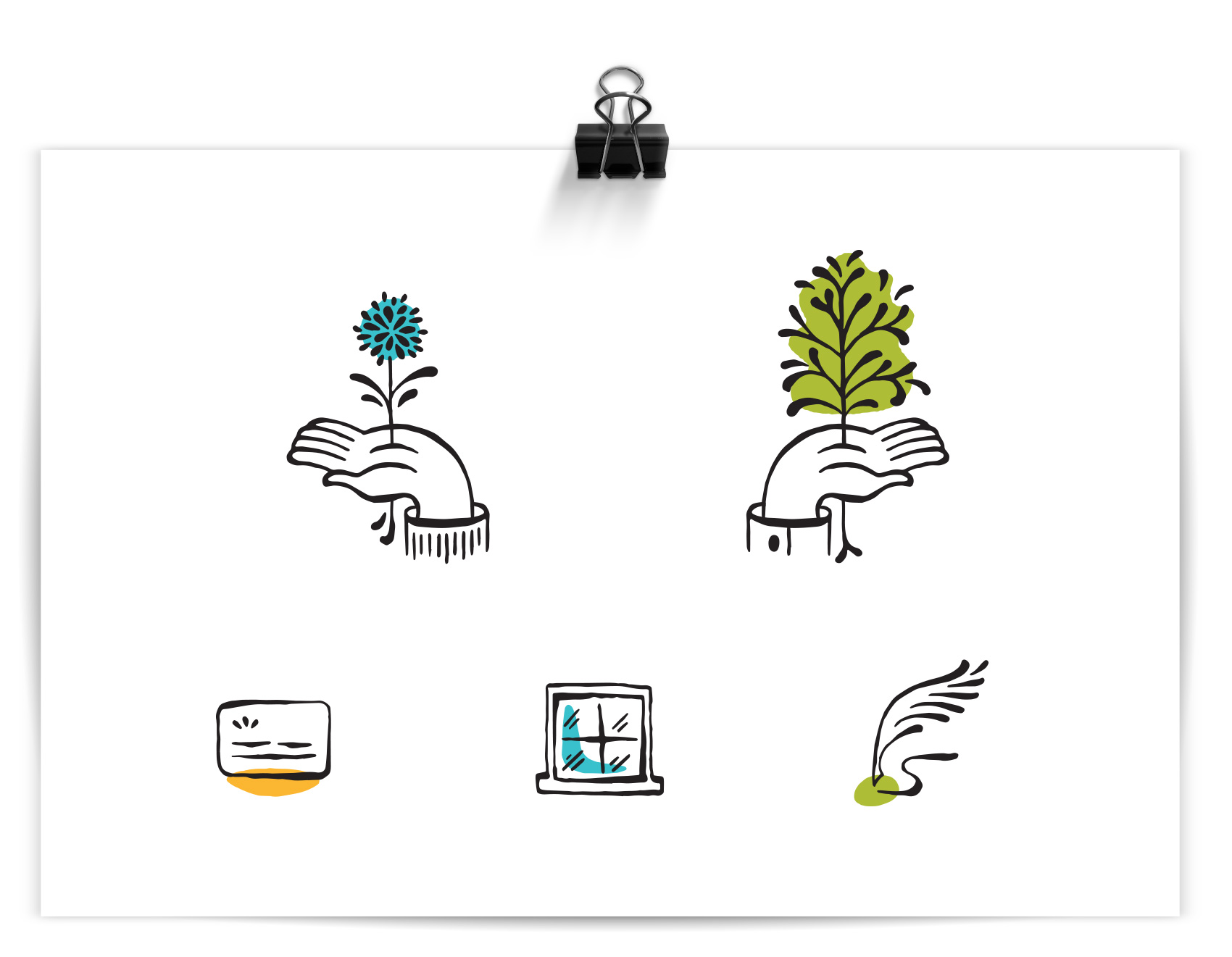
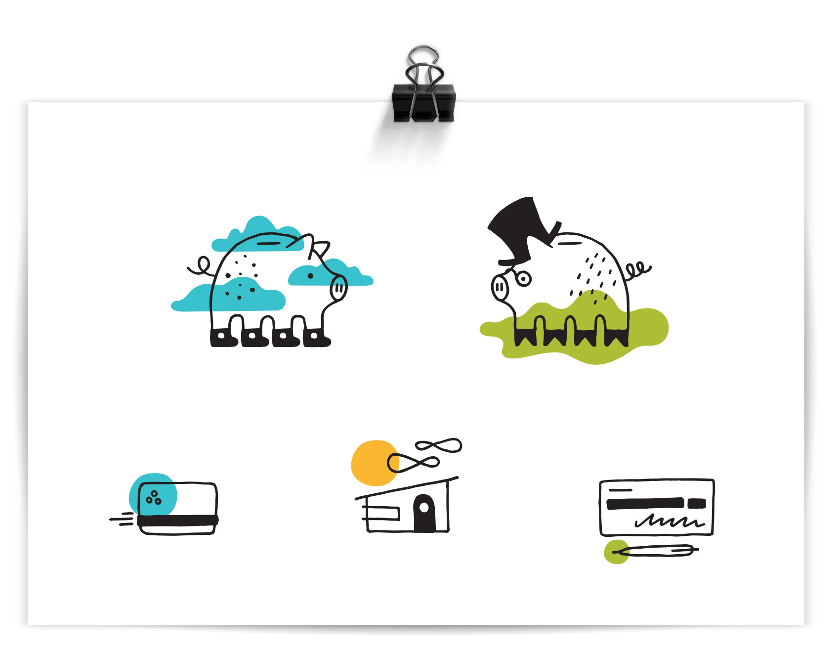
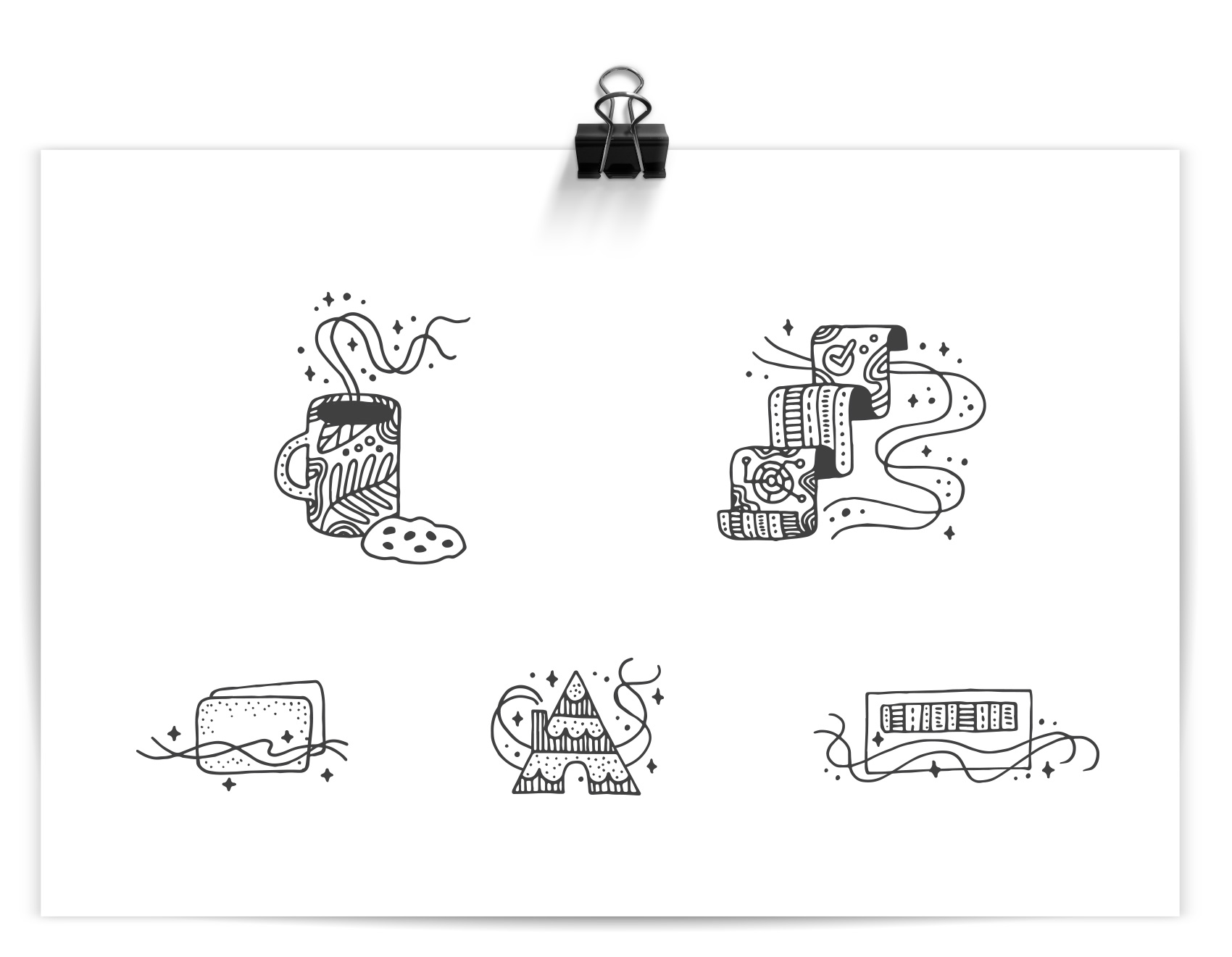
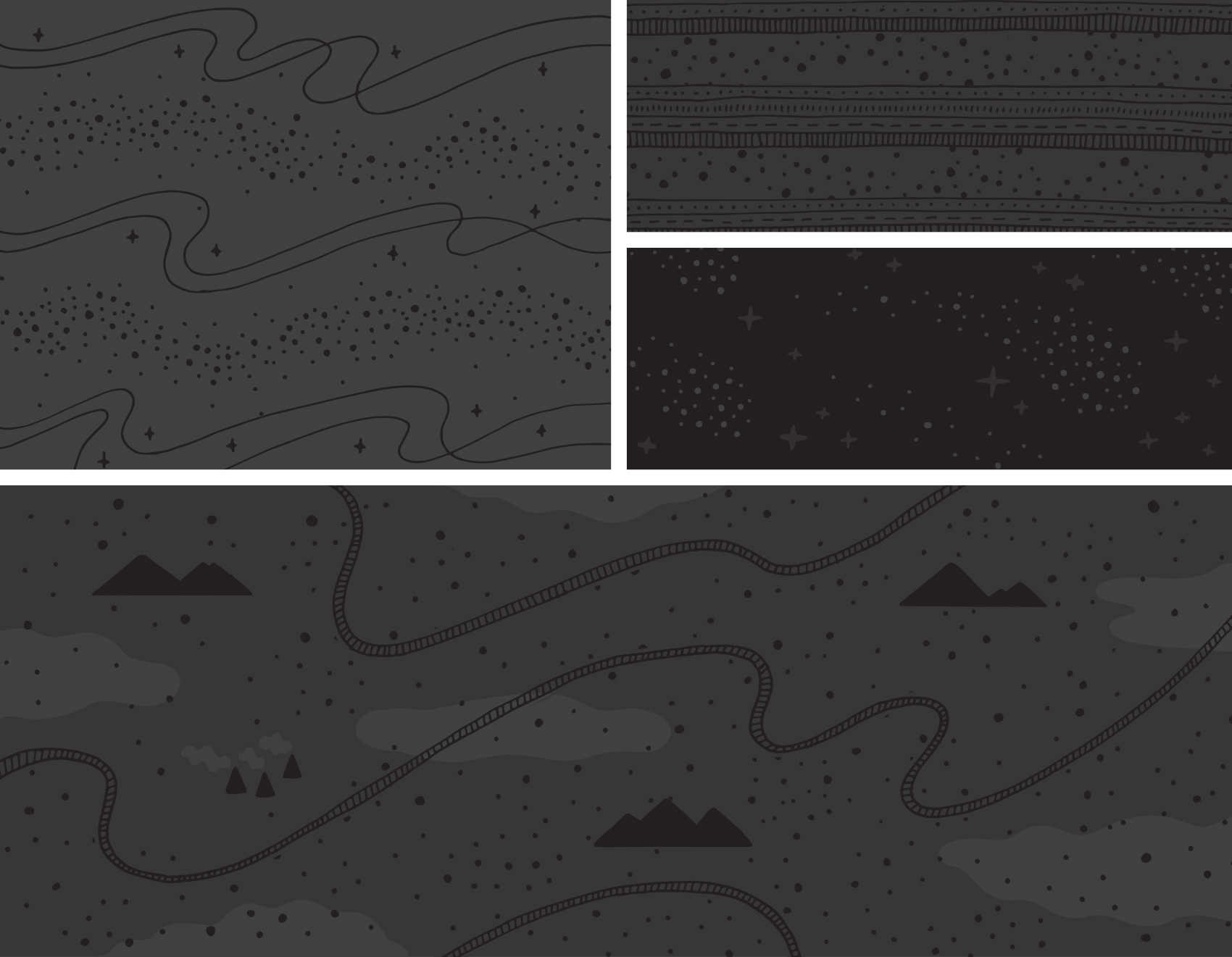
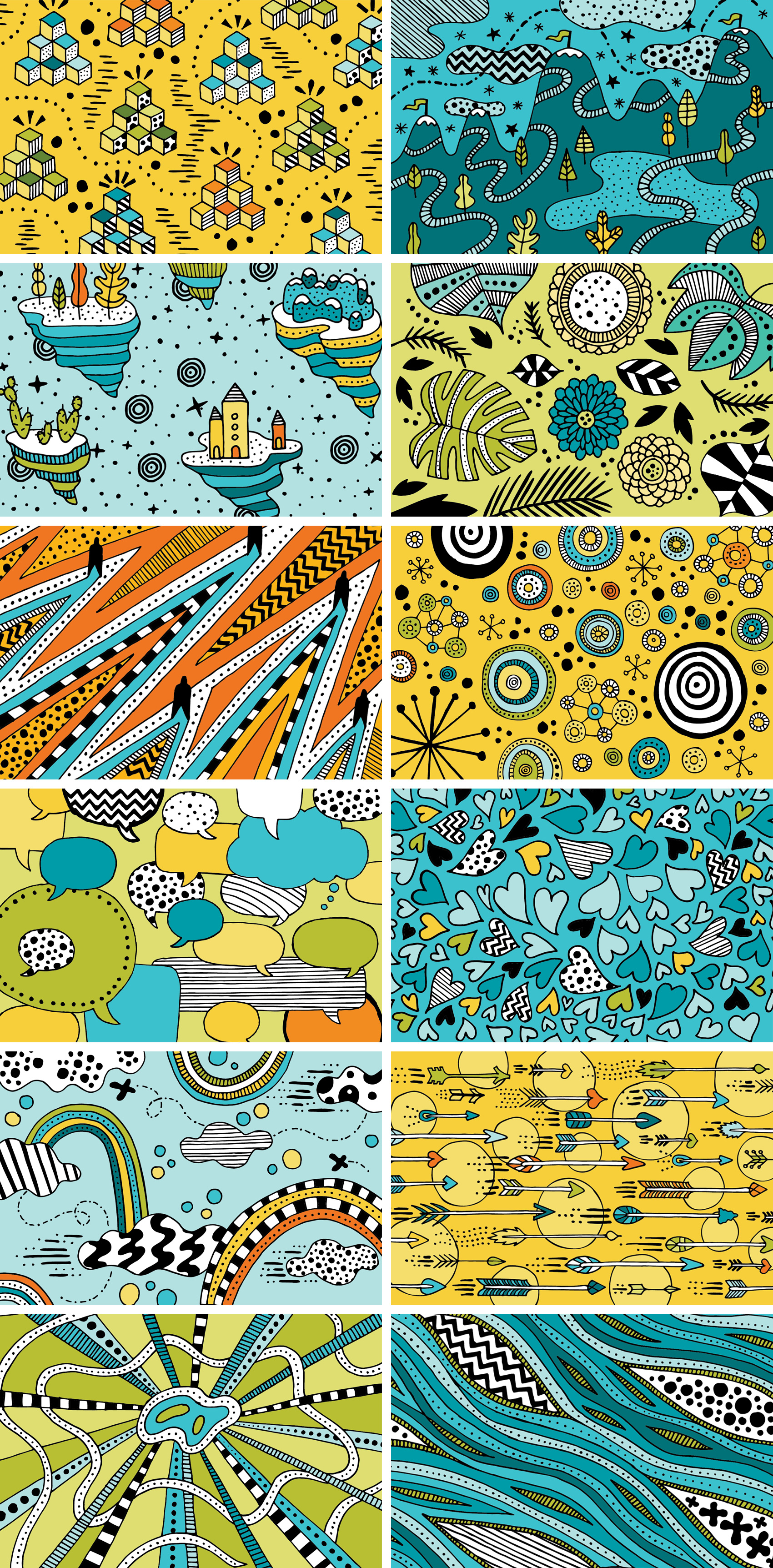
Tenet themes were used to guide each illustration which were created in the Umpqua brand palette, which thankfully is quite broad with multiple blues, greens, yellows and oranges. Client provided themes included: strive, thrive/challenge, change/versatility, knowledge, collaborate, diligence, grow/curiosity, heart/kindness, betterment, generosity, commitment, and unity.

twelve hand drawn illustrations to match the 12 tenets of Umpqua Bank new employee training

Credits
Client: Umpqua Bank
Creative Director: Kylie Emers
Project Manager: Jason Resch
Calendar Stand Production: Axiom
Calendar Panel Production: Pod4Print

Illustration Test for Umpqua Bank


Following up on the icon and pattern tests I worked on for Umpqua Bank, the most relevant style was used to create a more in-depth scene to show how that style would play out on a larger scale. The result was a friendly ecosystem of neighbors, businesses, nature and city drawn with a brush pen and colored digitally. The drawing was geared towards animation, balancing simple and complex so that small details could easily find movement on screen.

editorial illustration test for Umpqua Bank combining a community of personal, business, landscape, nature & city

bank icon tests for Umpqua bank: personal banking, business banking, credit cards, home loans, checking

Icon and Pattern Tests for Umpqua Bank


I’ve enjoyed working on so many projects for Umpqua Bank over the years, from building murals to 30-page mini magazines to postcards to desk calendars to identity systems. The most recent project was more experimental and without a true end deliverable – testing out different illustration styles to see what might be useful to a brand. In the spirit of sharing process and behind the scenes, here it is…

The work below represents a single round of illustration tests for icons and patterns. Personal banking & business banking was depicted as well as credit cards, home loans, and checking. Most of the patterns are generic and nature based to show style. The goal of the exercise was to test the limits of what styles might be appropriate for stretching their visual library. I drew towards ‘more fun’, ‘more ephemeral & cosmic’, and ‘more sophistication’.

Unless there is a clear style set from a brief, often my intent with the first round of of illustration trials is to provide a wide range so that comparisons are clear and to get a variety of feedback. Learning the pros and cons of three very different styles is much more educational than comparing three similar styles. After all, it’s not until the very end that you have to yell NAILED IT! Everything up until then is learning as much as possible so you can get it right in the end.

MORE FUN

Out of all the banks I know, Umpqua is the friendliest and most playful in their branding. What if I only focused on that, and tried to forget it was a bank after all? The result was a piggy in converse and a piggy in a topcoat and spectacles, because duh. Color accents are used reinforce the icon message or provide flair. This direction was presented as “FUNBANK”: Approachable with a wink, using simple linework with pops color, and themes covering everyday life and twists on “banking as usual”.

bank icon tests for Umpqua bank: personal banking, business banking, credit cards, home loans, checking

pattern & illustration tests for Umpqua bank: landscape patterns

MORE EPHEMERAL & COSMIC

Straying furthest from their current brand, this direction took inspiration from some specialty projects I have worked on for Umpqua Bank that were less mainstream. Intricate patterning with almost a tattoo-like quality were not the top pick, but an interesting study. The sparkly “magic factor” used throughout the series was meant to communicate Umpqua’s ‘special factor’. IF ONLY personal banking consisted of drinking coffee and eating cookies. This direction was presented as “IT’S MAGIC”: Playful and intricate with unexpected, detailed linework, this direction explores themes of service, delight, and magic in the mundane.

bank icon tests for Umpqua bank: personal banking, business banking, credit cards, home loans, checking

pattern & illustration tests for Umpqua bank: cosmos

MORE SOPHISTICATION

This style was a favorite and used as a starting point for further exploration (future post coming soon!). A controlled brush line provided a humanistic quality and felt more editorial and high-end than their current icon library. This direction was presented as “THE HUMAN TOUCH”: Refined and organic, using gestural linework with themes of growth and movement. (side note: this direction also gave me hand cramps)

bank icon tests for Umpqua bank: personal banking, business banking, credit cards, home loans, checking

pattern & illustration tests for Umpqua bank: nature based squiggles

That’s all folks – a work-in-progress showing the process of testing illustration styles for an un-banky banking place.

And then there was that time I made a bunch of icons for Walmart.


illustrated infographic of the Walmart annual enrollment benefits landscape

category divider icons for Walmart annual enrollment materials

Walmart's benefits, mystified.

color variations on icons for healthcare industry

lots and lots of icons

PROJECT NOTES

This library of icons, infographics and spot illustrations was used in Annual Enrollment materials for Walmart. // Annual Enrollment explains the benefits provided by an employer to all levels of employee; the content for the various pieces relied on variable content. // The illustrations were developed in the Walmart brand palette. // The work featured is a snapshot showing about one third of the illustration work completed. // All work was created for Liquid Agency with CD Kylie Emers & ACD Aldo Mollinedo for the end client Walmart.

Well Vegan Brand Refresh


Six years ago marked Well Vegan’s launch when Bureau developed the brand from scratch for food-entrepreneur Katie Koteen to market her vegan meal plan subscription service. This spring, with a ton of new site features and her first cookbook under her belt, Katie wanted a refresh for the logo and website.

The first thing on the docket was a logo update. The friendly hand drawn script was a keeper, but legibility was increased by redrawing it on a level baseline and separating the two words with a visual – one of Katie’s favorite illustrations from the initial branding, a white radish. A pop of green was retained in the radish leaves, but the overall impression was more toned down.

before and after logo for well vegan, from a smiling pea pod to a white radish

The inaugural 2011 branding for Well Vegan included lots of hand drawn elements, borders, spot illustrations and illustration as main images (see it here). In 2017 Katie wanted to update the site based on the increase in photography and recipe posts, as well as make the site feel a bit simpler and cleaner rather than the homespun start-up it used to be.

well vegan hand drawn logo in black brush pen with a radish illustration and green color pop

A major area of focus was paring down the use of illustration and color to allow the food photography to shine. Instead of being the main focus, illustrations were used as accents and often in black & white instead of full color. The fonts also were refreshed – headline and accents were kept in the friendly legacy font (Skolar) while body and informational text was updated to the lighter, brighter Mr. Eaves.

Well Vegan blog post design

In the instances where illustration is used for main effect, we stuck with the black line-work style with color accents. This also left room for future promotional illustrations which had been a heavy favorite over the years with subscribers and the Pinterest crowd.

Illustrated grocery bag for Well  Vegan's plan page

The new streamlined feel was leveraged lightly throughout the site and in the cookbook design, featured on the cover and as page accents. The book is currently available.

well vegan plan page and promotional Frugal Vegan cookbook page

Frugal Vegan Cookbook


From full-frontal meat spectacular to a dense foliage-laden tome of vegan cooking knowledge, my last two projects were on opposite ends of the food spectrum. This time the project at hand was designing a vegan cookbook: The Frugal Vegan! It’s no wonder half my blog posts are tagged MMMM, FOOD.

Well Vegan - Frugal Vegan cookbook cover with custom photo and hand drawn cover title

A friend and colleague I’ve worked with over the years recently published her first cookbook. Well Vegan is Katie Koteen’s online vegan meal-planning service. It was launched in 2010 and had been a side project of hers for several years, growing slowly with the addition of Kate Kasbee, then expanding the recipes and features on the site, and finally becoming a main focus of work which led to a book deal: Frugal Vegan: Affordable, Easy & Delicious Vegan Cooking. One of the most exciting parts of working with small business owners is seeing them grow their business and what direction(s) it takes over the years – this one is definitely on an upward trajectory.

frugal vegan cookbook salad introduction page for healthy vegan recipes

Katie & Kate tested and refined 99 recipes that focus on budget-friendly vegan cooking. I got to taste a few recipes along the way, witness an upgrade from an unreliable stove to a gas-top range, and in the end was asked to help with the book design. The project scope was limited but made a nice difference – developing a cover with photo direction and hand drawn typography reminiscent of her Well Vegan brand and creating an inside template for recipes and chapter introductions. Photography was shot by Wonder Jam. The end result is a fresh and easy-to-read cook book with accessible recipes that even (gasp) I could make. Probably.

Frugal Vegan is currently available for pre-order.

vegan pineapple scone recipe spread for Frugal Vegan cook book

The Whole Shebang from Olympia Provisions


A client that continues to provide fun and interesting projects, Olympia Provisions, recently commissioned the Bureau create a holiday gift guide (more to come on that another day). One of the main photo spreads was a compilation of all of their charcuterie in the shape of a pig, with the products placed approximately where it came from on the pig (give or take an artistic license or two).

olympia provisions charcuterie selection in the shape of a pig - the whole shebang!

The image was created by salumist Elias Cairo of Olympia Provisions placing all the meats in their respective areas, then myself adjusting the placement until it looked like your friendly neighborhood oinker if you were looking at it with X-ray meat vision. Photographer David Reamer shot the piece from a ladder, top down on a white sheet. The white marble was added in post production to give the pig a neutral background and showcase the variety of colors and textures (apparently fat marbling is a big deal in the meat world).

Now, I’m not averse to meat. I eat it. I enjoy it. I’ve even spent time in slaughter rooms on Eastern Oregon ranches during my youth and had my dad chase me to the hay barn brandishing a cow’s tongue (scary for an 8 year old). But in my last two decades of life I haven’t handled that much meat because a) I’m not the main cook in the house, and b) I live with a vegetarian. But handling 50 pieces of meat several times each for over an hour is a bit beyond what I ever though my job as a designer would entail. Suffice to say, I fulfilled my meat handling quota for the year on this project!

And, since this was a small part of their annual consumer-side catalog project, you can indeed buy The Whole Shebang (which is technically classified as a “half pig”) when holiday season rolls around. It’s a no-lose situation, and as we described this unique offering in the catalog…

Last minute dinner guests? Need to throw a party for a hundred of your best friends or business associates? Fear not—with our half pig, you’ll never experience a pork shortage again. Includes everything listed! Assembly required.

Ceek Logo and Website


An interesting client I have been working with recently is Ceek, a product design and development start-up that provides innovative solutions for frontline women’s healthcare. Bucking the historical trend of men making products for women to varying degrees of success, this company focuses on products created for women, by women. Definitely an approach I could get behind!

Ceek custom logotype in lavender.

Their logo was an exercise in custom typography and compactness as it needed to reproduce well on a variety of materials in small format (for example, as a deboss on a rubber handle grip). To aid in keeping the logo as big as possible at even the tiniest scales, a monoline x-height was implemented so the logo wouldn’t have to scale to accommodate the tallest character (since there are none!). A simple petal icon went through many iterations to become soft yet bold, feminine and somewhat regal, and have the right proportions to scale as well. A metallic lavender was chosen as the main brand color, differentiating it in the medical field which tends to employ blues (HEALTH!) and pinks (FOR WOMEN!) across the board. A broad palette of supporting colors were added to increase vibrancy and flexibility for future product lines and create a more nuanced palette than competitors, making the brand more approachable than clinical.

3 image banners for Ceek homepage, healthcare innovation for women.

Ceek’s first foray is tackling the age old device of every women’s annual visit – the speculum – with a range of patient and doctor friendly updates in their product design. Shockingly, the device hasn’t had major updating since its invention in the 1800s. From a graphic design perspective, it was also not the most inspirational visual matter to present front and center. To communicate Ceek’s intentions and story, we focused on their leading goals and featuring a wide variety of portrait stories and subtle growth focused imagery. A complementary logotype for Nella, the first product line, was also created. In addition to design, Leighann Franson aided in brand copywriting and Katie Koteen implemented the website.

Product page for Nella, Ceek's first product for women's healthcare.

Ceek Women's Healthcare about page and business card.