Ceek Logo and Website


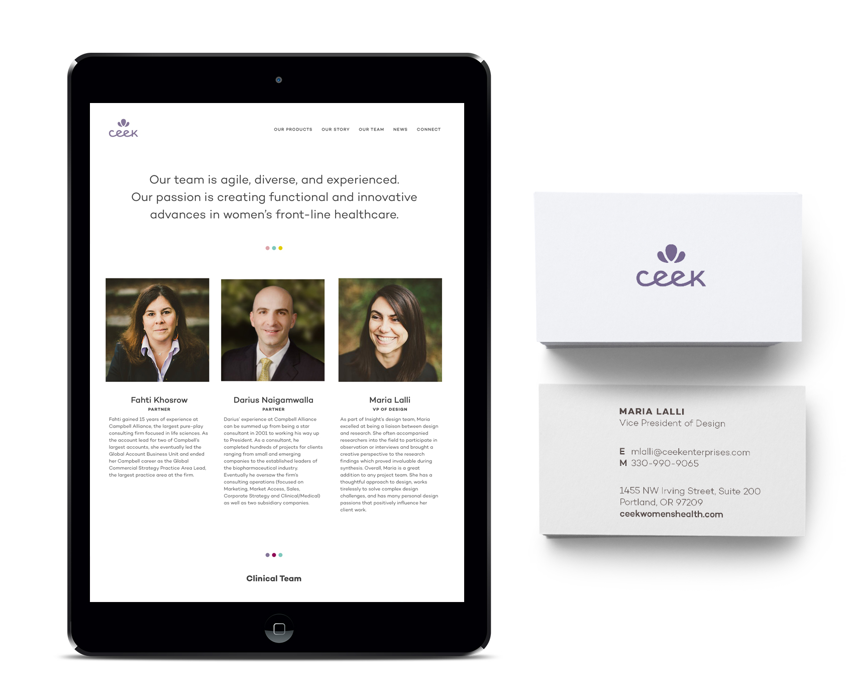
An interesting client I have been working with recently is Ceek, a product design and development start-up that provides innovative solutions for frontline women’s healthcare. Bucking the historical trend of men making products for women to varying degrees of success, this company focuses on products created for women, by women. Definitely an approach I could get behind!

Ceek custom logotype in lavender.

Their logo was an exercise in custom typography and compactness as it needed to reproduce well on a variety of materials in small format (for example, as a deboss on a rubber handle grip). To aid in keeping the logo as big as possible at even the tiniest scales, a monoline x-height was implemented so the logo wouldn’t have to scale to accommodate the tallest character (since there are none!). A simple petal icon went through many iterations to become soft yet bold, feminine and somewhat regal, and have the right proportions to scale as well. A metallic lavender was chosen as the main brand color, differentiating it in the medical field which tends to employ blues (HEALTH!) and pinks (FOR WOMEN!) across the board. A broad palette of supporting colors were added to increase vibrancy and flexibility for future product lines and create a more nuanced palette than competitors, making the brand more approachable than clinical.

3 image banners for Ceek homepage, healthcare innovation for women.

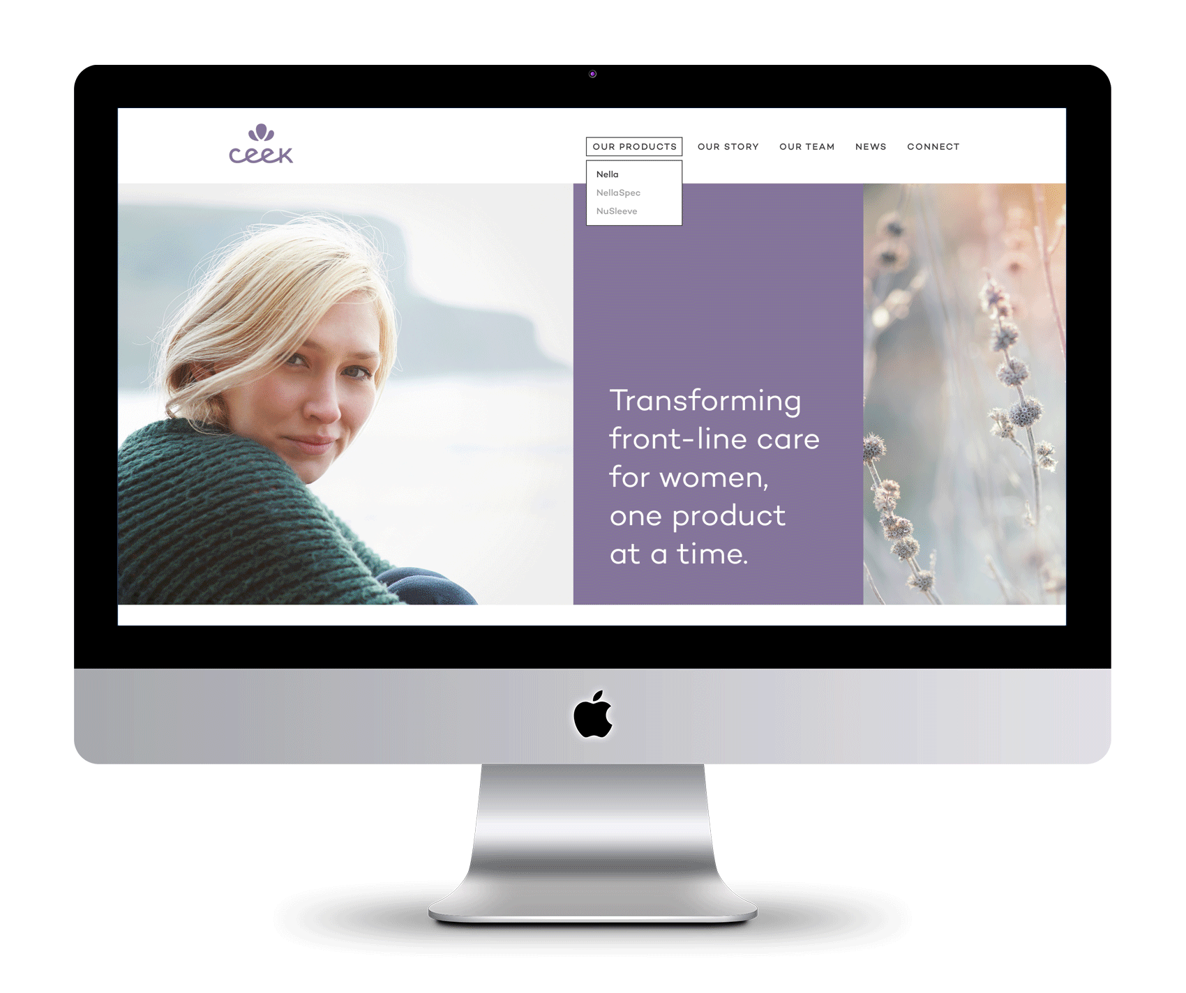
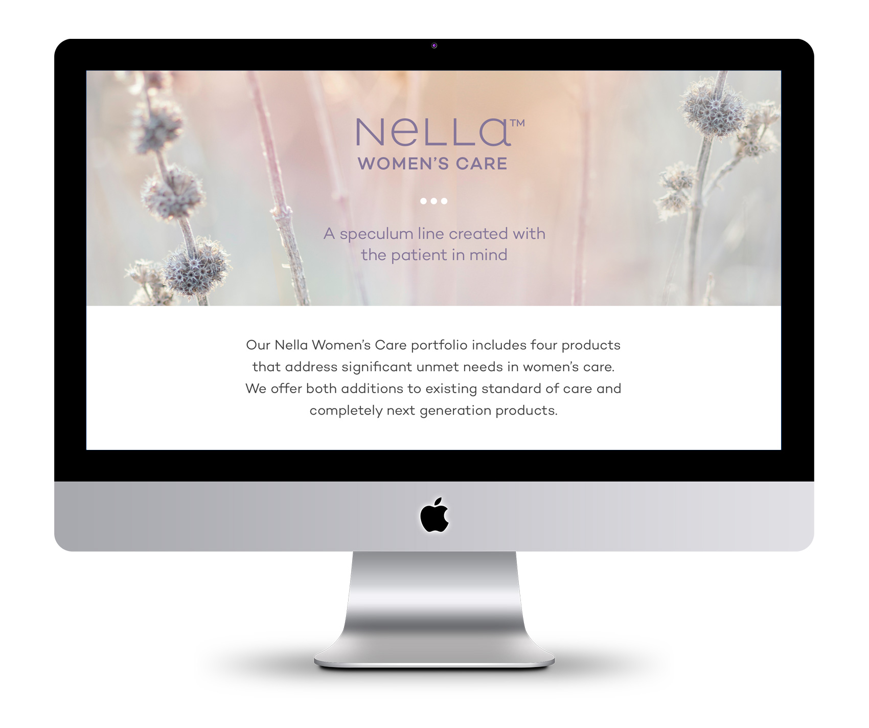
Ceek’s first foray is tackling the age old device of every women’s annual visit – the speculum – with a range of patient and doctor friendly updates in their product design. Shockingly, the device hasn’t had major updating since its invention in the 1800s. From a graphic design perspective, it was also not the most inspirational visual matter to present front and center. To communicate Ceek’s intentions and story, we focused on their leading goals and featuring a wide variety of portrait stories and subtle growth focused imagery. A complementary logotype for Nella, the first product line, was also created. In addition to design, Leighann Franson aided in brand copywriting and Katie Koteen implemented the website.

Product page for Nella, Ceek's first product for women's healthcare.

Ceek Women's Healthcare about page and business card.

Pin That Sh*t


Like most kids I collected various things throughout my childhood, including buttons and pins. Most of my pins were from family travels, my parent’s political involvement in education, or participation in school events (see the full array here). Ramblin’ Rod would not have been impressed, but it was my collection and I was proud of it.

A few buttons and pins were collected of my own volition, and one of my prize pins was found in a deserted lot near my home around 8 years of age – a unicorn with gold metal accents and a multi-colored mane. Between childhood activities of building forts out of firewood stacks and popping tar bubbles on recently repaired roads, finding a monogram unicorn pin was a highlightable moment – even if it had a G on it instead of an M. Many days I wore this pin and thought “if only my name started with a G”. Alas. Here are a few favorites from my childhood collection.

pin collection from my childhood including a unicorn with multicolor mane

So, it seemed destined that one day I would participate in a group art show called Pin That Sh*t during Design Week Portland 2017. Over 60 artists from around the world donated pins, all of which will be for sale with funds donated to support arts education. Once I learned I would be a part of the show, I revisited my 1980’s collection and started on designing something new for the show.

My brainstorming ran the gamut from textures to animals to random icons. A theme of birds became apparent which guided a more specific exploration of several bird pins, of which the top three were considered for the final piece. After feedback from studio mates, the simplest bird was adjusted to have bold black outlines, taking inspiration from my childhood unicorn pin but modernizing it in style. And really, what better way to converge ‘put a bird on it’ with the new hip trend of pinning everything in sight?

preliminary bird pin brainstorms

love bird with heart speech bubble and rainbow wings for WeMake Pin That Sh*t Show

Love Bird is a tiny yet highly visible fashion partner to any wardrobe or backpack choice. With a nickel metal detail and flat polished surface, its minimal design seeks to spread love and acceptance. It’s a bird with a meaning, but it’s also just darn cute!

Two larger collections are also a part of the show from Kate Bingaman-Burt and from Brian Stowell, and many artists donated more than one pin so that there will be over 600 pins on display. For a more comprehensive list of artists and their bios, visit WeMake’s event page.

The show opens April 27th at Tillamook Station (665 N Tillamook Street in PDX, OR), from 4-9pm. In addition to the pin display there will be activities and beer. Most pins will go for about $10, also known as very affordable art. Time to find a bigger jean jacket…

participant pins of Pin That Sh*t art show

The pin was produced through GS-JJ who make custom pins, patches AND belt buckles. To transport/display the love bird pin, I ordered custom cards from Moo. A square, rounded corner card with spot gloss on the title and white clouds was the perfect fit for the bird with both shiny and matte surfaces.

love bird pin with cloudy spot glass Moo Cards background backer

McAfee Cybersecurity Timelines


Working with Solid Branding for their client McAfee, the Bureau created a set of 20 cybersecurity related icons and a timeline infographic that was used for both McAfee’s involvement in cybersecurity and a generic version of general cybersecurity history, all done to match McAfee’s brand guidelines. Not being particularly techy or aware of the nefarious side of technology, working on this project made me a bit paranoid every time I opened up a device…are they watching?

Cybersecurity timeline for McAfee

Twenty cybersecurity icons for McAfee

Olympia Provisions Wurst Division


Drum roll please…for the opening of OP Wurst Division! Olympia Provisions’ offshoot restaurant series, Wurst, now has a new location on 3384 SE Division street. A renovation of the old Honky Tonk Taco building turned a teal & red taco joint into a high end sausage bar. You heard it – a high end sausage bar. The Bureau assisted by providing brand & signage suggestions including establishing a simple white, black and gold palette that takes advantage of the interior’s natural wood accents and a restrained use of signage combined with custom composed old-time woodcut illustrations.

Strongman sausage lifter announcing the new OP Wurst Division location in SE Portland

On the front facade two large backlit gold signs can be seen through the windows boasting BEER and SAUSAGE. What more do you need to know? Inspired by a hut on the top of Mount Hood that has no logo or branding other than BBQ written in 15-foot-tall letters on the roof, OP Wurst Division uses a minimal approach to great effect. The signage works double-time as cozy lighting while the bar is open and all-night-long advertising to passerby. Inside, the main impressions include a giant bar, gleaming rafters, and a newly installed fireplace in the west wing (otherwise known as the “wurst room”). When seen from outside the singular message makes sure you know what to expect. BEER. AND. SAUSAGE. (photos by Dina Avila)

acklit gold interior signage spelling BEER and SAUSAGE. Outdoor patio message: it could always be wurst.

An outside patio mural boldly shouts a simple message to people near and far: It could always be wurst. Speaking of which, the menu has a plethora of hot dog options from traditional to way-out-in-left-field (there are even a few menu options for veggie lovers). In conjunction with the opening, Olympia Provisions is also expanding their sausage options from the standard pork to include both chicken and beef sausages. So hustle on over to Wurst Division and try a traditional dog or an experimental twist on the classic wurst.

wreaths heralding chicken, pork and beef sausage selection at OP Wurst

Olympia Provisions Introduces Landrauchschinken


Feel free to grab and ice pack and sprain your tongue on that mouthful. I was once told that speaking Danish (my second language) was like talking with your mouth full of marbles, and that if it didn’t hurt just a little then you weren’t doing it right. The Swiss must have been visiting Scandinavia when they came up with this moniker for Swiss Country Ham. Good thing you can order meat from the internet in complete silence, so if you like a cured pig loin soaked in burnt sugar and flavored with juniper and rosemary delivered straight to your doorstep with no intervention by the pronunciation police, then you’re in luck.

Oh, here’s the little promo image I put together for Olympia Provisions social channels to promote their new product.
Say it with me…LOND – RAUK – SHEEN – KIN.

Vintage etched illustration of a pig for Olympia Provisions Landrauchschinken launch. It's Swiss Country Ham!

Olympia Provisions Inserts


Olympia Provisions, of famed salamis and several restaurants in Portland, has several meat-of-the-month clubs. You heard it right! Salamis, sausages, pâté and pickles* all get the white glove treatment and can be delivered straight to your doorstep or gullet, whichever is closest to the mailman.

For each club the Bureau was tasked with designing informational brochures so members knew (for example) exactly what was in their salami, how best to serve it, what kind of romantic dates salami likes best, and revealing once and for all what that white stuff on the outside of a salami is (protective edible house flora that has a reputation that precedes it).

Unsure of what to get your sweetie for Valentines to tell them they are that special someone? Say it with meat.

collateral inserts for Olympia Provisions' club of the months - salami of the month, sausage of the month, pate of the month and pickle of the month

*Not technically a meat.

Olympia Provisions Holiday Card


I’ve recently been designing collateral and packaging for Olympia Provisions, a fine meat-centric cluster of restaurants in Portland, Oregon and purveyor of American Charcuterie. Their branding is already top notch, so when the opportunity popped up to create their holiday postcard, it was purely fun. The process on this was super succinct with just a rough sketch of the idea before approval for design & illustration. Guess you can’t fail with the formula of meat + wreath. Meaty Christmas to all!

OP-Holiday-Card

Thanks to Hayden Walker for illustration skills that helped keep the project on time and on budget. A recent graduate, Hayden is a new to Portland and has helped the Bureau over the last few months on several projects, including the Oregon VS Oregon beer label design by decade.

Bandit Books Logo


Bandit Books is the two-pronged business of my friend Katy Meegan, focusing on bookkeeping for creative businesses as well as bookmaking and creative projects. Katy and I met at the IPRC over a decade ago as fellow letterpress teachers. We continued our friendship and shared love of books at Em Space, and for many many years Katy was half of the duo Keegan Meegan which offered letterpress and design services.

This summer Katy was taking her next professional step in combining her organizational and bookkeeping skills to help other creatives with their businesses. Over some evenings drawing together in my nook we talked about how that would look, which led to working together on her logo.

Katy knew she wanted a raccoon in her logo – it was her spirit animal and spoke to her as a symbol for not being your regular bookkeeper. Because of this, the first round of logos was very specific and concentrated on coons. Coons! Coons! Coons! I am a big fan of character studies, so I went about it trying to answer things such as: Can a raccoon reliably hold a book? If a raccoon were a typeface how would it look? How would a minimalist Scandinavian designer make a raccoon icon? Can a raccoon be as clever in a logo as in real life? The logo process shows the efforts of answering these questions.

lots of raccoon centric logo explorations for Bandit Books

After the first round, Katy was certain that the right raccoon for her was a mashup of a monoline raccoon portrait and the profile of a book, and the face of Bandit Books was born. The quality of the logo lent itself well to reproduction in letterpress, paying dues to Katy’s background in that arena, and the font was chosen so she could hand typeset other materials in the job case workhorse Futura. I’ll be posting more explorations on the brand materials soon. In the meantime, if you know a creative business looking for financial organization, you know who to call: Bandit Books.

bandit-books-logo

Ducks VS Beavers “Civil War” Beer Design Series


Each year, Oregon descends into sports madness when the Ducks (University of Oregon) and Beavers (Oregon State) face off at the “Civil War” football game, the biggest sporting event in the state. The tradition dates back to 1894 with over 115 games on record. Every November sport pennants fly proudly from cars, allegiances are sworn and catcalls are common. For the most part, I stay completely out of the mêlée. Until this year.

Which brings me to the Ducks VS Beavers Civil War “Beer Design by Decade” project! For every decade that the Ducks and Beavers have been competing against each other I created a beer label for both teams. Design wise I focused on the simplest execution possible to represent the styles, tropes, themes and feeling from that decade.

13 decades of beer designs for the Oregon State Beavers and University of Oregon Ducks.

While having participated in sports in high school with great fervor but mediocre talent, most of my 20’s and 30’s have been spent in front of a computer or a book. My sister, on the other hand, can most often be found cheering on her favorite sports team and alma mater: the Ducks. She probably inherited this from my dad who used to have a sport for every season which he watched dutifully and on the edge of his seat, can of peanuts and Pabst in hand. Realizing that my sister’s fandom would probably never subside, I decided to join in the only ways I knew how – eating guacamole during games and designing beer labels for the respective teams. Here are the labels zoomed in and side by side for each decade.

ducks-vs-beavers-civil-war-beer-design-final

Oh yeah, this years Civil War is on Saturday November 26th at Reser Stadium.

Thanks to:

Hayden Walker, a new Portland design transplant who helped with research and design as I balanced client work and a project effort that I underestimated greatly. See his work or Dribbble. Also to Tess Wojahn for helping with research (I’m sure a process post with inspiration images will follow at some point). See her work.

My playground friends from Madras, Oregon circa 1988 for spurring my alternative sports involvement when we wrote a rap about how great the Trail Blazers were (those were the days!).

My dad, who watched sports and drank beer and seemed to know infinitely more than both coaches and players based on the color commentary provided. He probably did know quite a bit as an ex-college and army ball player in both baseball & basketball. Those tense moments of accidentally running in front of the TV during an important play or daring to speak during a key game decision and being reprimanded with the Rankin glare will never be forgotten.

There you have it!

Ducks VS Beavers civil war beer design by decade

Ruby Receptionists online sign-up website


Another Ruby project from the last few months was helping the team, led by Terri Haswell, UX manager, to provide graphic assets for their online sign-up site. In addition to the structure and content getting an overhaul, the graphics were designed to make the process simpler and easy to understand while getting the basic information needed to help and retain new customers, all while providing a great first impression of what working with Ruby feels like.

Ruby-OLSA-homepage

I love working with Ruby’s illustration library and creating new scenes with the Ruby character and all her accoutrements. To reinforce the step-by-step process of signing up, we created an iconographic navigation path that highlights user progress. Translating the usually large and detailed illustrations into small icons was a good challenge in keeping the Ruby flair intact at a small size.

Ruby-OLSA-icons

At each step along the way, Ruby and her cohorts provide friendly assistance and encouragement in filling out 1) personal information, 2) choosing a plan, 3) selecting a greeting, 4) completing business information, 5) filling in team members, and 6) payment. Here are several more screens (the last screen is a “designer pick” that wasn’t used as a final).

Ruby-OLSA-backpages