Les Filles Forte


Frame series of pink and reflect blue illustrations in ballpoint ink / sketched digital pencil. Several women dancing and stretching, a trapeze artist, F is for Femme, and two woman supporting each other.

Learning new tricks is hard for old dogs, but recently I’ve been working more on my iPad Pro to integrate drawing on it into my design process. This series was testing out different brushes (finally settled on….regular old pencil) while also working on figure drawing skills. The sketches were then colored and adjusted in Photoshop.

I have yet to break out of the box on the iPad and draw on it differently than I do on paper; I still tend to use all the techniques I used when I drew in real life and had to scan all the parts to create the digital image. It might take a while before I can shift my mindset to a totally digital drawing workspace…now let’s just hope Google Translate did me right on the French translations.

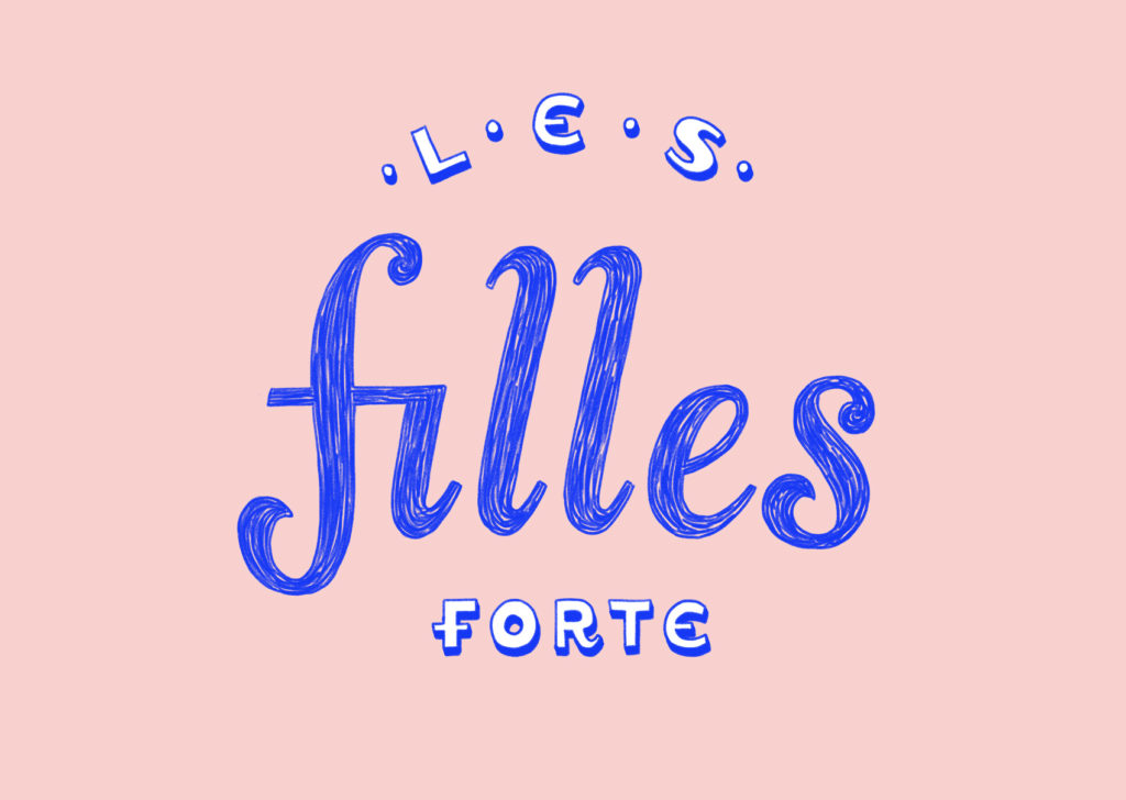
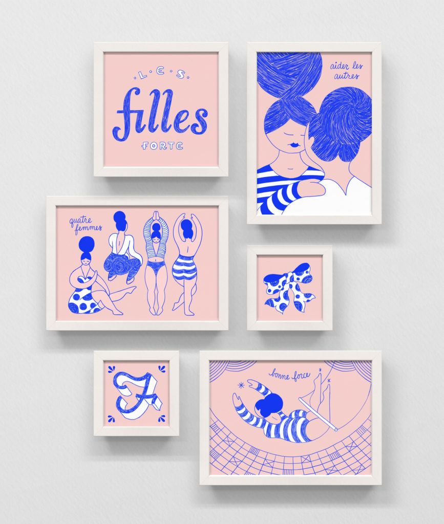
Les Filles Forte – The Strong Girls
Quatre Femmes – Four Women
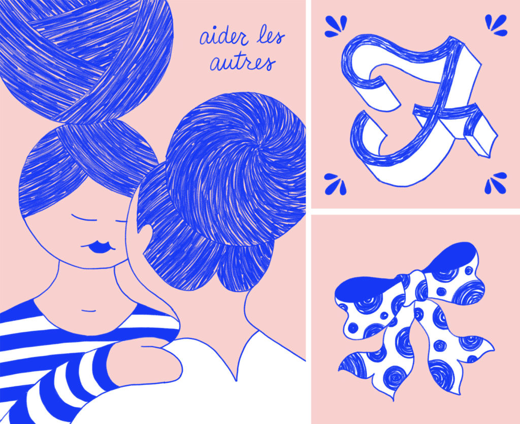
Aider les Autres – Help Others
Bonne Force – Good Strength

Pink and reflex blue artwork: Les Filles Fortes is French-inspired signage lettering, hand drawn on an iPad pro.
Pink and reflex blue artwork: four female figures stretching and dancing, wearing dots and stripes.
Pink and reflex blue artwork: two women supporting each other, with lots of sketched texture in their hair buns. F is for Femme (vintage drop cap) and a polka dot bow.
Pink and reflex blue artwork: a trapeze artist swings above the net, wearing a striped unitard. Bonne force.

Tofurky Lettering


After the first round of brand lettering done in 2016 went over well and was used extensively, Tofurky requested another batch of phrases to be illustrated to build out their brand assets even further. While a variety of lettering styles is represented, two main goals of this series was to have some consistent details throughout and have each phrase take up about the same proportion of space so they were easy to use in groups or in similar areas of packaging, POS, and other areas of branding.

Let's Yum This Thing - rallying cry in hand lettered typography for Tofurky.
Quartet of hand lettered phrases: taste bud high five, pickle's plus one, say yum, and up with flavor.
Yum For All hand lettering.
A Bun's Best Friend and Fork Friendly banner hand lettered phrases.
Small hand lettering bits and pieces: chomp chomp chomp, munch munch, takes yum to know yum, best friend of the tastebud, and friendliest food on the plate.

Born to Bake Book Cover


Over the years I have done many projects and non-projects with my intrepid foodie friend, Jen Stevenson. From her first guidebook and blog, to watching her become an award winning author for The Picnic and The Campout, we have eaten our way through a decade of friendship.

On the side, Jen churns out young adult literature and publishes them as e-books – the latest being Born to Bake, a story about a teen who enters a baking competition to earn money to go to culinary school in France. To add another book collaboration under our belts, I created the cover for it. Bake it ’til you make it!

Holiday Gift Wrap AKA Pattern Palooza!


It’s that time of year again! The time when Danes, half-Danes, quarter-Danes and honorary-Danes go deep into Danish Christmas traditions, as previously documented here, here, here and here.

This year is extra special because I had the opportunity to design some scandinavian-inspired promotional gift wrap paper in collaboration with Laura Luethje from West Coast Paper Solutions and Randy Murray from Brown Printing. So without further ado…

Four rolls of West Coast Paper and Brown Printing collaboration on holiday promotional gift wrap.

Red ribbon and silver snowflake flurry gift wrap paper patterns.

To create a series that was Christmasy without being too over the top, I opted for some patterns that kept it classy – abstract red ribbons and a snowflake flurry. On the back a tiered landscape of wintertime activity is revealed in tonal grays with pops of red, making it easy to mix and match between the three designs.

Tonal gray gnome village pattern with scenes from winter.

Red ribbon and silver snowflake flurry gift wrap paper patterns, along with gnome winter landscape in tonal grays.

Gift wrap patterns on presents: red ribbons, silver snowflakes and tonal gray gnome villages.

The WCP holiday wrap promo happens every year, and this year I was lucky enough to have Laura ask if I would create the designs. While West Coast Paper donated paper and I donated design, Brown Printing donated printing for a final product of two 2-sided promotional sheets produced on 70# Titan Dull Text.

As a bonus, I slipped a non-holiday side onto one of the sheets. Hand drawn with black ink and digitally colored, the feather pattern is an excerpt of a twelve feather series from a few years ago. Hopefully it gives the gift wrap a life past December.

Illustrated feather hand drawn gift wrap pattern or wallpaper.

Illustrated feather pattern gift wrap with watercolor specs.

Femme and Function Fundraiser at the Brigade


This fall I participated in a group art show organized by The Brigade, with the theme featuring portraits of women who are pioneers in technology. The show was titled Femme & Function and featured a wide range of mediums and contributions all made for silent auction bidding with proceeds going towards Girls, Inc – you can read more about it here on Medium.

I used the opportunity to create “off screen” with collage paper I had on hand, including an incredibly soft vintage piece of Swedish wallpaper I had received as gift wrap several years ago. This paper is so soft it’s almost a blanket, with gold and white screen printing worn down by time. My subject matter was Ada, Countess of Lovelace. I had read about her previously when doing some work for Code/Art (here and here) and had been taken by her interesting life. Trying out a new medium definitely gave me appreciation for true collage artists. My results are rudimentary, but the concept of a modern twist on the classic victorian portrait fits Ada and her before-her-time story well.

Collage portrait of Ada, Countess of Lovelace for the art show Femme & Function. Laser eyes shoot visionary ideas from a modern twist on the classic victorian portrait.

Unseen Visionary
Portrait of Ada Lovelace
size: 8×10″
cut paper / mixed media

As one of the pioneering women entrenched in developing computing technology and code, the accomplishments of Ada Lovelace (1815-1852) are often discounted, minimized, or attributed to her teacher and collaborator Charles Babbage, who concepted the first digital programmable computer. What most can agree on, however, was that Ada was the first to imagine the powers of computing applying to more than just numbers – she made the leap that numbers could represent anything, and therefore computers could be used to analyze innumerable sets and types of data, instead of solely numerical tasks.

Femme & Function art show at the Brigade.

Posca Marker Study: Happy Monster


Posca marker artwork of a happy monster wearing a yellow-feathered hat and talking to a venus fly trap.

I’ve been testing out working with Posca Markers, which are opaque liquid ink markers. Advertised as “mark vividly on any surface” I’ve found that the type of paper used really makes a difference in how they lay down (or tear up the paper), and that some colors seem more opaque than others. Testing out a new tool or material always takes some getting used to, especially if you have an idea of how it’s supposed to work versus how it actually works. So far the best success I’ve had with Posca Markers are for simple pieces.