Femme and Function Fundraiser at the Brigade


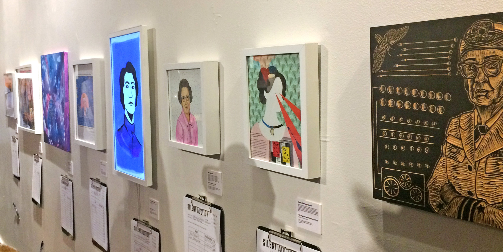
This fall I participated in a group art show organized by The Brigade, with the theme featuring portraits of women who are pioneers in technology. The show was titled Femme & Function and featured a wide range of mediums and contributions all made for silent auction bidding with proceeds going towards Girls, Inc – you can read more about it here on Medium.

I used the opportunity to create “off screen” with collage paper I had on hand, including an incredibly soft vintage piece of Swedish wallpaper I had received as gift wrap several years ago. This paper is so soft it’s almost a blanket, with gold and white screen printing worn down by time. My subject matter was Ada, Countess of Lovelace. I had read about her previously when doing some work for Code/Art (here and here) and had been taken by her interesting life. Trying out a new medium definitely gave me appreciation for true collage artists. My results are rudimentary, but the concept of a modern twist on the classic victorian portrait fits Ada and her before-her-time story well.
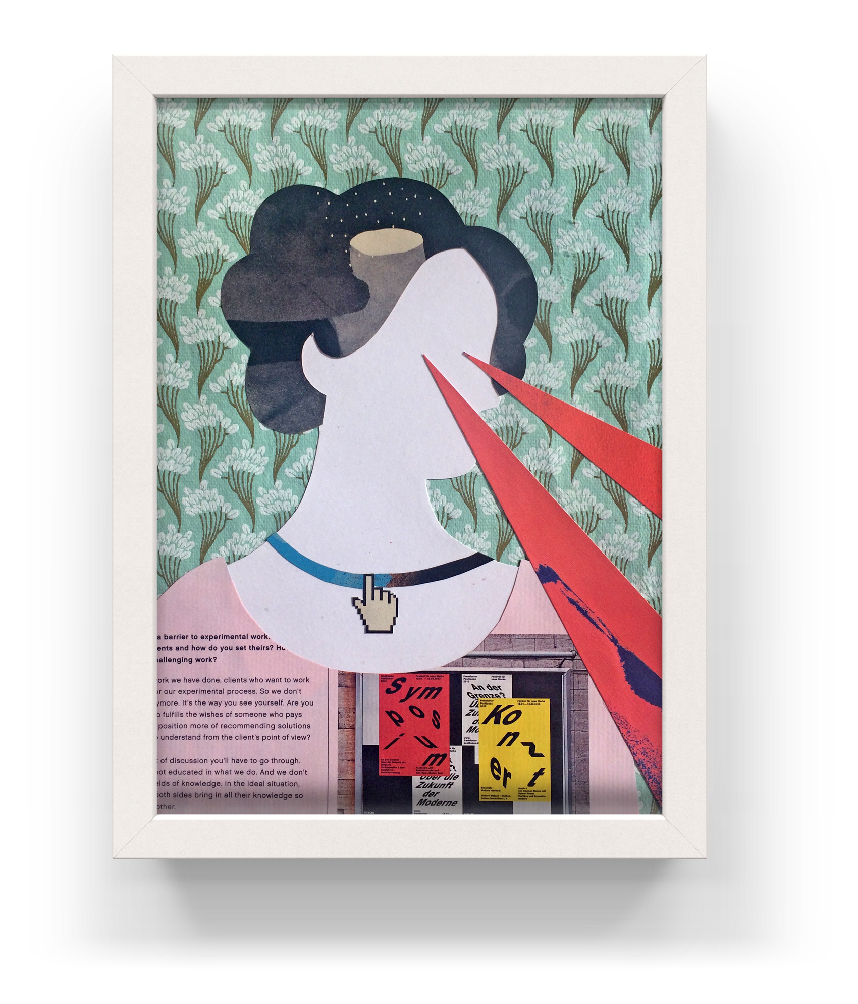
Collage portrait of Ada, Countess of Lovelace for the art show Femme & Function. Laser eyes shoot visionary ideas from a modern twist on the classic victorian portrait.

Unseen Visionary
Portrait of Ada Lovelace
size: 8×10″
cut paper / mixed media

As one of the pioneering women entrenched in developing computing technology and code, the accomplishments of Ada Lovelace (1815-1852) are often discounted, minimized, or attributed to her teacher and collaborator Charles Babbage, who concepted the first digital programmable computer. What most can agree on, however, was that Ada was the first to imagine the powers of computing applying to more than just numbers – she made the leap that numbers could represent anything, and therefore computers could be used to analyze innumerable sets and types of data, instead of solely numerical tasks.

Femme & Function art show at the Brigade.

Posca Marker Study: Happy Monster


Posca marker artwork of a happy monster wearing a yellow-feathered hat and talking to a venus fly trap.

I’ve been testing out working with Posca Markers, which are opaque liquid ink markers. Advertised as “mark vividly on any surface” I’ve found that the type of paper used really makes a difference in how they lay down (or tear up the paper), and that some colors seem more opaque than others. Testing out a new tool or material always takes some getting used to, especially if you have an idea of how it’s supposed to work versus how it actually works. So far the best success I’ve had with Posca Markers are for simple pieces.

Rainbow World Series


Series of four illustrations done in four rainbow-tastic colors. A girl and her mule, a bifurcated heart, rainbows everywhere, and a rainbow world interpretation of the Cinderella dress scene.

Looks like I’ve reached the stage in my side project career where much of my work will be inspired by: 1) my 4-year-old daughter’s drawings, 2) my daughter’s imagination, or 3) my daughter and her future. As an ever-changing subject matter, we’ll see how this appropriation of content develops over time.

Update: I showed my drawings to my daughter and told her she inspired me (ensue a long discussion about what the word inspire means), after which she demanded to copy my artwork. Below is the original that inspired me, and the redux inspired BY me. I foresee a long and fortuitous/contentious working relationship…

Return of the Love Bird


Another month, another Launch art show! Last month I showed an excerpt of ever-changing feathers. This month I am contributing a new format of my Love Bird enamel pin – namely giving it a frame and a bit more blue sky. In addition to a framed pin, there will be a gaggle of pins for sale at the very affordable art price of $10. Come to the show (info below), or read more about the original inspiration for my little love bird.

Portland’s First Thursday @ Conversa
Theme: Proud as I am
June 7, 2018 from 6-9pm
734 NW 14th Ave, Portland OR

Thanks again to Aldo, Susan and Julio for organizing!

Enamel bird pin blowing a heart kiss with rainbow pride wings.

Proud as I am launch art show at Conversa

Chocolate Wafer Concept Packaging


One of my favorite types of design projects is packaging – specifically food packaging. It is also one of the more fickle types of projects. Sometimes products miss their window of opportunity, sometimes start-ups aren’t able to get an investor to put the product on shelves, sometimes budgets fall through or a product line is re-oriented. Specialty products are sometimes explored up until launch, at which point they are deemed unviable. Once an entire project was derailed due to a macadamia nut shortage. You just can’t plan ahead for these kinds of things!

Because of this, I have worked on almost as many packaging projects that have been shelved than have actually reached shelves. Gelateria Naia is my one exceptional client that has taken every product I’ve worked on to market (see a few projects here and here, with more in the works!). Even the packaging projects that make it to market often take a YEAR OR TWO between packaging design and hitting shelves. This is like 1,948,465 years in “designer years” – it’s definitely not an exercise in instant gratification.

Last year I worked on chocolate wafer packaging for a company that packages US and European products for the Chinese market. Because of quality perception and some food scares, the design brief presented an interesting mix of designing in a way the Chinese market was used to (bold, zingy, pop!) while making the product look and feel European-based. Unfortunately the project was put on hold, but I wanted to share a direction from the initial design round (with a placeholder product name). A more traditional approach was selected as the final, where I got to practice drawing the Swiss Alps and milk splashes, but is not shown here because it hasn’t been released. So while not everything makes it to market, it doesn’t mean it isn’t sweet!

Concept packaging for chocolate wafers in four flavor ways: chocolate, vanilla, milk chocolate, and hazelnut. Illustration in a modern style but with traditional European motifs.

Metamorphosis Show – Feather Series


Series of 4 illustrated feathers in micron pen - patterned and textured with stipple borders, on the theme metamorphosis.

For the month of May an excerpt of my feather series will be a part of a group show at Conversa. The original series of twelve feathers was created over the course of a year, capturing the feelings of each month in regards to life changes and relationships I was experiencing at the time.

The opening night details are below, and thanks to Aldo, Susan and Julio for organizing!

First Thursday
Metamorphosis: The Art of Change
May 3rd, 2018 from 6-9pm
at Conversa: 734 NW 14th Ave, Portland

The Webfooter Antique Paper & Postcard Show


Each year, the Webfooters Postcard Club has their annual show and sale. It’s a bonanza of analog print ephemera, and an analog mindset (bring cash because that’s how you pay in 1955). Plus they have the tagline “Every subject known to man can be found on a postcard” so you can’t really go wrong by covering all of your bases. I have gone several times under the organization of my intrepid design friend Melissa, and this year was no exception in finding some vintage eye candy to share.

vintage sunset magazine illustrated covers from 1933, fun book covers, and a tax certificate for being a retail dealer in opium.

Concept Illustrations


Most projects I work on have piles and piles of unused work that don’t make it past the concept phase. This gets archived and usually never looked at again, unless I have a future project where I can use it as reference. Some of this backlog of work reminds me of all the times I tried something new or different, only to have the client choose a style that was safe or most matched my portfolio. Sometimes I’ll take rejects and rework them for my own personal edification. Mostly they languish…unless I post them on my blog!

Here are two images created for a campaign targeting both parents and teens on the same subject matter, with the headline “You got this”. This direction didn’t make the cut during an A/B social media test, in which some of the feedback was so cutting you’d wonder if people would say this to you in person. Some of the best outtakes went something like this “I hate this so much I want to look away”, “This is ugly. It looks like a child made it”, and “Pointless. Stupid”. The chosen direction (not shown) had similarly scathing comments (of course in conjunction with perfectly neutral and positive comments). Can’t please everybody!

Illustration of a teenage girl tossing a basketball into a hoop. // Illustration of a mom tossing clothes into a laundry basket