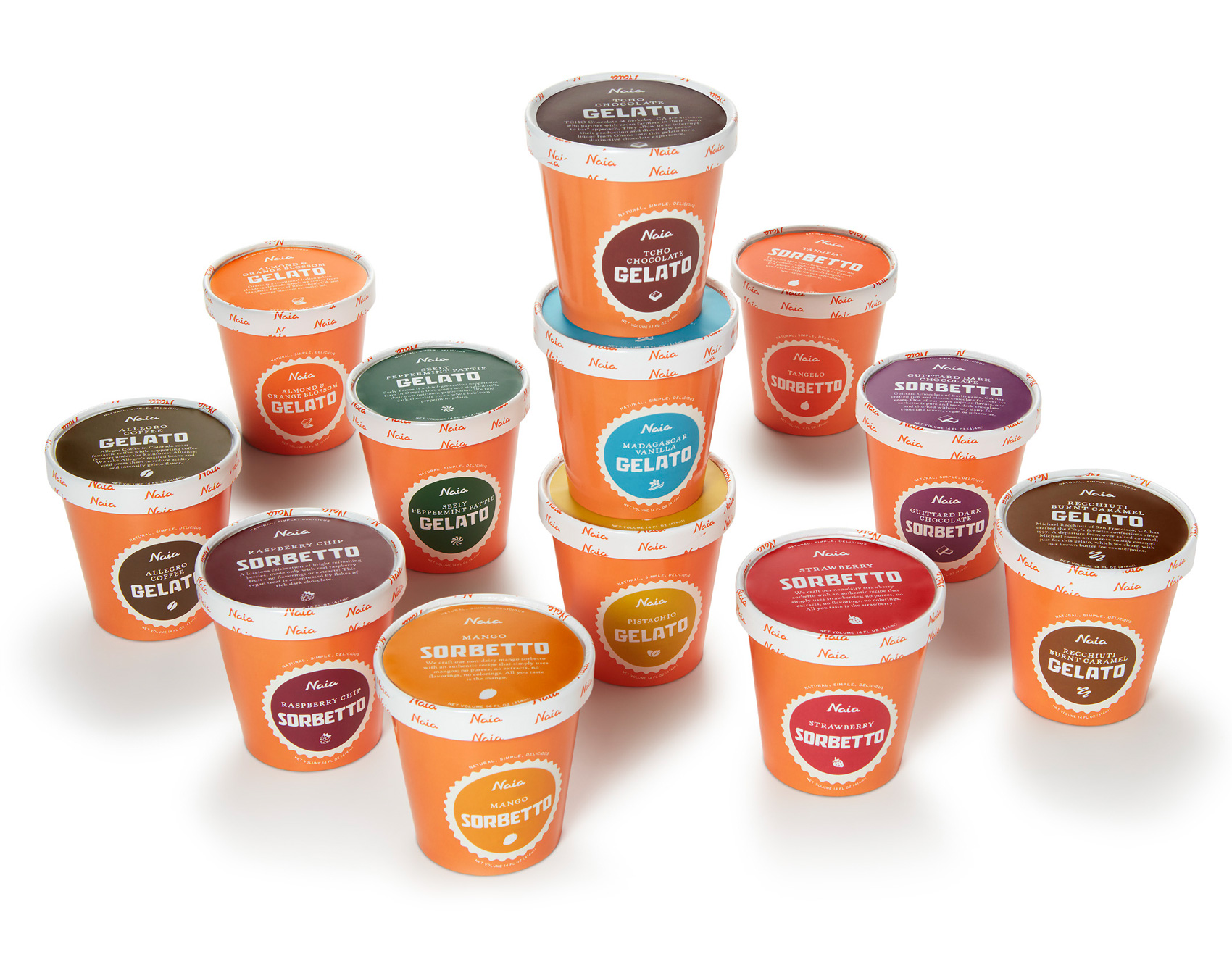
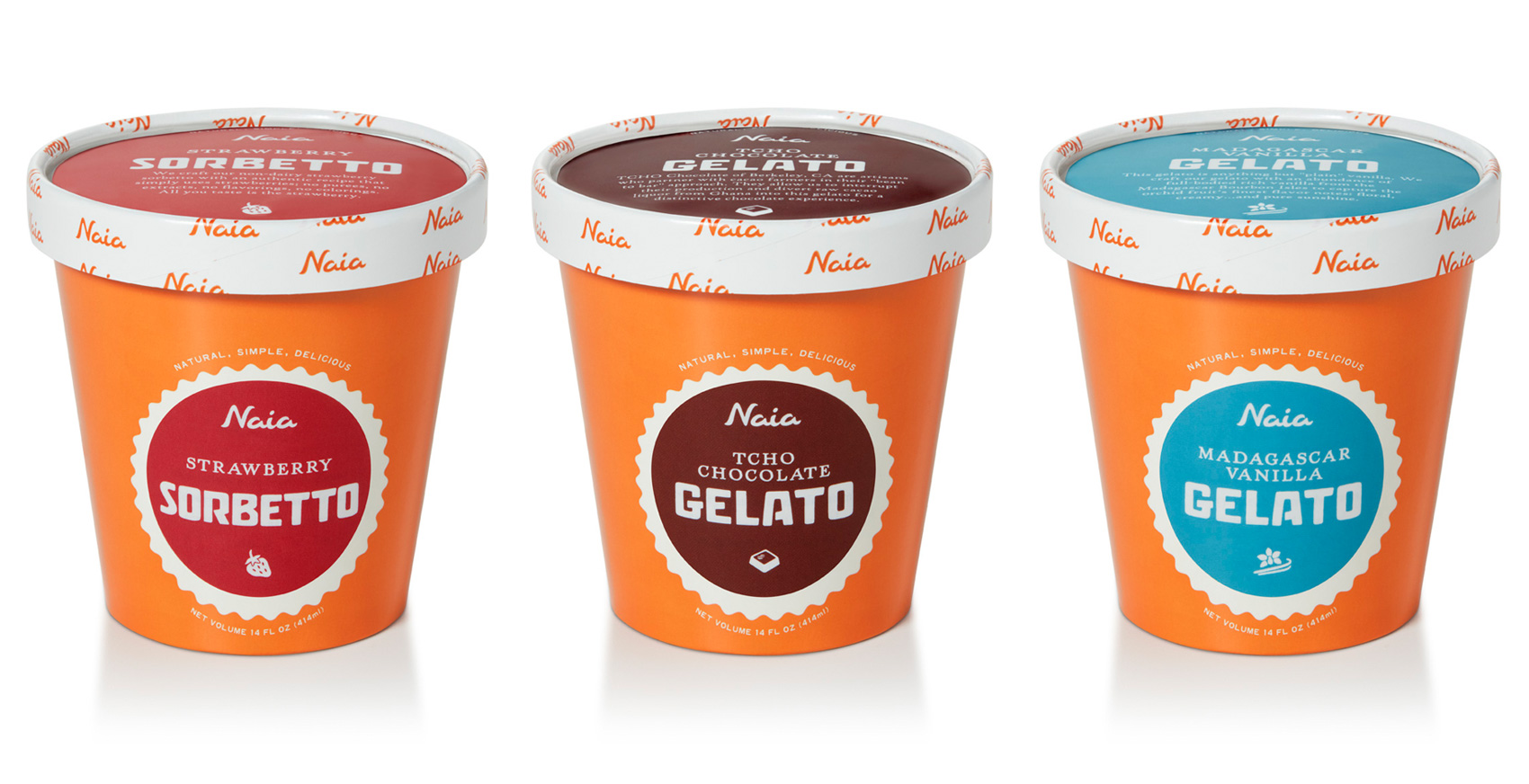
Long term client and collaborator, Gelateria Naia, has extended their gelato and sorbetto into a new format – the 14oz small tub. On this project, their signature orange was used as a background for the color-coding used on each flavor. Presented mostly in a top down freezer in grab-and-go areas, having a strong color presence on the lid was integral.
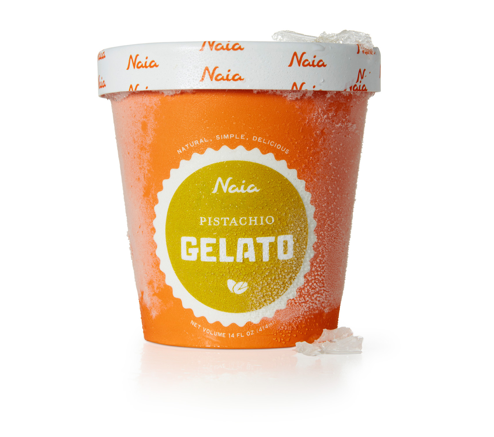
A major update / minor evolution to this brand was shifting their name on the packaging from Bar Gelato by Naia (also their namesake and inaugural product) to just Naia. Originally Bar Gelato made sense because it was their only product. However with the addition of sorbetto to the line-up, food regulations and approval got trickier with how the brand name only accurately described part of their product line. With this most recent packaging, Naia takes the lead as the brand name, and sorbetto and gelato can be used as the product identifier. Hierarchy on packages is critical for both the consumer, stocker, and fulfilling legal requirements. Pistachio is shown here because it’s my favorite flavor.
From a production standpoint, the cup was designed to be a standard issue brand orange with universal information, with a white scalloped template area into which a circular sticker could be placed to differentiate flavor. This type of design works well for product lines where it is hard to predict exact quantities of specific flavors, where flexibility in quantity/distribution of flavors is key, and when very small runs of speciality flavors are common. Naia often produces seasonal or specialty flavors, always experimenting with local producers to find nuanced and specific flavors. The rim of the cup was also a universally produced element, while the top of the lid was custom to each flavor.
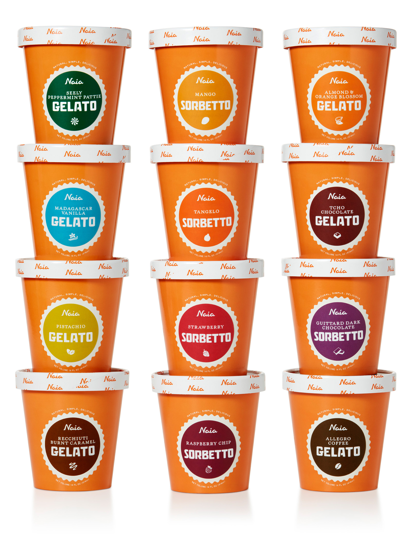
A series of icons associated with each flavor has been used across many of Naia’s products, so they were employed again to provide a subtle indicator of the simple and pure ingredients. The custom lettered blocky font previously used in the logotype is now the headliner, providing some visual crossover recognition, as consumers were used to seeing BAR GELATO large and in charge on the previous packaging. And now, for a National Geographic-esque photo of a herd of gelato/sorbetto migrating across the icy plains of your nearest Whole Foods freezer case.