I’ve enjoyed working on so many projects for Umpqua Bank over the years, from building murals to 30-page mini magazines to postcards to desk calendars to identity systems. The most recent project was more experimental and without a true end deliverable – testing out different illustration styles to see what might be useful to a brand. In the spirit of sharing process and behind the scenes, here it is…
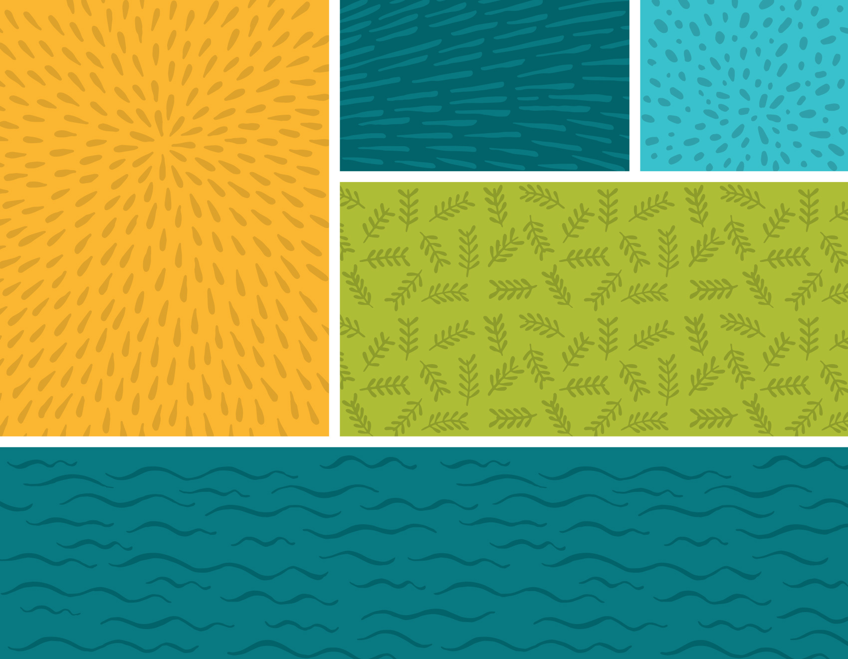
The work below represents a single round of illustration tests for icons and patterns. Personal banking & business banking was depicted as well as credit cards, home loans, and checking. Most of the patterns are generic and nature based to show style. The goal of the exercise was to test the limits of what styles might be appropriate for stretching their visual library. I drew towards ‘more fun’, ‘more ephemeral & cosmic’, and ‘more sophistication’.
Unless there is a clear style set from a brief, often my intent with the first round of of illustration trials is to provide a wide range so that comparisons are clear and to get a variety of feedback. Learning the pros and cons of three very different styles is much more educational than comparing three similar styles. After all, it’s not until the very end that you have to yell NAILED IT! Everything up until then is learning as much as possible so you can get it right in the end.
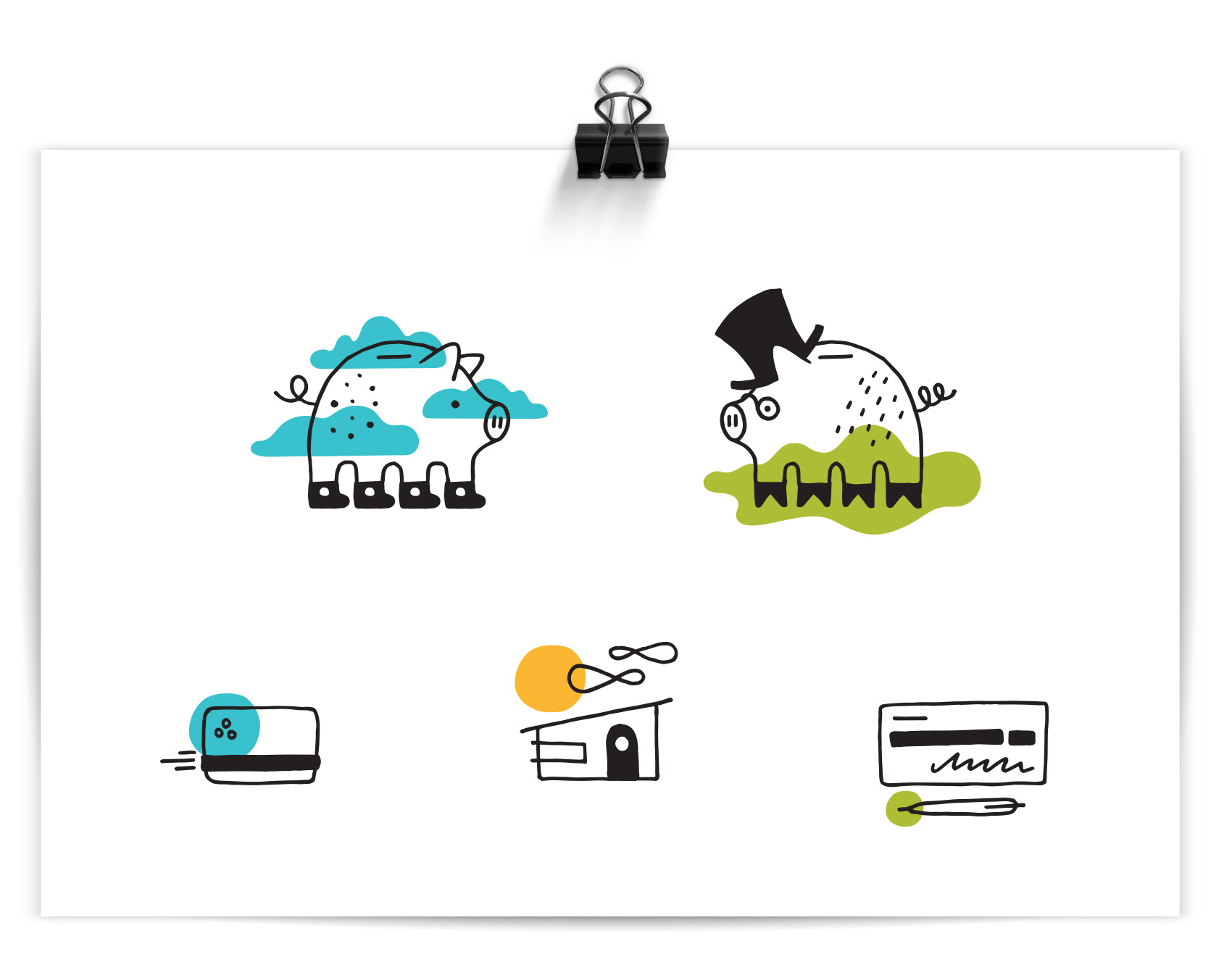
MORE FUN
Out of all the banks I know, Umpqua is the friendliest and most playful in their branding. What if I only focused on that, and tried to forget it was a bank after all? The result was a piggy in converse and a piggy in a topcoat and spectacles, because duh. Color accents are used reinforce the icon message or provide flair. This direction was presented as “FUNBANK”: Approachable with a wink, using simple linework with pops color, and themes covering everyday life and twists on “banking as usual”.

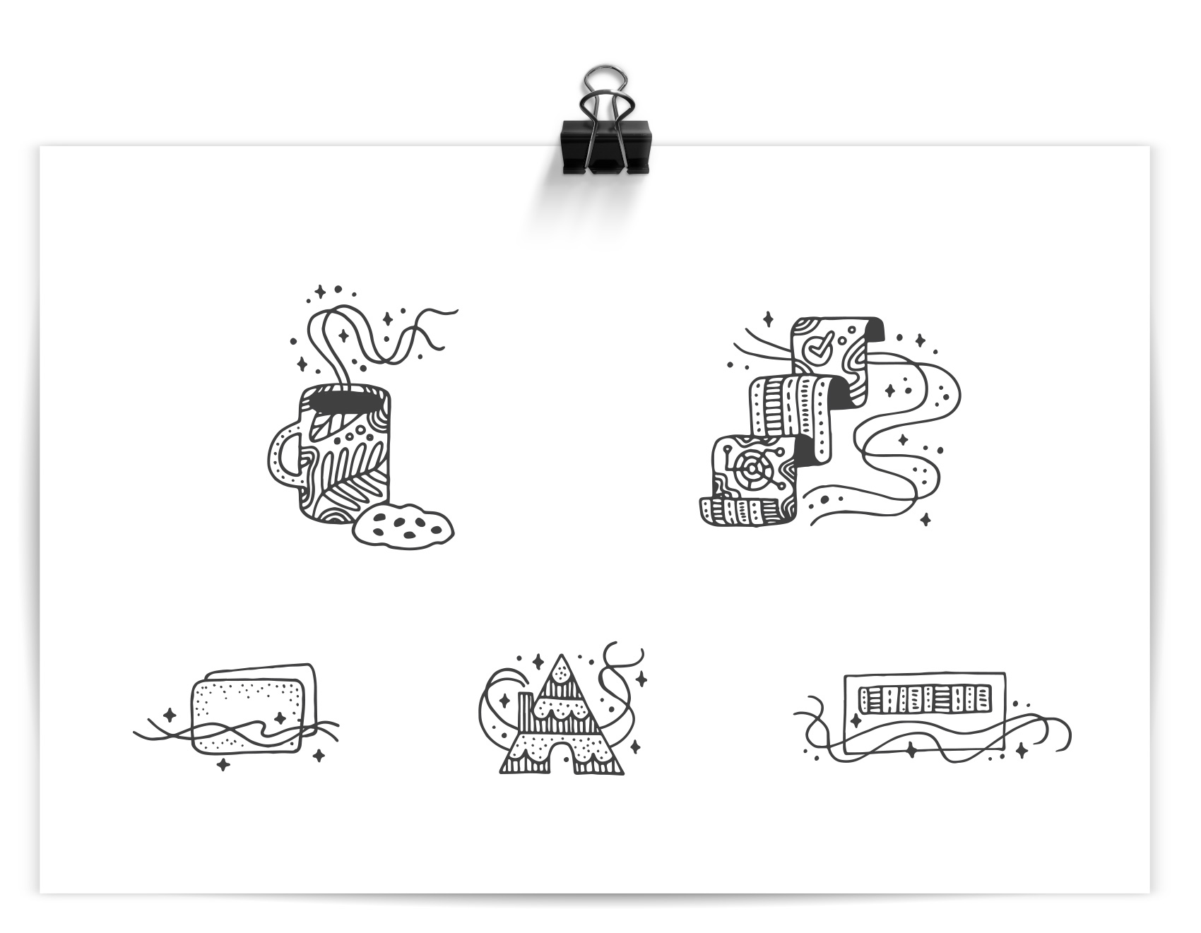
MORE EPHEMERAL & COSMIC
Straying furthest from their current brand, this direction took inspiration from some specialty projects I have worked on for Umpqua Bank that were less mainstream. Intricate patterning with almost a tattoo-like quality were not the top pick, but an interesting study. The sparkly “magic factor” used throughout the series was meant to communicate Umpqua’s ‘special factor’. IF ONLY personal banking consisted of drinking coffee and eating cookies. This direction was presented as “IT’S MAGIC”: Playful and intricate with unexpected, detailed linework, this direction explores themes of service, delight, and magic in the mundane.
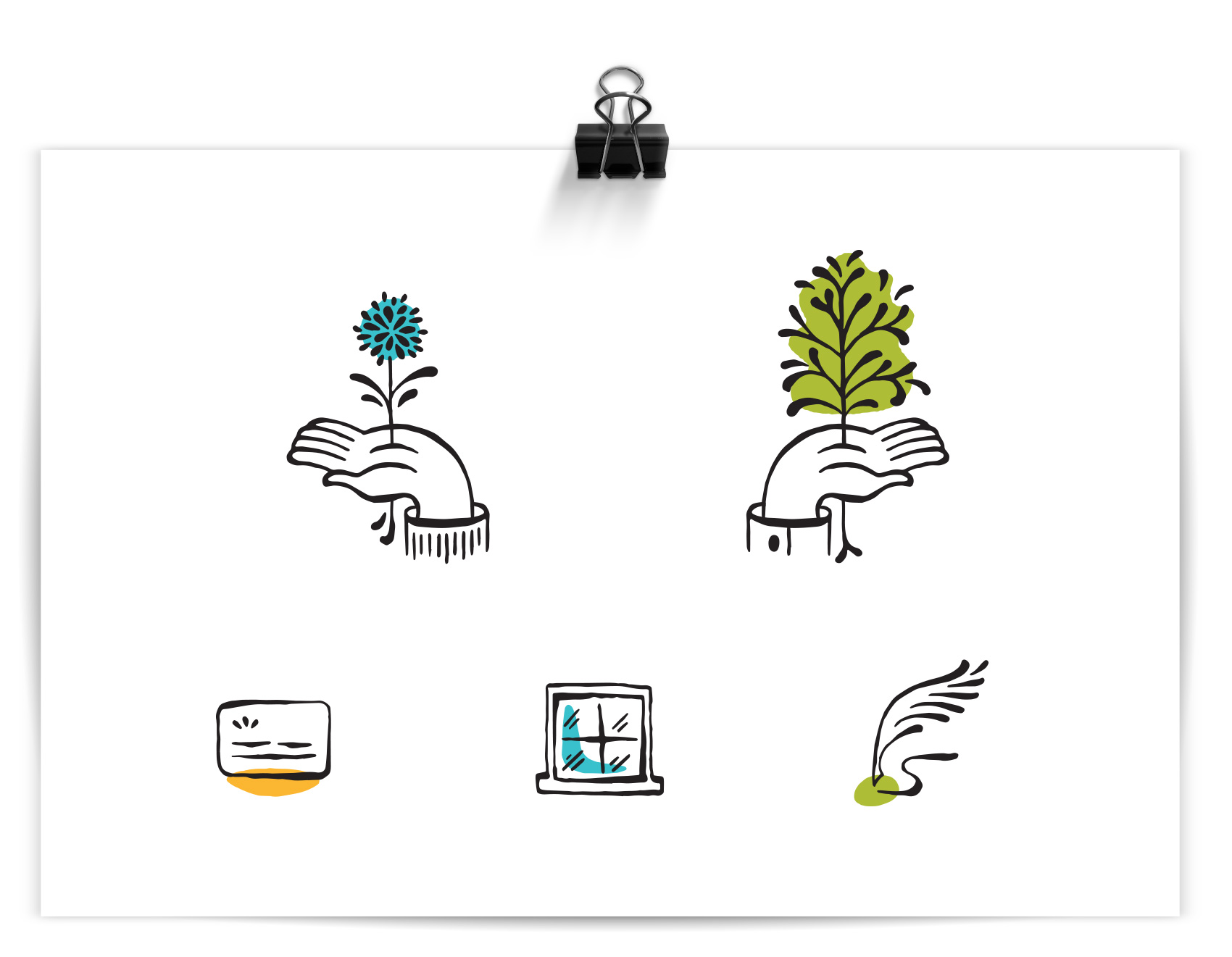
MORE SOPHISTICATION
This style was a favorite and used as a starting point for further exploration (future post coming soon!). A controlled brush line provided a humanistic quality and felt more editorial and high-end than their current icon library. This direction was presented as “THE HUMAN TOUCH”: Refined and organic, using gestural linework with themes of growth and movement. (side note: this direction also gave me hand cramps)
That’s all folks – a work-in-progress showing the process of testing illustration styles for an un-banky banking place.