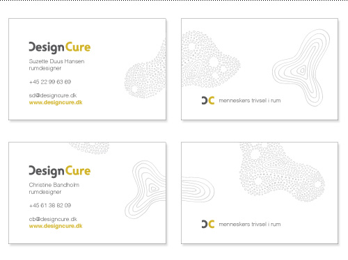
Recently I worked on a fun redesign project for two interior space designers who wanted their logo and website revamped. While logo redesigns aren’t always about doing something new and crazy, it’s a good design challenge to keep enough of the existing logo around for client recognition while updating it to something new and better.
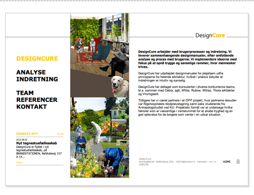
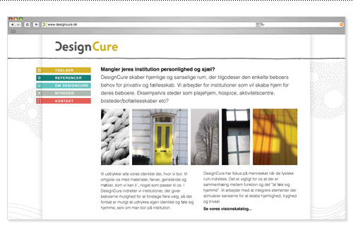
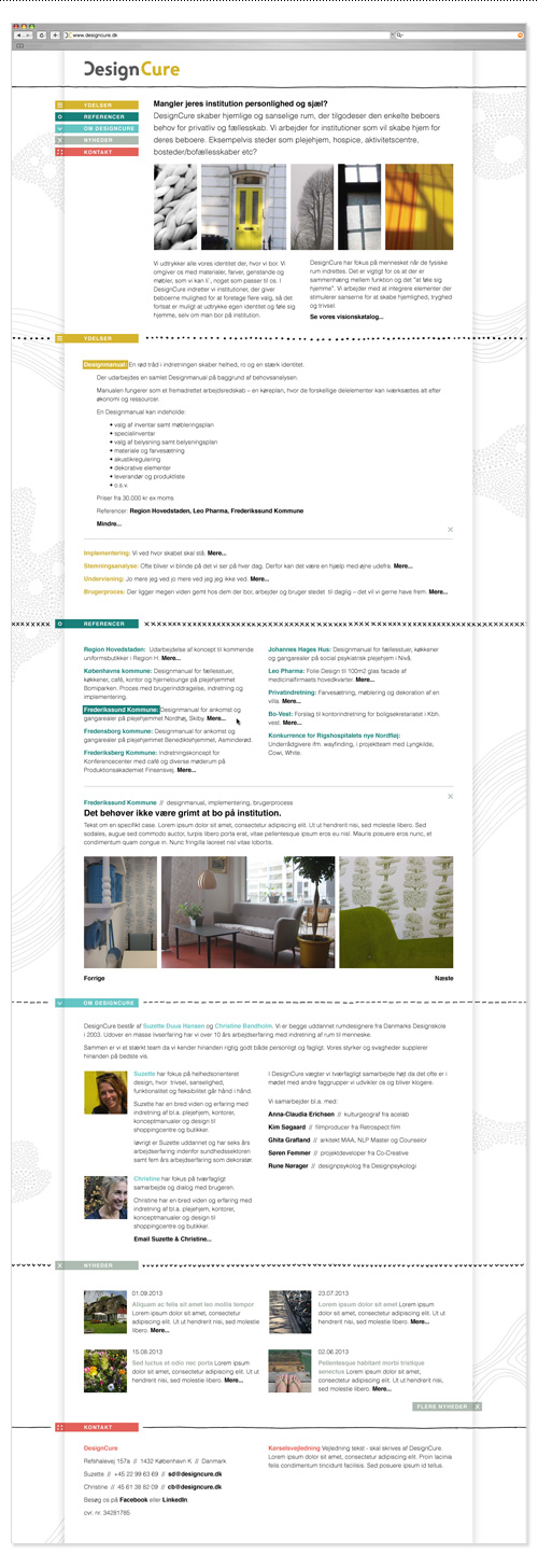
One of the design goals for their new website was to combine Danish simplicity with an organic, textural and hand-drawn feel. To accomplish this the structure of the site was kept simple with utilitarian fonts and text formatting, which allowed the few color pops and hand-drawn elements stand out but not overwhelm the simplicity.
The patterned shapes were also used on the business cards to support the tagline and DesignCure’s thinking that space is organic and evolving, not structured and rigid, and even institutional spaces can be designed to feel at home in.
The amount of content on the site was minimal, so we opted for an all-on-one page design to make it easy to get to everything. The site was built in WordPress to allow for easy client updates. You can see an expanded view of the site design below, or visit the DesignCure website here. Big thanks to Refresh Media and Jip Jip for working together across continents to make the technical part of this site happen.
NICE combination of grid and organic design Mette. Very clean/friendly looking design!