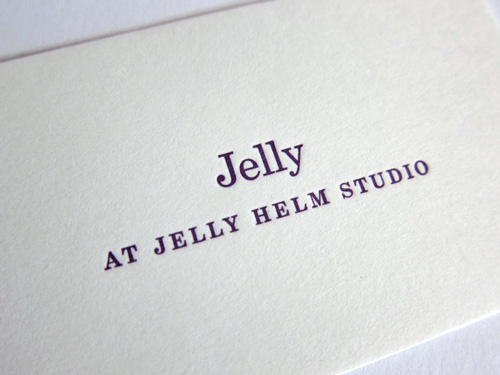
One of the projects I’ve worked on recently for Jelly Helm Studio was to design the studio’s business cards. Several ideas were sketched out (monograms, pop-up castles, and a series of tableaus, among others), but early in the brainstorming process we decided that simple was better. To support this direction, internet research turned up calling cards from way back when.
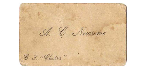
Most business cards from days of yore included only the person’s name. Additional notations on the card (in the lower corners) were left for specific reasons and were part of the intricate etiquette system surrounding the calling card, which are detailed in The Gentleman’s Guide to the Calling Card. We took the calling card structure and updated for the 21st century. Done and done.
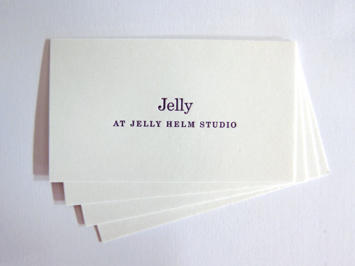
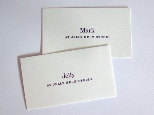
The smaller-than-usual cards were letterpress printed by Kyle van Horn of Baltimore Print Studios with a nice deep plum ink on French Muscletone Whip Cream. During the project, Kyle sent us this slip taped to a furniture cabinet at the Baltimore Print Studios.
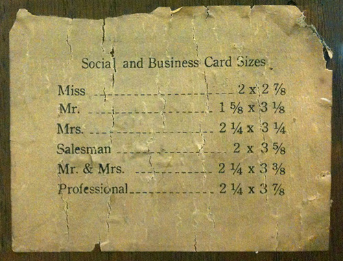
According to this, Jelly Helm’s business card size (1.75″ x 3″) is somewhere between a Miss and a Mister. According to me, it’s just the right size to carry the information on it.
Superfantastic idea