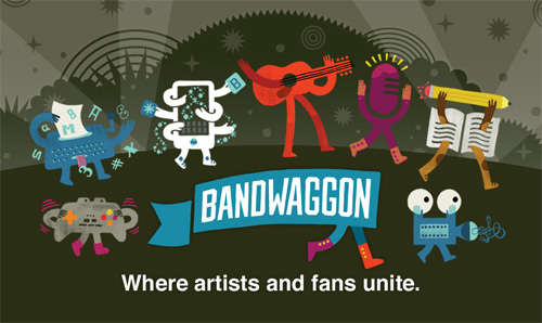
For the past 6 months I have been working on a very exciting project for a group of entrepreneurs who want to change the art and music economy. Frequently, only a few artists “make it” only to have a large part of their profits go to a label or agent. How to make a system that is more balanced? Enter the team at Bandwaggon.
Bandwaggon aims to make the process more fair by connecting fans directly with artists and letting fans helps artists succeed by sharing and promoting their work. In exchange, fans get a share of the profits – but only to a certain point; the artists always takes home the bulk of the profits. A direct artist-to-fan relationship, where they work together without the top 1% fleecing the socks off of everyone…sounds nice.
Logo
The essence of the Bandwaggon logo was found fairly early in a flag icon that leads everyone towards this new entertainment economy. Many rounds followed exploring the flag shape, how it was carried, and who was the bearer and a balance between being professional and non-slick. Ultimately the flag was brought in-line with the characters (below) as a banner with legs – no extra figure was needed to communicate that you should come along.
Characters + Icons
A series of characters were developed in the initial stages of the website to add personality and show that artists from all walks were included under the Bandwaggon flag. These characters were finalized far before the logo, which helped inspire the final logo.
A guitar rocking with its tongue out, an over communicative film strip, a clown using itself for entertainment, a book combating writer’s block, and a typewriter tripping on letters are just a few of the colorful cast of Bandwaggon. These characters are used throughout the site and other materials to emphasize that the magic comes from the artists and their wonderfully varying personalities.
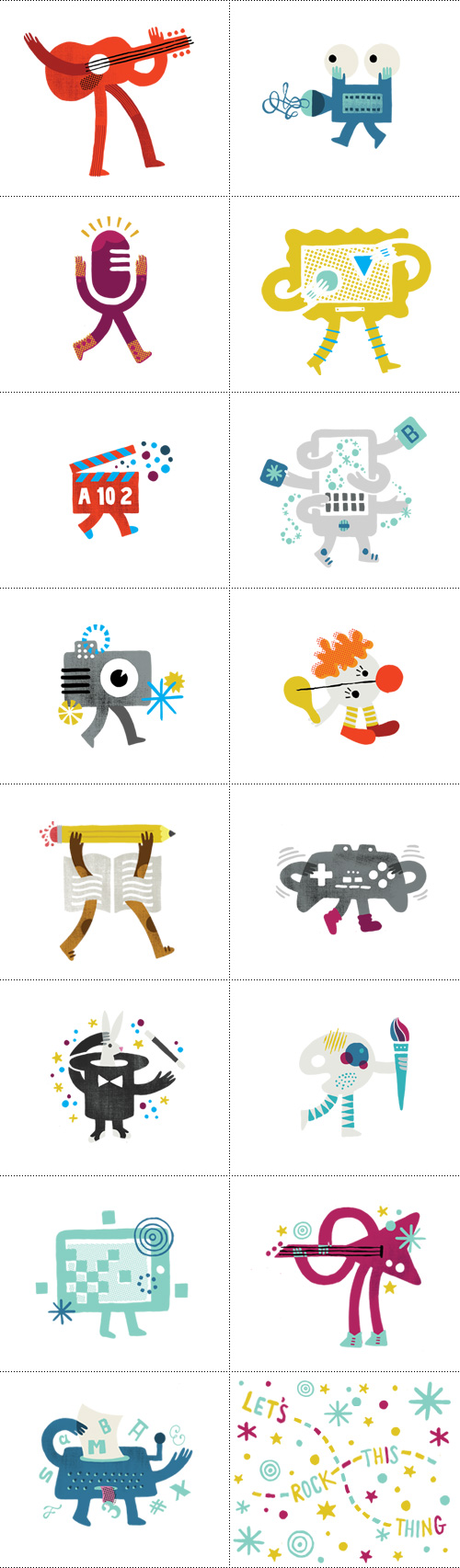
Additional icons were created to accompany text explaining in detail the process of how Bandwaggon works, as well as to draw attention to specific areas users should take action (megaphone).
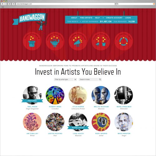
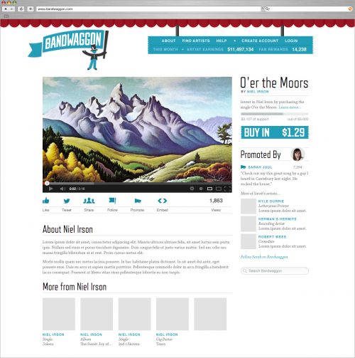
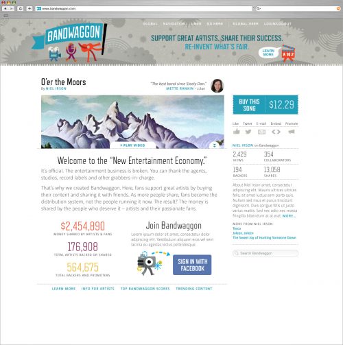
Website
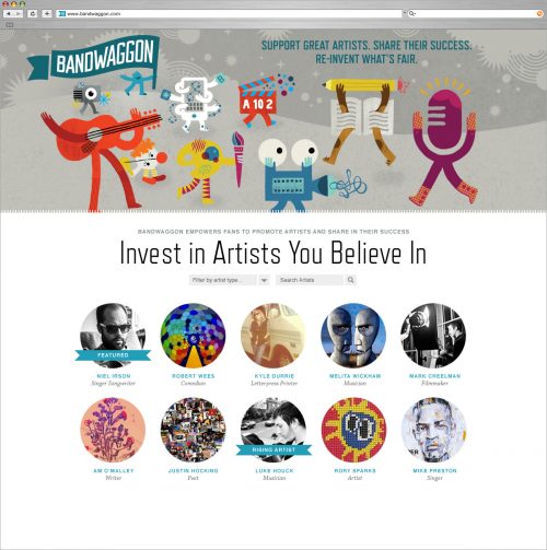
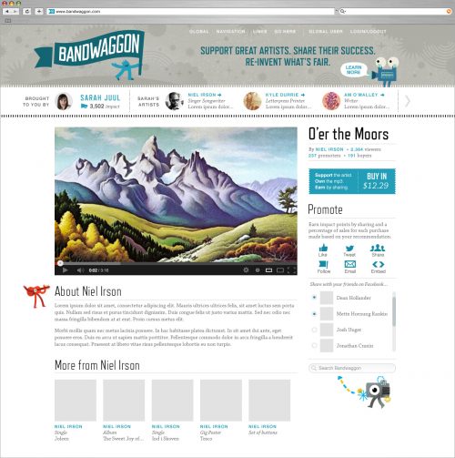
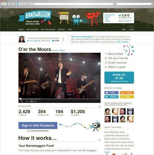
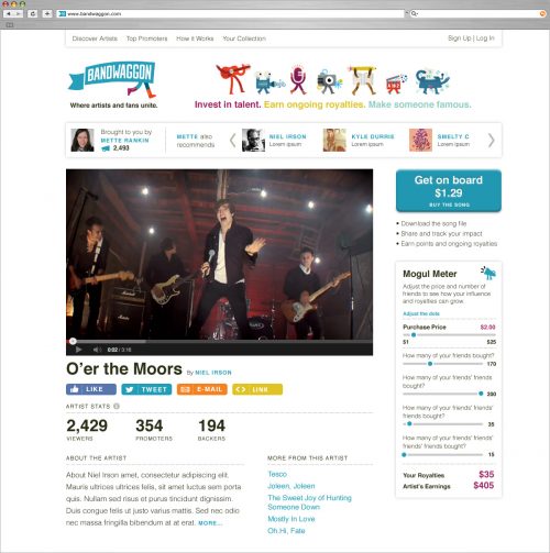
The website for Bandwaggon was a very fluid process compared to the “step 1-2-3 and it’s done” process. Since the development team was building in steps and the messaging was constantly evolving, the design also had to morph in response to new priorities and technology requests. Below is a range of excerpts from the site designs that were created along the way.
Please note all site images are mock-ups with fake content. Website is in beta testing so still in progress.
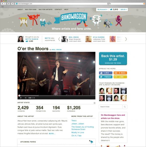
Bandwaggon is in beta-testing, so visit their and login if you’d like to help out in the early stages of their site.
Gorgeous work Mette!