Scoop Love Branding


Just in time for the end of summer, here comes another ice cream project (I hear the first project, Gelato by Naia, is available at Zupan’s on Belmont – after tasting 6 flavors I can guarantee they are delicious)!

This gig was for a small home-grown ice cream vendor from Charleston, South Carolina, who works under the name Scoop Love. More grassroots than most, the ice cream is only available at the local farmer’s market with scoops being served from a small ice cream cart.

Logo, palette and main icon.

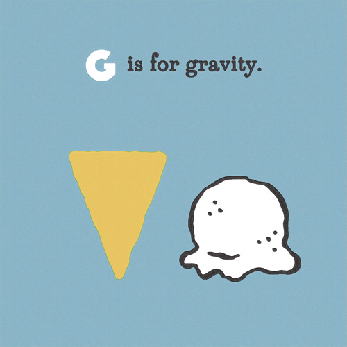
Inspired by the 50s ice cream culture and parlor style, the branding is as simple as possible in a throwback analog way. Most items are 2 colors and the use of elements is repetitive and straight forward. The entire system relies on only an iconic waffle cone pattern, a circle, and a heart here and there.
Continue reading “Scoop Love Branding”

More Icebreakers Book Illustrations


Here are more illustrations for the Icebreakers book I’ve posted about previously here and here. The illustration style was a new one for me, catering to the client’s need for a large quantity of illustrations that were unique for a small budget. Drawing people can be time consuming, but in this case we substituted the painstaking details such as faces, hands and feet for colors and patterns on bendy-bodies that were easy to contort into many shapes without needing to be realistic.

The Sheriff sharpshooter game requires a quick reaction time and shouting bang to avoid being eliminated from the game.

I enjoyed the challenge of this and the project limitations giving way to something I normally wouldn’t try at first glance. The result was a very easy and functional way of drawing characters in an endless variety of personalities.

One Body requires you to mimic the leader.

Another part of this project was creating vocal symbols that, for the most part, weren’t based in a specific language, since Postyr Project travels all over the world with their a cappella group. The spirals, crosses, dots and hash marks serve their pictographic purpose well, and remind me of the difficulty of pronouncing something your tongue is not used to twisting. For example when anybody Danish tries out the word squirrel – it might as well be a squiggly line in a speech bubble. Don’t worry Danes, we can’t say “rød grød med fløde” so I think we’re even.

The radar game, where participants make unique noises and try to find each other with eyes closed.

The first edition of the book is just about sold out, but you can see the authors’ website here for future editions: www.breaktheice.dk.

Love, Hanna


The last few years I have lettered phrases for Hanna Andersson’s catalogue (see it here and here). So when the Portland-based childrenswear company with Swedish roots decided to expand with a new line of clothing for mothers called “love, hanna”, they asked me to letter the logo in a similar style.

Logo for Hanna Andersson's new women's line "love, hanna".
Logo for Hanna Andersson’s new women’s line “love, hanna”.

The usually jumpy and quirky lettering style was toned down a bit for the logo for consistency and legibility, and a Scandinavian woven heart icon was added under the art direction of Lynda Hodge, who also steered the branding of the line.

Love, Hanna logo used on the hangtag of the women's  clothing line.
Love, Hanna logo used on the hangtag of the women’s clothing line.
The icon used in a bronze pin to attach hangtags to items.
Hangtag and pin combo in action.

The line follows suite to their kid’s line motto of “let kids be kids” with classic basics that wear well – definitely not “mom jeans” while still being comfy and versatile.

love-hanna-website2
The new logo in action on the Hanna Andersson website.

Hanna Andersson is known for their super soft and quality kidswear, so it’s no surprise that the blogosphere is picking up on the new line of easy but still stylish clothes for mom.

Some love, hanna styles.

The Flavor Profiles Blog: Logo + Illustration


One of my favorite subjects to work with is food. I also love helping people start up their own thing, whether it’s publishing their own book, building a website service, or bringing a new product to market. So when writer Mona Johnson contacted me to create a logo and illustrations for her burgeoning food blog focused on the Pacific Northwest, it was a perfect match.

She wanted a spare and refined look paired with detailed line illustrations to punctuate her stories and beautifully understated and vibrant photography. After the first few posts, I think the combination is a success – check out her site here: www.theflavorprofiles.com.

The logo typography was hand-drawn, a trait Mona and I thought should be consistent throughout inked elements, but derived from didone fonts for cleanness and a sense of professionalism.

The Flavor Profiles logo.

The illustrations were created at a detail level so they could be used either large and in charge, or as small icons sprinkled throughout the site.

The Flavor Profiles illustrations in miniature size.

A close up of the first five large illustrations made for The Flavor Profiles: knife, pitchfork, cast iron pan, chanterelle mushroom, and dungeness crab.

The Flavor Profiles illustrations.