Gelato Tub Packaging


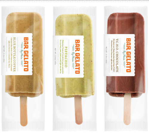
Several years ago I created a logo and packaging for Bar Gelato through Substance. The product did well in stores, which spurred the birth of gelato in a tub. Naia Gelateria requested creative direction for a packaging line that related to the original bars and stood out on the shelves as straightforward and modern.

Chocolate gelato made with TCHO Chocolate.

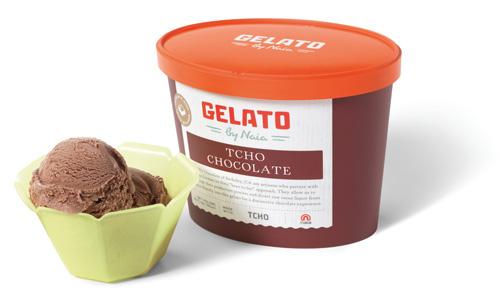
It was an interesting project with the task of blending the brand recognition of Bar Gelato with the original store brand of Naia Gelateria. To capitalize on shopper recognition for a product that was positioned in two different areas in the grocery store, we repurposed the hand drawn Bar Gelato logotype to read just “Gelato” by Naia.

A universal lid reinforced the original Naia brand.

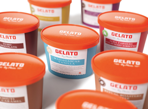
The results were a packaging series with a strong color presence on shelf and a small ingredient icon to differentiate flavors. Using a universal orange lid reinforced Naia’s hand while the scalloped butcher paper and fonts referenced Bar Gelato.

Strong color differentiation helped distinguish flavors on the shelf.

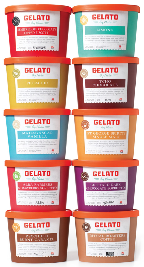
Currently the tubs are available at specialty markets in Northern California, or you can check out Naia’s selection of Bar Gelato. Similarly to Bar Gelato’s release, interest in carrying the tubs has been positive so expect availability to increase exponentially!

bar-gelato-trio
The original and inaugural packaging for Naia’s first in-store product, Bar Gelato.

Mark Creelman, PhD


Remember when I made up fake research titles with my friend Jonathan, hoping to sound smarter than I actually was? Well I also have friends who make real research titles that resemble tongue twisters to us regular folk…titles such as “Femtosecond Time-Resolved Optical and Raman Spectroscopy of Photoinduced Spin Crossover: Temporal Resolution of Low-to-High Spin Optical Switching”. Introducing my buddy Mark Creelman.

Mark Creelman in his natural habitat...surrounded by laser equipment.
Mark Creelman in his natural habitat…surrounded by laser equipment.

Mark recently requested a business card now that he was officially done with school and on the job hunt (after undergrad at Lewis & Clark and a mere 8 years at Berkeley). Not only is he an expert in Raman spectroscopy and complex laser systems, he is also an Eagle Scout. To make him the hippest science dude on the spectroscopic job market, I created four badges for him to choose from and paired it with a respectable but techy (and coincidentally Danish-designed) font called Kontrapunkt, with a solid hit of pop-culture reference.

Now you know who to contact for all of your needs concerning “Structural Dynamics of a Noncovalent Charge Transfer Complex from Femtosecond Stimulated Raman Spectroscopy”. Or you need a voice actor who can pronounce femtosecond fives times fast like a pro.

Note: For the scientist’s privacy all contact information above is generic. Let me know if you want to get in touch with Mr., I mean, Dr. Creelman.

Icebreakers Book Update


Earlier this spring I wrote about a book project called Icebreakers. I worked on the illustrations, cover design, and page templates for members of Postyr Project, who put together icebreaker activities using music, rhythm and sound as the building blocks for interaction. After getting funding to finish up the content and production of the book, it’s for sale now!

And here are some more illustrations from the project to give you a feel for it.

Instructional illustrations for actions: stomp foot, clap hands, clap on thigh, snap fingers, foot drag, slide, kick, hand mouth clap, skipping, hopping and clapping, rotate body.

The Bureau is Back, Stateside


on-my-way

The last month has seen cobwebs forming on the Bureau blog, but with good reason. After spending the last two and a half years in Denmark being indoctrinated in minimalistic design, I have moved back to my roots – Oregon. Portland to be exact, a mecca of creatives and a familiar stomping ground. A transatlantic move takes time, effort, and more time, so I’m looking forward to getting the ball rolling in August with business HQ reestablished on the west coast.

Since my last update from abroad, I was able to add a few more notches to my belt of design experiences…

1. Attended a Dribbble meetup where I pitched my Lemonade Stand for Restaurant Day.
2. Met the various founders of Forge, and attended their inaugural design event.
3. Went to a few more museums here, here, here and here.
4. Found further companionship in the form of officemates at the shared space Hjernestorm and finally at WhoMadeId.
5. Increased my Danish client roster manifold, including an illustration for an akvavit bottle, rebrand of an interior design group, branding and packaging for a new alarm system product, and branding for modular housing concept company.

I feel I’ve left Denmark rich with experiences, and while there are many things I will miss about the tiny country of vikings, it’s good to be back stateside. Now I’m looking forward to reconnecting with the designers and makers here. And eating lots of burritos.