Photos from Danmark, Issue IX
Message in a Bottle
Let me tell you a story. A story of magic and chance and hope and five friendly girls who one afternoon chose to spend a few hours writing messages in a bottle.
Magic. Last year, a girl wrote a message in a bottle. It was a love letter, she was searching, and it was found. A man in a kayak was out enjoying the fjord when he spied her bottle, a surprise from his usual solitary trips at sea. Unfortunately, he was already spoken for – a married man who could not accept the questions posed in her message. But he wanted to help this girl and promised to send the bottle on its way again the next time he was out on the open waters.
Months went by. The girl forgot about her message in a bottle. One day she received an email from a Danish boy who was wind surfing in Tenerife. He too had found the bottle out on the open water. At first thinking it was a joke, he took a picture of it and asked “are you real?”. A letter written by a Danish girl found by a Danish boy so many miles from home seemed like a stretch. But there was nothing false about it, so they started to write back and forth.
Chance. The boy and girl met, even though he was living in Barcelona and she in Copenhagen. But while the circumstances were exciting, the pressure of fate was too much and reality unfolded in a more mundane way than Hollywood might have written. They lived so far away, they were unsure, they decided to abstain from pursuing further communication after their first meeting. Let down, both returned to their everyday lives.
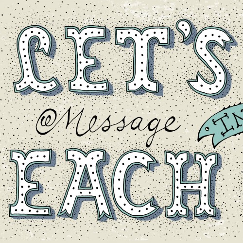
Hope. Not to be discouraged, she returned the next year with the same group of girls to drink another bottle of wine, pour words onto a page and throw it into the big blue sea. Perhaps the message in a bottle itself won’t find what she is looking for. But the process and the action held significance, and being clear in what you seek is often the first step in finding it.
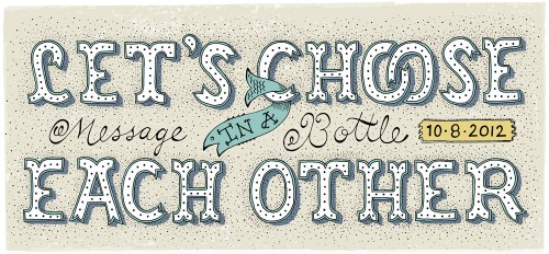
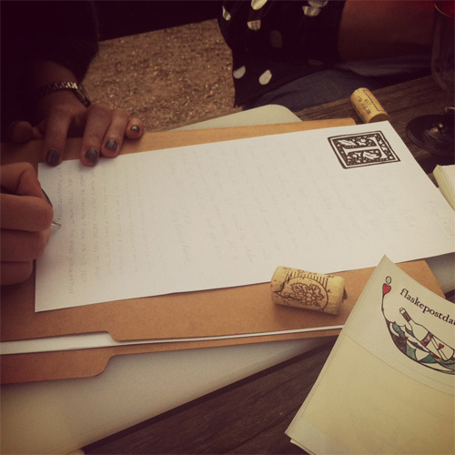
The flaskepostdating event was organized by Ditte and Lotte, who were inspired to write messages in a bottle after they found one on a beach in Denmark and wondered – what if this message had come from somebody important, meant just for them? Read more about the history and use of messages in a bottle on Wikipedia. The story about the girl and the boy was recounted as one of many past success stories that stemmed from a flaskepostdating event. See you there this coming summer?
Coke Iconography for Xplane
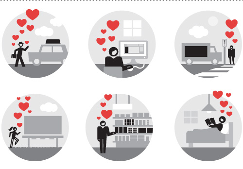
Here is a small excerpt from a project I worked on for Xplane, illustrating an internal process diagram for Coke. The style direction for the project was simple and modern without being completely stripped down. The overall diagram was more complex but also top corporate secret, so here are a few made-for-public-viewing icons from the project to give you an idea of the whole.


Predigital Digital Type
I remember as a child an activity my mother would put before my sister and I when she wanted our full concentration on something – i.e., peace and quiet. Bead artwork, where you place small plastic beads with holes in them on a plastic form, after which you melt them with an iron. The final product was never really worth keeping, but I imagine the hours it kept the two of us occupied were priceless.
So when a friend of mine recently went on a bead buying binge at a craft store, I was gripped by nostalgia and later a slight streak of OCD when I started on some bead artwork again. The process was both frustrating and meditative, but after some warm up I was able to pick up two beads at once to place on the gridded plate.
The first plate I made tested my skills in one-bit typography in spelling Oink, Moo, Juhu. The background became a gradient to create the contrast needed for the type to stand out, and because the bead bags I had were a random blend of colors, so there wasn’t enough of one color to make a solid color background. The second plate used all the beads I didn’t use for the first plate in a much simpler patchwork composition.
The words are much easier to see if you close one eye and slightly blur your vision. I suppose a composition with 1500 beads would have given a crisper image, but I also would have had to put my wrist in traction afterwards.
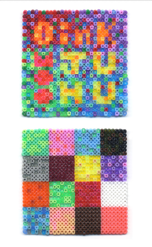
Each of the little plastic beads is 2.5mm in diameter. That is very very small. So small, that picking up beads with your fingers would be near impossible unless you were a hamster. So out came the tweezers to assemble the 784 beads per plate. The bag of beads cost 10 kroner, so I’d say I got my money’s worth based on hours of entertainment per bag.
While making these I also had plenty of time to invent a new party game. Best played in the wee hours after guests are sufficiently inebriated to think just about anything is amusing, I call it “Sweaty Palms”. The rules are:
-
1. Take a plate of plastic beads
2. Take your hand and place flat on beads
3. Lift your hand and see how many beads stick to your sweaty palm
4. The player with the most beads (by count or by weight), wins the game!
Finally, a game that gives sweaty people the upper hand.
Niel Irson Debut Album
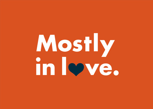
Recently I had the pleasure of working with Danish singer-songwriter Niel Irson on artwork and schwag for his debut album, “The Sweet Joy of Hunting Someone Down”. While the title of the album might feel like a spurned revenge, deep down he’s a softie which is evident in one of my favorite songs from the album, the sweet duet “Mostly in Love”.
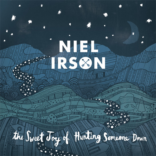
A simple logotype was needed to apply to all manner of materials large and small, so functional Futura was chosen with slight alterations. Another benefit of Futura, commonly available, is that the artist could create branded materials on the fly. The counter in the O was knocked out to allow for a smidgeon of graphic flair in the form of a two arrows at a crossroad.

Niel provided some key words to guide the design: journey, the road, hunt, adventurer, and romantic. After some brainstorming together we decided to create a nighttime landscape full of experiences guided by the stars. Orion, the original Love Hunter, was subtly featured in a splotchy skyscape. To get the most out of creating name recognition, the logotype was placed front and center on the cover artwork so that even on small uses such as Facebook the name is reinforced visually.
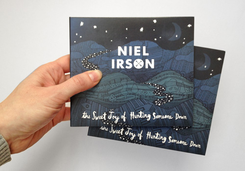
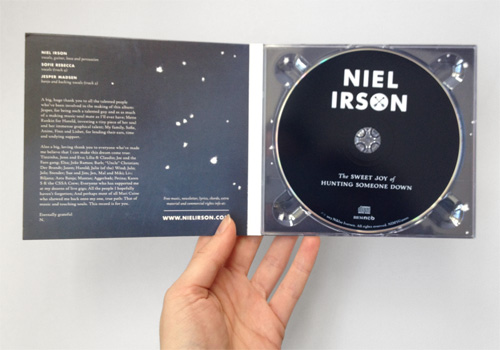
Irson is a man of grand gestures, he doesn’t do things in a small way, and the more I got to know him the more this was apparent in both his music and life choices. A few years ago he quit his job to move to Portugal, spend some time writing and playing, falling in love, and finding out about things the way you do when you’re in a new pool.
A year later he headed home, richer a plethora of recordings that he became determined to release as an album. After working at a day job as a programmer for a stint, he took the leap and became a music man full time, including a move to the UK to promote himself in a climate suited for the singer-songwriter. Kudos to anyone who has the guts to know they are meant to do something, and then follow through on that responsibility.
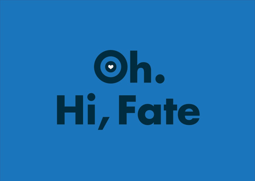
To help spread the word, we bit off the very tip of the merchandising iceberg by making a series of pins and postcards. There’s more to come, that’s for sure!
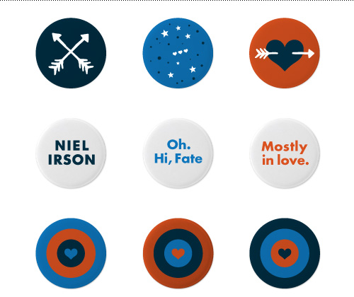
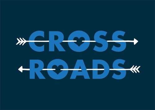
Niel is a throwback to the time of chivalry and love at first sight, a valiant modern gentleman. I wish him the best on his new adventures in moving to London to pursue his dream as a singer-songwriter – if putting your heart on the line gets you anywhere, this man will go far.
Crackle and Pop
