Umpqua Private Bank Website


I’m happy to share a project I’ve been working on for Umpqua Bank. The site is for their Private Bank that focuses on the needs of highly monied clients. I use Umpqua Bank for my business needs and their customer service (and chocolate treats when you visit in person) are unparalleled. This is a bank I can get behind so I was glad to be brought onto the project.

The task was to translate Umpqua’s sunny and upbeat public facing visual identity to a more formal space online without becoming a dry biscuit of financial conservatism. A custom tiling wood pattern background was made to reflect the use of wood in the interior of the bank while all content is contained on a piece of digital paper. Umpqua brand fonts were used in a large and friendly manner with short digestible text.

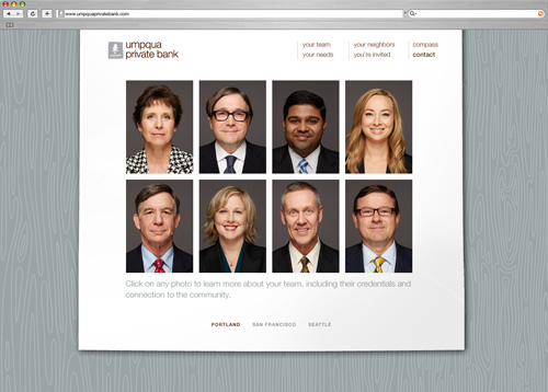
To populate the site, Chris Hornbecker took portraits of the private bank team with both the typical serious banker face (no smile), and the Umpqua face (smile!). Juliet Zulu created a video featuring one of their customers, Steve Smith of Smith Tea, which is shown on the homepage. I worked directly with Mark Jacobs who works in the Creative Strategies Department at Umpqua (and was also my partner in making the Goodie Monster in 2011). Matt Distefano of Umpqua coded the site.

Here are some shots of the site, or you can visit it here and see the exquisite video vignette.
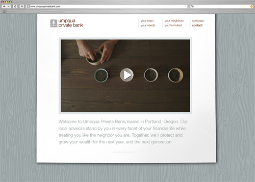
Homepage with video by Juliet Zulu.
Private Bank team portraits by Chris Hornbecker.
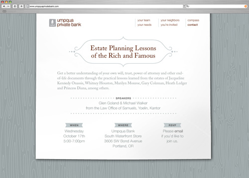
Why yes, I'd like to plan my estate like the rich and famous. Step one: acquire estate.
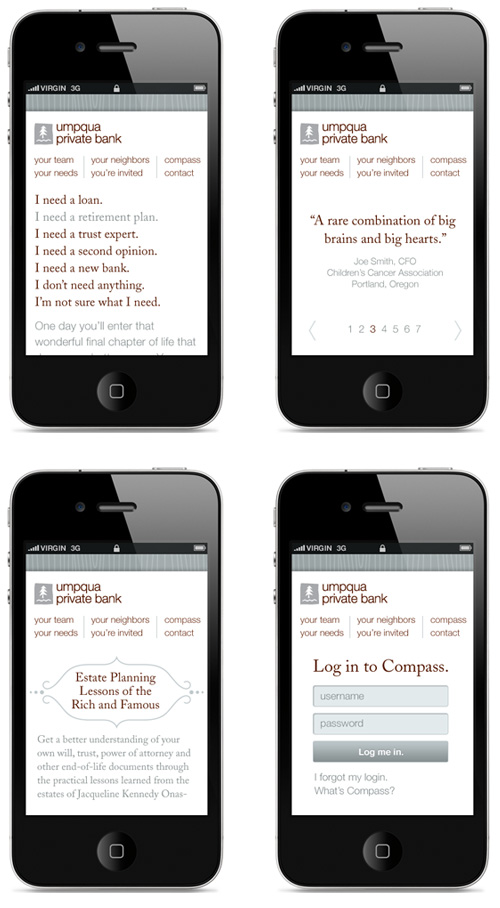
For little screens and big fingers.

I’m a fan of Mark Jacobs, I’m a fan of Smith Teas, and I’m a fan of Umpqua Bank.

TRIPLE SCORE!
Café Noir Infographic


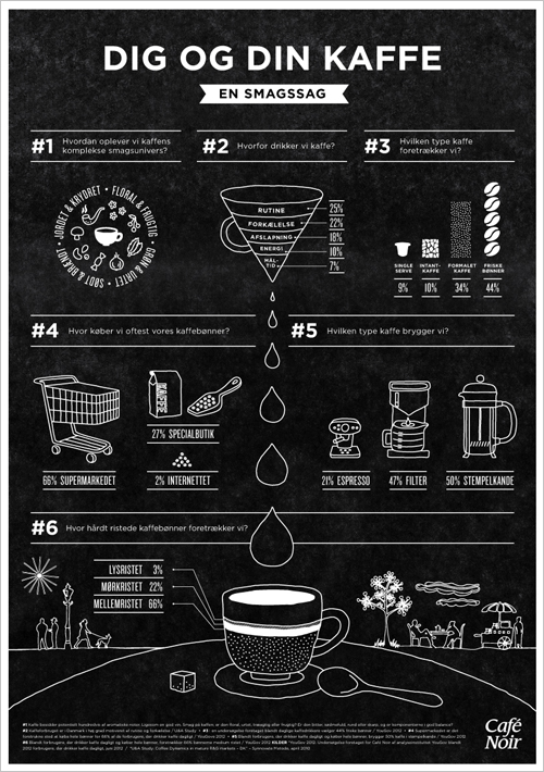
Here are the results from my first direct freelance project with a Danish client – an illustration and info graphic project made in collaboration with food communicator Marie Sainabou Jeng for Café Noir.

Café Noir was hosting an event for Danish media in relation to their release of Aroma Editions, four new coffee products created with the coffee experience in mind, not just throwing back a cup of black liquid for the sake of an energy boost and scalding your uvula. The poster was created to give journalists key facts around Café Noir’s research, in addition to having a coffee tasting and some informational mini-classes about coffee.

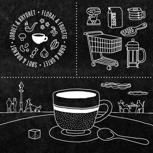
Style-wise the piece was created to fit in with the Aroma Editions brand with illustrations that matched their packaging and were simple enough to be stand alone graphics in printed and online media.

The info graphic focused on the data that informed Café Noir to follow the story of taste in their new product line. For example, did you know that coffee has 28 distinguishable tastes and 66 aromas? Most people drink coffee because it is a part of their routine? Presented with these two facts, I think it’s high time that coffee drinkers get out of their rut and experience at least a few of the nearly unending flavor possibilities when it comes to being a coffee connoisseur.

Poster infographic for Café Noir.
Close up of selected illustrations in Café Noir style.

Testing, Testing


At times things feel like a test. A good test, an unknown test, a test that will explain something later, a test that will reveal surprising results, a test that is just plain fun. Due to a genetic splicing experiment between two people, my parents, I am equal parts implementor of MAKING THINGS WORK and EXPERIMENTS. Sometimes the functional part comes first, but I find when the experiment part comes first it leads to a function I never would have imagined. For example, a new way to cook an egg.

Experiment No. 1 - egg on a stick. A sunny side egg hanging precariously on a roughly hewn roasting stick.